Category Archives: Water

An interactive map of water risk and stress

The World Resources Institute has developed Aqueduct, an interactive mapping tool that offers a fascinating look at water-related risks and stresses, including projected impacts due to climate change.

Using global data donated by Coca-Cola, one of several heavyweight corporate partners (Goldman Sachs and General Electric founded the Aqueduct Alliance), WRI has analyzed and visualized a dozen water-related risk factors facing businesses, governments, and communities. Below is a view of overall water risk (click to enlarge).

WRI Aqueduct: overall water risk

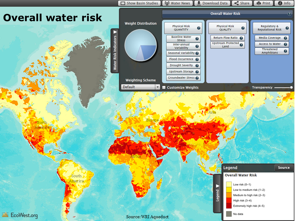
Elements of water risk

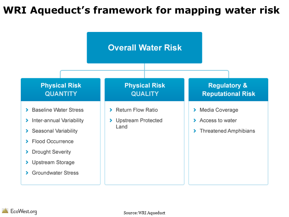
Aqueduct’s water risk model includes a dozen components, as shown in the slide below. The physical quantity risks deal with questions of supply, such as a location’s climate and its susceptibility to drought. The physical quality risks revolve around pollution, such as the protective status of upstream watersheds and how many times river water is re-used. The final category, regulatory and reputational risk, uses proxies, such as the number of threatened amphibians to highlight more fragile ecosystems that may face restrictions on withdrawals. There’s even a measure for media coverage of water issues to indicate where businesses will face greater risks to their public image if they do not manage water sustainably.

WRI Aqueduct water risk framework

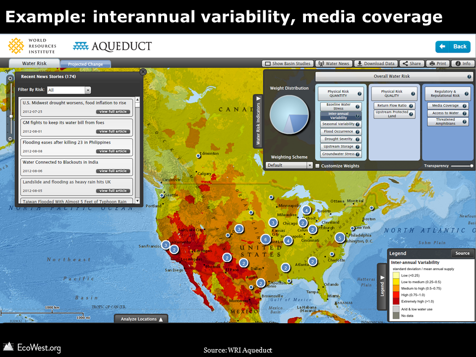
In the online atlas, you can examine each of these dozen factors separately and weight the three categories according to the needs of industry groups, including agriculture, semiconductors, and oil and gas. In the screenshot below, I’ve zoomed in on the United States and selected interannual variability (how much the water supply varies year to year). This risk factor is generally much greater in the West than in the East, and especially high in the Southwest. The numbers in circles indicate how many water-related media stories are currently showing up in the map’s built-in news feed.

WRI Aqueduct: example

Background on project

Here’s more about the project from WRI:

Water scarcity is one of the defining issues of the 21st century. In its Global Risks 2013 report, the World Economic Forum identified water supply crises as one of the highest impact and most likely risks facing the planet. With the support of a diverse group of partners, the World Resources Institute built Aqueduct to help companies, investors, governments, and communities better understand where and how water risks are emerging around the world.In January 2013, the World Resources Institute launched the centerpiece of Aqueduct after a three-year development effort: the Water Risk Atlas. The Atlas uses a robust, peer reviewed methodology and the best-available data to create high-resolution, customizable global maps of water risk.

The Aqueduct Water Risk Framework brings together 12  indicators into three categories of water risk and an overall aggregated score. The framework is based on a thorough review of the literature and available global data, and includes several indicators developed exclusively for Aqueduct. It is structured, in particular, to help companies and investors understand indicators of water-related risk to their business, but is intended for all users, including government and civil society to better understand geographic water issues. The Aqueduct Alliance, founded by General Electric and Goldman Sachs, is the network of companies and organizations that support the Aqueduct project. These partners provide resources as well as expertise and perspective to the project.

Mapping water stress

One illuminating feature of the atlas is that it allows you to examine water stress–essentially the imbalance between water supply and demand–under current conditions and three IPCC climate change scenarios.

The map below shows the baseline water stress, which is defined as “the ratio of total annual freshwater withdrawals for the year 2000, relative to expected annual renewable freshwater supply based on 1950-1990 climatic norms.”

WRI aqueduct: baseline water stress

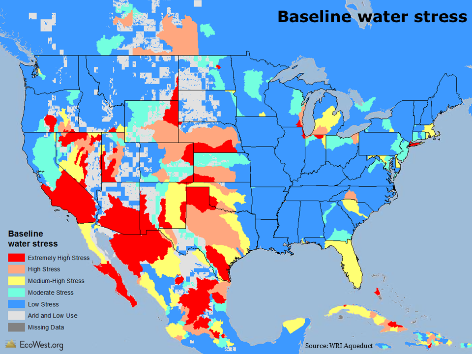
As you would expect, there’s a lot more stress, water-wise, in Phoenix than Portland. The roots of some age-old intrastate water conflicts show up pretty clearly, such as lower water stress in California’s wetter north, but extremely high stress in the drier south. There are similar dividing lines in Colorado: most of the water is on the Western slope, but the bulk of the population is east of Continental Divide along the Front Range.

Projecting climate change impacts

The maps below look ahead to 2095 and depicts projected changes in water stress. I’ve used the IPCC’s optimistic B2 and pessimistic A2 emissions scenarios, which show that higher levels of greenhouse gases will create much more water stress across the country. In the pessimistic scenario, I didn’t find any places in the continental United States where water stress decreased by 2095.

WRI Aqueduct projected change in water stress optimistic scenario

Water stress map

The Aqueduct atlas also has climate change projections for 2025 and 2050. It’s one of many ways you can customize your views of the data and I’d encourage anyone with an interest in water issues to take a few minutes to explore WRI’s useful visualization.

Data sources

WRI provides the data for download on this page. You can also download their framework document and indicator metadata. Below is an embed of their YouTube video explaining how to use the Aqueduct tool.

Downloads

EcoWest’s mission is to analyze, visualize, and share data on environmental trends in the North American West. Please subscribe to our RSS feed, opt-in for email updates, follow us on Twitter, or like us on Facebook.

Visualizing Colorado River challenges and options

The Colorado River, lifeblood of the Southwest, is in trouble. Demand for river water is rising as the region’s population continues to grow, but the Colorado’s inherently capricious supply is increasingly in doubt due to climate change.

A federal report released in December took an exhaustive look at the challenges facing the Colorado River Basin and it examined the options for dealing with expected shortages.  I’ve gone through the Colorado River Basin Water Supply and Demand Study and pulled out the key figures, which you can download at the bottom of this post.

Colorado River Bain Study from EcoWest on Vimeo.

Shortage projected

If I had to pick one graphic that summed up the dilemma facing the Colorado River, it would be this one:

Colorado River historical and projected water use and supply

Looking back in time, the graphic shows that water use in the basin steadily increased during the 20th century, but the river’s flow was predictably erratic (that blue line is a 10-year moving average but it’s still as uneven as the basin’s topography).

Looking ahead, water demand is expected to keep growing (the fuzzy areas indicate the uncertainty in the projections). Predicting the flow of the Colorado decades into the future is a tough task, but the study concluded that the supply would probably decrease, as indicated by the gentle downward slope of the blue line. By 2060, the imbalance between supply and demand is expected to be about 3.2 million acre-feet.

Comparing costs of solutions

Besides identifying the problem, the Basin Study evaluated a wide variety of proposals for addressing the shortfall—everything from increasing water conservation in cities and on farms, to building massive new pipelines and desalination plants, even far-fetched ideas like towing icebergs to Southern California.

I extracted data from a summary table in the study in order to visualize how these options compare, both in price and in how much water they’ll yield.

In the graphic below, I’ve ranked all of the options from highest to lowest cost (the unit here is dollars per acre-foot per year). I’ve also color-coded them by category.

Cost of options for Colorado River

As you can see, the range of costs is enormous, but there are some general patterns. Conservation measures are among the cheapest, while desalinating ocean water or covering reservoirs to reduce evaporation are pricey. (For a few of these options, the study provided a range of costs, but for simplicity’s sake I’ve used the average in this graphic.)

The chart below ranks the options by how much water they’re expected to yield in 2035.

Potential yield of options for Colorado River

Water conservation in agriculture and among municipal and industrial (M&I) users is projected to yield the most, but weather modification (aka cloud-seeding) also performs well on this measure.

I combined the cost and yield data into one graphic by varying the width of the bars by the volume of water that each strategy is expected to produce. The thicker the bar, the greater the yield. In this case, I used the projections for 2060, rather than 2035.

Cost and yield of options for Colorado River

In releasing the Basin Study in December, federal officials stressed the conservation options over massive new infrastructure projects, such as pumping the Missouri or Mississippi rivers to the Colorado Front Range. These graphics show why that’s pretty much a no-brainer: conservation delivers more bang for the buck and avoids the enormous environmental impacts of augmentation projects.

Downloads

Data sources

You can download the Basin Study and associated reports here.

The Denver Post had a good overview of the Basin Study’s release. See recent stories by the Los Angeles Times and Associated Press  for more on what the federal government is doing to follow up on the report.

EcoWest’s mission is to analyze, visualize, and share data on environmental trends in the North American West. Please subscribe to our RSS feed, opt-in for email updates, follow us on Twitter, or like us on Facebook.

Flow diagrams of U.S. and Western water use

Americans use an average of 410 billion gallons of water per day. Where does all that water come from and where does it go?

Flow diagrams from the Lawrence Livermore National Laboratory provide excellent summaries of the nation’s water use. These graphics, also known as Sankey diagrams, show how much we pump from groundwater aquifers, how many gallons of surface water we divert, and which economic sectors use the most water.

In this slide deck (download links at bottom of post), I’ve pulled together the flow diagrams for the 11 Western states, which show some interesting regional patterns in water use.

Flow diagrams of U.S. and Western water use from EcoWest on Vimeo.

Diagrams visualize commodity flows

Lawrence Livermore produces similar graphics for energy and carbon dioxide. In another post, I provide a little background on Sankey diagrams, which are a great tool for visualizing how a commodity flows through a system.

Data for the water diagrams come from the U.S. Geological Survey, which publishes a report every five years summarizing the nation’s water use (the latest year available is 2005).

The flow diagrams segment water sources into four main categories: fresh surface water, saline surface water, fresh groundwater, and saline (brackish) groundwater. Lawrence Livermore summarizes national-level water use this way:

Fresh surface-water, from lakes and rivers, is used at large scale in every sector of the economy. Saline surface water, primarily ocean water, is mostly used for once-through thermoelectric cooling, although some ocean water is used for industrial cooling and a small but growing amount of ocean water is being desalinated for public consumption. Significant quantities of fresh groundwater are used in irrigation and fresh groundwater plays an important role in both public supply as well as self-supplied domestic water consumption. Brackish groundwater is the most difficult water resource to use and is therefore primarily used in the mining sector and in power production (often in geothermal power plants).

Western states vary widely

The state-level slides reveal that water is managed very differently across the West, with some residents heavily dependent on surface water and others more reliant on groundwater. In Montana, Utah, and Wyoming, saline groundwater is an important source for mining and industry, while in Idaho and Oregon there’s a fair amount of fresh water devoted to aquaculture.

Across the region, the water delivered to homes and businesses is just a fraction of what’s devoted to growing crops. Consider the arid state of Arizona, where discussions about water tend to focus on the state’s growing cities. In reality, the graphic below (click to enlarge) shows that farming totally dominates water consumption in Arizona.

Arizona water flow

When examining these slides, it’s important to remember that the size of the rectangles and the connecting lines are not comparable from state to state. Instead, they show the proportions of surface water and groundwater that are directed to various uses within each state.

Lawrence Livermore also offers this caveat:

Water use data is notoriously hard to compile. Accounting policies vary between different water management districts and water use is not metered in the same way that higher-priced commodities are sold. Quantifying water use by location and sector requires substantial estimation.Water disposition is even more difficult to quantify. While the quality of wastewater discharge is measured regularly for environmental purposes, the total quantity of wastewater is not carefully monitored, especially when that wastewater already meets environmental regulations for discharge.

Despite these drawbacks, I’ve found these diagrams to be super-helpful in understanding Western and national water-use patterns. Once the U.S. Geological Survey releases data from the 2010 report, which isn’t expected until 2014, it’ll be interesting to see if there have been any significant shifts in water use.

Downloads

EcoWest’s mission is to analyze, visualize, and share data on environmental trends in the North American West. Please subscribe to our RSS feed, opt-in for email updates, follow us on Twitter, or like us on Facebook.