Category Archives: Water

A dashboard for monitoring drought

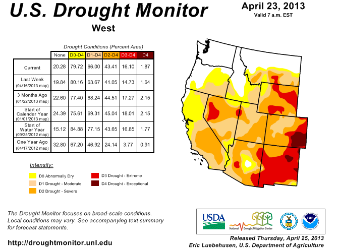
Aside from the Pacific Northwest, nearly all of the land west of the 100th Meridian is currently drier than normal. The drought has been especially severe in the nation’s midsection, where some areas are suffering through “exceptional” conditions, according to the U.S. Drought Monitor.

To track drought severity, I’ve created a dashboard on this page that shows what percentage of the contiguous United States and the 11 Western states were in various categories of drought. The dashboard allows you to export images like the one below (click to enlarge).

Drought monitor dashboard

The graphics visualize data back to 2000 and show that the current drought in the West is beginning to rival the brutal dry spell that gripped the region in the early 2000s. Just a couple of years ago, very few areas in the West were abnormally dry, but that sure changed in a hurry. Below is the latest map of drought conditions in the region.

West drought monitor

Although drought is a natural part of the Western climate, the shortage of precipitation has major implications for the region’s water supply, the severity of its upcoming wildfire season, and the health of ecosystems already confronting a broad spectrum of threats.

Data sources

The dashboard is based on the U.S. Drought Monitor, which provides historical data on this page. There are other ways to measure drought, such as the Palmer Index. In a future post, I’ll be sharing some slides that explain the differences in the various measures.

National Public Radio has put together an animated series of maps that show how drought conditions have changed over the past few years.

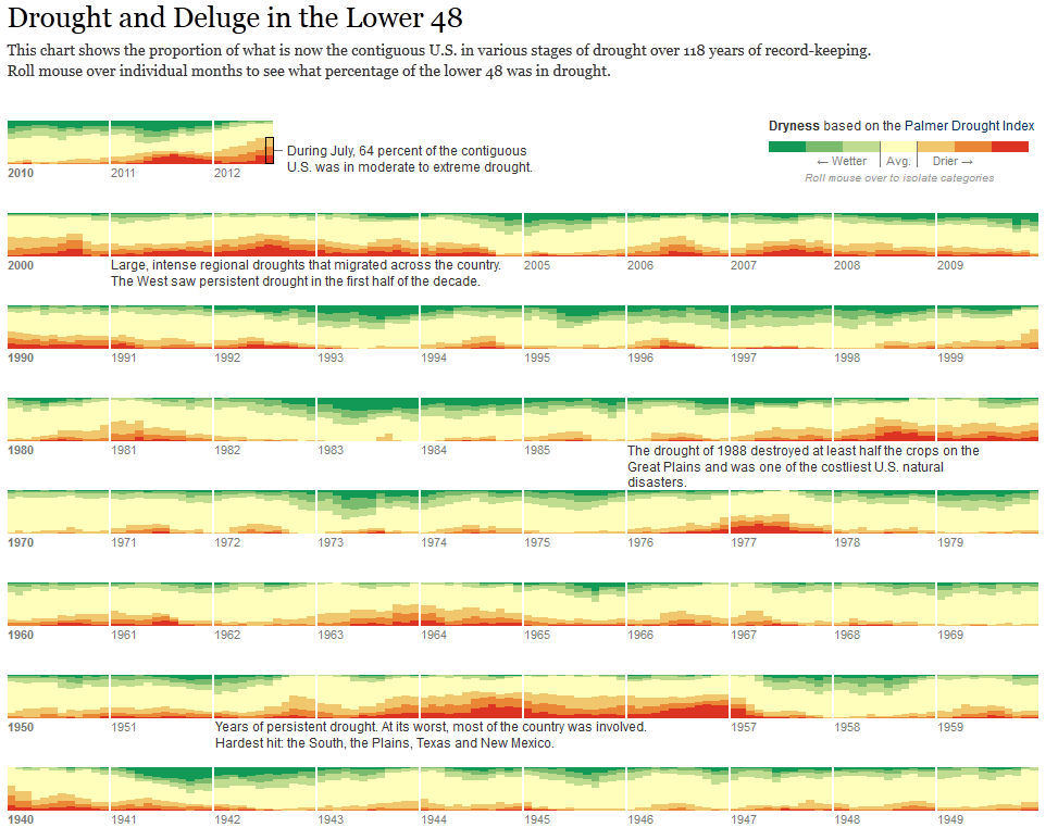
It’s also worth checking out how the The New York Times has mapped the drought’s footprint since 1896.

EcoWest’s mission is to analyze, visualize, and share data on environmental trends in the North American West. Please subscribe to our RSS feed, opt-in for email updates, follow us on Twitter, or like us on Facebook.

Survey says: water bills are rising

In the West and around the nation, the price of water keeps going up.

Since 2010, Circle of Blue has been gathering water rate data in the 20 largest U.S. cities, plus 10 regionally representative cities. From 2011 to 2012, single-family residential water prices rose an average of 7.3 percent; since 2010, the increase is nearly 18 percent.

The graphics below show how water bills have changed in Western cities. One interesting feature of these charts is that they analyze water use under three different scenarios: low use (50 gallons per person daily), medium use (100 gallons per person daily), and high (150 gallons per person daily.) To promote conservation, many Western utilities have a progressive rate structure, which charges customers more per gallon if their use exceeds certain thresholds.

Mountain west water rates

Mountain Water PriceWest coast water rates WestCoastWaterPrice

On the national level, the price of water is rising at a pace much faster than the overall rate of inflation. The graphic below, from the Institute of Public Utilities at Michigan State University, compares the costs of various utilities and water/sewer bills really stand out.

Trends in utility prices

CPItrends Many Western utilities are searching for new (expensive) supplies to meet the rising demands of the growing customer base, putting upward pressure on rates. But the nation’s crumbling water works are perhaps an even bigger driver of the increasing costs, as Circle of Blue notes:

The upward trend for rates is an inherent feature of the water sector. Compared with other utilities, water departments require significantly more assets — pumps, pipes, and plants — to generate revenue. All of that hardware is expensive to maintain, and, as the fountain of water main breaks across the U.S. attests, a good portion of this infrastructure has come to the end of its effective life. The American Water Works Association recently estimated that replacing the nation’s pipes alone will cost $US 1 trillion over the next 25 years. Most of this will come from ratepayers, who pay as much as 99 percent of all money that is spent on water supply systems, according to the U.S. Conference of Mayors

Rising prices are generally portrayed as a bad thing in the media, and I’d just as soon spend my money on something other than my monthly water bill, but the bright side to increasing prices is that it can encourage more efficient water use.

For more on these issues, check out our water deck, which includes some slides on the price of water and the sorry state of our nation’s water infrastructure.

EcoWest’s mission is to analyze, visualize, and share data on environmental trends in the North American West. Please subscribe to our RSS feed, opt-in for email updates, follow us on Twitter, or like us on Facebook.

2012 Graphics Highlights from The New York Times

The New York Times does some of the best data visualization in journalism and the paper has assembled highlights of its 2012 work. A few of these graphics relate to Western environmental issues and some are accompanied by descriptions of how they were created. Here are my favorites:


Drought footprint
Source: The New York Times

1) The drought’s footprint

Brilliant use of small multiples to show what fraction of the United States was experiencing moderate to extreme drought in a given year. When the piece was published in July, more than half the contiguous United States was classified this way, the highest level in nearly six decades.

The graphic stretches all the way back to 1896 and it really shows that 2012 was an exceptionally dry year. But as recently as 2010, very few areas were experiencing drought.

We cover drought in our water deck, and in a future post I’ll be sharing some visualizations that focus on drought the West.


2) Drought and deluge

Source: The New York Times
Drought and deluge. Source: The New York Times

The Times used a different system for measuring drought to create another visualization. Rather than relying the U.S. Drought Monitor, as it did in the footprint maps, the paper uses the Palmer Drought Severity Index. The former uses the Palmer index as one of its inputs, but it’s also based on stream flows, crop moisture, precipitation patterns, and expert judgement. The Palmer index is strictly based on temperature and precipitation. It not only shows drought but also wet spells.

One cool thing about this graphic is that you can roll your mouse over the various levels of the Palmer index to see the driest and wettest periods. Once again, the current drought stands out as a deep one, but it’s certainly not unprecedented.

Another thing I noticed is that in 2011, large parts of the country were either very dry or very wet.


Obama budget
Slicing Obama’s budget. Source: The New York Times

3) Slicing Obama’s budget

This graphic puts the humble pie chart to shame and effectively shows how entitlements, defense, and debt costs dominate the federal budget. Click on the “Department Totals” tab to see how federal spending is divided up by agency. As you might imagine, environmental departments, such as EPA and Interior, are overshadowed by other agencies.

We cover federal (and other) spending in our politics deck and have a number of other graphics showing how environmental and natural resource programs are tiny in comparison with other federal spending priorities.


Democratic convention
Words used at Democratic convention Source: The New York Times

4) Parsing the rhetoric at political conventions

The Times analyzed all of the speeches at the Republican and Democratic conventions to determine which words were most common and how the language of the two parties differed.

You can plug in your own words or phrases to see how often they were spoken. I’m being a bit parochial, but here are the number of hits I got for both parties: environment (3), conservation (0), climate change (1), global warming (0), pollution (1), water (4). And that’s per 25,000 words.


EcoWest’s mission is to analyze, visualize, and share data on environmental trends in the North American West. Please subscribe to our RSS feed, opt-in for email updates, follow us on Twitter, or like us on Facebook.