Tag Archives: fires

Counting homes in the Western WUI

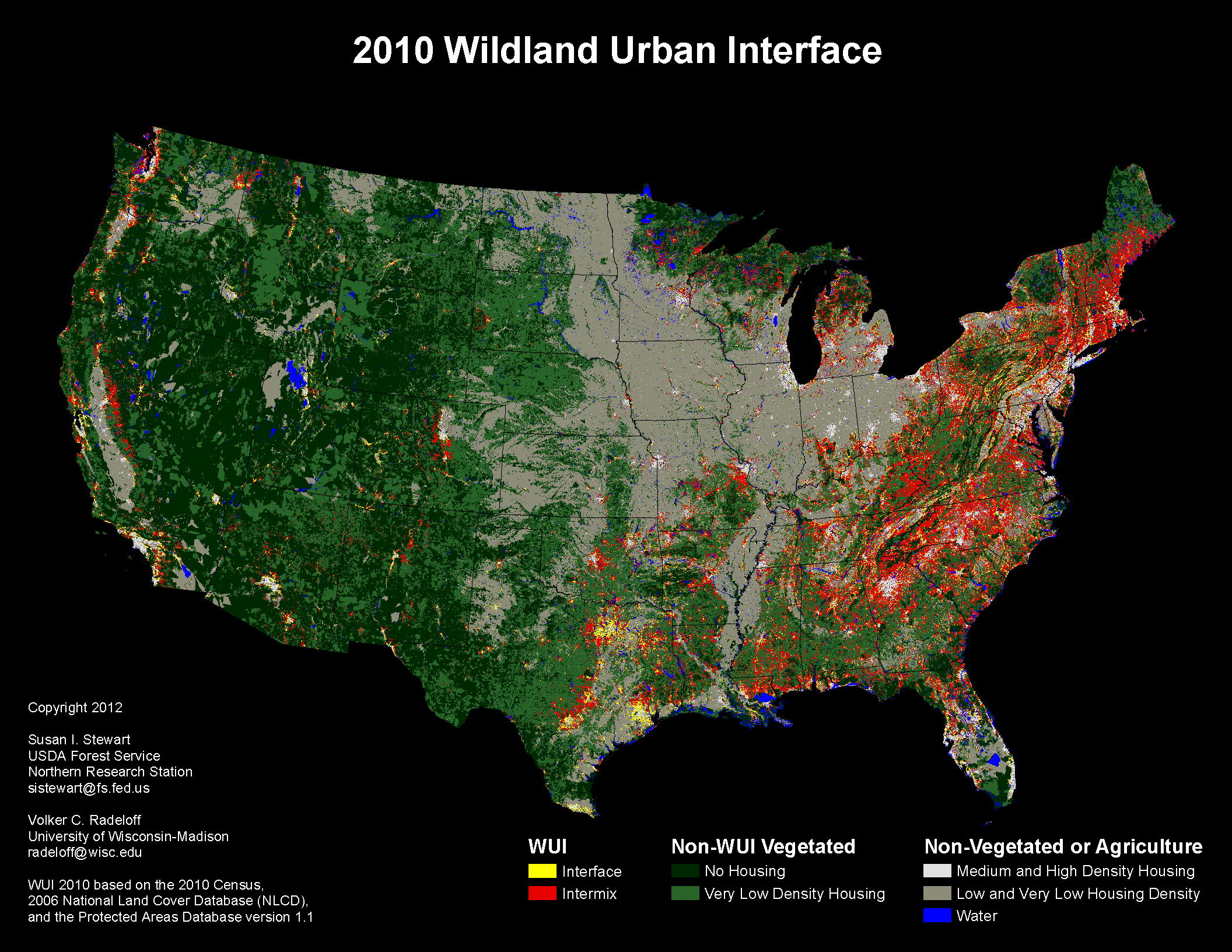
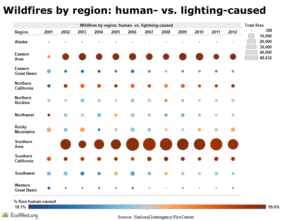
When firefighters are deployed to battle wildfires, they often focus on saving structures in the wildland-urban interface (WUI), where homes mix with or border flammable vegetation.

Where are these vulnerable homes located in the West?

Data from analytics firm CoreLogic provide a good high-level overview of the Western WUI. I’ve created a dashboard on this page to summarize their numbers.

CoreLogic uses four categorizes to describe the risk of wildfires destroying residential properties: very high, high, moderate, and low. There are also categories for agricultural and urban properties, which are not rated for their fire danger.

In the 13 Western states it analyzed, CoreLogic found some 740,000 residences at high or very high risk for wildfire damage and those homes are valued at more than $136 billion. Nearly 168,000 homes, valued at more than $32 billion, are in the very high risk category.

Geographic disparities

Below are a couple of views of the data (click to enlarge). The map shows the number of homes in the very high risk category, with the circles colored by the percent of homes in each state that are in this most vulnerable category. You can see that California and Colorado both have nearly 50,000 homes in this category, but while that’s about 3 percent of Colorado’s residential properties, it’s just 0.5 percent of California’s. The bar chart shows what percent of each state’s homes are in the very high and high categories.

EcoWest WUI homes dashboard

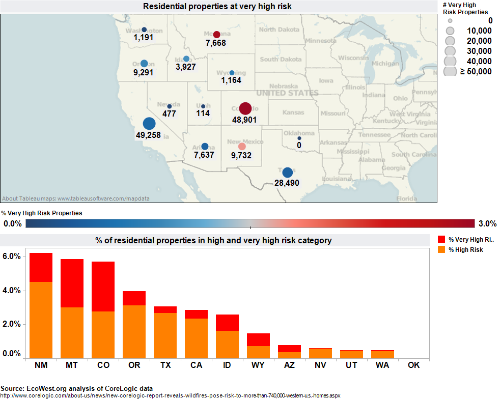
New Mexico, Montana, and Colorado have the highest percentages of homes in the top-two risk categories. Below is another visualization of the data, which just focuses on the very high risk category.

Number of residential properties facing very high risk

Comparing average home values

CoreLogic also provides data on the value of the residential properties in each of the risk categories. I divided these values by the number of homes in each category to create an average value figure, which is presented below in a scatter plot.

In this graphic, I’m comparing the very high risk to the low risk homes. The circles vary in size by the number of homes in the very high risk category and they’re colored to show the percent of homes in a state that are in this most vulnerable subset. If a state is above the 45-degree line, its very high risk properties are more valuable, on average, than the low risk homes, and vice versa.

Comparing values of properties in Western WUI

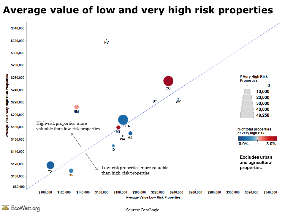
This scatter plot shows that in plenty of Western states, homes in the riskiest and least risky categorize have roughly the same average value (they fall on or close to the 45-degree line). But in Nevada, the very high risk homes have an average value of about $325,000, while the lowest risk houses have an average value of about $165,000. The spread of the circles also indicates that there’s great state-to-state variation in home values. Colorado’s very high risk properties, for example, are more than twice as valuable as those in Texas.

CoreLogic sells much more detailed information on risk to insurance companies, but these state-level figures still show some interesting geographic patterns. California, Colorado, and Texas have the most homes in the WUI, while Washington, Wyoming, Nevada, Utah, and Oklahoma have very few.

Here’s more from CoreLogic and Dr. Howard Botts, its vice president and director of database development:

The Wildland Urban Interface (WUI) identifies the intersection of potentially high-risk fire areas and large numbers of homes. The report states that just between the years of 1990 to 2008, there were close to 17 million new homes built in the U.S., of which 10 million (58 percent) were located in the WUI and therefore potentially located near high wildfire risk zones. “Homes located within a city boundary are not safe from the threat of wildfire destruction. In fact, the unprecedented growth of urban areas over the past 50 years has generally increased the likelihood homes will be damaged by wildfire activity,” said Botts. “As residential development has expanded into formerly undeveloped wildlands, the transitional area between the two, known as the Wildfire Urban Interface, has become exceptionally vulnerable to wildfire. Approximately 40 percent of homes in the U.S. are located in that zone, and wind-blown embers are capable of igniting homes located hundreds, or even thousands of feet away from an actual fire.”

I’d be curious if readers see any other patterns in the data, which is available for download below. We have a gallery of state-by-state WUI maps and some more discussion of the issue in this post.

NOTE: I’m about to head off on vacation, so EcoWest will resume with new posts the week of July 15.

Downloads

EcoWest’s mission is to analyze, visualize, and share data on environmental trends in the North American West. Please subscribe to our RSS feed, opt-in for email updates, follow us on Twitter, or like us on Facebook.

Mapping the Wildland-Urban Interface

The fire-prone wildland-urban interface (WUI) is in the news after more than 500 homes burned in the 14,280-acre Black Forest Fire near Colorado Springs. The most destructive wildfire in state history (in terms of homes lost) has once again highlighted the dangers of living amid flammable forests and woodlands.

I’ve pulled together maps of the WUI (“WOO-ee” is how fire folks pronounce it) on this page and in PowerPoint slide decks that you can download at the bottom of this post.

The maps come from the University of Wisconsin’s SILVIS laboratory. Below are some examples. If you click on the images, you’ll be able to see much more detail in a larger version and start the 1990-to-2000 animation for California.

United_States_wui_2010
Oregon_wui_2010
California WUI animation 1990 to 2000

Intermix versus interface

These maps distinguish between the wildland-urban interface (yellow in 2010 maps) and intermix (red) areas. “Intermix WUI are areas where housing and vegetation intermingle; interface WUI are areas with housing in the vicinity of contiguous wildland vegetation,” according to the lab.

I was surprised by the prevalence of the WUI back East. Eastern areas record a large number human-caused fires and some can get pretty large (see our fire trends dashboard and post for more on this), but it seems like wildfires burning down homes is always portrayed as a Western issue. These maps do not account for the varying fire potential around the country–they’re more about where homes and potential fuels mix.

In the West, the WUI is found pretty much where you’d expect. In many of the region’s cities and denser suburbs, there simply isn’t enough vegetation to burn. Conversely, you won’t find the WUI in the middle of a wilderness where homes aren’t allowed. It tends to be on the outskirts of metro areas, where homes mix with the vegetation, right up to the front porch in some cases, or in more rural places where homes are surrounded by public lands and continuous blocks of fuel.

As an example, I’ve created this close-up of the Colorado Front Range and labelled it with some major cities, as well as the Black Forest Fire, in the WUI northeast of Colorado Springs.

Colorado Front Range WUI

These WUI maps seem like a pretty good proxy for the risk of wildfires destroying homes and property in the United States, at least in the West. The yellow/red color scheme may imply that the dangers are greater in the intermix than the interface, but in a 2005 paper, the researchers write that the categorization “does not explicitly account for differences in fire risk.”

With billions of dollars of real estate at stake, private firms like CoreLogic do even more detailed analysis of the hazards. In a future post, I’ll share some data on the number of homes at risk in each state.

Data sources

The SILVIS lab provides many more images and the underlying GIS data on this page.

This data was the basis for a 2005 paper in Ecological Applications (PDF here).

Downloads

EcoWest’s mission is to analyze, visualize, and share data on environmental trends in the North American West. Please subscribe to our RSS feed, opt-in for email updates, follow us on Twitter, or like us on Facebook.

Wildfire ignition trends: humans versus lightning

The Western wildfire season is well underway, so I thought this would be a good time to examine a key question: what causes wildfires?

Basically it boils down to two ignition sources—humans and lightning—but the balance between these two causes varies dramatically across the country. We have a dashboard on ignition that illustrates the data and I’ve created a PowerPoint presentation that you can download at the bottom of the post.

This graphic summarizes the national picture since 2001:

National wildfire cause

Two metrics: fires and acres

Over the past dozen years, more than 80 percent of all wildfires have been caused by people and that rate has been very steady. But if you look at the acreage burned, as opposed to the number of fires, humans are usually responsible for less than half the total.

Why the difference? Lightning-sparked fires in remote parts of the West and Alaska may get very large before they are contained; in some cases, these blazes are allowed to burn to reduce fuels. By contrast, many human-caused fires start in populated areas and are quickly controlled.

You can see the regional differences in the chart below, which shows what percent of fires were human-caused from 2001 to 2010. The regions are defined by the National Interagency Fire Center.

Regional wildfire cause

Back East and in California, humans are responsible for starting the vast majority of fires, whereas in the Great Basin, it’s less than 40 percent. This regional breakdown suggests that fire prevention programs will be more effective in some areas than others.

Explore data in our dashboard

Our wildfire ignition dashboard presents this information in a different way and allows you to interact with the data. The screenshot below shows the number of acres burned in each region:

Acres burned by region

There have been some huge wildfires up in Alaska and nearly all the acreage burned was due to lightning-sparked blazes. Conversely, human-caused wildfires predominate in the Southern area. In other regions, such as the Southwest, the situation is more variable. In some years, humans are responsible for the bulk of acres burned, but in other years most of the burning is due to lightning

The screenshot below shows the number of wildfires in each region. The Southern and Eastern regions, where the bulk of the nation’s population lives, have the greatest number of human-caused wildfires, but in places like the Great Basin, where relatively few people live, the vast majority of fires are caused by lightning.

Fires by region

Takeaways

The large number of lightning-caused fires out West should remind us that wildfires are inevitable in the region. Measures like campfire bans and public lands closures, which may succeed in cutting the number of human-caused fires, can only do so much.

This data also illustrates why it’s so important for us to get beyond national-level statistics when analyzing wildfires. Otherwise we end up lumping together lightning-caused blazes in the unpopulated Alaskan tundra and arson fires in the chaparral of suburban Los Angeles.

Downloads

Data sources

The National Interagency Fire Center publishes data on the cause of wildfires on this page.

EcoWest’s mission is to analyze, visualize, and share data on environmental trends in the North American West. Please subscribe to our RSS feed, opt-in for email updates, follow us on Twitter, or like us on Facebook.