Tag Archives: map

The United States of Energy

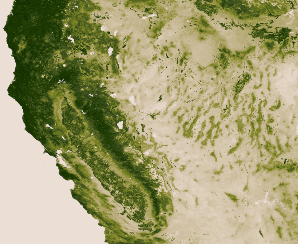
Maps of our nation’s energy potential usually display just one source, such as the location of wind farms or the extent of natural gas fields. In an interesting new data visualization, advertising and PR firm Saxum has combined both fossil and renewable energy resources into a map of The United States of Energy.

Below are the front and back of the viz, which has so much info that it probably reads best in hard copy (click on images to enlarge).

The firm describes the project as “the first data visualization piece of its kind to comprehensively detail our nation’s vast and diverse energy portfolio. ” Here’s more from them:

What began as a simple graphic showcasing America’s energy riches quickly grew into a two-sided, folded map concept displaying thousands of individual data points. The #USofEnergy map visualizes our country’s energy potential by charting current sources of energy production and identifying future resources and known deposits. Energy resources surveyed include: natural gas, oil, coal, nuclear, hydroelectric, wind, geothermal, solar and biomass. We compiled the data from a broad range of industry and government sources, including the National Renewable Energy Laboratory, U.S. Geological Survey, U.S. Energy Information Administration, U.S. Army Corps of Engineers, Nuclear Research Council and American Wind Energy Association.

In some parts of the country, such as the nation’s midsection, there are so many different energy sources being exploited that the map is tough to make out. Overlapping layers present a difficulty here, but in other regions, such as the East Coast, there’s a lot of white space.

Saxum, which describes itself as “one of the leading integrated marketing communications agencies in the Great Plains,” highlights that 46 percent of U.S. energy is produced by nine states in the center of the country, as shown below.

United States of Energy Midwest
Source: Saxum

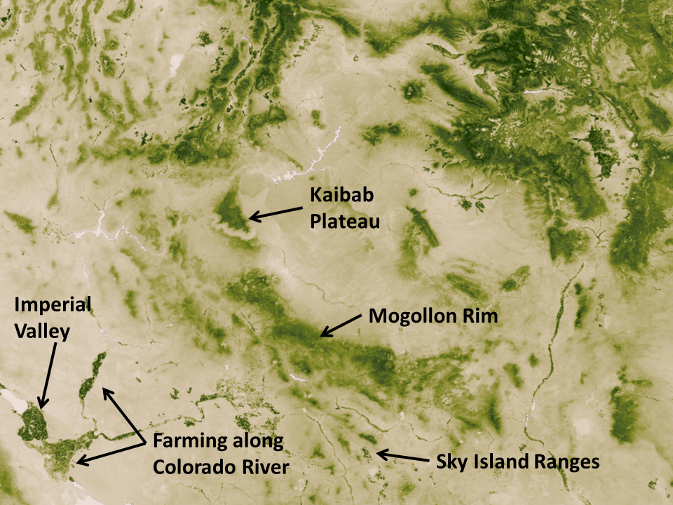
It’s worth zooming in to their legend to see what all these layers really mean. With biomass, for example, an entire county is shaded orange if it’s in the top-20 percent for producing energy in this way per square kilometer. With solar, only the best places in the country are shown. Here in Denver, for example, we’re not covered by the solar layer, but photovoltaic panels on the roof of my home/office generate the majority of electricity we consume (see this more detailed solar potential map from the U.S. Department of Energy).

Don’t ask me how, but it would be great to see an online, interactive version of Saxum’s map. That format could let you provide even greater detail on the energy sources, such as varying the size of the points used to display nuclear plants and hydroelectric dams by how much energy they produce, or by allowing users to turn layers on and off. (UPDATE: Saxum has an interactive data visualization here.)

Emily Guerin at High Country News has a good overview of the other trends that Saxum highlights in its map.

If you’re looking for maps of individual energy sources, check out our PowerPoint presentation on land use.

EcoWest’s mission is to analyze, visualize, and share data on environmental trends in the North American West. Please subscribe to our RSS feed, opt-in for email updates, follow us on Twitter, or like us on Facebook.

Mapping the green on the blue planet

Scientists have released new high-resolution maps that illustrate the lushness of vegetation, or lack thereof, around the globe.

Researchers at NASA and the National Oceanic and Atmospheric Administration (NOAA) used satellite data from April 2012 to April 2013 to create maps like the ones below (click to enlarge).

NASA vegetation globes
Source: NASA

“The darkest green areas are the lushest in vegetation, while the pale colors are sparse in vegetation cover either due to snow, drought, rock, or urban areas,” NASA/NOAA says.

Satellites are able to gauge the lushness of vegetation because sunlight reflect off plants differently than cities, barren peaks, and other non-vegetated areas. “Plants absorb visible light to undergo photosynthesis, so when vegetation is lush, nearly all of the visible light is absorbed by the photosynthetic leaves, and much more near-infrared light is reflected back into space,” NASA/NOAA says. “However for deserts and regions with sparse vegetation, the amount of reflected visible and near-infrared light are both relatively high.” Here’s a diagram illustrating the concept:

Vegetation-index-diagram

Zooming into West

Compared to the rest of North America, the American West stands out for the relative lack of vegetation in many interior areas. Although the Pacific Northwest and taller mountain ranges show up as deep green, the Southwest looks pretty tan. Check out the rain shadow to the east of the Sierra Nevada Range, as well as the verdant ranges in the Great Basin, in this closeup:

NASA vegetation California
Source: NASA

Below I’ve zoomed into the Southwest, where you can clearly see the irrigation along the Colorado River. I’ve also marked some notable islands of green, such as the Kaibab Plateau and the elevated archipelago of “sky island” mountain ranges in Southeast Arizona.

NASA vegetation Southwest
Source: NASA

Downloading map

NASA/NOAA create a new greenness image every week. With a resolution of 500 meters (each pixel depicts about 62 acres), the weekly maps weigh in at 13 gigabytes each. You can download a 30,000 pixel by 15,000 pixel image (176 megabytes) and that’s what I’ve used to create the close-ups above.

Below is a video tour that shows how the vegetation changed during one year, both due to the changing seasons and human activities. The footprint of cities in Europe and Asia is striking.

EcoWest’s mission is to analyze, visualize, and share data on environmental trends in the North American West. Please subscribe to our RSS feed, opt-in for email updates, follow us on Twitter, or like us on Facebook.

Interactive population maps from Census Bureau

It’s hardly news that the West’s population is booming, but which counties in region are growing fastest? How has the demographic profile of Western states been changing?

The U.S. Census Bureau offers up some great interactive maps that depict population changes between 2000 and 2010. These maps, which you can embed in websites and blogs, also show how the racial composition of states changed during the first decade of the 21st century.

I’ve compiled the maps for all 11 Western states on this page, which also includes a national overview.

Some rural counties losing residents

Below is an example from Colorado. Although the state’s overall population rose 17% from 2000 to 2010, plenty of counties actually lost residents during the decade. The shrinking counties are found in rural, agricultural regions, while many of the fastest growing counties are located near cities in the Front Range, from Fort Collins to Denver to Colorado Springs, and along the state’s Western Slope. This same pattern of declining rural populations holds true in some other Western states, such Montana, New Mexico, and Oregon.

Latino population rising

One of the most striking trends is the sharp rise in the number of Latino residents. Below is a map for Nevada, which saw its Latino population increase by 82% from 2000 to 2010. Every state in the region experienced strong growth in Latino residents, ranging from 25% in New Mexico and 28% in California, which already had large Latino populations in 2000, to 73% in Idaho and 78% in Utah, which ranked third and second behind Nevada. Overall, the Latino share of the U.S. population increased 41% from 2000 to 2010.

EcoWest’s mission is to analyze, visualize, and share data on environmental trends in the North American West. Please subscribe to our RSS feed, opt-in for email updates, follow us on Twitter, or like us on Facebook.