Tag Archives: wildfires

Wildfire ignition trends: humans versus lightning

The Western wildfire season is well underway, so I thought this would be a good time to examine a key question: what causes wildfires?

Basically it boils down to two ignition sources—humans and lightning—but the balance between these two causes varies dramatically across the country. We have a dashboard on ignition that illustrates the data and I’ve created a PowerPoint presentation that you can download at the bottom of the post.

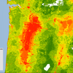
This graphic summarizes the national picture since 2001:

National wildfire cause

Two metrics: fires and acres

Over the past dozen years, more than 80 percent of all wildfires have been caused by people and that rate has been very steady. But if you look at the acreage burned, as opposed to the number of fires, humans are usually responsible for less than half the total.

Why the difference? Lightning-sparked fires in remote parts of the West and Alaska may get very large before they are contained; in some cases, these blazes are allowed to burn to reduce fuels. By contrast, many human-caused fires start in populated areas and are quickly controlled.

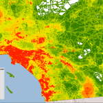
You can see the regional differences in the chart below, which shows what percent of fires were human-caused from 2001 to 2010. The regions are defined by the National Interagency Fire Center.

Regional wildfire cause

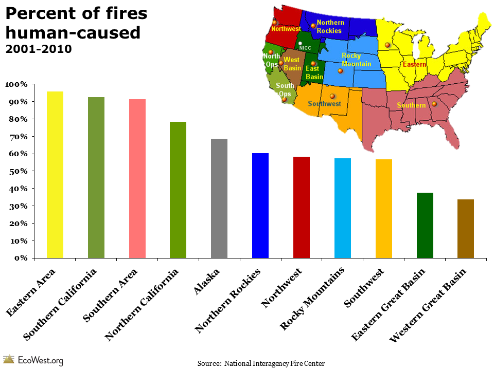
Back East and in California, humans are responsible for starting the vast majority of fires, whereas in the Great Basin, it’s less than 40 percent. This regional breakdown suggests that fire prevention programs will be more effective in some areas than others.

Explore data in our dashboard

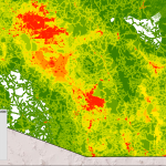
Our wildfire ignition dashboard presents this information in a different way and allows you to interact with the data. The screenshot below shows the number of acres burned in each region:

Acres burned by region

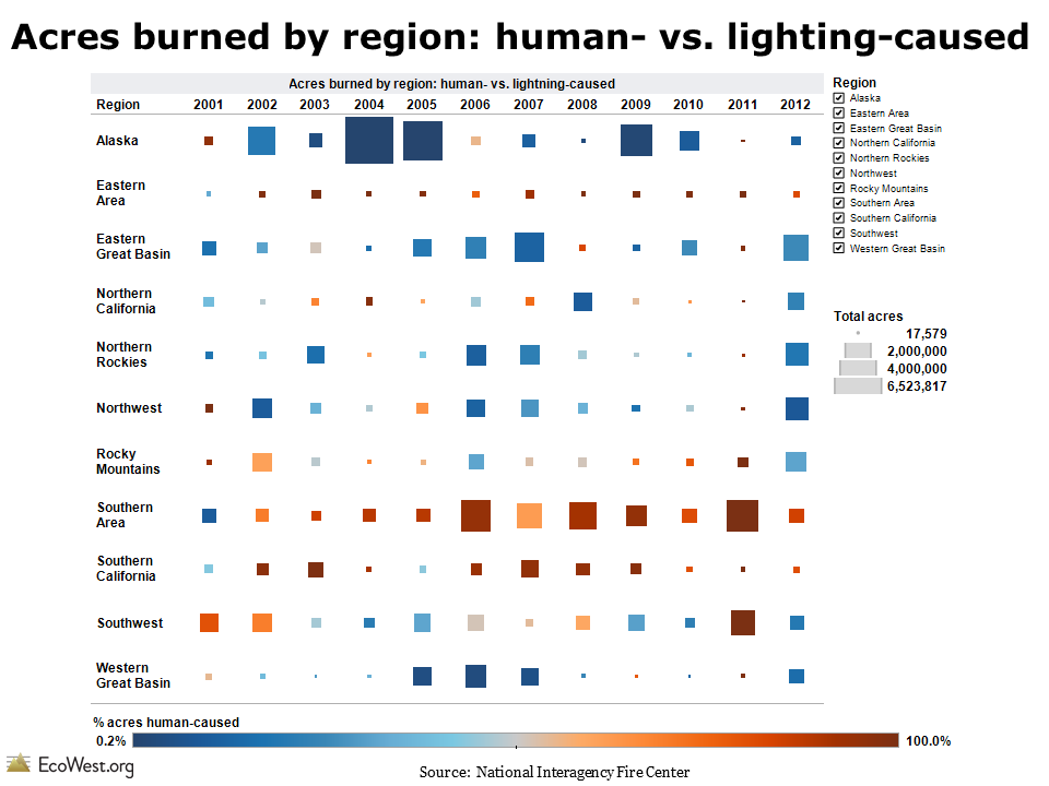
There have been some huge wildfires up in Alaska and nearly all the acreage burned was due to lightning-sparked blazes. Conversely, human-caused wildfires predominate in the Southern area. In other regions, such as the Southwest, the situation is more variable. In some years, humans are responsible for the bulk of acres burned, but in other years most of the burning is due to lightning

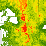
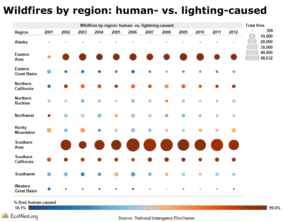
The screenshot below shows the number of wildfires in each region. The Southern and Eastern regions, where the bulk of the nation’s population lives, have the greatest number of human-caused wildfires, but in places like the Great Basin, where relatively few people live, the vast majority of fires are caused by lightning.

Fires by region

Takeaways

The large number of lightning-caused fires out West should remind us that wildfires are inevitable in the region. Measures like campfire bans and public lands closures, which may succeed in cutting the number of human-caused fires, can only do so much.

This data also illustrates why it’s so important for us to get beyond national-level statistics when analyzing wildfires. Otherwise we end up lumping together lightning-caused blazes in the unpopulated Alaskan tundra and arson fires in the chaparral of suburban Los Angeles.

Downloads

Data sources

The National Interagency Fire Center publishes data on the cause of wildfires on this page.

EcoWest’s mission is to analyze, visualize, and share data on environmental trends in the North American West. Please subscribe to our RSS feed, opt-in for email updates, follow us on Twitter, or like us on Facebook.

Gauging wildfire severity with suppression metrics

The number of acres burned is the most common metric used for tracking wildfires, but there are other important measures for gauging the severity of the fire season.

The struggle to suppress wildfires is something that the federal government monitors very closely. For decades, it has been consistently reporting data on the army of firefighters deployed and the fleet of aircraft mobilized.

I’ve gathered the data on wildfire suppression in this dashboard and I’ve created a corresponding PowerPoint deck that’s available for download at the bottom of this post. In an earlier post, I discuss our fire trends dashboard, which tracks the number of fires and acres burned.

EcoWest wildfire suppresion metrics from EcoWest on Vimeo.

Preparedness levels

One way to examine historical wildfire activity is to look at how many days the federal government was operating under various preparedness levels. The National Interagency Fire Center uses five categories, similar to the now-abandoned Homeland Security threat levels. Preparedness level 5 is reserved for the most active times, while under level 4 the competition for firefighting resources is a bit less intense, and so on down to level 1, which is where we’re at now. It’s a little like the DEFCON levels that indicate the posture of American armed forces and show how close we are to a nuclear war.

The graphic below (click to enlarge) shows that preparedness levels vary greatly from year to year, but the 2000s were generally a busy time for wildland firefighters. In 2009 and 2010, however, the federal government never raised the preparedness level beyond 3.
wildfire preparedness

Firefighting resources

The federal government collects copious data on its deployment of firefighting resources and those figures are also barometers of wildfire activity. The graphic below (click to enlarge) shows some of the suppression trends. Type 1 helicopters are larger than type 2 helicopters, and type 1 mobilizations refer to the number of times that top-level incident command teams are deployed. Smaller, less complex fires are managed by type 2 teams. These categories tend to move together, but you’ll notice that the number of air tankers mobilized dropped around 2001—that’s because safety concerns over the aging fleet forced many planes to be grounded, even during some very active fire seasons.
wildfire suppression metrics
It’s hard to detect any long-term trend in these suppression metrics. The level of effort expended to fight wildfires could also depend on government budgets. But when I’ve compared these suppression numbers to the data on acres burned, they’ve lined up pretty well. The number of days at preparedness levels 4 and 5, as well as the deployment of firefighting resources, is higher in years with a lot of big burns and lower in years when there are fewer fires that demand a quasi-military response.

I’d be curious to hear what others see in these graphics and whether folks think these metrics yield any valuable insights.

Data sources

The National Interagency Fire Center in Boise (which wildfire wonks pronounce “NIF-see”) is the go-to source for information on wildfires and suppression. I scraped data from NIFC’s annual reports to create these graphics and dashboards.

Downloads

EcoWest’s mission is to analyze, visualize, and share data on environmental trends in the North American West. Please subscribe to our RSS feed, opt-in for email updates, follow us on Twitter, or like us on Facebook.

Human footprint maps of Western states and cities

Just a quick post to let you know that I’ve created a gallery of high-resolution maps depicting the human footprint in each of the 11 Western states, plus some major cities in the region.

I wrote about this dataset a few weeks ago and wanted to share some more detailed, zoomed-in views. White indicates areas with the least human impact, followed by green for places where the footprint is minimal, while orange and red areas are where people have done the most to transform native ecosystems.

Below is the gallery, which also available on this page.

The human footprint map is based on the work of U.S. Geological Survey (USGS) scientists and was the basis of a 2008 paper in Ecological Applications by Matthias Leu, Steven E. Hanser, and Steven T. Knick. The scientists focused on 14 features, including the location of cities, farms, roads, canals, power lines, oil and gas wells, and human-caused wildfires.

Please let me know if you have any issues viewing the maps. This is the first time I’ve used the WordPress gallery feature and I’m wondering if it’s an effective tool for sharing images.

Same goes for anything on EcoWest: as we get off the ground, we’re looking for feedback, suggestions, and other comments from users so we can make this site as useful as possible. Thanks!

EcoWest’s mission is to analyze, visualize, and share data on environmental trends in the North American West. Please subscribe to our RSS feed, opt-in for email updates, follow us on Twitter, or like us on Facebook.