Category Archives: Drought

Plotting “dead pool” and other watersheds for Lake Powell and Lake Mead

The elevations of Lake Powell and Lake Mead, two critical reservoirs on the Colorado River, are like the Dow and S&P 500 for water in the Southwest. These closely watched metrics serve as simple barometers and summaries of how things are going in a fiendishly complex system, be it the U.S. economy or a watershed spread across a quarter-million square miles that provides drinking water for nearly 40 million people.

“Water buffaloes,” the professionals who manage the West’s most precious resource, have been sounding bearish in recent days about Powell and Mead, the nation’s two largest reservoirs by capacity. The past 14 years have been the driest for the Colorado River in more than a century of record keeping. On Friday, federal officials announced they will cut releases from Powell from 8.23 million acre-feet to 7.48 million acre-feet, which would be lowest release since the reservoir was filling in the 1960s.

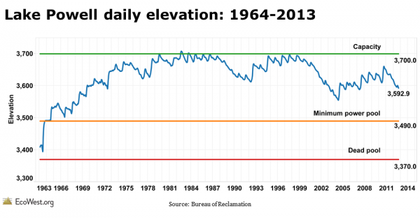
To track water storage in Powell and Mead, I’ve created a dashboard that plots the lake levels and some important benchmarks. Below are some images from the visualization (click to enlarge). There’s also a PowerPoint presentation you can download at the bottom of the post.

Lake Powell elevation graphic Lake Mead elevation graphic

Elevation benchmarks

The Powell chart plots the daily elevation and the Mead chart illustrates the July 1 level; in the former, you can see the annual ebb and flow. I used two different time scales because that’s how I found the data on the U.S. Bureau of Reclamation’s websites (separate offices manage Powell and Mead).

Capacity shows the elevation when the reservoirs are full. For Powell, raising the spillway gates can slightly increase capacity, but flooding in 1983 did nearly overtop Glen Canyon Dam. When a reservoir is at dead pool, the water level is so low that it cannot drain by gravity through the dam’s outlet works. Hydropower can only be generated when the reservoir is above the minimum power pool. For Mead, which supplies the Las Vegas metro area, the elevation of the Southern Nevada Water Authority’s lower intake is shown.

Our dashboard uses lake elevation, but in our PowerPoint deck we also have some slides showing changes in volume. Each metric tells us different things about the status of the reservoirs, but elevation is easier to visualize. Below is a photo I took last April of Powell’s so-called bathtub ring, which is even more exposed today.
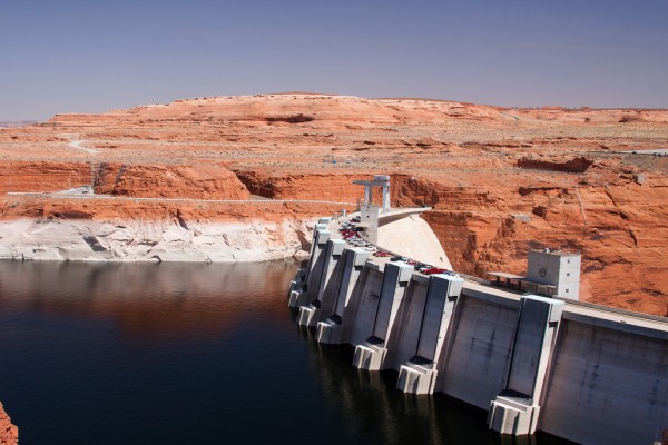
Lake Powell and Glen Canyon Dam
Lake Powell and Glen Canyon Dam, April 2012. Photo by Mitch Tobin.

Satellite imagery shows Powell’s decline

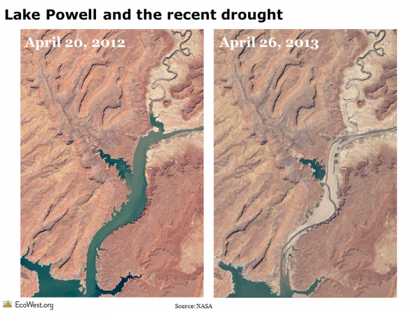
Another way to track the status of these reservoirs is by taking repeat photographs, either on Earth or from space, of the same location. Below are two views of Lake Powell, the first showing 2002 vs. 2003, and the second comparing 2012 vs. 2013, based on NASA satellite imagery.

Lake Powell drought photograph

Lake Powell satellite image drought

The PowerPoint deck that you can download below contains a time series of satellite images of Powell from 1999 to 2013. The contrast between 2012 and 2013 illustrates why federal officials are taking action and cutting releases from the reservoir.

Reservoir levels projected to fall

Looking ahead, federal water managers project that Mead will drop another eight feet in 2014 due to reduced releases from Powell. Below is a graphic from Reclamation that shows Powell is likely to keep falling as well.

Lake Powell elevation projection

Basin susceptible to megadroughts

The outlook for precipitation in the basin over the next few years is uncertain, but one thing we know for sure is that the Colorado River is vulnerable to megadroughts, the likes of which we haven’t seen in modern times. The graphic below, from the U.S. Climate Change Science Program, shows the annual flow of the Colorado River over the past 1,200 years. Scientists used tree rings to estimate the river’s volume before the instrumental record, which is shown as a red line. The arrows point out that the basin has been periodically hit with megadroughts that were worse than the one we’ve been experiencing since 2000.
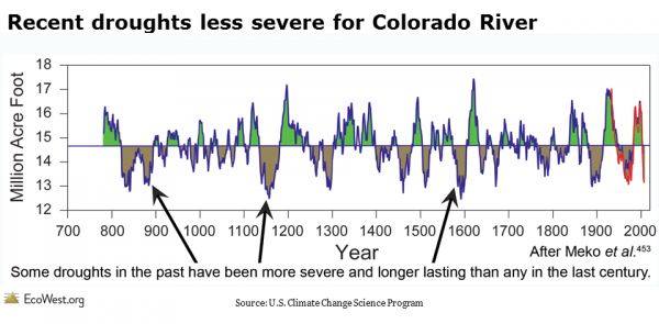
Colorado River drought tree ring record

Climate change expected to shrink Colorado’s flow

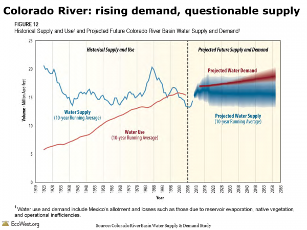
Even without considering climate change, the Colorado River would face a challenging future because the demand for its limited–and capricious–supply is increasing along with the Southwest’s population. But scientists project that even less water will flow down the river in the decades to come due to rising temperatures and altered precipitation patterns. The graphic below, from Reclamation’s recent Basin Study, shows that demand is projected to exceed supply on the river (see our earlier post for more details).

Colorado River historical and projected water use and supply

Data sources

The Bureau of Reclamation provides detailed data on Lake Powell and Lake Mead. I pulled the benchmark levels from this Reclamation presentation, specifically page 15.

If you’re keeping score at home, the capacity of elevation of Powell is listed as 3,700 feet, but during floods the reservoir’s elevation can go slightly above this level by raising the spillway gates. In 1983, Powell reached an all-time high elevation of 3,708.34 feet.

The decision to cut releases from Powell was covered by The Arizona Republic,  National Public Radio, and The Salt Lake Tribune, among others.

Downloads

EcoWest’s mission is to analyze, visualize, and share data on environmental trends in the North American West. Please subscribe to our RSS feed, opt-in for email updates, follow us on Twitter, or like us on Facebook.

A dashboard for monitoring drought

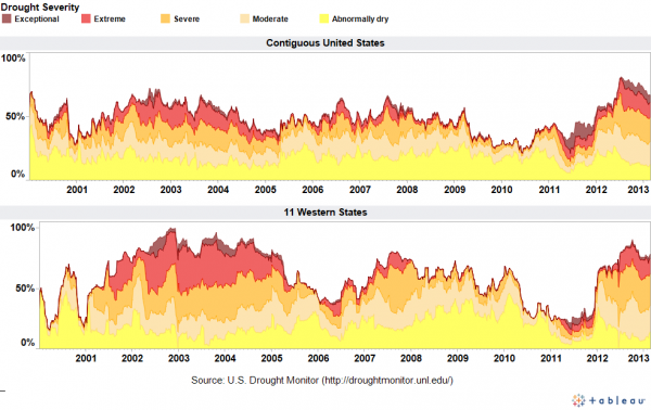
Aside from the Pacific Northwest, nearly all of the land west of the 100th Meridian is currently drier than normal. The drought has been especially severe in the nation’s midsection, where some areas are suffering through “exceptional” conditions, according to the U.S. Drought Monitor.

To track drought severity, I’ve created a dashboard on this page that shows what percentage of the contiguous United States and the 11 Western states were in various categories of drought. The dashboard allows you to export images like the one below (click to enlarge).

Drought monitor dashboard

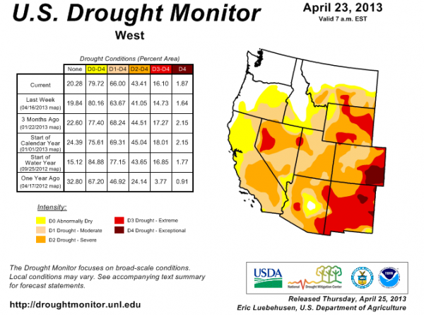
The graphics visualize data back to 2000 and show that the current drought in the West is beginning to rival the brutal dry spell that gripped the region in the early 2000s. Just a couple of years ago, very few areas in the West were abnormally dry, but that sure changed in a hurry. Below is the latest map of drought conditions in the region.

West drought monitor

Although drought is a natural part of the Western climate, the shortage of precipitation has major implications for the region’s water supply, the severity of its upcoming wildfire season, and the health of ecosystems already confronting a broad spectrum of threats.

Data sources

The dashboard is based on the U.S. Drought Monitor, which provides historical data on this page. There are other ways to measure drought, such as the Palmer Index. In a future post, I’ll be sharing some slides that explain the differences in the various measures.

National Public Radio has put together an animated series of maps that show how drought conditions have changed over the past few years.

It’s also worth checking out how the The New York Times has mapped the drought’s footprint since 1896.

EcoWest’s mission is to analyze, visualize, and share data on environmental trends in the North American West. Please subscribe to our RSS feed, opt-in for email updates, follow us on Twitter, or like us on Facebook.

2012 Graphics Highlights from The New York Times

The New York Times does some of the best data visualization in journalism and the paper has assembled highlights of its 2012 work. A few of these graphics relate to Western environmental issues and some are accompanied by descriptions of how they were created. Here are my favorites:


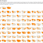
Drought footprint
Source: The New York Times

1) The drought’s footprint

Brilliant use of small multiples to show what fraction of the United States was experiencing moderate to extreme drought in a given year. When the piece was published in July, more than half the contiguous United States was classified this way, the highest level in nearly six decades.

The graphic stretches all the way back to 1896 and it really shows that 2012 was an exceptionally dry year. But as recently as 2010, very few areas were experiencing drought.

We cover drought in our water deck, and in a future post I’ll be sharing some visualizations that focus on drought the West.


2) Drought and deluge

Source: The New York Times
Drought and deluge. Source: The New York Times

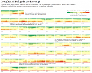
The Times used a different system for measuring drought to create another visualization. Rather than relying the U.S. Drought Monitor, as it did in the footprint maps, the paper uses the Palmer Drought Severity Index. The former uses the Palmer index as one of its inputs, but it’s also based on stream flows, crop moisture, precipitation patterns, and expert judgement. The Palmer index is strictly based on temperature and precipitation. It not only shows drought but also wet spells.

One cool thing about this graphic is that you can roll your mouse over the various levels of the Palmer index to see the driest and wettest periods. Once again, the current drought stands out as a deep one, but it’s certainly not unprecedented.

Another thing I noticed is that in 2011, large parts of the country were either very dry or very wet.


Obama budget
Slicing Obama’s budget. Source: The New York Times

3) Slicing Obama’s budget

This graphic puts the humble pie chart to shame and effectively shows how entitlements, defense, and debt costs dominate the federal budget. Click on the “Department Totals” tab to see how federal spending is divided up by agency. As you might imagine, environmental departments, such as EPA and Interior, are overshadowed by other agencies.

We cover federal (and other) spending in our politics deck and have a number of other graphics showing how environmental and natural resource programs are tiny in comparison with other federal spending priorities.


Democratic convention
Words used at Democratic convention Source: The New York Times

4) Parsing the rhetoric at political conventions

The Times analyzed all of the speeches at the Republican and Democratic conventions to determine which words were most common and how the language of the two parties differed.

You can plug in your own words or phrases to see how often they were spoken. I’m being a bit parochial, but here are the number of hits I got for both parties: environment (3), conservation (0), climate change (1), global warming (0), pollution (1), water (4). And that’s per 25,000 words.


EcoWest’s mission is to analyze, visualize, and share data on environmental trends in the North American West. Please subscribe to our RSS feed, opt-in for email updates, follow us on Twitter, or like us on Facebook.