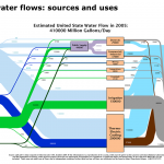
Flow diagrams from the Lawrence Livermore National Laboratory provide excellent summaries of the nation’s water use. These graphics, also known as Sankey diagrams, show how much we pump from groundwater aquifers, how many gallons of surface water we divert, and which economic sectors use the most water. Below are flow diagrams for the nation and the 11 Western states. Please see this post for more details.


