Tag Archives: water supply

Drop on the planet: 3 visualizations of Earth’s most precious natural resource

Scarcity of freshwater is a defining feature of the American West, and planet Earth.

Nearly 97% of the world’s H2O is in the oceans. More than two-thirds of the globe’s freshwater is frozen in glaciers and polar ice caps.

Below are a trio of graphics to visualize water on Earth. I’ve found these slides useful for providing context in water-related presentations.

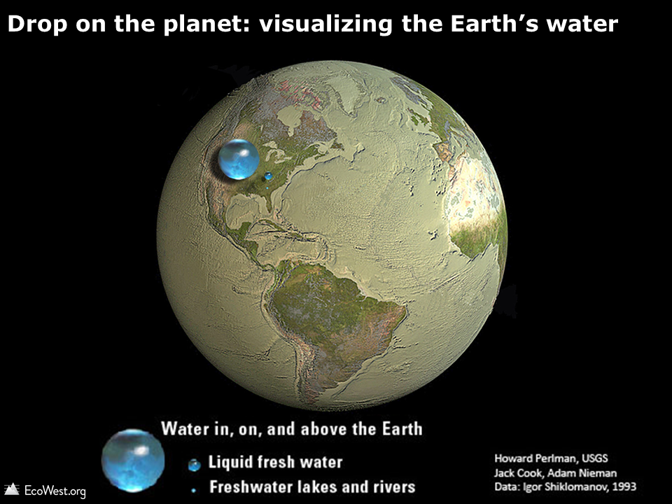
1) The world’s water: drop on a planet

About 70% of the planet’s surface area is covered by water, but the amount is tiny when compared to the Earth’s total volume. The illustration below shows that if you collected all of the planet’s water into a single sphere, it would be 860 miles across. Situated to the right is a 170-mile-wide ball over Kentucky that represents all the fresh liquid water found in the ground, lakes, swamps, and rivers. That miniscule 35-mile-wide dot over Georgia is all the freshwater in lakes and rivers.

Water on Earth graphic
Source: U.S. Geological Survey

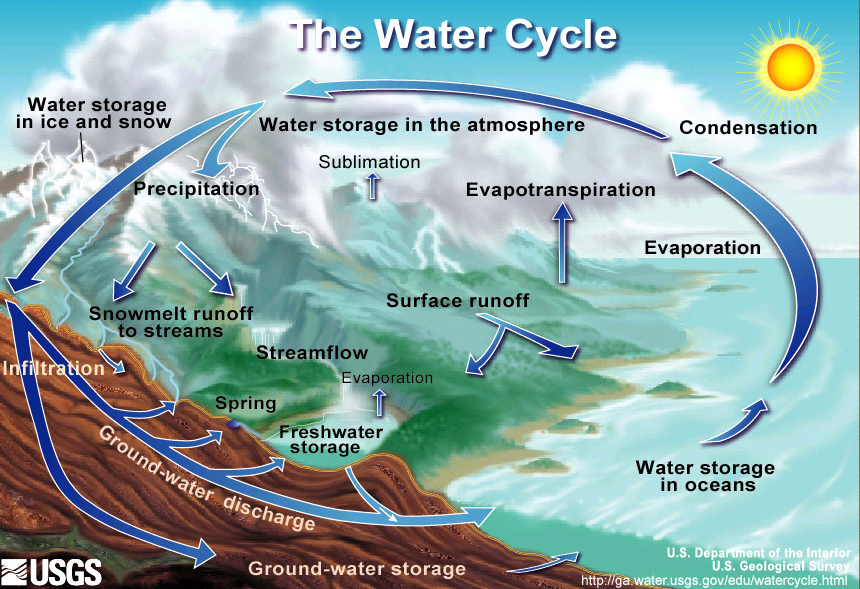
2) The water cycle: a closed loop

The diagram below illustrates the water cycle and a critical point: water on Earth is essentially a finite resource and the system is basically a closed one. If you want to be a stickler, it’s not a 100% closed system since there’s a bit of entry and leakage via comets depositing ice and water vapor escaping to space. This graphic also doesn’t show volcanoes emitting steam or water lost to faults on the ocean bed. But the basic point remains: we can reuse water, convert the sea into a potable supply, even try to coax the sky into precipitating with cloud seeding, but we can’t manufacture new water.

U.S. Geological Survey water cycle
Source: U.S. Geological Survey

3) Breaking down the types of water

The graphic below shows that freshwater comprises just 2.5% of the Earth’s total water supply and 69% of that freshwater is locked up in glaciers and icecaps (at least for now). Most of the remaining freshwater is found below our feet as groundwater. Sometimes this subterranean supply is relatively easy to access, but in other locations it may be too deep or costly to extract. Fresh surface water is a rare commodity on this planet. Rivers, for example, account for just 0.006% of all freshwater and 0.0002% of all water found on Earth.
Distribution of water on Earth

We have more slides covering water issues, including supply, demand, quality, infrastructure, and climate change, in our water PowerPoint presentation.

Downloads

EcoWest’s mission is to analyze, visualize, and share data on environmental trends in the North American West. Please subscribe to our RSS feed, opt-in for email updates, follow us on Twitter, or like us on Facebook.

Visualizing Colorado River challenges and options

The Colorado River, lifeblood of the Southwest, is in trouble. Demand for river water is rising as the region’s population continues to grow, but the Colorado’s inherently capricious supply is increasingly in doubt due to climate change.

A federal report released in December took an exhaustive look at the challenges facing the Colorado River Basin and it examined the options for dealing with expected shortages.  I’ve gone through the Colorado River Basin Water Supply and Demand Study and pulled out the key figures, which you can download at the bottom of this post.

Colorado River Bain Study from EcoWest on Vimeo.

Shortage projected

If I had to pick one graphic that summed up the dilemma facing the Colorado River, it would be this one:

Colorado River historical and projected water use and supply

Looking back in time, the graphic shows that water use in the basin steadily increased during the 20th century, but the river’s flow was predictably erratic (that blue line is a 10-year moving average but it’s still as uneven as the basin’s topography).

Looking ahead, water demand is expected to keep growing (the fuzzy areas indicate the uncertainty in the projections). Predicting the flow of the Colorado decades into the future is a tough task, but the study concluded that the supply would probably decrease, as indicated by the gentle downward slope of the blue line. By 2060, the imbalance between supply and demand is expected to be about 3.2 million acre-feet.

Comparing costs of solutions

Besides identifying the problem, the Basin Study evaluated a wide variety of proposals for addressing the shortfall—everything from increasing water conservation in cities and on farms, to building massive new pipelines and desalination plants, even far-fetched ideas like towing icebergs to Southern California.

I extracted data from a summary table in the study in order to visualize how these options compare, both in price and in how much water they’ll yield.

In the graphic below, I’ve ranked all of the options from highest to lowest cost (the unit here is dollars per acre-foot per year). I’ve also color-coded them by category.

Cost of options for Colorado River

As you can see, the range of costs is enormous, but there are some general patterns. Conservation measures are among the cheapest, while desalinating ocean water or covering reservoirs to reduce evaporation are pricey. (For a few of these options, the study provided a range of costs, but for simplicity’s sake I’ve used the average in this graphic.)

The chart below ranks the options by how much water they’re expected to yield in 2035.

Potential yield of options for Colorado River

Water conservation in agriculture and among municipal and industrial (M&I) users is projected to yield the most, but weather modification (aka cloud-seeding) also performs well on this measure.

I combined the cost and yield data into one graphic by varying the width of the bars by the volume of water that each strategy is expected to produce. The thicker the bar, the greater the yield. In this case, I used the projections for 2060, rather than 2035.

Cost and yield of options for Colorado River

In releasing the Basin Study in December, federal officials stressed the conservation options over massive new infrastructure projects, such as pumping the Missouri or Mississippi rivers to the Colorado Front Range. These graphics show why that’s pretty much a no-brainer: conservation delivers more bang for the buck and avoids the enormous environmental impacts of augmentation projects.

Downloads

Data sources

You can download the Basin Study and associated reports here.

The Denver Post had a good overview of the Basin Study’s release. See recent stories by the Los Angeles Times and Associated Press  for more on what the federal government is doing to follow up on the report.

EcoWest’s mission is to analyze, visualize, and share data on environmental trends in the North American West. Please subscribe to our RSS feed, opt-in for email updates, follow us on Twitter, or like us on Facebook.

Survey says: water bills are rising

In the West and around the nation, the price of water keeps going up.

Since 2010, Circle of Blue has been gathering water rate data in the 20 largest U.S. cities, plus 10 regionally representative cities. From 2011 to 2012, single-family residential water prices rose an average of 7.3 percent; since 2010, the increase is nearly 18 percent.

The graphics below show how water bills have changed in Western cities. One interesting feature of these charts is that they analyze water use under three different scenarios: low use (50 gallons per person daily), medium use (100 gallons per person daily), and high (150 gallons per person daily.) To promote conservation, many Western utilities have a progressive rate structure, which charges customers more per gallon if their use exceeds certain thresholds.

Mountain west water rates

Mountain Water PriceWest coast water rates WestCoastWaterPrice

On the national level, the price of water is rising at a pace much faster than the overall rate of inflation. The graphic below, from the Institute of Public Utilities at Michigan State University, compares the costs of various utilities and water/sewer bills really stand out.

Trends in utility prices

CPItrends Many Western utilities are searching for new (expensive) supplies to meet the rising demands of the growing customer base, putting upward pressure on rates. But the nation’s crumbling water works are perhaps an even bigger driver of the increasing costs, as Circle of Blue notes:

The upward trend for rates is an inherent feature of the water sector. Compared with other utilities, water departments require significantly more assets — pumps, pipes, and plants — to generate revenue. All of that hardware is expensive to maintain, and, as the fountain of water main breaks across the U.S. attests, a good portion of this infrastructure has come to the end of its effective life. The American Water Works Association recently estimated that replacing the nation’s pipes alone will cost $US 1 trillion over the next 25 years. Most of this will come from ratepayers, who pay as much as 99 percent of all money that is spent on water supply systems, according to the U.S. Conference of Mayors

Rising prices are generally portrayed as a bad thing in the media, and I’d just as soon spend my money on something other than my monthly water bill, but the bright side to increasing prices is that it can encourage more efficient water use.

For more on these issues, check out our water deck, which includes some slides on the price of water and the sorry state of our nation’s water infrastructure.

EcoWest’s mission is to analyze, visualize, and share data on environmental trends in the North American West. Please subscribe to our RSS feed, opt-in for email updates, follow us on Twitter, or like us on Facebook.