Tag Archives: map

Sightsmap plots most photographed places on planet

Governments around the world protect places for a variety of reasons. There are landscapes set aside for critters and memorials to fallen warriors. In the United States and elsewhere, one of the biggest motivations for creating national parks and other preserves is that they’re pretty to look at and photograph.

Beauty may be in the eye of the beholder, but aesthetics and scenic vistas also figure prominently in things like environmental impact statements. Is there a way to quantify how photogenic or beautiful a spot is?

Sightsmap is the closest thing I’ve found. Using data from photos uploaded and geotagged in Panoramio, a popular photo sharing service acquired by Google in 2007, Sightsmap generates high-resolution heat maps that illustrate the number of photos snapped at sites around the world. Below are global and U.S. maps (click to enlarge, and see this gallery for more maps).

Sightsmap World
World
Sightsmap United States
United States

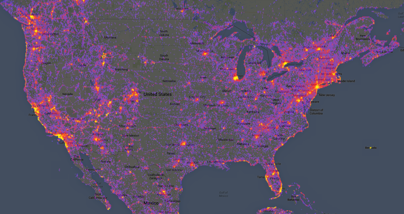
Panoramio already has more than 100,000,000 images, but its photos represent just a tiny fraction of the millions of images captured every day on Earth. Data from Panoramio’s sample isn’t representative. Among other biases, the service appears particularly popular in Europe, and there are data quality issues I note below. Despite these limitations, Sightsmap tells some interesting stories about how we travel and photograph the world around us.

Some popular unpopulated places

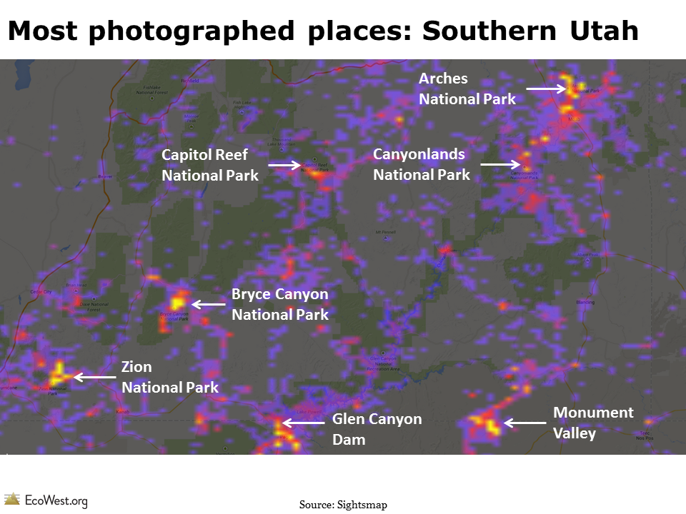
As you would expect, more populated places tend to have more photographs on Sightsmap, but there are plenty of hotspots in unpopulated parts of the American West (and other regions). The map below shows that Southern Utah, one of the least populated places in the continental United States, is also one of the most photographed because it’s home to so many national parks and tourist attractions.

Most photographed places Southern Utah
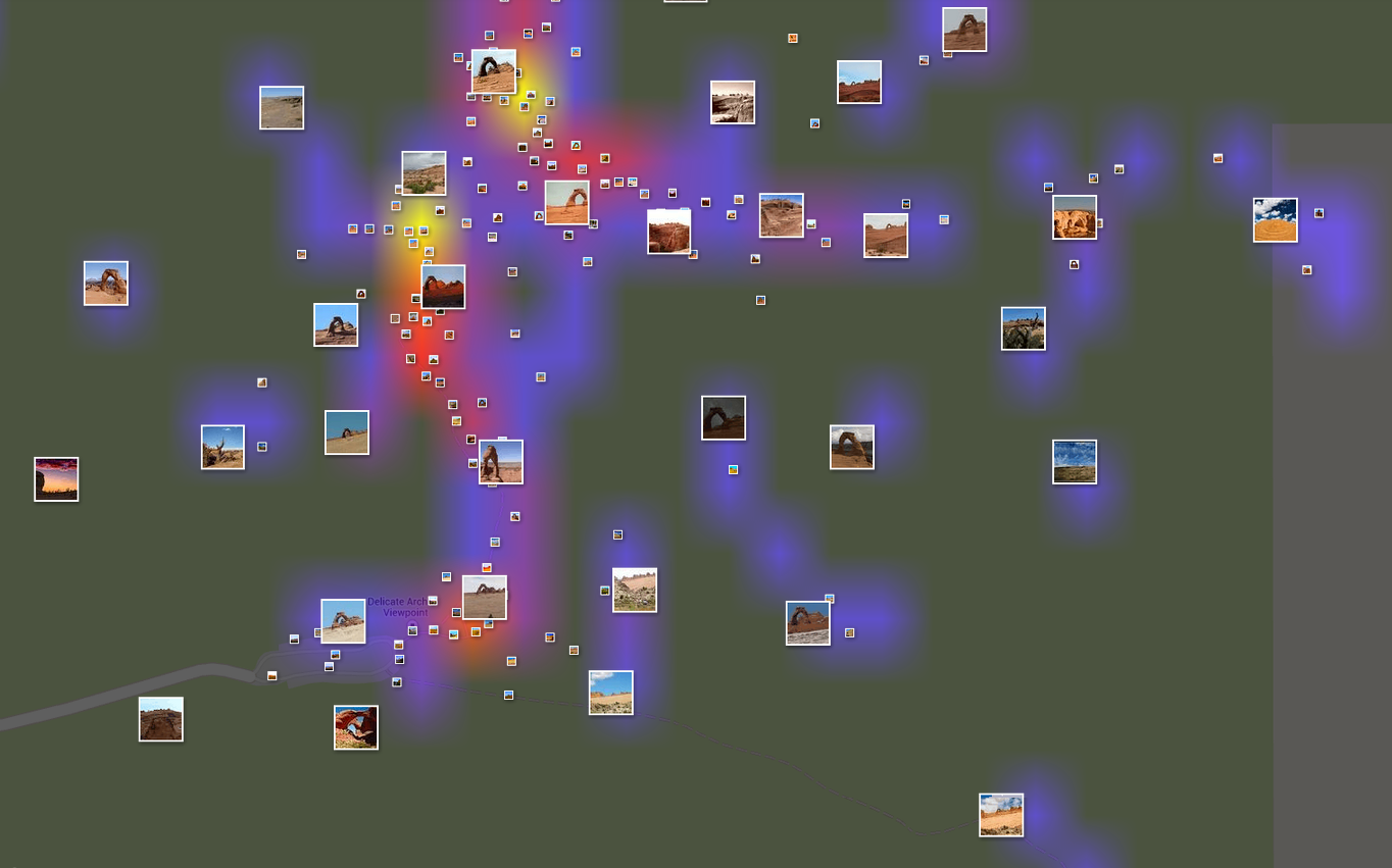
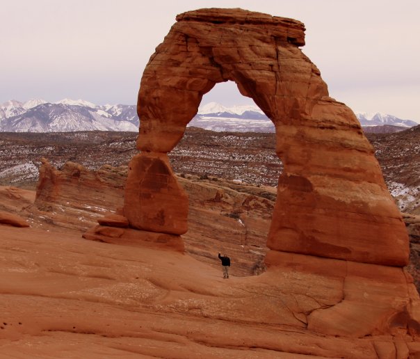
Sightsmap allows you to drill down and show the density of photographs at a very high resolution. Once you’re zoomed in close enough, you can also see thumbnails of the images. Below is the heat map for the area around Delicate Arch, in Arches National Park, plus a photo of me in that spot.

Sightsmap Delicate Arch, Utah
Delicate Arch, Utah


Delicate Arch, Utah.
The author at work. Delicate Arch, Utah.

National parks: most visitors stick to roads

Look at the photo heat maps for national parks and you’ll see a pattern familiar to any ranger or frequent visitor: people tend to stick to the roads and pavement. Below is the Sightsmap for Yellowstone National Park.

Sightsmap Yellowstone
Yellowstone National Park

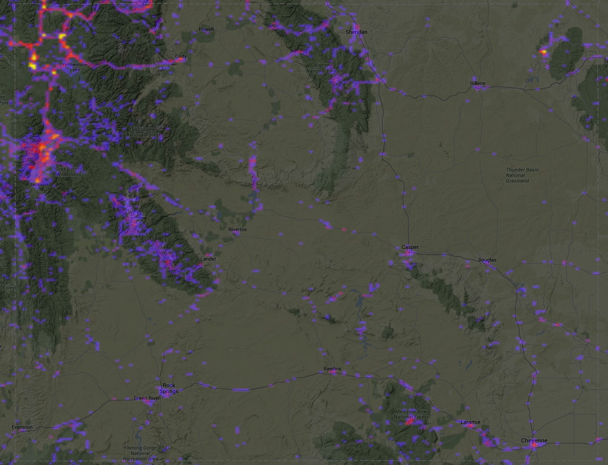
Tourists and photographers also tend to concentrate in just a few parts of Western states and cities. Below is a map of the state of Wyoming. Virtually all of the activity on Sightsmap is focused in the northwest portion of the state, home to Yellowstone and Grand Teton national parks. Other hotspots are the Wind River Range and the Bighorn Mountains (where I photographed the sunset that appears in the EcoWest banner).

Sightsmap Wyoming
Wyoming

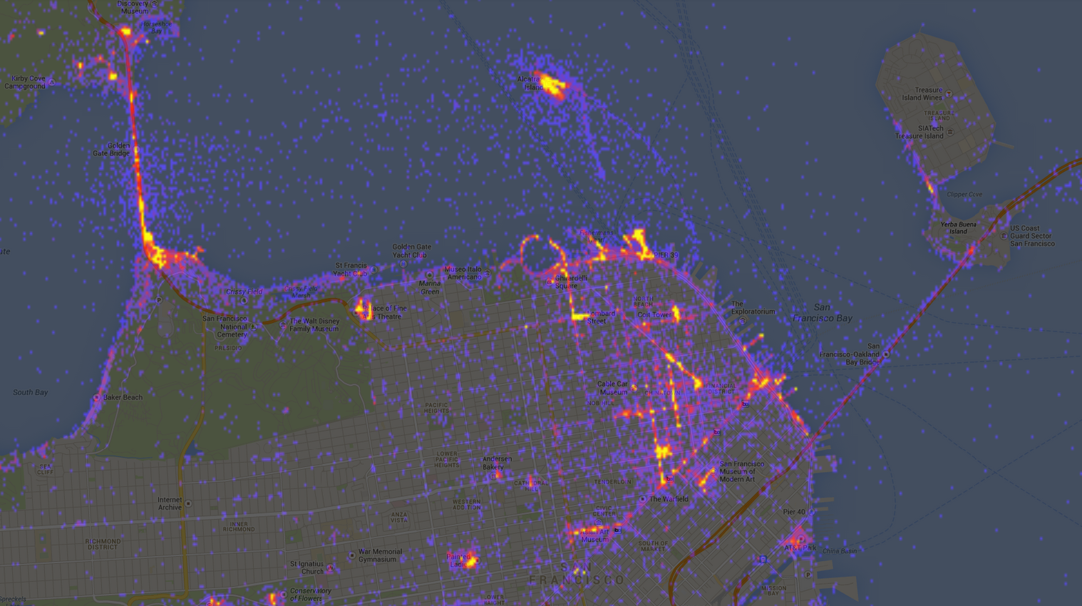
Even in a tourist mecca like the San Francisco Bay Area, where I suspect there are plenty of residents geotagging/uploading their photos, the heat maps show that certain areas are much more photogenic than others. A closeup of the 49-square-mile city of San Francisco reveals hotspots around sites such as the Golden Gate Bridge and Transamerica Pyramid, plus a fair number of shots taken on San Francisco Bay, but relatively few photos in the city’s western neighborhoods.

Sightsmap Bay Area
San Francisco Bay Area
Sightsmap SF
San Francisco

Restricted access: blank spots on the map

When I created human footprint maps, I was especially interested in the blank spaces where impacts were minimal. Likewise, I was instantly drawn to areas on Sightsmap where few or no photographs had been posted.

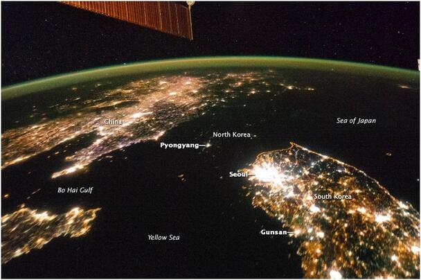
Below are two maps of the Korean Peninsula: I created the first using Sightsmap; the second was snapped by an astronaut aboard the International Space Station.

Sightsmap Korea
Photo heat map of Korean Peninsula

Night lights on the Korean Peninsula. Source: NASA/ISS

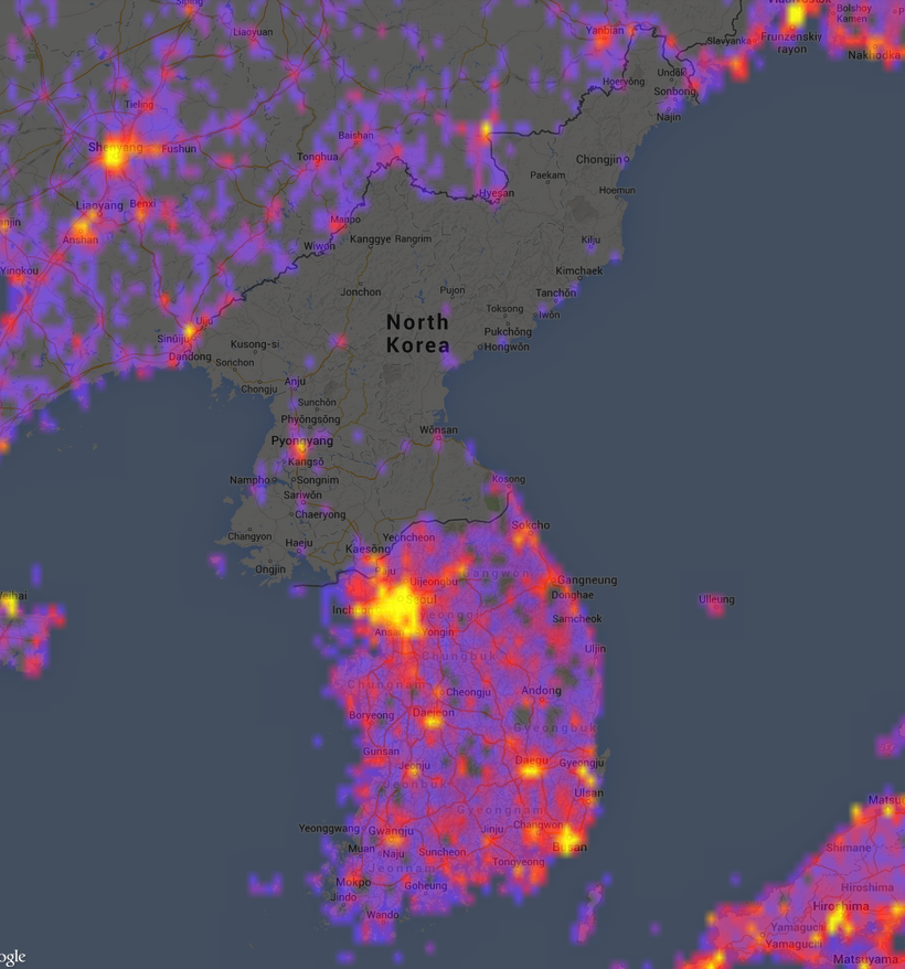
It’s easy to pick on North Korea, but we also have plenty of places in our own country where public access is prohibited. Below is a Sightsmap view of the area around Las Vegas, which includes a number of military installations to the northwest of the city that are annotated in the second map.

Sightsmap Las Vegas

Source: Wikipedia
Source: Wikipedia

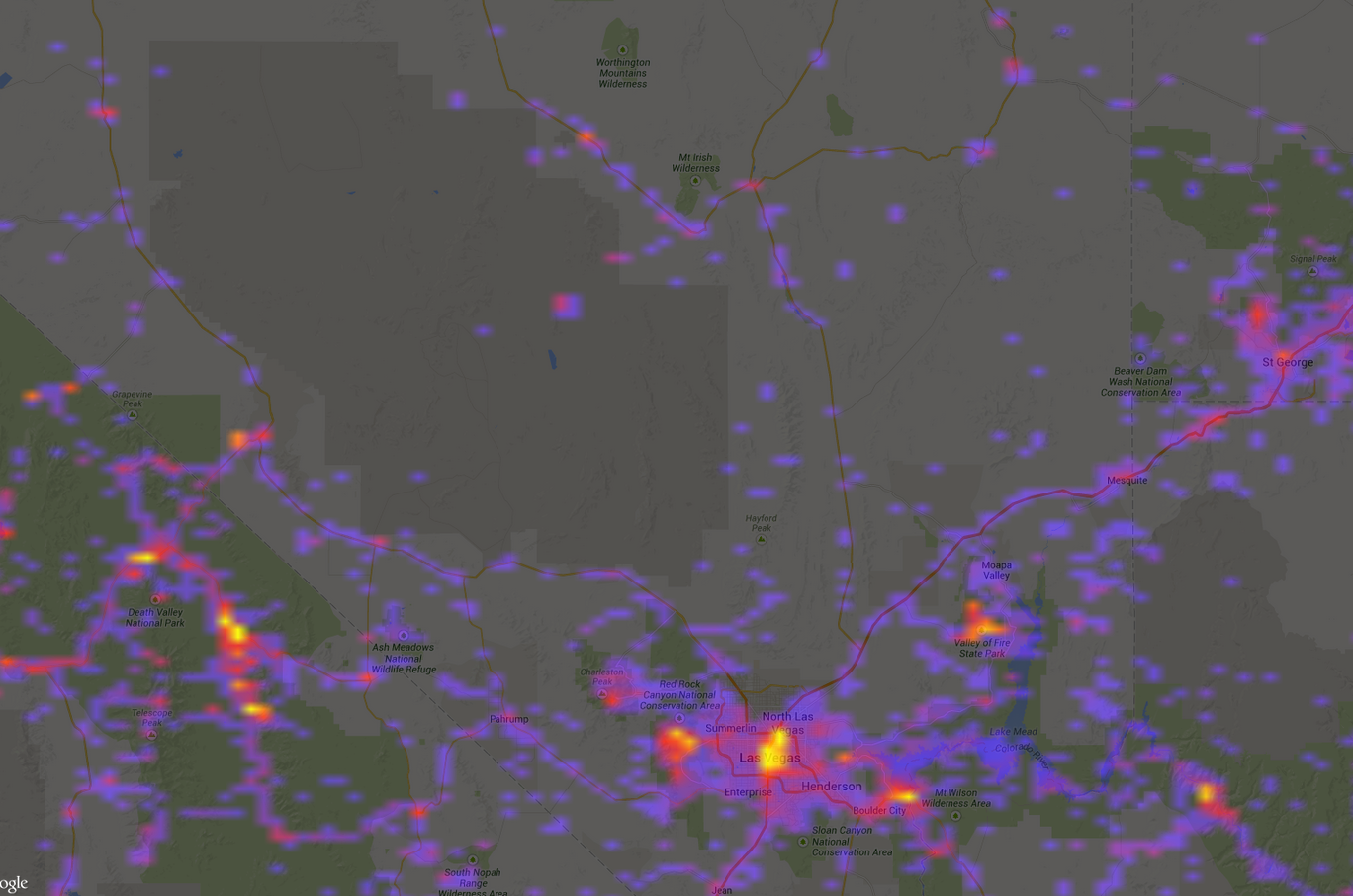
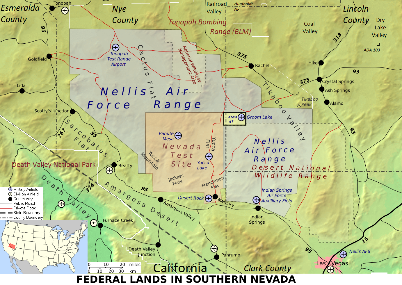
I was curious if there were photos of the fabled Area 51, the military installation that is ground zero for UFO folklore and assorted conspiracy theories. Sightsmap shows some grainy images of the facility that legitimately look like they were captured by photographers zooming in from surrounding mountains, plus some photos that appear to be from a tour. But there’s also this garbage image below, which someone uploaded and geotagged at Area 51, so Sightsmap surely has some questionable data.

Area 51 Sightsmap

Like any crowdsourced endeavor, Sightsmap is only as good as the data that users share and tag. Despite its flaws, I found these heat maps fascinating to explore. I could imagine them being useful not only to photographers who are plotting where to set up their tripods, but also to city planners and land managers trying to understand patterns in visitor use.

Data sources

Here’s a description from Sightsmap:

The heatmap shows the places people like, based on the number of panoramio photos at each place in the world. The dark areas have few photos, the red areas have more and the yellow areas have a large number of photos geotagged. The hottest places have markers linking photos, Streetview, Wikipedia, Wikivoyage, Foursquare and Google Plus articles about the site. The place names are selected by the Wikipedia readership numbers and foursquare checkins. Area populations are based on the geonames database. Street level heatmaps are available for [the] top 15,000 places in the world, sorted by the number of photos in an area of a size of a few square kilometers around the place center. The popularity ranking of places in high-res area maps is computed by combining place hotness with popularity rankings from Wikipedia, Foursquare and real-time Google Places selection.

EcoWest’s mission is to analyze, visualize, and share data on environmental trends in the North American West. Please subscribe to our RSS feed, opt-in for email updates, follow us on Twitter, or like us on Facebook.

Deep brain freeze: visualizing the polar vortex

For the second afternoon in a row, a potent cold front has swept across Denver, marking the return of a deep freeze for much of the country. Yesterday, my weather station recorded a 32-degree drop in less than 90 minutes (here’s a chart).

This latest cold snap is sure to revive talk about the polar vortex, a persistent upper-level cyclone that swirls high above the Arctic and Antarctica, so I thought I’d round up some visualizations that illustrate what’s happening.

The graphic below, from the National Weather Service, explains what the polar vortex is, and isn’t.

NWS polar vortex graphic

The polar vortex always remains above the poles, but sometimes the Arctic vortex weakens and allows some frigid air to move south into the United States. (CNN has a good piece explaining why the polar vortex is something of a misnomer for describing the weather we’re experiencing in the states.)

NASA has also produced a great little video describing how the polar vortex works:


Here’s a graphic from the CBC up in Canada, where they have even more experience with the polar vortex.

CBC polar vortex graphic


I also found the graphic below from Scientific American to be helpful in understanding the concept.

vortex-graphic


Although the polar vortex has been portrayed by some as disproving global warming, there is actually evidence that climate change is playing some role in the cold air descending south. The thinking is that warming in the Arctic is messing with the vortex and associated jet stream. Brian Walsh has a nice summary in Time and Eric Holthaus has a good explainer at Quartz.

There’s also some research linking heavy autumn snows in Siberia to the polar vortex and abnormally cold weather in the Eastern United States and Europe, according to an NSF-funded study.

Source: Nicolle Rager Fuller, National Science Foundation

Here’s how NSF describes the graphic above:

Researchers have validated a new weather prediction model that uses autumn snowfall to predict winter cold in the United States and Europe. When snowfall is high in Siberia, the resultant cold air enhances atmospheric disturbances, which propagate into the upper level of the atmosphere, or stratosphere, warming the polar vortex. When the polar vortex warms, the jet stream is pushed south leading to colder winters across the eastern United States and Europe. Conversely, under these conditions the Arctic will have a warmer than average winter.

It’s amazing how the snowpack in Siberia can affect the temperature in New York, and it almost sounds like an example of the butterfly effect, the notion coined by chaos theory pioneer Edward Lorenz that small perturbations in a system can theoretically have large effects down the line (e.g., a butterfly flapping its wings causing a hurricane halfway around the globe).

Just as fascinating to me is how the term “polar vortex” has roared onto the scene this winter like an Arctic cold front sweeping down the High Plains. I’m something of a weather nerd, but I hadn’t heard much about the polar vortex before it caught hold during the January cold snap.

But this is not some newfangled scientific concept. The term was used as early as 1853, and the apparent trigger for the cold wave in early 2014, a phenomenon called sudden stratospheric warming, was discovered in 1952. Rush Limbaugh claimed that the polar vortex was a “hoax” created by the liberal media. NBC weatherman Al Roker set the record straight with a tweet:

I’d love to see an analysis of how this term took hold and was used/misused as a case study in science communications and journalism. The word “vortex” has a certain mystical quality; for me, it instantly conjures Sedona, where supposed vortices of spiritual energy are located among the red rock formations. If you ask Google to define vortex, the second definition, after the physics stuff, is “something regarded as a whirling mass” with the example of “the vortex of existence.” So perhaps vortex captures the American zeitgeist.

According to Wikipedia, the polar vortex is also known both as the “polar low,” which sounds to me like a term a psychiatrist would use to describe a depressed patient, and “circumpolar whirl,” which makes me think of a dance step or frosted decoration on a cake. I wouldn’t expect to see “polar low” or “circumpolar whirl” getting as much ink or scrolling on cable news.

Whatever the reason, the polar vortex has entered the American consciousness, and the exceptionally cold temperatures in some of the country for a portion of the winter have become part of the whole climate change narrative. It takes some mental jujitsu to yield to the counter-intuitive notion that global warming can actually cause cold waves to plunge deeper and increase the frequency of epic snow storms while also threatening the snowpack overall.

For all the talk of Arctic air masses in the states, January was the fourth-warmest year on record for the globe, as shown in the NOAA map below, so it’s important to remember that a piece of the polar vortex is influencing a temporary weather pattern on just one portion of the planet.
Bg7evj2CUAAGjfL.jpg large

EcoWest’s mission is to analyze, visualize, and share data on environmental trends in the North American West. Please subscribe to our RSS feed, opt-in for email updates, follow us on Twitter, or like us on Facebook.

LandScope America: a tool to visualize land conservation

If you want to visualize your favorite wilderness area or map the protected areas in your city, LandScope America provides a free and convenient resource. This user-friendly GIS tool, a collaborative project of NatureServe and the National Geographic Society, lets you explore protected lands across the country, create maps of conservation projects, and share your work with others.

LandScope Screenshot

Key features of LandScope America

The focal point of LandScope America is an interactive map that overlays data layers, photos, and user-contributed stories. The map includes three key elements:

  • Base maps: three options (street, satellite, or hybrid) are found at the upper-right corner.
  • Themes: these comprise the spatial data that overlay the base map. Options include conservation priorities, protected areas, threats, plants and animals, and ecosystems. Users can change the theme by selecting the drop-down menu in the upper-left corner.

Diverse range of target audiences

One of the key advantages of LandScope America is its versatility for different user groups. Audiences that can benefit from the resource include:

  • Public agencies: In a recent post, we noted that $39 billion is spent annually on conservation in the United States. Public agencies could increase their effectiveness by combining the conservation priorities of public and private organizations in a single map layer. For example, agencies might overlay The Nature Conservancy’s ecoregional priorities with State Wildlife Action Plans and regional greenprints to better understand the level of coordination between various groups.
  • Land trusts: Using the mapping platform, land trusts can create, share, and print maps of conservation projects. For organizations on a tight budget, LandScope America can provide a powerful alternative to expensive GIS packages.
  • Private landowners: For farmers, ranchers, and private timberland owners, LandScope America features useful resources on options and financial incentives for conserving land. Using the map, landowners can see how their property fits into the wider ecological context and learn how providing wildlife habitat can make them eligible for incentive programs such as the Forest Land Enhancement Program.

Mapping in practice

As an example, I mapped how changes in housing density around Denver relate to key wildlife habitat. The following three maps show the rapid rate of projected growth emanating from the city’s center.

Denver_HousingDensity_1970
Denver_HousingDensity_2000
Denver_HousingDensity_2030
The next map shows important nesting areas and wildlife habitat in Colorado. Land trusts and public agencies could use similar maps to understand how projected human development may encroach upon habitat.
CO_State_Plants_Animals

Public expenditures in conservation

I also experimented with the map’s “Conservation by the Numbers” scorecards to examine trends in conservation spending across the West. This data is drawn from the Trust for Public Land’s Conservation Almanac, which tracks acres protected and dollars spent using public funding to buy land for parks and open space, during the time period 1998-2005.

Examining total spending on conservation, we see that California is the largest aggregate spender, with an annual average of $363 million spent on parks and open space protection. Wyoming has the lowest public expenditures, with $2.2 million spent annually on conservation funding. Montana has highest per capita public investments in conservation—roughly $179 per person. On the other end, Nevada spends only $13 per person on conservation. Below is an image from a dashboard we created to visualize the data.

Conservation spending dashboardA wide variety of factors, however, influence the cost of protecting land in a given state. In Washington, it costs an average of $2,044 to conserve an acre of land, but only $14 per acre conserved in Idaho. Several variables could explain this wide gap, including differences in land prices and development pressures. Washington’s high costs may also reflect some high-value acquisitions during the period in question.

Explore beyond your backyard, both near and far

LandScope America also lets you discover and explore open spaces near your own home. Just enter a zip code to find parks and nature preserves, as well as the names of conservation organizations working in the area.

In addition, LandScope America exposes users to more remote wilderness areas through photographs, audio, video, and articles embedded directly in the maps.

Explore your favorite places in the West using LandScope America, and let us know what you learn.

Downloads

EcoWest’s mission is to analyze, visualize, and share data on environmental trends in the North American West. Please subscribe to our RSS feed, opt-in for email updates, follow us on Twitter, or like us on Facebook.