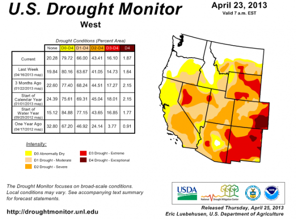
Aside from the Pacific Northwest, nearly all of the land west of the 100th Meridian is currently drier than normal. The drought has been especially severe in the nation’s midsection, where some areas are suffering through “exceptional” conditions, according to the U.S. Drought Monitor.
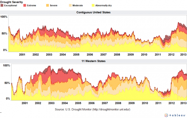
To track drought severity, I’ve created a dashboard on this page that shows what percentage of the contiguous United States and the 11 Western states were in various categories of drought. The dashboard allows you to export images like the one below (click to enlarge).
The graphics visualize data back to 2000 and show that the current drought in the West is beginning to rival the brutal dry spell that gripped the region in the early 2000s. Just a couple of years ago, very few areas in the West were abnormally dry, but that sure changed in a hurry. Below is the latest map of drought conditions in the region.
Although drought is a natural part of the Western climate, the shortage of precipitation has major implications for the region’s water supply, the severity of its upcoming wildfire season, and the health of ecosystems already confronting a broad spectrum of threats.
Data sources
The dashboard is based on the U.S. Drought Monitor, which provides historical data on this page. There are other ways to measure drought, such as the Palmer Index. In a future post, I’ll be sharing some slides that explain the differences in the various measures.
National Public Radio has put together an animated series of maps that show how drought conditions have changed over the past few years.
It’s also worth checking out how the The New York Times has mapped the drought’s footprint since 1896.
EcoWest’s mission is to analyze, visualize, and share data on environmental trends in the North American West. Please subscribe to our RSS feed, opt-in for email updates, follow us on Twitter, or like us on Facebook.


