All posts by Mitch Tobin

Mitch Tobin, the editor of ecowest.org, is owner of Sea to Snow Consulting and was previously communications director at California Environmental Associates. Prior to joining CEA, Mitch was a newspaper reporter at the Napa Valley Register, Tucson Citizen, and Arizona Daily Star, where he covered water, environmental, and border issues for five years. He was also a contributor to High Country News. Mitch's first book, Endangered (Fulcrum 2010), evaluates the effectiveness of the Endangered Species Act and received a gold medal in the 2011 Independent Publisher Book Awards.

2012 Graphics Highlights from The New York Times

The New York Times does some of the best data visualization in journalism and the paper has assembled highlights of its 2012 work. A few of these graphics relate to Western environmental issues and some are accompanied by descriptions of how they were created. Here are my favorites:


Drought footprint
Source: The New York Times

1) The drought’s footprint

Brilliant use of small multiples to show what fraction of the United States was experiencing moderate to extreme drought in a given year. When the piece was published in July, more than half the contiguous United States was classified this way, the highest level in nearly six decades.

The graphic stretches all the way back to 1896 and it really shows that 2012 was an exceptionally dry year. But as recently as 2010, very few areas were experiencing drought.

We cover drought in our water deck, and in a future post I’ll be sharing some visualizations that focus on drought the West.


2) Drought and deluge

Source: The New York Times
Drought and deluge. Source: The New York Times

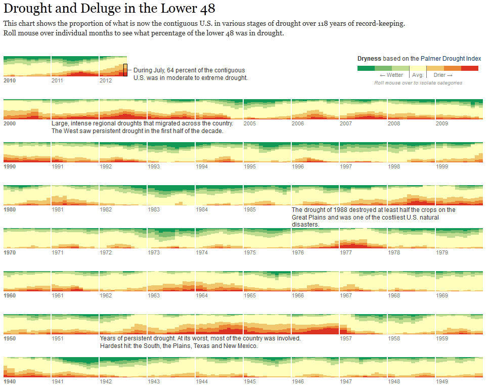
The Times used a different system for measuring drought to create another visualization. Rather than relying the U.S. Drought Monitor, as it did in the footprint maps, the paper uses the Palmer Drought Severity Index. The former uses the Palmer index as one of its inputs, but it’s also based on stream flows, crop moisture, precipitation patterns, and expert judgement. The Palmer index is strictly based on temperature and precipitation. It not only shows drought but also wet spells.

One cool thing about this graphic is that you can roll your mouse over the various levels of the Palmer index to see the driest and wettest periods. Once again, the current drought stands out as a deep one, but it’s certainly not unprecedented.

Another thing I noticed is that in 2011, large parts of the country were either very dry or very wet.


Obama budget
Slicing Obama’s budget. Source: The New York Times

3) Slicing Obama’s budget

This graphic puts the humble pie chart to shame and effectively shows how entitlements, defense, and debt costs dominate the federal budget. Click on the “Department Totals” tab to see how federal spending is divided up by agency. As you might imagine, environmental departments, such as EPA and Interior, are overshadowed by other agencies.

We cover federal (and other) spending in our politics deck and have a number of other graphics showing how environmental and natural resource programs are tiny in comparison with other federal spending priorities.


Democratic convention
Words used at Democratic convention Source: The New York Times

4) Parsing the rhetoric at political conventions

The Times analyzed all of the speeches at the Republican and Democratic conventions to determine which words were most common and how the language of the two parties differed.

You can plug in your own words or phrases to see how often they were spoken. I’m being a bit parochial, but here are the number of hits I got for both parties: environment (3), conservation (0), climate change (1), global warming (0), pollution (1), water (4). And that’s per 25,000 words.


EcoWest’s mission is to analyze, visualize, and share data on environmental trends in the North American West. Please subscribe to our RSS feed, opt-in for email updates, follow us on Twitter, or like us on Facebook.

Trends in endangered species listings

To list or not to list?

That’s the key question facing the U.S. Fish and Wildlife Service when it comes to endangered species.  More than 1,300 plants and animals have been granted federal protection and these so-called listed species are embroiled in practically every Western environmental issue. The Endangered Species Act (ESA) has real teeth and it’s often the biggest hammer in environmentalists’ toolbox.

In this set of slides, I show where federally protected species live and review the history of ESA listings.

Trends in endangered species listings from EcoWest on Vimeo.

Endangered species are found throughout the country, but they tend to be concentrated in a few hotspots. The graphic below, from NatureServe, depicts how many listed threatened and endangered species are found in each county. Hawaii, the Pacific Coast, the Southwest, Appalachia, and Florida stand out for their large number of listed species, but many U.S. counties, especially in the Midwest, have no threatened or endangered species.

Species map

The number of listed species might seem like a useful barometer for tracking the status of biodiversity, but it’s an imperfect metric at best. Species are supposed to be added to the list solely on the basis of science and biologists’ assessment of their imperilment, even if doing so would derail development or impose steep economic costs. In reality, several studies have found that politics frequently intrudes in the listing process. See, for example, my book Endangered: Biodiversity on the Brink, and a 1990 book by Richard Tobin (no relation),  The Expendable Future: U.S. Politics and the Protection of Biological Diversity.

In its first term, the Obama administration has listed more species per year than George W. Bush’s administration, but considerably fewer than during the Clinton administration. Looking at the rate of species listings says as much about the political appetite for such regulatory moves as it does about the status of the nation’s biodiversity.

The ESA gives citizens the ability to petition the federal government to add a new species to the list and some environmental groups, such as the Center for Biological Diversity and WildEarth Guardians, frequently make these requests. Fish and Wildlife is obligated to evaluate these petitions and decide whether a species should be listed, but with limited resources the agency can only process so many petitions. ESA opponents in Congress and elsewhere have figured out that by limiting this listing budget, they can constrict the pipeline of new species gaining federal protection.

Candidates in regulatory purgatory

The result is a gaping loophole that allows the government to declare a species’ listing as biologically “warranted but precluded” by budget constraints. Fish and Wildlife is only supposed to use this exception if “expeditious progress is being made to add qualified species” to the endangered club. In reality, the exception has become an all-too-convenient way for the government to abdicate its responsibilities under the ESA. I liken it to creating a long, slow-moving line for species to get aboard our legislative Noah’s Ark.

At least 24 species have blinked out while in the listing pipeline and the backlog of candidate species was the subject of recent litigation.  The Obama administration has made some progress in reducing the number of candidates from about 250 at the start of his first term to 192 in November 2012. Candidate species, like listed species, are found throughout the country, but they’re concentrated in Western and Southern states.

The number of listed species is bound to keep rising because only 20 have been declared recovered and no longer in need of ESA protection. In 18 cases, the government decided the original listing was in error, often because of taxonomic changes or the discovery of new populations. A species protected by the ESA has been declared extinct only nine times over the past four decades, which is pretty impressive given that many plants and animals only receive ESA protection after they’ve been driven to the brink.

Downloads

Data sources

Fish and Wildlife’s ESA site is the go-to source for information on endangered species. I’ve also found Precious Heritage: The Status of Biodiversity in the United States to be an extremely helpful resource. The Nature Conservancy and NatureServe make some of the book’s figures available here.

If you’d like to explore some of this data further, I’ve built a state-by-state dashboard that shows the number of listed, candidate, and extinct species.

EcoWest’s mission is to analyze, visualize, and share data on environmental trends in the North American West. Please subscribe to our RSS feed, opt-in for email updates, or follow us on Twitter.

Wind and ocean currents visualized

You may not need a weatherman to know which way the wind blows, but the data that climate researchers collect can certainly deliver some beautiful visualizations of the currents constantly swirling in the skies and oceans.

Witness the Perpetual Ocean, a project of NASA’s Scientific Visualization Studio. This video, shown below, depicts the flow of ocean currents around the globe. Others have noted how the viz resembles van Gogh’s Starry Night painting.

Similarly, a couple of ex-Google employes have produced a great visualization of winds in the United States. The map from hint.fm is updated hourly with data from the National Digital Forecast Database. The viz doesn’t embed easily, but below is a screenshot of the map.

Wind map