All posts by Mitch Tobin

Mitch Tobin, the editor of ecowest.org, is owner of Sea to Snow Consulting and was previously communications director at California Environmental Associates. Prior to joining CEA, Mitch was a newspaper reporter at the Napa Valley Register, Tucson Citizen, and Arizona Daily Star, where he covered water, environmental, and border issues for five years. He was also a contributor to High Country News. Mitch's first book, Endangered (Fulcrum 2010), evaluates the effectiveness of the Endangered Species Act and received a gold medal in the 2011 Independent Publisher Book Awards.

An interactive map of water risk and stress

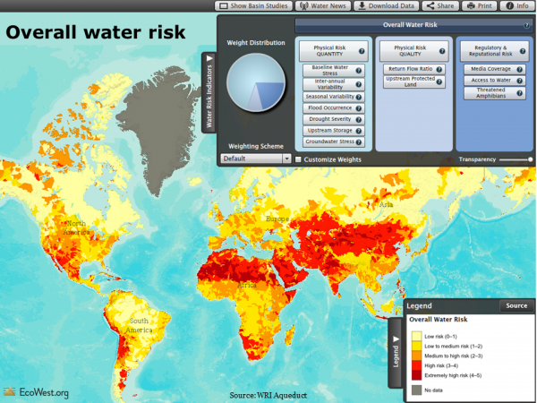
The World Resources Institute has developed Aqueduct, an interactive mapping tool that offers a fascinating look at water-related risks and stresses, including projected impacts due to climate change.

Using global data donated by Coca-Cola, one of several heavyweight corporate partners (Goldman Sachs and General Electric founded the Aqueduct Alliance), WRI has analyzed and visualized a dozen water-related risk factors facing businesses, governments, and communities. Below is a view of overall water risk (click to enlarge).

WRI Aqueduct: overall water risk

Elements of water risk

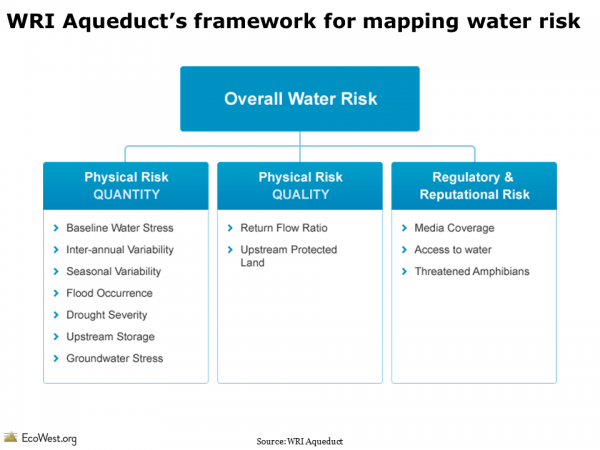
Aqueduct’s water risk model includes a dozen components, as shown in the slide below. The physical quantity risks deal with questions of supply, such as a location’s climate and its susceptibility to drought. The physical quality risks revolve around pollution, such as the protective status of upstream watersheds and how many times river water is re-used. The final category, regulatory and reputational risk, uses proxies, such as the number of threatened amphibians to highlight more fragile ecosystems that may face restrictions on withdrawals. There’s even a measure for media coverage of water issues to indicate where businesses will face greater risks to their public image if they do not manage water sustainably.

WRI Aqueduct water risk framework

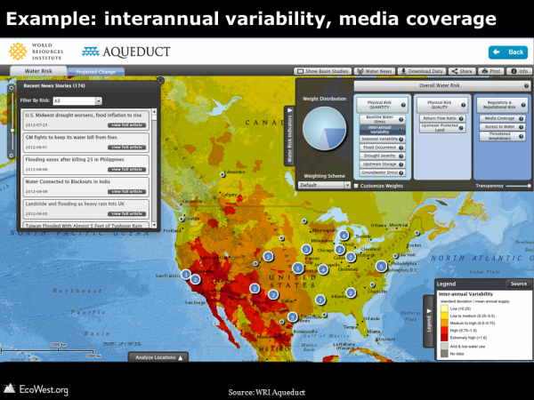
In the online atlas, you can examine each of these dozen factors separately and weight the three categories according to the needs of industry groups, including agriculture, semiconductors, and oil and gas. In the screenshot below, I’ve zoomed in on the United States and selected interannual variability (how much the water supply varies year to year). This risk factor is generally much greater in the West than in the East, and especially high in the Southwest. The numbers in circles indicate how many water-related media stories are currently showing up in the map’s built-in news feed.

WRI Aqueduct: example

Background on project

Here’s more about the project from WRI:

Water scarcity is one of the defining issues of the 21st century. In its Global Risks 2013 report, the World Economic Forum identified water supply crises as one of the highest impact and most likely risks facing the planet. With the support of a diverse group of partners, the World Resources Institute built Aqueduct to help companies, investors, governments, and communities better understand where and how water risks are emerging around the world.In January 2013, the World Resources Institute launched the centerpiece of Aqueduct after a three-year development effort: the Water Risk Atlas. The Atlas uses a robust, peer reviewed methodology and the best-available data to create high-resolution, customizable global maps of water risk.

The Aqueduct Water Risk Framework brings together 12  indicators into three categories of water risk and an overall aggregated score. The framework is based on a thorough review of the literature and available global data, and includes several indicators developed exclusively for Aqueduct. It is structured, in particular, to help companies and investors understand indicators of water-related risk to their business, but is intended for all users, including government and civil society to better understand geographic water issues. The Aqueduct Alliance, founded by General Electric and Goldman Sachs, is the network of companies and organizations that support the Aqueduct project. These partners provide resources as well as expertise and perspective to the project.

Mapping water stress

One illuminating feature of the atlas is that it allows you to examine water stress–essentially the imbalance between water supply and demand–under current conditions and three IPCC climate change scenarios.

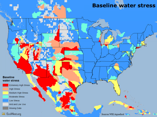
The map below shows the baseline water stress, which is defined as “the ratio of total annual freshwater withdrawals for the year 2000, relative to expected annual renewable freshwater supply based on 1950-1990 climatic norms.”

WRI aqueduct: baseline water stress

As you would expect, there’s a lot more stress, water-wise, in Phoenix than Portland. The roots of some age-old intrastate water conflicts show up pretty clearly, such as lower water stress in California’s wetter north, but extremely high stress in the drier south. There are similar dividing lines in Colorado: most of the water is on the Western slope, but the bulk of the population is east of Continental Divide along the Front Range.

Projecting climate change impacts

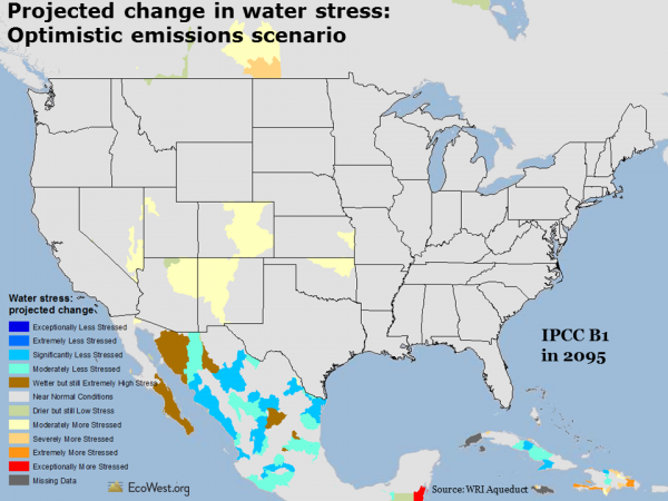
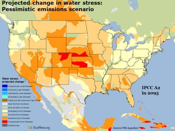
The maps below look ahead to 2095 and depicts projected changes in water stress. I’ve used the IPCC’s optimistic B2 and pessimistic A2 emissions scenarios, which show that higher levels of greenhouse gases will create much more water stress across the country. In the pessimistic scenario, I didn’t find any places in the continental United States where water stress decreased by 2095.

WRI Aqueduct projected change in water stress optimistic scenario

Water stress map

The Aqueduct atlas also has climate change projections for 2025 and 2050. It’s one of many ways you can customize your views of the data and I’d encourage anyone with an interest in water issues to take a few minutes to explore WRI’s useful visualization.

Data sources

WRI provides the data for download on this page. You can also download their framework document and indicator metadata. Below is an embed of their YouTube video explaining how to use the Aqueduct tool.

Downloads

EcoWest’s mission is to analyze, visualize, and share data on environmental trends in the North American West. Please subscribe to our RSS feed, opt-in for email updates, follow us on Twitter, or like us on Facebook.

The fuels dilemma and Western wildfires

When I was getting certified as a wildland firefighter in 2002, they taught us that fire behavior is based on three basic factors.

First, weather: not just the temperature, humidity, and wind at that moment, but also the climatic conditions over the preceding months and years. All else equal, if it’s hot, dry, windy, and you’re in a drought, you’d expect more extreme fire behavior.

Second, topography: drafty canyons, south-facing slopes exposed to the desiccating sun, and other natural features can encourage burning. Fire travels faster uphill, our instructors cautioned us, but firefighters move slower.

Third, fuels: the type of vegetation, its volume, its moisture content, and its continuity on the landscape. As a fire travels from grasslands to woodlands to dense forests, its personality can change radically.

The first two factors–weather and topography–are out of our control, putting aside the fact that we are changing the weather via climate change and loading the dice toward more fire-friendly conditions in the American West.

What we can directly influence are the fuels. We can break the natural cycle of wildfires by suppressing both human- and lighting-caused blazes, allowing the fuel to build up. We can mechanically thin and intentionally burn areas to reduce the amount of fuel available to future wildfires. We can go so far as to cut down all the trees and pave over a place, thereby eliminating the possibility of a wildfire (or a natural ecosystem).

Tracking fuels treatment to tame Western wildfires from EcoWest on Vimeo.

Fuels dilemma

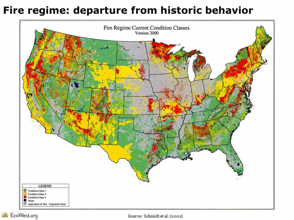
Today, the American West is facing a fuels dilemma. The graphic below shows the condition of fire regimes across the country. Red illustrates areas where wildfires may be significantly altered from their historic behavior, yellow shows areas that are moderately altered from historic conditions, and green marks where conditions are near historical norms. This data is from 2000, but things probably haven’t changed much since then.

Fire regime: departure from historic conditions

I’ve created slides like these to describe the fuels dilemma in a PowerPoint you can download at the bottom of this post. The presentation explains how the policy of fire suppression has disrupted the natural fire regime in many parts of the West. I’ve also analyzed federal statistics on the number of acres thinned and burned, both in the slide deck and on this dashboard page, but the government’s reporting on fuels treatment is lacking and I’m still in search of better data to characterize this crucial issue.

Fuels treatment

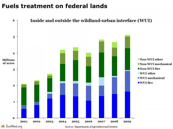
The graphic below distinguishes between a couple of different types of fuels treatment. The first distinction is between activity taking place within and beyond the wildland-urban interface. Known by its acronym, the WUI is where property and residents are at greatest risk of wildfires. The second distinction is between thinning with chainsaws (“mechanical”) and prescribed burns (“fire”).

Fuels treatment on federal lands

The total acreage has been climbing in recent years, but the government only reports this data through 2009. I haven’t been able to find anything more current, but would welcome any suggestions from readers. The data source appears to have been created as part of the George W. Bush administration’s Healthy Forests Initiative but not continued by Barack Obama’s administration.

As of 2009, the federal government was treating an increasing number of acres, but it’s critical to remember that these totals are small relative to the size of the problem. Some 190 million acres of federal land face an elevated risk of catastrophic wildfire, according to one widely used estimate from the U.S. Forest Service (see here for technical report).

I was also struck by the considerable amount of thinning taking place outside of the WUI. Proposals to cut down brush and trees right around vulnerable communities often have the backing of environmental groups, but as these thinning projects move farther into the backcountry, they tend to face more opposition, especially if sizable timber harvesting is part of the equation.

Prescribed burns

On a per acre basis, prescribed fires are much less expensive than mechanical thinning projects, but conditions have to be just right to set a prescribed fire so that it doesn’t turn into a disastrous wildfire. That’s happened occasionally in the West, such as the 2000 Cerro Grande Fire in New Mexico and the 2012 Lower North Fork Fire in Colorado that killed three people. Many in the public remain skeptical or outright opposed to prescribed burns because of the risks and smoke.

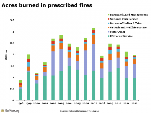
The graphic below shows that the number of acres burned in prescribed fires was increasing for a while, but the national total is just a couple million acres annually. (This time series, from the National Interagency Fire Center, is part of their annual report and looks like it will continue.)

Acres burned in prescribed fires

Wildland-fire use

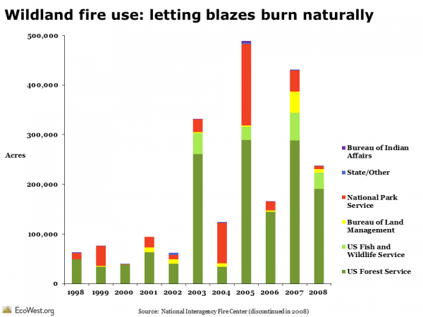
The federal government used to report on instances of “wildland fire use,” essentially letting wildfires burn rather than suppressing them. This strategy is still practiced today when fires are in a wilderness or other remote area and not posing a significant threat to property and people. The graphic below shows the number of acres burned in these types of fires, by agency, but the feds stopped reporting this statistic in 2008.

Acres burned in wildland fire use

Looking ahead

In places like the Southwest, there’s pretty broad agreement among scientists, land managers, firefighters, and conservation groups that additional thinning in the WUI and increased prescribed burns could mitigate–but not eliminate–the risks of catastrophic fires destroying homes. The data I’ve found suggest there’s been a slight upward trend in such fuel treatments, but the overall totals are small and are likely to remain so in a time of fiscal austerity. Letting nature do the work for us would obviously be less expensive, even ecologically preferable, but the proliferation of homes in fire-prone landscapes has made fire suppression an imperative across much of the West.

Sources

Data on thinning comes from this report, part of a cooperative effort between the Interior and Agriculture departments. The information on prescribed burns and wildland fire use are from the National Interagency Fire Center.

This story from HowStuffWorks has a good discussion of the three key factors that explain fire behavior.

The Yarnell Fire disaster has generated some solid coverage of the wildfire issue. See this piece by Felicity Barringer of The New York Times on the rising number of homes in the WUI and this op-ed in the Arizona Republic by Don Falk of the University of Arizona. I’m quoted briefly in this story by Amanda Paulson in the Christian Science Monitor.

Downloads

EcoWest’s mission is to analyze, visualize, and share data on environmental trends in the North American West. Please subscribe to our RSS feed, opt-in for email updates, follow us on Twitter, or like us on Facebook.
The United States of Energy

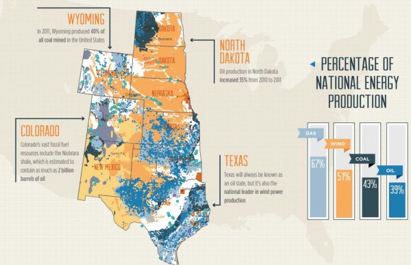
Maps of our nation’s energy potential usually display just one source, such as the location of wind farms or the extent of natural gas fields. In an interesting new data visualization, advertising and PR firm Saxum has combined both fossil and renewable energy resources into a map of The United States of Energy.

Below are the front and back of the viz, which has so much info that it probably reads best in hard copy (click on images to enlarge).

The firm describes the project as “the first data visualization piece of its kind to comprehensively detail our nation’s vast and diverse energy portfolio. ” Here’s more from them:

What began as a simple graphic showcasing America’s energy riches quickly grew into a two-sided, folded map concept displaying thousands of individual data points. The #USofEnergy map visualizes our country’s energy potential by charting current sources of energy production and identifying future resources and known deposits. Energy resources surveyed include: natural gas, oil, coal, nuclear, hydroelectric, wind, geothermal, solar and biomass. We compiled the data from a broad range of industry and government sources, including the National Renewable Energy Laboratory, U.S. Geological Survey, U.S. Energy Information Administration, U.S. Army Corps of Engineers, Nuclear Research Council and American Wind Energy Association.

In some parts of the country, such as the nation’s midsection, there are so many different energy sources being exploited that the map is tough to make out. Overlapping layers present a difficulty here, but in other regions, such as the East Coast, there’s a lot of white space.

Saxum, which describes itself as “one of the leading integrated marketing communications agencies in the Great Plains,” highlights that 46 percent of U.S. energy is produced by nine states in the center of the country, as shown below.

United States of Energy Midwest
Source: Saxum

It’s worth zooming in to their legend to see what all these layers really mean. With biomass, for example, an entire county is shaded orange if it’s in the top-20 percent for producing energy in this way per square kilometer. With solar, only the best places in the country are shown. Here in Denver, for example, we’re not covered by the solar layer, but photovoltaic panels on the roof of my home/office generate the majority of electricity we consume (see this more detailed solar potential map from the U.S. Department of Energy).

Don’t ask me how, but it would be great to see an online, interactive version of Saxum’s map. That format could let you provide even greater detail on the energy sources, such as varying the size of the points used to display nuclear plants and hydroelectric dams by how much energy they produce, or by allowing users to turn layers on and off. (UPDATE: Saxum has an interactive data visualization here.)

Emily Guerin at High Country News has a good overview of the other trends that Saxum highlights in its map.

If you’re looking for maps of individual energy sources, check out our PowerPoint presentation on land use.

EcoWest’s mission is to analyze, visualize, and share data on environmental trends in the North American West. Please subscribe to our RSS feed, opt-in for email updates, follow us on Twitter, or like us on Facebook.