Scientists have released new high-resolution maps that illustrate the lushness of vegetation, or lack thereof, around the globe.
Researchers at NASA and the National Oceanic and Atmospheric Administration (NOAA) used satellite data from April 2012 to April 2013 to create maps like the ones below (click to enlarge).
Source: NASA
“The darkest green areas are the lushest in vegetation, while the pale colors are sparse in vegetation cover either due to snow, drought, rock, or urban areas,” NASA/NOAA says.
Satellites are able to gauge the lushness of vegetation because sunlight reflect off plants differently than cities, barren peaks, and other non-vegetated areas. “Plants absorb visible light to undergo photosynthesis, so when vegetation is lush, nearly all of the visible light is absorbed by the photosynthetic leaves, and much more near-infrared light is reflected back into space,” NASA/NOAA says. “However for deserts and regions with sparse vegetation, the amount of reflected visible and near-infrared light are both relatively high.” Here’s a diagram illustrating the concept:
Zooming into West
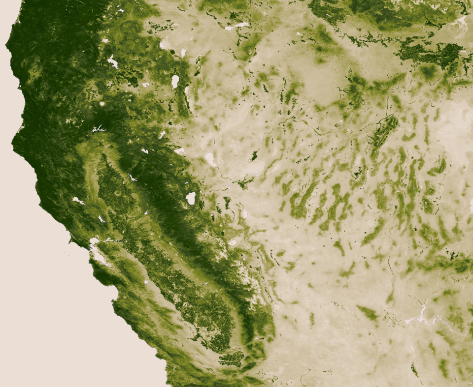
Compared to the rest of North America, the American West stands out for the relative lack of vegetation in many interior areas. Although the Pacific Northwest and taller mountain ranges show up as deep green, the Southwest looks pretty tan. Check out the rain shadow to the east of the Sierra Nevada Range, as well as the verdant ranges in the Great Basin, in this closeup:
Source: NASA
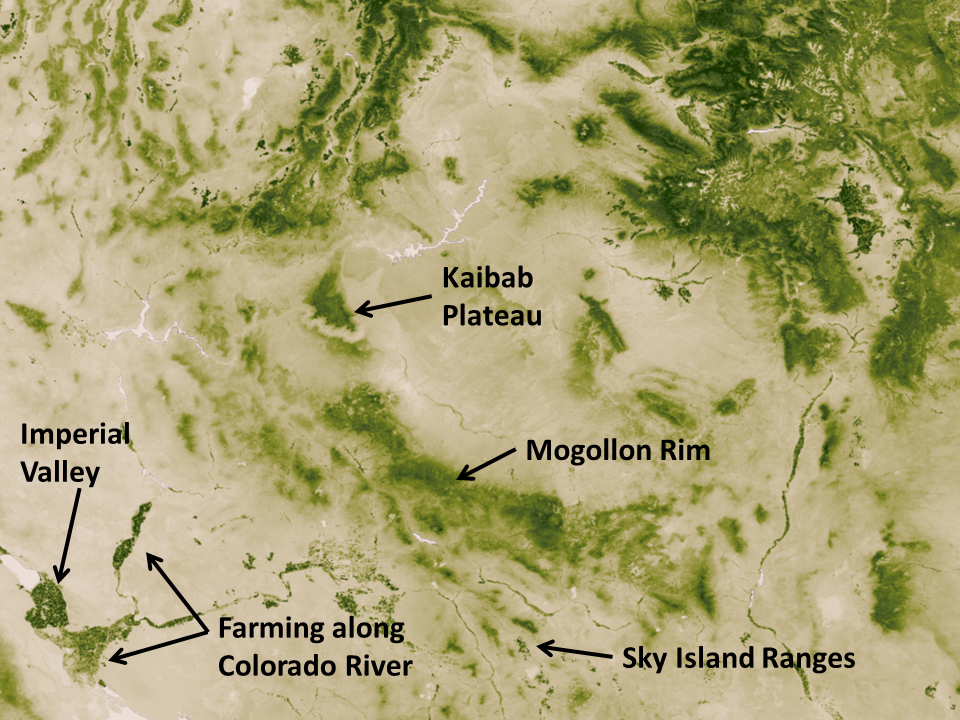
Below I’ve zoomed into the Southwest, where you can clearly see the irrigation along the Colorado River. I’ve also marked some notable islands of green, such as the Kaibab Plateau and the elevated archipelago of “sky island” mountain ranges in Southeast Arizona.
Source: NASA
Downloading map
NASA/NOAA create a new greenness image every week. With a resolution of 500 meters (each pixel depicts about 62 acres), the weekly maps weigh in at 13 gigabytes each. You can download a 30,000 pixel by 15,000 pixel image (176 megabytes) and that’s what I’ve used to create the close-ups above.
Below is a video tour that shows how the vegetation changed during one year, both due to the changing seasons and human activities. The footprint of cities in Europe and Asia is striking.
EcoWest’s mission is to analyze, visualize, and share data on environmental trends in the North American West. Please subscribe to our RSS feed, opt-in for email updates, follow us on Twitter, or like us on Facebook.
Google has just released an interesting tool for tracking environmental changes through satellite imagery.
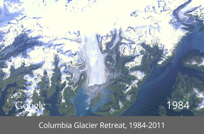
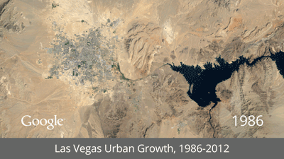
Timelapse shows changes to the Earth’s surface over nearly three decades, from 1984 to 2012. Each frame in these animations is a year of imagery from the Landsat satellite program.
Google has put together some pre-made views and below I’ve pasted the animations from North America. There’s also a description of each animation in this article in Time.
Las Vegas urban growth
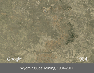
Wyoming coal mining
Columbia glacier retreat
I found the Las Vegas view most striking. It’s similar to an animation of the city’s growth that I wrote about here.
What’s really cool about this tool is that you can zoom in to any area on the globe and see how the landscape has been evolving. I focused in on Tucson, where I lived for many years, and I could easily see the growth, especially new golf courses in the desert, as well as the scars left behind by wildfires that struck the nearby Santa Catalina range from 2002 to 2004.
Unfortunately, you can’t zoom in very close with the Timelapse tool, and it doesn’t look like there’s a way to save your own animation. But maybe that’s coming?
I noticed that the Google Earth Engine site also provides an interesting data set on roadless areas that shows places around the globe that are more than 1 kilometer from a road, railway, or navigable river. Below is a screen shot of the dataset, which I’d like to explore further.
Global roadless areas
EcoWest’s mission is to analyze, visualize, and share data on environmental trends in the North American West. Please subscribe to our RSS feed, opt-in for email updates, follow us on Twitter, or like us on Facebook.
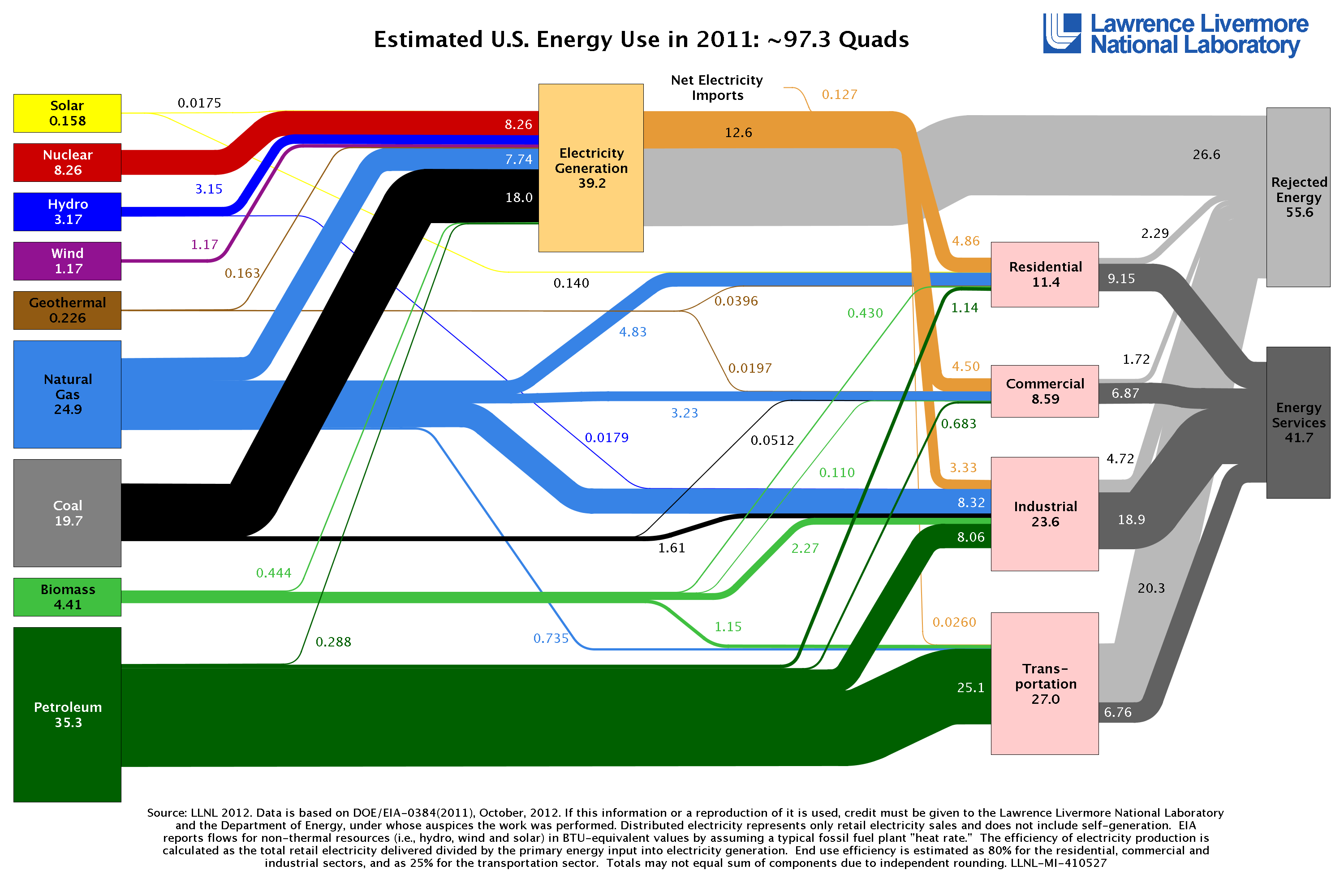
Energy flows through everything, so it’s only fitting to use flow charts to depict our complex energy economy.
Since the early 1970s, the Lawrence Livermore National Laboratory has been producing such graphics, not only for energy, but also for water and carbon dioxide. Technically known as Sankey diagrams, these data visualizations summarize flows through a system by varying the width of lines according to the magnitude of the commodity in question.
In this deck of slides, I offer up some of Sankey diagrams that illustrate energy trends in the United States and Western states. Looking at these visualizations over time shows that fossil fuels continue to dominate the nation’s energy mix, but renewable sources are making some headway. In the West, some inland states rely almost exclusively on coal to generate electricity, but other states use significant quantities of natural gas, wind, and nuclear power. Overall, petroleum in the transportation sector accounts for the greatest share of our energy flows.
History of diagram
Matthew Henry Phineas Riall Sankey. Source: Wikipedia
Sankey diagrams are named after Matthew Henry Phineas Riall Sankey, an Irish Captain who used the graphic in a 1898 publication on steam engines. Since then, Sankey’s diagrams have won a dedicated following among data visualization nerds. There’s even an entire blog devoted to the graphic, which boasts in its tagline that “a Sankey diagram says more than 1,000 pie charts.” The blog has a good overview of software tools that create Sankey diagrams here.
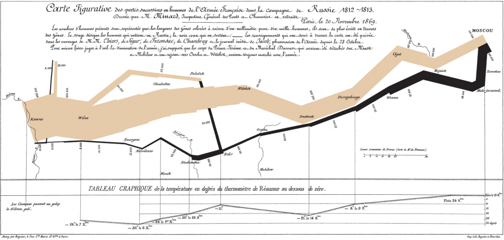
One of the earliest and most famous examples of the form illustrates Napoleon’s disastrous Russian campaign in the early 19th century. Created by Charles Joseph Minard, a French civil engineer, the graphic (technically, a flow map) depicts the army’s movement across Europe and shows how their ranks were reduced from 422,000 troops in June 1812, when they invaded Russia, to just 10,000, when the remnants of the force staggered back into Poland after retreating through a brutal winter.
Data visualization guru Edward Tufte, whose undergraduate political science class helped get me interested in graphics and data analysis more than two decades ago, calls it “probably the best statistical graphic ever drawn.” Besides showing the declining troop totals, the graphic details the army’s location and direction over time, as well as the temperature.
Minard’s famous flow map. Source: Wikipedia
Significant shifts in energy flows
LLNL’s latest energy diagram, released in October 2012, depicts 2011 data and illustrates some major changes in the nation’s energy sector. As the lab noted in its press release, “Americans used less energy in 2011 than in the previous year due mainly to a shift to higher-efficiency energy technologies in the transportation and residential sectors.”
The largest increase in energy production was in the wind sector; hydropower also grew due to a wet winter in the West. Even so, the nation’s energy flows are still dominated by coal, natural gas, and petroleum. “Sustained low natural gas prices have prompted a shift from coal to gas in the electricity generating sector,” said A.J. Simon, an energy systems analyst at the lab. “Sustained high oil prices have likely driven the decline in oil use over the past 5 years as people choose to drive less and purchase automobiles that get more miles per gallon.”
Energy use varies widely in West
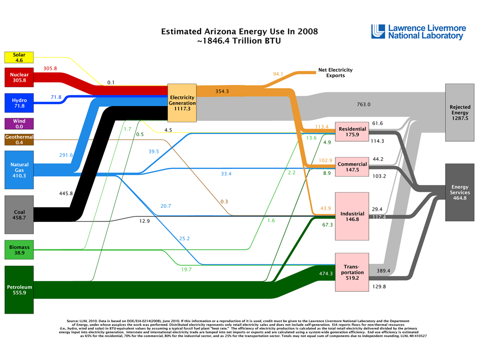
Among Western states, the Sankey diagrams show some clear patterns. States like Wyoming, Colorado, New Mexico, Montana, and Utah rely heavily on coal for their electricity production, in some cases exporting that power to other states. Coal may be king for electricity generation in many states in the intermountain West, but it’s hydropower that dominates power portfolios in the Pacific Northwest: Washington, Oregon, and Idaho get the bulk of their electricity from dams. Other states have more diversified portfolios; Arizona, shown below, relies on a mix of coal (40%), nuclear (27%), natural gas (26%), and hydropower (6%). But not much solar for a pretty sunny state.
In all of the energy diagrams, you’ll notice that a significant share of energy is “rejected.” A good example of rejected energy is waste heat from power plants. The greater the percentage of rejected energy, the less efficient the system. It’s worth noting that the state-level data is from 2008, three years older that the national data, and the U.S. energy economy has undergone some major shifts since then, including a shift from coal to natural gas and growing competitiveness of wind power.
Long-standing data source
The Lawrence Livermore National Laboratory has published flow charts of energy, water, and carbon dioxide since the early 1970s, sometimes going down to the level of individual states. Here’s how the lab describes the graphics and their creation:
Flow charts are valuable as single‐page references that contain quantitative data about resource, commodity and byproduct flows in a graphical form that also conveys structural information about the system that manages those flows. Recent advances in the automation of Sankey Diagram generation have made it possible to produce a consistent set of state‐level energy flowcharts. A computer program reads SEDS [State Energy Data System] data, performs a set of calculations and re‐sizes and re‐labels the flows in the figure. Human interaction is required only to reconcile instances where graphical elements overlap.
Other versions
The U.S. Department of Energy’s Office of Science offers similar diagrams, including one that embeds some interesting factoids and imagery. I’ve included them in the deck as well. Here’s how the agency summarizes its flow graphics:
Oil provided the largest share of the 98 quads of primary energy consumed, and most of it was used for transportation. Consumption of natural gas, the nation’s second largest energy source, is split three ways—electricity generation, industrial processing, and residential and commercial uses (mostly for heating). Coal, our third largest source, is used almost exclusively for electricity. Nuclear energy and renewables each meet less than 10% of U.S. energy demand.
The International Energy Agency has also produced a poster-sized Sankey diagram depicting world energy flows (there’s a PDF available, but the text is microscopic).
In a future post, I’ll take a closer look at Sankey diagrams that visualize water flows. In the meantime, I’d be curious to hear what others think about these graphical tools and any insights they reveal about the energy challenges we face.
EcoWest’s mission is to analyze, visualize, and share data on environmental trends in the North American West. Please subscribe to our RSS feed, opt-in for email updates, follow us on Twitter, or like us on Facebook.