Tag Archives: driving

Trulia’s mapping tool goes far beyond real estate

You may quibble with how Trulia values your home, but the real estate website provides an impressive interactive map with detailed views of social and environmental variables.

In addition to offering a treasure trove of information on real estate down to the parcel level, Trulia’s mapping engine also visualizes high-resolution data on things like commute times and the risk of wildfires, flooding, and earthquakes.

Below I describe some of my favorite features and share some screenshots. This mapping tool is not without its issues, but it’s generally well-designed and easy to use.

Commute times: driving and transit

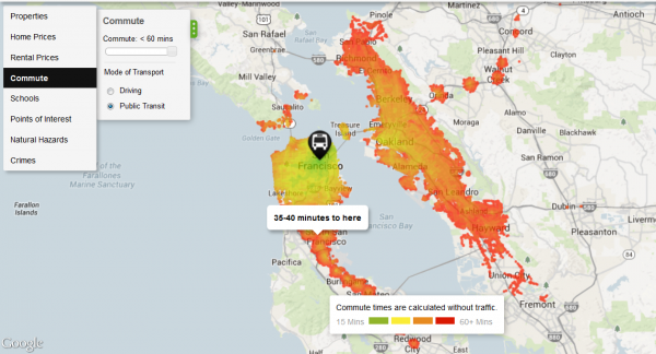
One of Trulia’s most interesting features is a layer that maps commuting times. Below are the heat maps for San Francisco, first for driving and then for transit. The two maps are pretty close. Putting aside transit strikes, the Bay Area has a solid system of trains, buses, ferries, and other alternatives to driving, so commuting long distances by transit is feasible, even mandatory, for many residents in the region. These maps don’t account for traffic delays, which is a big caveat. Click on images to enlarge.
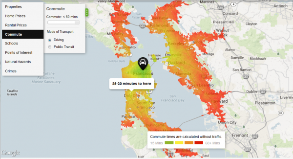
San Francisco commute time driving
Source: Trulia
San Francisco commute time transit
Source: Trulia

Compare the pair of images above to the ones below for Las Vegas, where there’s a huge disparity between driving and public transit commuting times. If you give yourself an hour to commute to the city center, being able to drive opens up many more places to live around Las Vegas.
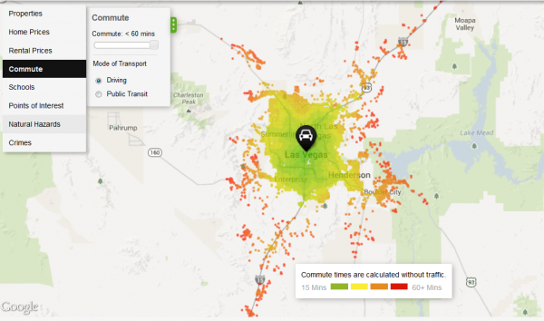
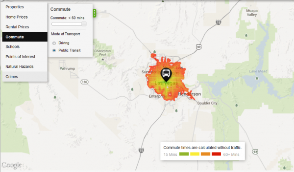
Las Vegas commute driving
Source: Trulia
Las Vegas commute transit
Source: Trulia

Natural hazards mapped

Another useful aspect of Trulia’s map is a collection of natural hazard maps, including depictions of the risks of flooding, wildfires, tornadoes, earthquakes, and hurricanes. One criticism is that the mapping engine doesn’t let you export your views, so you’ll have to rely on screenshots. It’s also difficult to zoom out and see the entire country. You can get around this by zooming out on your browser (press control and the minus sign), which is what I’ve done for the national maps below, but then the text is microscopic. Trulia works best when zoomed in to a region or metro area.

Wildfires

The map below shows wildfire potential across the country and illustrates the inherent risk of an area experiencing a severe blaze under the right conditions.
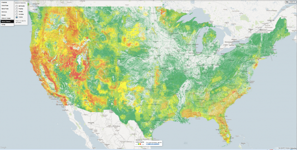
Trulia wildfire
Source: Trulia

Trulia does a good job explaining its data sources. For the wildland fire potential (WFP) layer, here’s the definition they’re using:

Areas with high WFP values represent fuels with a higher probability of experiencing a high-intensity fire under conducive weather conditions. Areas with low WFP values, therefore, represent a low probability of experiencing a wildfire. The WFP map is maintained by the USDA Forest Service, Fire Modeling Institute, and is intended to be used in analyses of wildfire risk at regional or national scales. The WFP is not intended to be a forecast or wildfire outlook, as it does not include information on current or forecasted weather or fuel moisture conditions.

If you zoom in close enough, the wildfire data also includes perimeters of previous fires. Below is the fire potential around Los Angeles, including the outlines of fires during 2007, a particularly active year. At least in this part of the country, extremely high fire danger areas lie in close proximity to places where the risk is virtually nil.
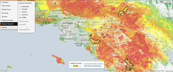
Trulia wildfire LA
Source: Trulia

If you zoom in to some other regions, the data may get a little funky. Below is a close-up of the Denver area. In the city, the pixelated data suggests that some city blocks have a greater wildfire risk than others, but in reality you’re not going to see a wildfire within the Denver city limits. The map is basically right: as you move west, into the foothills of the Front Range, wildfire potential definitely increases, but at this resolution the map is somewhat misleading.
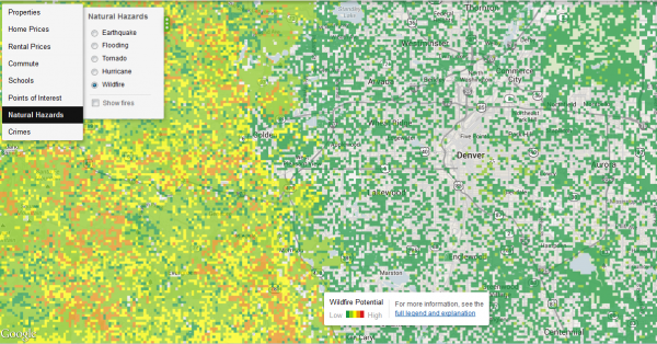
Trulia wildfire Denver
Source: Trulia

Flooding

Another limitation is that Trulia is missing data for some parts of the country. In the screenshot below, flood risks suddenly disappear north of Denver. That’s because there’s no data for Weld County. Trulia cautions that even counties with flood data from FEMA don’t necessarily have full coverage.
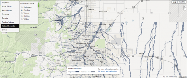
Trulia flood Boulder
Source: Trulia

Here’s how Trulia describes the high (100-year flood zone ) and moderate (500-year flood zone) risk categories:

In high risk areas, there is at least a 1 in 4 chance of flooding during a 30-year mortgage. All home and business owners in these areas with mortgages from federally regulated or insured lenders are required to buy flood insurance. In moderate risk areas, the risk of being flooded is reduced but not completely removed. These areas submit over 20% of NFIP claims and receive one-third of disaster assistance for flooding. Flood insurance isn’t federally required in moderate-to-low areas, but it is recommended for all property owners and renters.

Although Trulia’s flood risk data may be spotty, covered areas are mapped in great detail, as shown in the map below of Boulder, Colorado, which recently experienced epic flooding.
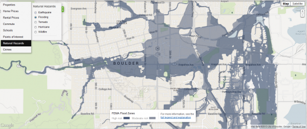
Trulia flood Boulder zoom
Source: Trulia

Tornadoes

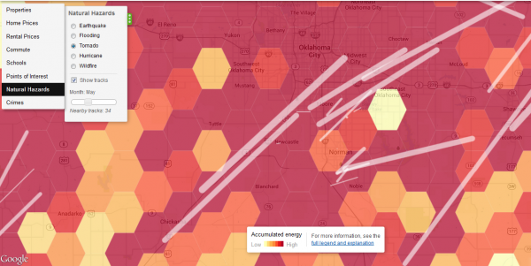
Trulia’s tornado hazard map, based on data from the National Weather Service’s Storm Prediction Center, shows that this weather phenomenon is largely absent from the American West. Drill down to the local level and the map shows the tracks of previous tornadoes. Below the national map is the area around Oklahoma City. I chose the month of May, when disasters such as the Moore Tornado of 2013 have occurred. This map uses a technique known as hexagonal binning, which employs a honeycomb grid to aggregate and visualize the data.
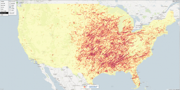
Trulia tornado
Source: Trulia
Trulia tornado OKC
Source: Trulia

Earthquakes

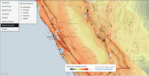
Trulia’s earthquake hazard map shows potential shaking intensity and the system of faults. Here’s how Trulia summarizes the USGS data:

The data represent a model showing a 10% probability that ground motion will reach a specified level within 50 years. Shaking potential is calculated considering historic earthquakes, slip rates on major faults and deformation throughout the region, and the potential for amplification of seismic waves by near-surface geologic materials … Faults are represented as black lines on the map. Darker lines signify a larger slip rate, which is a measurement of how fast one side of the fault slides past the other side.

Everyone knows California and the West Coast is earthquake country, but I hadn’t realized how many other, inland areas are also susceptible to shaking. Below the national map is a close-up of central California.
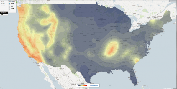
Trulia earthquake
Source: Trulia
Trulia earthquake SF
Source: Trulia

Telling stories with Trulia

I was pleasantly surprised by the richness of data in Trulia’s maps. Its main competitor, Zillow, doesn’t have anything that comes close. Even if you’re not in the market for a house or thinking of selling, the website is a useful resource for learning more about your community.

The geography of crime, shown below for the Bay Area, is a bit beyond our bailiwick here at EcoWest, but it’s certainly a key driver of growth and land-use patterns that have major environmental consequences (see this Trulia post for more on these crime maps).

Using Trulia, journalists, NGOs, researchers, and local policymakers can piece together a compelling portrait of a city or region by visualizing geographic patterns in crime, housing, transportation, education, and environmental hazards.
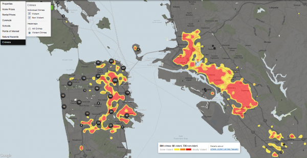
Trulia crime San Francisco Oakland
Source: Trulia

EcoWest’s mission is to analyze, visualize, and share data on environmental trends in the North American West. Please subscribe to our RSS feed, opt-in for email updates, follow us on Twitter, or like us on Facebook.

Americans are driving less: the state-by-state story

At the peak of the recession, did you swap your family’s annual summer road trip for a “staycation” or plan errands to reduce your number of car trips? Have you engaged in the semi-competitive practice of hypermiling? If so, you’re far from alone in your quest to reduce your annual mileage behind the wheel, according to a recent report from the U.S. Public Interest Research Group (PIRG).

In the report, “Moving Off the Road: A State-by-State Analysis of the National Decline in Driving,” U.S. PIRG shows that 46 states plus the District of Columbia have experienced a reduction in the average number of driving miles since 2004.

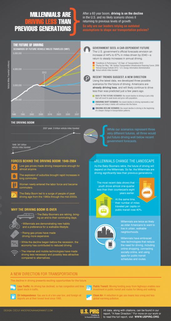
The report counters U.S. government forecasts, which have traditionally held that economic conditions and driving activity are directly related: as the economy improves, driving would be expected to increase. But U.S. PIRG found no correlation between the per capita decline in driving and how states fared economically in recent years. Here’s their summary infographic:

US PIRG new direction infographic
Source: U.S. PIRG

The study puts transportation policy—and the tens of billions of dollars associated with it—in a new light. Joanna Guy, program associate with the Maryland PIRG Foundation, framed the situation this way:

Given these trends, we need to press the reset button on our transportation policy. Just because past transportation investments overwhelmingly went to highway construction doesn’t mean that continues to be the right choice for [the] future.

End of the “driving boom”

During the nearly six-decade “driving boom” that began in 1946, Americans increased their driving nearly every year. Nationally, per capita vehicle-miles traveled (VMT) peaked in the year 2004 and began to decline prior to the recession, which suggests that something other than the economy is behind the drop-off in driving.

In an earlier report released this spring, U.S. PIRG identified a few factors that contributed to the end of the driving boom:

  • The baby boom generation is retiring, leading to far fewer commuting miles.
  • Millennials are driving significantly less than previous generations and prefer a more walkable, public transit-oriented lifestyle.
  • Rising gas prices have increased the cost of driving.
  • The depressed economy has reduced transportation demands for some sectors, even though the driving decline started prior to the recession.
  • New technologies, such as online shopping, have curbed the number of trips to stores, while smartphone apps for public transit schedules have made it easier to incorporate bus and rail trips into one’s lifestyle, particularly in dense urban areas.

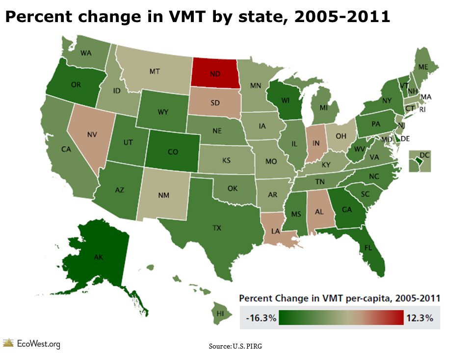
There are only four states (North Dakota, Nevada, Louisiana, and Alabama) where driving miles per capita in 2011 were above their 2004 or 2005 levels. Since 2005, several states—including Alaska, Delaware, Oregon, Georgia, Wyoming, and South Carolina—have actually seen double-digit percent reductions in per capita VMT.

Percent change in vehicle miles traveled (VMT) by state, 2005-2011

State-by-state driving differences

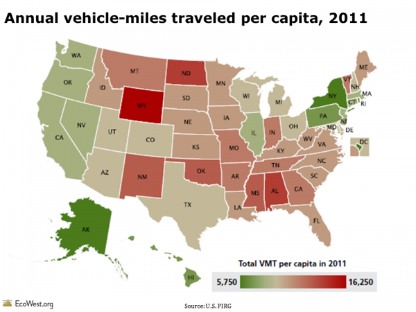
The average American drove roughly 9,500 miles in 2011, but there are big differences in driving patterns at the state level. For instance, the average Wyoming resident drives more than 16,000 miles annually, while District of Columbia residents drive less than 5,775 miles each year. Within the West, the average resident drives around 10,200 miles annually, with Washington State residents reporting the lowest annual figure at 8,300 miles.

Annual vehicle miles traveled per capita, 2011

According to the report, no single factor alone can explain the difference in per capita driving across states. The study examined multiple variables—population density, median household income, frequency of working from home—and found only a rough correlation between more urban populations and lower VMT.

Nationwide, urban residents drive about 9,930 miles per year, while rural residents drive an average of 14,850 miles. Wyoming has the second-lowest population density in the country, so you would expect it to fall on the upper end of the VMT range.

Driving decline: more than an economic aftershock

Although the recent recession has undoubtedly influenced the national per capita decline in driving, U.S. PIRG argues that the trend should not be perceived as a short-lived byproduct of the recession. It cites four reasons:

  • Per capita driving began declining before the recession, with VMT peaking in 2004.
  • Other metrics, such as the percentage of young people with a driver’s license and the number of vehicles per household, also started declining prior to the recession.
  • Per capita driving declined among both the employed and unemployed.
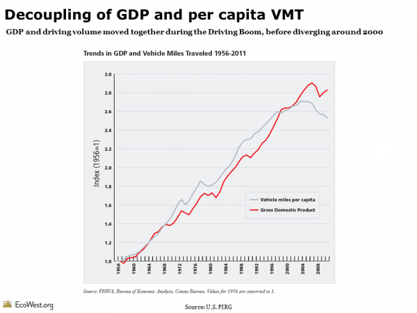
  • Per capita VMT and national GDP moved in tandem throughout the driving boom (1960s to early 2000s). At the beginning of the 21st century, the two indicators decoupled: GDP continued to increase, while driving fell or remained steady.

Decoupling of VMT and GDP

Reimagining future transportation policy

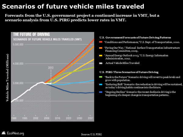
By default, U.S. transportation engineers typically estimate there will be a continually rising number of drivers on the road in the future. A range of government forecasts have all projected a steady increase in annual driving, with the expected increase by 2040 ranging from 44% to 67%.

U.S. PIRG, however, created its own scenarios for the future of driving, all of which predict lower VMT trendlines than government forecasts, as shown in the chart below.

Scenarios of future vehicle miles traveled

The U.S. PIRG report opens the conversation on why and how we might re-envision the country’s transportation policy. In light of tight budgets for transportation projects, there is fierce competition for every dollar. Funds diverted from a potentially superfluous highway expansion could be used to improve alternative transit options, such as bus routes and bike lanes.

Research suggests that investing in alternative forms of transportation is more than a feel-good policy: it can also boost economic development. A study by the University of Vermont Transportation Research Center found that housing prices in Baltimore tended to increase based on the proximity to bicycle lanes.

Data sources

You can download the full report and accompanying data for “Moving Off the Road: A State-by-State Analysis of the National Decline in Driving” from U.S. PIRG here.

The data is also accessible on this dashboard.

Downloads

EcoWest’s mission is to analyze, visualize, and share data on environmental trends in the North American West. Please subscribe to our RSS feed, opt-in for email updates, follow us on Twitter, or like us on Facebook.