Tag Archives: drought

2012 was hottest year on record for U.S.

No doubt about it: 2012 was toasty. Today, the National Oceanic and Atmospheric Administration reported that 2012 was not only the warmest on record for the lower 48 since 1895 but also the second worst on a measure known as the Climate Extremes Index, which includes factors such as temperature anomalies, drought patterns, and the strength of tropical storms (you can create your own visualizations of the index here).

I’ve put together some of the summary graphics from the report and related media coverage in this slide deck.

2012 was hottest year on record in U.S. from EcoWest on Vimeo.

It was definitely an abnormal weather year for the American West (when was the last year that felt “normal”!?). Wyoming, Utah, and New Mexico all had their hottest years on record, while 2012 ranked second warmest for Colorado and Nevada. The story for precipitation was more varied, with many inland states suffering a deep drought as Oregon and Washington experienced some of their wettest years since the late 19th century.
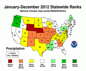
2012 precipitation state rankings
2012 statewide rankings for precipitation. Source: National Climatic Data Center

Nationwide, the extent of snow cover was the third smallest since 1966/1967. In the West, areas outside of the Northern Rockies and Pacific Northwest had a meager snowpack by April 1, 2012.
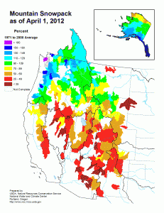
April 1 2012 snowpack
Snowpack on April 1, 2012. Source: National Climatic Data Center

It’ll be interesting to see if this stark summary of extreme weather in the United States gains any traction in the national conversation. This report is currently the top story on the websites of the New York Times and Washington Post.

For more on the effects of rising temperatures in the American West, check out our climate deck.

Downloads

EcoWest’s mission is to analyze, visualize, and share data on environmental trends in the North American West. Please subscribe to our RSS feed, opt-in for email updates, follow us on Twitter, or like us on Facebook.

2012 Graphics Highlights from The New York Times

The New York Times does some of the best data visualization in journalism and the paper has assembled highlights of its 2012 work. A few of these graphics relate to Western environmental issues and some are accompanied by descriptions of how they were created. Here are my favorites:


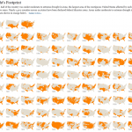
Drought footprint
Source: The New York Times

1) The drought’s footprint

Brilliant use of small multiples to show what fraction of the United States was experiencing moderate to extreme drought in a given year. When the piece was published in July, more than half the contiguous United States was classified this way, the highest level in nearly six decades.

The graphic stretches all the way back to 1896 and it really shows that 2012 was an exceptionally dry year. But as recently as 2010, very few areas were experiencing drought.

We cover drought in our water deck, and in a future post I’ll be sharing some visualizations that focus on drought the West.


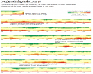
2) Drought and deluge

Source: The New York Times
Drought and deluge. Source: The New York Times

The Times used a different system for measuring drought to create another visualization. Rather than relying the U.S. Drought Monitor, as it did in the footprint maps, the paper uses the Palmer Drought Severity Index. The former uses the Palmer index as one of its inputs, but it’s also based on stream flows, crop moisture, precipitation patterns, and expert judgement. The Palmer index is strictly based on temperature and precipitation. It not only shows drought but also wet spells.

One cool thing about this graphic is that you can roll your mouse over the various levels of the Palmer index to see the driest and wettest periods. Once again, the current drought stands out as a deep one, but it’s certainly not unprecedented.

Another thing I noticed is that in 2011, large parts of the country were either very dry or very wet.


Obama budget
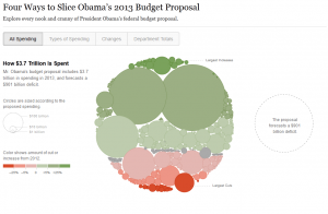
Slicing Obama’s budget. Source: The New York Times

3) Slicing Obama’s budget

This graphic puts the humble pie chart to shame and effectively shows how entitlements, defense, and debt costs dominate the federal budget. Click on the “Department Totals” tab to see how federal spending is divided up by agency. As you might imagine, environmental departments, such as EPA and Interior, are overshadowed by other agencies.

We cover federal (and other) spending in our politics deck and have a number of other graphics showing how environmental and natural resource programs are tiny in comparison with other federal spending priorities.


Democratic convention
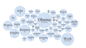
Words used at Democratic convention Source: The New York Times

4) Parsing the rhetoric at political conventions

The Times analyzed all of the speeches at the Republican and Democratic conventions to determine which words were most common and how the language of the two parties differed.

You can plug in your own words or phrases to see how often they were spoken. I’m being a bit parochial, but here are the number of hits I got for both parties: environment (3), conservation (0), climate change (1), global warming (0), pollution (1), water (4). And that’s per 25,000 words.


EcoWest’s mission is to analyze, visualize, and share data on environmental trends in the North American West. Please subscribe to our RSS feed, opt-in for email updates, follow us on Twitter, or like us on Facebook.