The United States boasts the greatest diversity of ecosystems of any country and it’s home to more than 200,000 species. But about one-third of U.S. plants and animals are considered at risk by biologists, and at least 500 U.S. species are already extinct or missing.
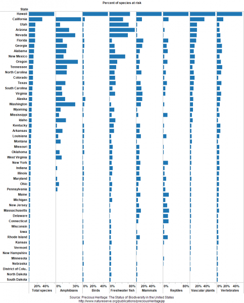
How do the 50 states compare in terms of number of species—and their imperilment? I’ve created some simple dashboards that illustrate the state-by-state tallies. These graphics, which you can sort, print, and customize, show the number of various types of species found in each state and the fraction of those species that are imperiled.
The data comes from Precious Heritage: The Status of Biodiversity in the United States, a great book produced by The Nature Conservancy and NatureServe in 2000. At-risk species have elevated risks of extinction, according to the system developed by the project, and therefore have the greatest conservation concern.
Here are some of the patterns I noticed in the dashboards:
- Despite their aridity, many Western states have tons of species. Arizona and New Mexico, neither of which have any coastal habitat, rank third and fourth in total number of species.
- Hawaii has by far the greatest percent of species at risk. The native biodiversity of this isolated archipelago has been devastated by the introduction of non-native species.
- States in the West, especially the Southwest, also have many imperiled species. California, Arizona, Utah, and Nevada round out the top 5 states.
- Freshwater fish are doing very poorly, especially in the West, where Arizona, Utah, Nevada, New Mexico, California, and Oregon all have at least 25 percent at risk.
- Outside of Hawaii, birds tend to be doing better than many other types of species.
Using the dashboard
A couple of notes about the dashboards:
- You can sort by state name or by any of the variables at the bottom.
- Because Hawaii is such an outlier, I can be helpful to examine the dashboard by excluding that state (just click on the name and the option will pop up).
- The toolbar at the bottom allows you to create an image or PDF, plus download the underlying data.
- This dashboard reports the percent of a state’s species at risk, not the actual number, but that data is also provided in Precious Heritage.
Learn more in our biodiversity deck
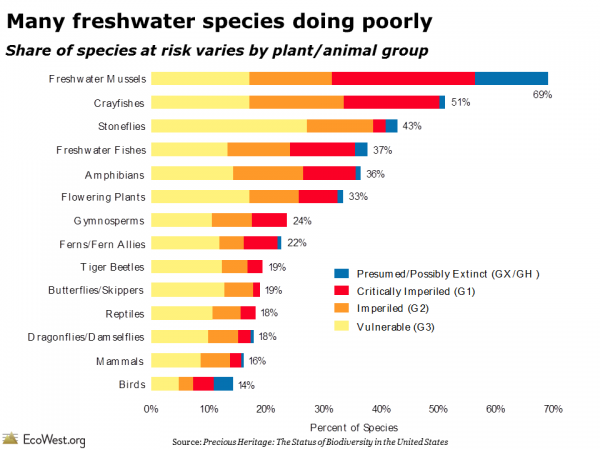
These dashboards focus on the state level, but in our biodiversity slide deck we offer a slew of maps and graphics summarizing the national picture. The one below shows that many freshwater species are in jeopardy, whereas some of the best known types of species, such as birds and mammals, are doing comparatively better.
Data sources
Anyone doing research on U.S biodiversity should definitely check out the Precious Heritage book. It contains a wealth of information on the status of U.S. species and many of the graphics in the book are available for free download on this page.
EcoWest’s mission is to analyze, visualize, and share data on environmental trends in the North American West. Please subscribe to our RSS feed, opt-in for email updates, follow us on Twitter, or like us on Facebook.


