All posts by Mitch Tobin

Mitch Tobin, the editor of ecowest.org, is owner of Sea to Snow Consulting and was previously communications director at California Environmental Associates. Prior to joining CEA, Mitch was a newspaper reporter at the Napa Valley Register, Tucson Citizen, and Arizona Daily Star, where he covered water, environmental, and border issues for five years. He was also a contributor to High Country News. Mitch's first book, Endangered (Fulcrum 2010), evaluates the effectiveness of the Endangered Species Act and received a gold medal in the 2011 Independent Publisher Book Awards.

Lay of the land: who owns the West?

The preponderance of public land is one of the American West’s defining features and it’s a primary reason why so much of the region has escaped the kind of intensive development that characterizes most areas back East.

In this set of slides, I examine the lay of the land in the West and explain how the mosaic of ownership has shaped the region’s evolution. Although the federal government is the biggest player in the region, the future of the West’s environment also hinges on state, tribal, and private land-management decisions.

Land ownership in the American West from EcoWest on Vimeo.

Federal government biggest land owner

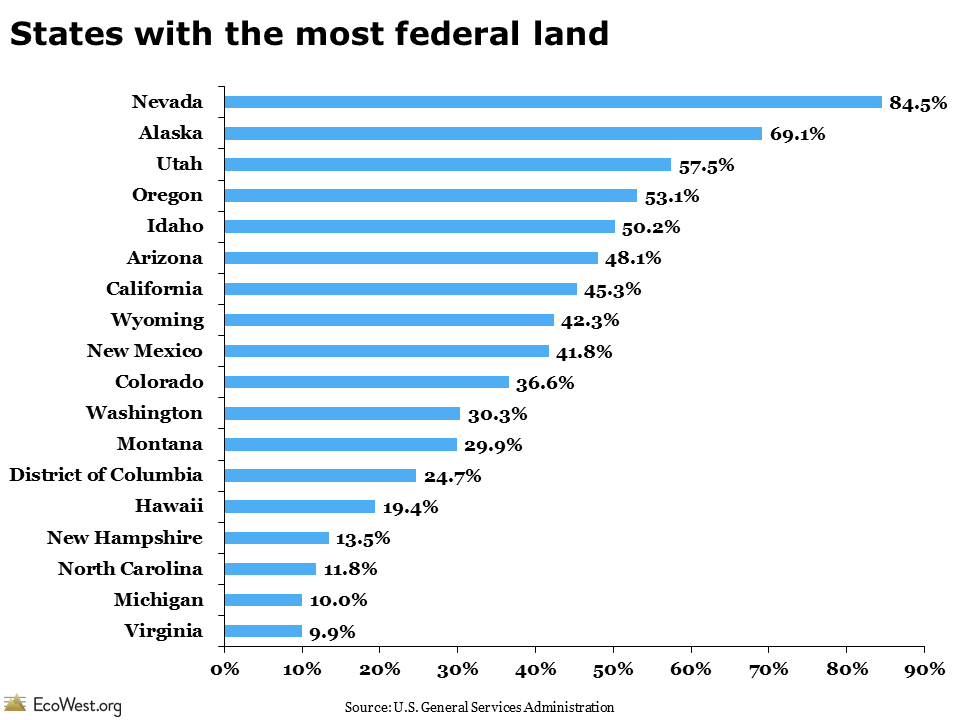
The U.S. government owns nearly half of the 11 Western states, but those federal acres are managed very differently by a host of agencies with varying mandates. Wilderness areas within national parks or wildlife refuges ban nearly all human development, while some Forest Service and Bureau of Land Management properties are more like industrial zones, with priority given to intensive logging, mining, drilling, grazing, and motorized recreation. The graphic below, based on a similar map in a 2008 Stanford magazine article, shows what share of each state is federal land.

Federal lands map

In some parts of the West, such as the Great Basin in Nevada, it seems like the federal government owns everything in sight. But these slides show that the level of federal influence varies dramatically across the region. At the low end, about 30 percent of Montana and Washington land is federally owned; at the top, Nevada is nearly 85 percent federal. There’s also considerable variability within individual states: the plains of eastern Colorado, for example, are nearly all private, while the Rocky Mountains in the center of the state are predominantly federal.

Federal lands bar chart

In an incredibly diverse region, it’s hard to envision a “typical” Western landscape, but there’s a general pattern in ownership. Pioneers tended to settle around streams and rivers, so many of the West’s vital watercourses are surrounded by private land (such lands often harbor the greatest biodiversity). Mountain ranges are often under the purview of the Forest Service, with wilderness areas sometimes found at the highest elevations (where biodiversity and biological productivity tends to be lowest). In the basins between these ranges, the Bureau of Land Management tends to dominate the drier, lower-elevation areas.

Tribal and state land also critical

There are other key players. Tribal land, which covers large portions of Arizona and New Mexico, is found in every Western state. Military training and weapons experiments take place on lands controlled by the departments of Defense and Energy. Some of these places, such as the fabled Area 51 in Southern Nevada, are top secret, but portions of others, such as the Barry M. Goldwater bombing range in Southwest Arizona, are open to recreational users who get a special permit.

Especially in the West, but also in some parts of the upper Midwest and Northeast, state governments control a fair amount of land. Out West, these acres were generally given to the states by the federal government when territories entered the union. Typically, states are supposed to raise money for their public schools by selling some of these lands to the highest bidder, so protections for these areas are far from permanent.

Land ownership map

Because there’s so much public property in the West, many landscapes are at least nominally protected by the government. But public ownership doesn’t equal immunity from human influence. As I discuss in another post, the vast network of roads and other infrastructure in the region has fragmented habitat and abetted the spread of non-native species. The multiple-use philosophy that governs much of the property overseen by the Forest Service and Bureau of Land Management means natural resources may be vulnerable to development and human activity.

What patterns in land ownership do you notice in these slides?

Downloads

Data sources

The maps of land ownership come from the Protected Area Database. This data from the Conservation Biology Institute is available for free download on DataBasin.

Other valuable sources of data on land ownership include the Bureau of Land Management’s Public Land Statistics report, the U.S. Department of Agriculture’s Economic Research Service, and the U.S. General Services Administration’s Federal Real Property Profile (the latest report is from 2004, but these figures haven’t changed much in recent years).

EcoWest’s mission is to analyze, visualize, and share data on environmental trends in the North American West. Please subscribe to our RSS feed, opt-in for email updates, follow us on Twitter, or like us on Facebook.

Go with the flow: Sankey diagrams illustrate energy economy

Energy flows through everything, so it’s only fitting to use flow charts to depict our complex energy economy.

Since the early 1970s, the Lawrence Livermore National Laboratory has been producing such graphics, not only for energy, but also for water and carbon dioxide. Technically known as Sankey diagrams, these data visualizations summarize flows through a system by varying the width of lines according to the magnitude of the commodity in question.

In this deck of slides, I offer up some of Sankey diagrams that illustrate energy trends in the United States and Western states. Looking at these visualizations over time shows that fossil fuels continue to dominate the nation’s energy mix, but renewable sources are making some headway. In the West, some inland states rely almost exclusively on coal to generate electricity, but other states use significant quantities of natural gas, wind, and nuclear power. Overall, petroleum in the transportation sector accounts for the greatest share of our energy flows.

History of diagram

Matthew Henry Phineas Riall Sankey
Matthew Henry Phineas Riall Sankey. Source: Wikipedia

Sankey diagrams are named after Matthew Henry Phineas Riall Sankey, an Irish Captain who used the graphic in a 1898 publication on steam engines. Since then, Sankey’s diagrams have won a dedicated following among data visualization nerds. There’s even an entire blog devoted to the graphic, which boasts in its tagline that “a Sankey diagram says more than 1,000 pie charts.” The blog has a good overview of software tools that create Sankey diagrams here.

One of the earliest and most famous examples of the form illustrates Napoleon’s disastrous Russian campaign in the early 19th century. Created by Charles Joseph Minard, a French civil engineer, the graphic (technically, a flow map) depicts the army’s movement across Europe and shows how their ranks were reduced from 422,000 troops in June 1812, when they invaded Russia, to just 10,000, when the remnants of the force staggered back into Poland after retreating through a brutal winter.

Data visualization guru Edward Tufte, whose undergraduate political science class helped get me interested in graphics and data analysis more than two decades ago, calls it “probably the best statistical graphic ever drawn.” Besides showing the declining troop totals, the graphic details the army’s location and direction over time, as well as the temperature.

Minard's flow map
Minard’s famous flow map. Source: Wikipedia

Significant shifts in energy flows

LLNL’s latest energy diagram, released in October 2012, depicts 2011 data and illustrates some major changes in the nation’s energy sector. As the lab noted in its press release, “Americans used less energy in 2011 than in the previous year due mainly to a shift to higher-efficiency energy technologies in the transportation and residential sectors.”

The largest increase in energy production was in the wind sector; hydropower also grew due to a wet winter in the West. Even so, the nation’s energy flows are still dominated by coal, natural gas, and petroleum. “Sustained low natural gas prices have prompted a shift from coal to gas in the electricity generating sector,” said A.J. Simon, an energy systems analyst at the lab. “Sustained high oil prices have likely driven the decline in oil use over the past 5 years as people choose to drive less and purchase automobiles that get more miles per gallon.”

LLNL energy Sankey

Energy use varies widely in West

Among Western states, the Sankey diagrams show some clear patterns. States like Wyoming, Colorado, New Mexico, Montana, and Utah rely heavily on coal for their electricity production, in some cases exporting that power to other states. Coal may be king for electricity generation in many states in the intermountain West, but it’s hydropower that dominates power portfolios in the Pacific Northwest: Washington, Oregon, and Idaho get the bulk of their electricity from dams. Other states have more diversified portfolios; Arizona, shown below, relies on a mix of coal (40%), nuclear (27%), natural gas (26%), and hydropower (6%). But not much solar for a pretty sunny state.

Arizona Sankey energy

In all of the energy diagrams, you’ll notice that a significant share of energy is “rejected.” A good example of rejected energy is waste heat from power plants. The greater the percentage of rejected energy, the less efficient the system. It’s worth noting that the state-level data is from 2008, three years older that the national data, and the U.S. energy economy has undergone some major shifts since then, including a shift from coal to natural gas and growing competitiveness of wind power.

Long-standing data source

The Lawrence Livermore National Laboratory has published flow charts of energy, water, and carbon dioxide since the early 1970s, sometimes going down to the level of individual states. Here’s how the lab describes the graphics and their creation:

Flow charts are valuable as single‐page references that contain quantitative data about resource, commodity and byproduct flows in a graphical form that also conveys structural information about the system that manages those flows. Recent advances in the automation of Sankey Diagram generation have made it possible to produce a consistent set of state‐level energy flowcharts. A computer program reads SEDS [State Energy Data System] data, performs a set of calculations and re‐sizes and re‐labels the flows in the figure. Human interaction is required only to reconcile instances where graphical elements overlap.

Other versions

The U.S. Department of Energy’s Office of Science offers similar diagrams, including one that embeds some interesting factoids and imagery. I’ve included them in the deck as well. Here’s how the agency summarizes its flow graphics:

Oil provided the largest share of the 98 quads of primary energy consumed, and most of it was used for transportation. Consumption of natural gas, the nation’s second largest energy source, is split three ways—electricity generation, industrial processing, and residential and commercial uses (mostly for heating). Coal, our third largest source, is used almost exclusively for electricity. Nuclear energy and renewables each meet less than 10% of U.S. energy demand.

The International Energy Agency has also produced a poster-sized Sankey diagram depicting world energy flows (there’s a PDF available, but the text is microscopic).

In a future post, I’ll take a closer look at Sankey diagrams that visualize water flows. In the meantime, I’d be curious to hear what others think about these graphical tools and any insights they reveal about the energy challenges we face.

Downloads

EcoWest’s mission is to analyze, visualize, and share data on environmental trends in the North American West. Please subscribe to our RSS feed, opt-in for email updates, follow us on Twitter, or like us on Facebook.

Tracking trends in recent wildfire activity

With drought gripping much of the West, 2013 could be another active wildfire season in the region. There’s already a fast-moving blaze in Southern California that is threatening hundreds of homes.

To track the severity of wildfires, I’ve created a dashboard on this page that summarizes recent trends, both nationally and in the West.

The screenshot below (click to enlarge) shows how the number of fires, acres burned, and average size of fires has changed since 1987. While the number of fires has remained relatively constant, the acreage burned and average size have been exhibiting an upward trend.

National overview since 1987

In our wildfire PowerPoint deck, we explain why Western wildfires are generally getting bigger and more destructive. Although fire is a natural part of many Western forests, woodlands, and grasslands, we’re now suffering from the legacy of misguided fire suppression in ecosystems where frequent, low-intensity blazes once consumed excess fuel. A 2006 paper in Science, which found that “large wildfire activity increased suddenly and markedly in the mid-1980s,” argued that warming temperatures and an earlier spring snowmelt were the biggest drivers.

If you examine the yearly statistics, however, you’ll see that wildfire activity varies greatly from season to season. A couple of enormous blazes can really skew the national totals, while in some years benign weather keeps a damper on wildfires. You can see that variability even more clearly by just looking at the Western states in this screen shot below (click to enlarge).

Western states fires

In Idaho, for example, very few acres burned in 2004, but 2007 was especially active. Some years, such as 2004 and 2010, were relatively tame across the entire West. In others, certain regions were especially hard hit, such as Arizona and New Mexico in 2011. But then at other times, such as 2012, nearly all states reported lots of acres burned.

The dashboard also allows you to examine wildfire activity by different regions. With all of the graphics, you can include/exclude variables, sort the data, and create downloadable images and PDFs.

I’ve used this same data to create some PowerPoint slides, which are available in this video below and through download links at the bottom of the post.

Tracking trends in wildfire activity from EcoWest on Vimeo.

In the coming weeks, I’ll be rolling out more slides and dashboards for monitoring the wildfire issue, including ignition sources, fuels treatment, and wildfire suppression.

Data sources

Compared to other issues, I’ve found that tracking wildfires is relatively straightforward. Almost all of the key data is managed by the National Interagency Fire Center in Boise, Idaho. During the fire season, NIFC provides detailed information on blazes in progress, but the center also compiles statistics and produces an annual report that summarizes the preceding year. Here’s the 2012 summary, for example.

Downloads

EcoWest’s mission is to analyze, visualize, and share data on environmental trends in the North American West. Please subscribe to our RSS feed, opt-in for email updates, follow us on Twitter, or like us on Facebook.