All posts by Mitch Tobin

Mitch Tobin, the editor of ecowest.org, is owner of Sea to Snow Consulting and was previously communications director at California Environmental Associates. Prior to joining CEA, Mitch was a newspaper reporter at the Napa Valley Register, Tucson Citizen, and Arizona Daily Star, where he covered water, environmental, and border issues for five years. He was also a contributor to High Country News. Mitch's first book, Endangered (Fulcrum 2010), evaluates the effectiveness of the Endangered Species Act and received a gold medal in the 2011 Independent Publisher Book Awards.

Our SXSW Eco presentation and the PowerPoint paradox

SXSW Eco logoI was in Austin last week, speaking at the annual SXSW Eco conference, so I wanted to share my presentation and a lesson or two I learned about PowerPoint.

The presenter’s job is becoming even more difficult in a harried era of micro attention spans. With audience members carrying multiple Internet-enabled devices at all times, there’s a lot of competing stimuli in the room. At the same time, all of this wonderful technology and gadgetry has made it easier than ever to create beautiful and informative slides, maps, graphics, and other data visualizations. It’s a PowerPoint paradox.

My talk provided an overview of the American West and two of its key environmental issues: the expanding human footprint and the questionable water supplies. You can download the PowerPoint at the bottom of the post, or watch a narrated video in this embed:

EcoWest SXSW Eco Presentation from EcoWest on Vimeo.

The SXSW Eco event is a green spin-off of the popular SXSW music, film, and interactive festivals. I felt a little lost at times because speakers were covering such a dizzying array of topics: tracking African elephants with cell phones, making American water use more sustainable, reforming Austin’s electric utility, promoting eco-friendly detergents. If there was a unifying theme, it seemed to be using technology and innovation to tackle environmental problems.

At the meeting, I had an epiphany about communications and PowerPoint. Many of the speakers were great, but I was surprised by how many audience members (including me) had their heads buried in their phones, laptops, and tablets during presentations. I suppose some people were live-tweeting or taking notes, but many appeared to be seeking novelty on social networks or working feverishly on something unrelated to the speaker. During the session breaks at the Austin Convention Center, many people’s idea of networking was logging onto the free Wi-Fi network and once again looking into a screen.

Comic Book Guy
Today’s audience is impatient, hyper-connected, and difficult to please. Source: Simpsons Wikia

My takeaway is that attention spans continue to shrink, especially among younger and tech-savvy audiences, so if you don’t have something super interesting to show or say, people will quickly tune you out and get back online.

The deck below contains 52 slides, which may seem like a lot for a 15-minute session, but I was able to get through them all. Do the math and it’s 17 seconds per slide. Now, I did grow up in New York, so no one has ever accused me of speaking with a drawl, but a good chunk of my presentation consists of photos that don’t need more than 15 seconds and animation “builds” in which I rapidly add new layers onto a map.

I’m no PowerPoint guru or master presenter, but nowadays if you want to use a screen in your talk, you almost have to show lots of slides in rapid succession to replicate surfing the web or scrolling a social media feed. If you put a slide up on your screen for more than a minute, many in the audience will get antsy and think about checking one of their own screens.

I’d love to hear readers’ thoughts and advice about presenting to today’s hyper-connected, multitasking audiences.

Downloads

EcoWest’s mission is to analyze, visualize, and share data on environmental trends in the North American West. Please subscribe to our RSS feed, opt-in for email updates, follow us on Twitter, or like us on Facebook.

Drop on the planet: 3 visualizations of Earth’s most precious natural resource

Scarcity of freshwater is a defining feature of the American West, and planet Earth.

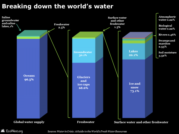
Nearly 97% of the world’s H2O is in the oceans. More than two-thirds of the globe’s freshwater is frozen in glaciers and polar ice caps.

Below are a trio of graphics to visualize water on Earth. I’ve found these slides useful for providing context in water-related presentations.

1) The world’s water: drop on a planet

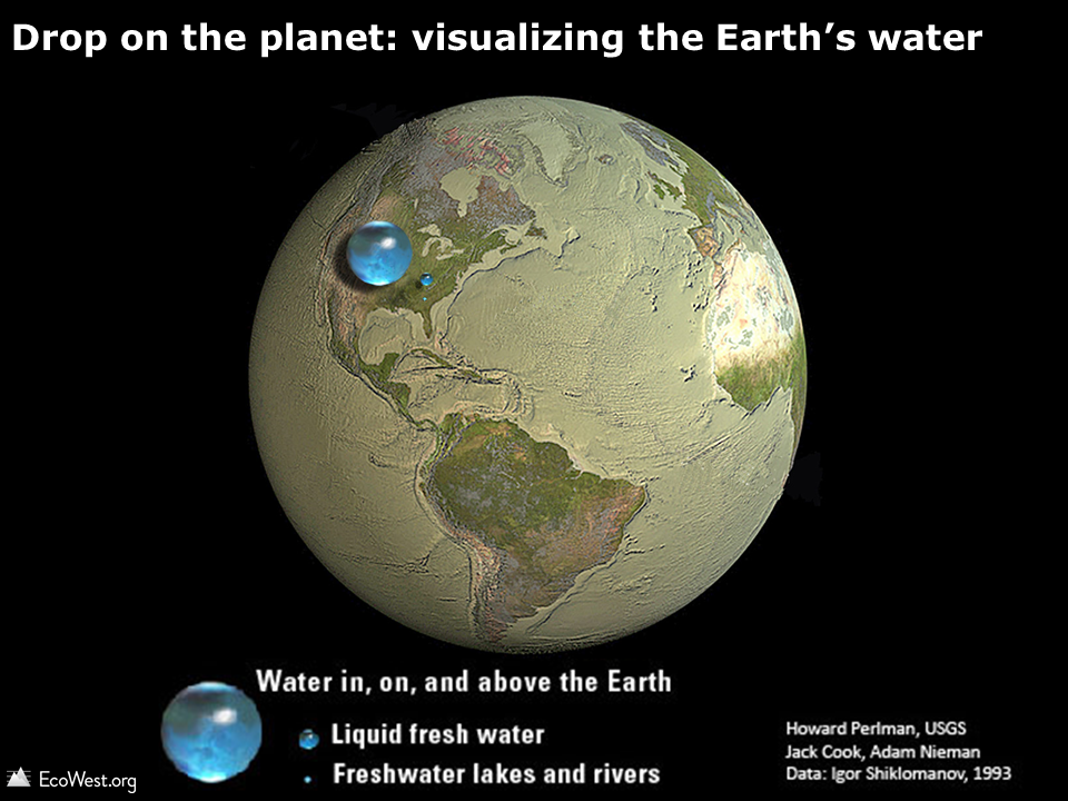
About 70% of the planet’s surface area is covered by water, but the amount is tiny when compared to the Earth’s total volume. The illustration below shows that if you collected all of the planet’s water into a single sphere, it would be 860 miles across. Situated to the right is a 170-mile-wide ball over Kentucky that represents all the fresh liquid water found in the ground, lakes, swamps, and rivers. That miniscule 35-mile-wide dot over Georgia is all the freshwater in lakes and rivers.

Water on Earth graphic
Source: U.S. Geological Survey

2) The water cycle: a closed loop

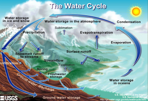
The diagram below illustrates the water cycle and a critical point: water on Earth is essentially a finite resource and the system is basically a closed one. If you want to be a stickler, it’s not a 100% closed system since there’s a bit of entry and leakage via comets depositing ice and water vapor escaping to space. This graphic also doesn’t show volcanoes emitting steam or water lost to faults on the ocean bed. But the basic point remains: we can reuse water, convert the sea into a potable supply, even try to coax the sky into precipitating with cloud seeding, but we can’t manufacture new water.

U.S. Geological Survey water cycle
Source: U.S. Geological Survey

3) Breaking down the types of water

The graphic below shows that freshwater comprises just 2.5% of the Earth’s total water supply and 69% of that freshwater is locked up in glaciers and icecaps (at least for now). Most of the remaining freshwater is found below our feet as groundwater. Sometimes this subterranean supply is relatively easy to access, but in other locations it may be too deep or costly to extract. Fresh surface water is a rare commodity on this planet. Rivers, for example, account for just 0.006% of all freshwater and 0.0002% of all water found on Earth.
Distribution of water on Earth

We have more slides covering water issues, including supply, demand, quality, infrastructure, and climate change, in our water PowerPoint presentation.

Downloads

EcoWest’s mission is to analyze, visualize, and share data on environmental trends in the North American West. Please subscribe to our RSS feed, opt-in for email updates, follow us on Twitter, or like us on Facebook.

Up in smoke: federal wildfire suppression costs are rising

Federal spending to fight wildfires is trending higher. Not only is the overall, inflation-adjusted cost increasing, but the federal cost per wildfire and per acre burned are also on the upswing.

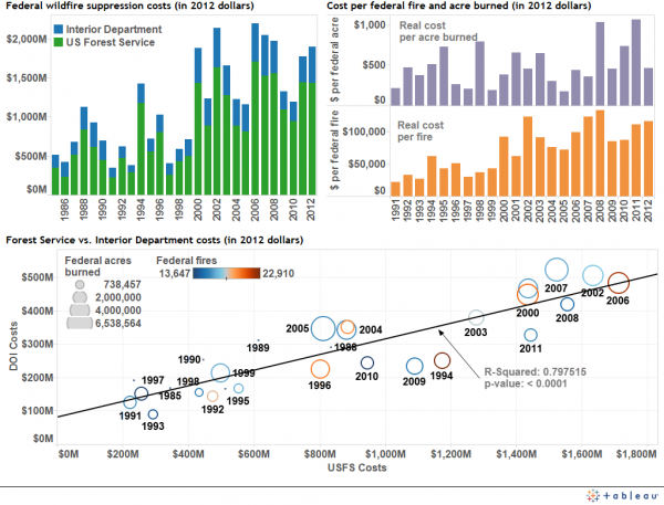
Before the federal shutdown turned government websites into virtual ghost towns, I was snooping around the National Interagency Fire Center’s site, and I came across some new data on suppression spending (specifically this table). Below is a screenshot of a dashboard that I built to visualize the data (click to enlarge).

Wildfire suppression costsSome thoughts about the three graphics in this dashboard:

1) Overall costs increasing, but not steadily

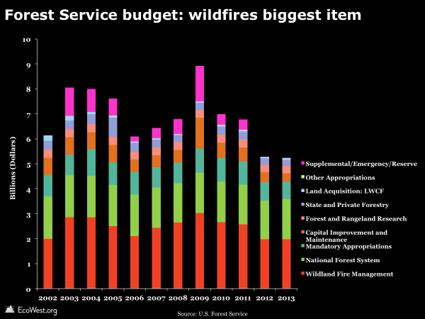
In recent years, the annual tab for U.S. taxpayers has sometimes exceeded $2 billion (in 2012 dollars). But as we’ve discussed in previous posts, wildfire activity can vary dramatically from year to year, largely due to weather conditions, so the costs also jump around. The U.S. Forest Service accounts for the bulk of spending. As shown in the graphic below from our politics deck, wildfires make up the biggest chunk of the agency’s budget. Bad fire years often require emergency or supplemental spending, shown at the top in pink.

Forest Service budget

2) Why are costs per fire and acre increasing?

The acreage burned by wildfires is trending higher, so it’s not surprising that the overall total for suppression is also rising. But I was intrigued to discover that the amount of money spent per fire and per acre burned is also increasing. To calculate these measures, I took the total spending and divided by the number of fires and acres classified as “federal.” Now, I’m sure that some federal suppression funds have helped fight wildfires on non-federal lands, and I’m certain that the budgets of state and local fire agencies have sometimes helped battle fires on federal property. So this simple calculation may have issues, but it seems like a metric worth watching.

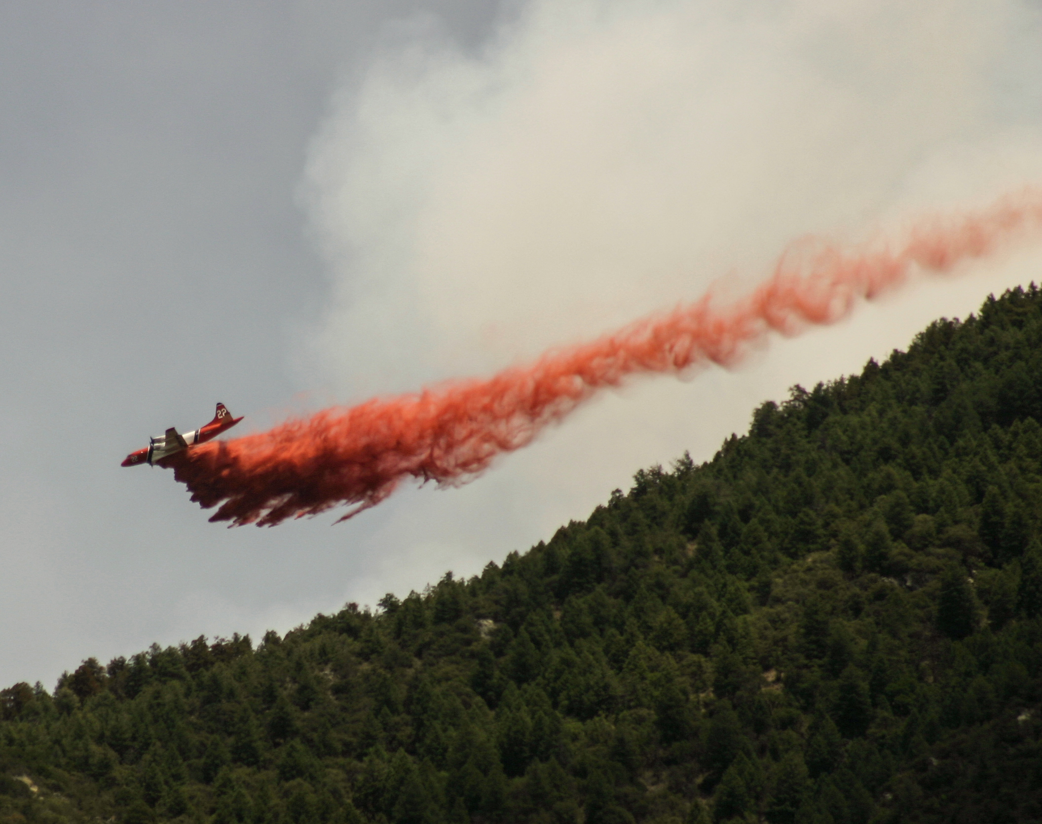
It’s not clear why these figures are rising. Is it a sign of mounting government inefficiency? Are increasingly intense wildfires more difficult to control? Are fire managers using more expensive resources, such as air power? For more on the last question, see this Los Angeles Times story, part of a great 2008 series on wildfires by Bettina Boxall and Julie Cart, who won the Pulitzer Prize for their work. Aviation accounts for about one-fifth of the Forest Service’s suppression budget, according to the story, but as the headline says, “Air tanker drops in wildfires are often just for show.”

An air tanker drops retardant in Arizona's Coronado National Forest. Photo by Mitch Tobin.
An air tanker drops retardant in Arizona’s Coronado National Forest. Photo by Mitch Tobin.

3) Forest Service and Interior suppression costs move together

The scatterplot in the dashboard shows that wildfire spending by the Forest Service tends to track spending by agencies in the Interior Department, such as the National Park Service, Bureau of Land Management, and U.S. Fish and Wildlife Service. Not a big surprise, but these various agencies do manage different landscapes, with the Forest Service lands often found in higher elevation areas than rangeland overseen by the BLM, so you would expect some variability between them. The severity of the wildfire season isn’t the only determinant of suppression budgets. The overall fiscal climate presumably influences the budgets for these agencies in a similar way.

Data sources

The National Interagency Fire Center  is the data source for the suppression dashboard. The table also lists the total number of wildfires and acres burned, not just incidents on federal lands. Data on wildfires burned by landowner and agency are available for download our main wildfire page. We also track suppression metrics, such as days at various preparedness levels and deployment of firefighting assets, on this dashboard, which is described in this post.

Downloads

EcoWest’s mission is to analyze, visualize, and share data on environmental trends in the North American West. Please subscribe to our RSS feed, opt-in for email updates, follow us on Twitter, or like us on Facebook.