All posts by Mitch Tobin

Mitch Tobin, the editor of ecowest.org, is owner of Sea to Snow Consulting and was previously communications director at California Environmental Associates. Prior to joining CEA, Mitch was a newspaper reporter at the Napa Valley Register, Tucson Citizen, and Arizona Daily Star, where he covered water, environmental, and border issues for five years. He was also a contributor to High Country News. Mitch's first book, Endangered (Fulcrum 2010), evaluates the effectiveness of the Endangered Species Act and received a gold medal in the 2011 Independent Publisher Book Awards.

Mapping the green on the blue planet

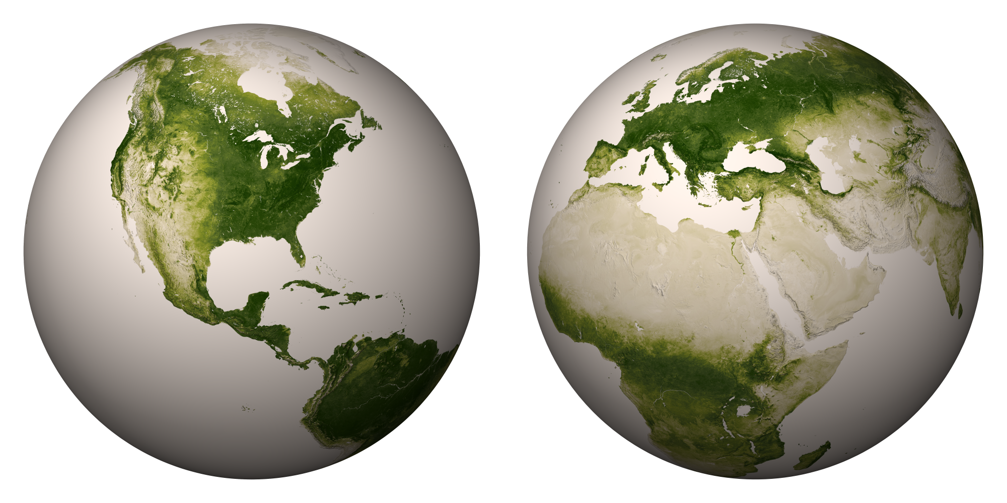
Scientists have released new high-resolution maps that illustrate the lushness of vegetation, or lack thereof, around the globe.

Researchers at NASA and the National Oceanic and Atmospheric Administration (NOAA) used satellite data from April 2012 to April 2013 to create maps like the ones below (click to enlarge).
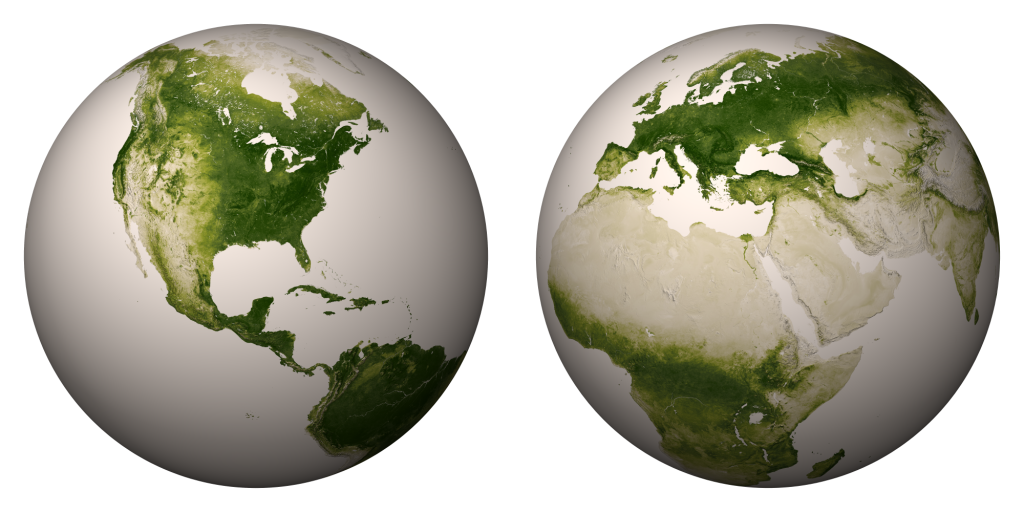
NASA vegetation globes
Source: NASA

“The darkest green areas are the lushest in vegetation, while the pale colors are sparse in vegetation cover either due to snow, drought, rock, or urban areas,” NASA/NOAA says.

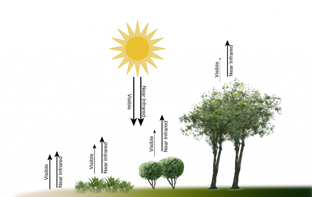
Satellites are able to gauge the lushness of vegetation because sunlight reflect off plants differently than cities, barren peaks, and other non-vegetated areas. “Plants absorb visible light to undergo photosynthesis, so when vegetation is lush, nearly all of the visible light is absorbed by the photosynthetic leaves, and much more near-infrared light is reflected back into space,” NASA/NOAA says. “However for deserts and regions with sparse vegetation, the amount of reflected visible and near-infrared light are both relatively high.” Here’s a diagram illustrating the concept:

Vegetation-index-diagram

Zooming into West

Compared to the rest of North America, the American West stands out for the relative lack of vegetation in many interior areas. Although the Pacific Northwest and taller mountain ranges show up as deep green, the Southwest looks pretty tan. Check out the rain shadow to the east of the Sierra Nevada Range, as well as the verdant ranges in the Great Basin, in this closeup:
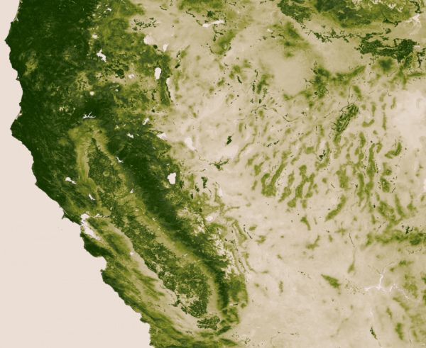
NASA vegetation California
Source: NASA

Below I’ve zoomed into the Southwest, where you can clearly see the irrigation along the Colorado River. I’ve also marked some notable islands of green, such as the Kaibab Plateau and the elevated archipelago of “sky island” mountain ranges in Southeast Arizona.
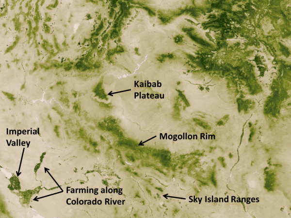
NASA vegetation Southwest
Source: NASA

Downloading map

NASA/NOAA create a new greenness image every week. With a resolution of 500 meters (each pixel depicts about 62 acres), the weekly maps weigh in at 13 gigabytes each. You can download a 30,000 pixel by 15,000 pixel image (176 megabytes) and that’s what I’ve used to create the close-ups above.

Below is a video tour that shows how the vegetation changed during one year, both due to the changing seasons and human activities. The footprint of cities in Europe and Asia is striking.

EcoWest’s mission is to analyze, visualize, and share data on environmental trends in the North American West. Please subscribe to our RSS feed, opt-in for email updates, follow us on Twitter, or like us on Facebook.

Mapping the Wildland-Urban Interface

The fire-prone wildland-urban interface (WUI) is in the news after more than 500 homes burned in the 14,280-acre Black Forest Fire near Colorado Springs. The most destructive wildfire in state history (in terms of homes lost) has once again highlighted the dangers of living amid flammable forests and woodlands.

I’ve pulled together maps of the WUI (“WOO-ee” is how fire folks pronounce it) on this page and in PowerPoint slide decks that you can download at the bottom of this post.

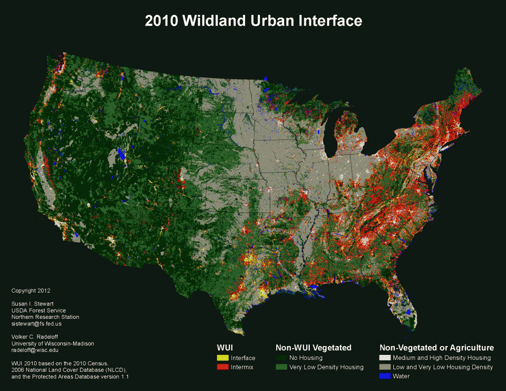
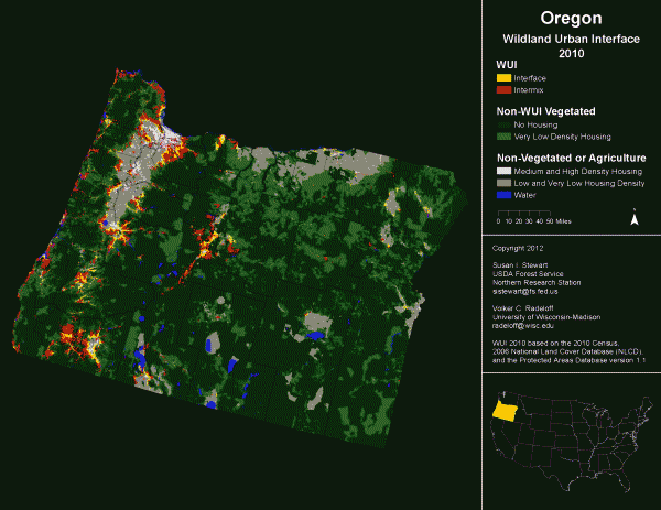
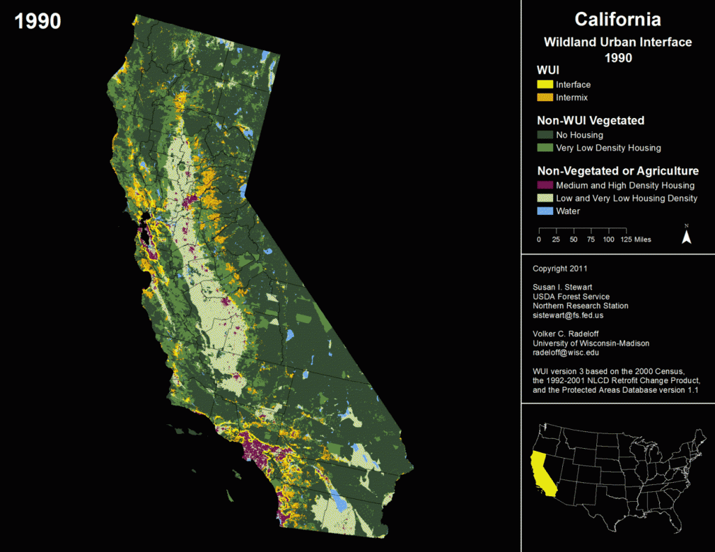
The maps come from the University of Wisconsin’s SILVIS laboratory. Below are some examples. If you click on the images, you’ll be able to see much more detail in a larger version and start the 1990-to-2000 animation for California.

United_States_wui_2010
Oregon_wui_2010
California WUI animation 1990 to 2000

Intermix versus interface

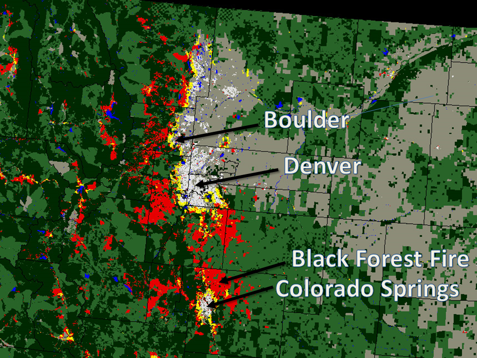
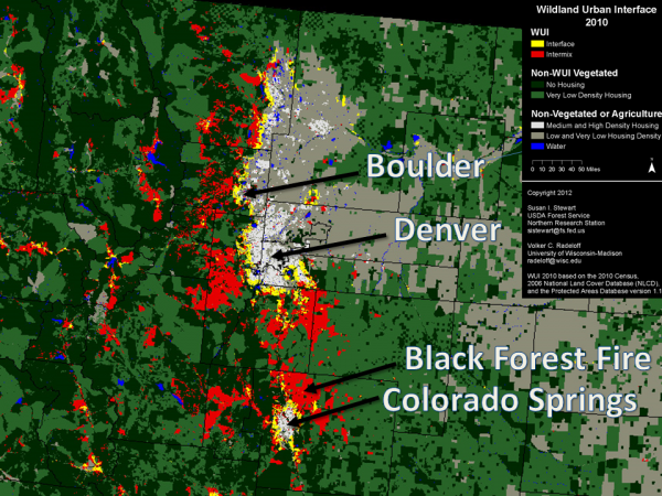
These maps distinguish between the wildland-urban interface (yellow in 2010 maps) and intermix (red) areas. “Intermix WUI are areas where housing and vegetation intermingle; interface WUI are areas with housing in the vicinity of contiguous wildland vegetation,” according to the lab.

I was surprised by the prevalence of the WUI back East. Eastern areas record a large number human-caused fires and some can get pretty large (see our fire trends dashboard and post for more on this), but it seems like wildfires burning down homes is always portrayed as a Western issue. These maps do not account for the varying fire potential around the country–they’re more about where homes and potential fuels mix.

In the West, the WUI is found pretty much where you’d expect. In many of the region’s cities and denser suburbs, there simply isn’t enough vegetation to burn. Conversely, you won’t find the WUI in the middle of a wilderness where homes aren’t allowed. It tends to be on the outskirts of metro areas, where homes mix with the vegetation, right up to the front porch in some cases, or in more rural places where homes are surrounded by public lands and continuous blocks of fuel.

As an example, I’ve created this close-up of the Colorado Front Range and labelled it with some major cities, as well as the Black Forest Fire, in the WUI northeast of Colorado Springs.

Colorado Front Range WUI

These WUI maps seem like a pretty good proxy for the risk of wildfires destroying homes and property in the United States, at least in the West. The yellow/red color scheme may imply that the dangers are greater in the intermix than the interface, but in a 2005 paper, the researchers write that the categorization “does not explicitly account for differences in fire risk.”

With billions of dollars of real estate at stake, private firms like CoreLogic do even more detailed analysis of the hazards. In a future post, I’ll share some data on the number of homes at risk in each state.

Data sources

The SILVIS lab provides many more images and the underlying GIS data on this page.

This data was the basis for a 2005 paper in Ecological Applications (PDF here).

Downloads

EcoWest’s mission is to analyze, visualize, and share data on environmental trends in the North American West. Please subscribe to our RSS feed, opt-in for email updates, follow us on Twitter, or like us on Facebook.
A century of wildland firefighter deaths

[6/30/2013 UPDATE: see this post for more details on how the deaths of 19 firefighters in the Yarnell Hill Fire rank historically]

I’m sorry to say that some wildland firefighters are likely to die in the coming months. Over the past decade, an average of 18 people have been killed each year while trying to suppress U.S. wildfires.

I’ve created a dashboard to track fatalities among U.S. wildland firefighters and put together a short presentation that you can download at the bottom of this post along with the data.

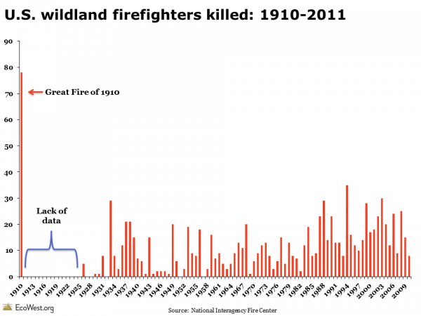
As we discuss in our fire slide deck, the Western wildfire season is getting longer and fires are burning more intensely in many places, so I was curious whether there had been an uptick in the number of firefighter fatalities. There is, in fact, a slight upward trend in deaths, but that may be due to an increasing number of firefighters deployed, rather than the job becoming riskier.

More than 1,000 killed

Wildland firefighting remains a dangerous business, with at least 1,030 people killed in the line of duty since the Great Fire of 1910 in the Northern Rockies. The government reports no deaths for the subsequent 15 years, which I’m assuming is due to a lack of data, and the most recent data available is from 2011.

Wildland firefighter deaths: 1910-2011

Cause of death

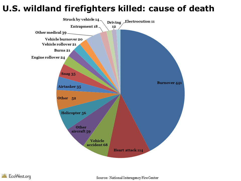
The most common way that wildland firefighters die is when they are overrun by flames. Such burnovers account for 42% of all deaths in the database, as shown in the pie chart below.

U.S. wildland firefighters killed: cause of death

The next leading cause is heart attack. Fighting fires by hand is grueling physical work and it’s not unusual to see wildland firefighters in their 40s or 50s. When not fighting fires, many work for land management agencies, such as the Forest Service, Park Service, and Bureau of Land Management.

The other trend that jumps out of this morbid data is the perils of driving and flying around wildfires. There were 288 fatalities related to airplanes, helicopters, and vehicles, or about 28% of the total.

Most deaths in West

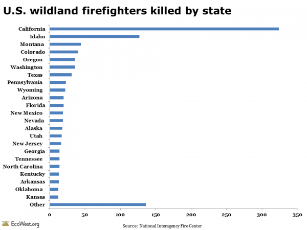
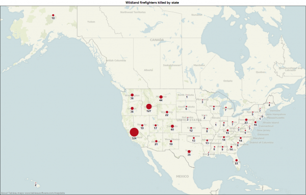
Wildland firefighters have died in every state except Massachusetts. Eight of the top 10 states for wildland firefighter fatalities are in the West, with California leading the way by far.

U.S. wildland firefighters killed by state

The map below, from our dashboard, shows the geographic distribution of fatalities.

Wildland firefighter fatalities by state

Inherently dangerous work

I’ve been fascinated with wildland firefighting ever since I was certified, or “red-carded,” in 2002 by the Coronado National Forest, while I was reporting for the Arizona Daily Star (read more about my experiences embedding with crews in this piece for Powell’s Books).

Going through the training and spending a lot of time covering wildfires in the Southwest from 2002 to 2005 gave me the sense that safety is taken very seriously by fire managers and firefighters. But it was also easy to see how inherently dangerous the work is, especially once you add aircraft and fire engines to a dynamic environment that is often smoky, dark, and unfamiliar to the exhausted firefighters struggling to protect life and property.

Data sources

The National Interagency Fire Center maintains data on wildland firefighter fatalities on this page.

Downloads

EcoWest’s mission is to analyze, visualize, and share data on environmental trends in the North American West. Please subscribe to our RSS feed, opt-in for email updates, follow us on Twitter, or like us on Facebook.