Category Archives: Elections

Tracking conservation ballot measures

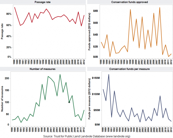
Open space bonds and other ballot measures are a critical source of environmental funding in the United States. Since 1988, American voters have approved 1,810 ballot measures that have generated more than $58 billion for conservation.

These measures usually pass, even though they typically involve increasing taxes and government spending.

To track the success of conservation ballot measures, I’ve created a dashboard on this page based on the Trust for Public Land’s LandVote database. Click on the screenshot below to enlarge.

Ballot measure dashboard

I used the same data to create a couple of slides, which are available for download at the bottom of this post and in this video below.

Conservation measures generally do well at the polls, in part because backers tend to avoid placing them on ballots when the chances of passage are low, such as during a recession. On average, three-quarters are approved, but the number of measures tends to be lower in off-year elections.

In recent years, with the economy in the doldrums, fewer measures have been placed on ballots. Funding peaked in 2008, when some $8 billion was approved.

It’ll be interesting to see whether the number of measures put to voters increases in the years ahead if the economy continues to recover.

Downloads

Data sources

The Trust for Public Land makes this data available through its LandVote database. Data from 1996 onward is most comprehensive. “Measures for the years prior to 1996 have been researched to the extent possible,” the website says, “based on historical research collected from newspaper archives and state and local elections officials.”

EcoWest’s mission is to analyze, visualize, and share data on environmental trends in the North American West. Please subscribe to our RSS feed, opt-in for email updates, follow us on Twitter, or like us on Facebook.

2012 Graphics Highlights from The New York Times

The New York Times does some of the best data visualization in journalism and the paper has assembled highlights of its 2012 work. A few of these graphics relate to Western environmental issues and some are accompanied by descriptions of how they were created. Here are my favorites:


Drought footprint
Source: The New York Times

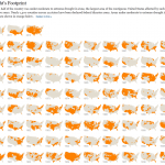
1) The drought’s footprint

Brilliant use of small multiples to show what fraction of the United States was experiencing moderate to extreme drought in a given year. When the piece was published in July, more than half the contiguous United States was classified this way, the highest level in nearly six decades.

The graphic stretches all the way back to 1896 and it really shows that 2012 was an exceptionally dry year. But as recently as 2010, very few areas were experiencing drought.

We cover drought in our water deck, and in a future post I’ll be sharing some visualizations that focus on drought the West.


2) Drought and deluge

Source: The New York Times
Drought and deluge. Source: The New York Times

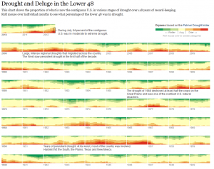
The Times used a different system for measuring drought to create another visualization. Rather than relying the U.S. Drought Monitor, as it did in the footprint maps, the paper uses the Palmer Drought Severity Index. The former uses the Palmer index as one of its inputs, but it’s also based on stream flows, crop moisture, precipitation patterns, and expert judgement. The Palmer index is strictly based on temperature and precipitation. It not only shows drought but also wet spells.

One cool thing about this graphic is that you can roll your mouse over the various levels of the Palmer index to see the driest and wettest periods. Once again, the current drought stands out as a deep one, but it’s certainly not unprecedented.

Another thing I noticed is that in 2011, large parts of the country were either very dry or very wet.


Obama budget
Slicing Obama’s budget. Source: The New York Times

3) Slicing Obama’s budget

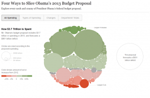
This graphic puts the humble pie chart to shame and effectively shows how entitlements, defense, and debt costs dominate the federal budget. Click on the “Department Totals” tab to see how federal spending is divided up by agency. As you might imagine, environmental departments, such as EPA and Interior, are overshadowed by other agencies.

We cover federal (and other) spending in our politics deck and have a number of other graphics showing how environmental and natural resource programs are tiny in comparison with other federal spending priorities.


Democratic convention
Words used at Democratic convention Source: The New York Times

4) Parsing the rhetoric at political conventions

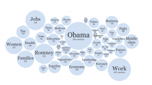
The Times analyzed all of the speeches at the Republican and Democratic conventions to determine which words were most common and how the language of the two parties differed.

You can plug in your own words or phrases to see how often they were spoken. I’m being a bit parochial, but here are the number of hits I got for both parties: environment (3), conservation (0), climate change (1), global warming (0), pollution (1), water (4). And that’s per 25,000 words.


EcoWest’s mission is to analyze, visualize, and share data on environmental trends in the North American West. Please subscribe to our RSS feed, opt-in for email updates, follow us on Twitter, or like us on Facebook.