Category Archives: Wildfires

2013 wildfire season way below average

Wildfires were thrust into the national spotlight twice this year, first when 19 firefighters died in Arizona on June 30, and again in August, when the 257,314-acre Rim Fire burned in and around Yosemite National Park.

But if you look at the federal government’s statistics, 2013 is on track to be one of the quietest wildfire seasons in years. In the West and on Forest Service land, the season was closer to normal, but in the South and East, 2013 was a very quiet year for wildfires.

Year-to-date numbers

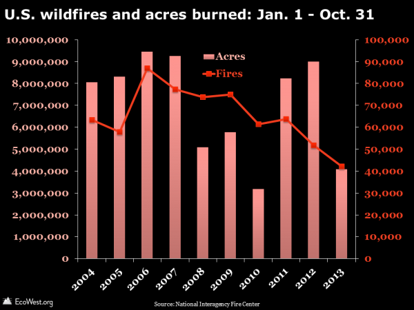
By the end of October, 40,775 fires had burned 4.1 million acres nationwide, which was only 63% of the 10-year average for the number fires, and just 59% of the 10-year average for acres burned (click on graphics to enlarge).

U.S. wildfires and acres burned: Jan. 1 - Oct. 31

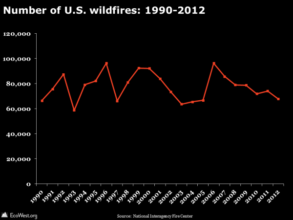
Some wildfires will break out between now and December 31, but the numbers aren’t going to jump as we head into winter. The time series below, for the full 12 months, shows that the lowest number of fires since 1990 was 58,810 in 1993, so unless there are more than 18,000 fires in November and December, 2013 is going to beat that record.

Number of U.S. wildfires: 1990-2012

Regional breakdown

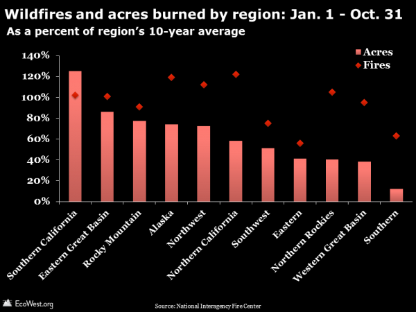
The graphics above illustrate national data. If you break it down by region, the number of acres burned has been below the 10-year average in every region except Southern California (which encompasses the Rim Fire).

The chart below shows the Southern region is at just 63% of average for fires and 12% for acres, while the number of fires in the Eastern region is 56% of average and the number acres burned is 41% of average. Very wet conditions in the South and East in 2013 were responsible for the diminished fire activity and this played a big part in suppressing the national totals (a map of the regions is here).

Wildfires and acres burned by region: Jan. 1 - Oct. 31

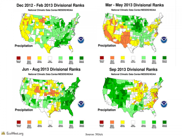
Going into the 2013 wildfire season, it looked like the West might be in store for a bad year. The preceding winter and spring were relatively dry, but some late spring storms and a strong summer monsoon in the Southwest reduced the danger. September was the wettest on record for many places in Colorado, Oregon, and Washington, as shown below.

NOAA monthly precip

Fire activity by landowner

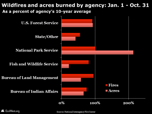
Another way to look at fire activity is by landowner. The National Park Service, which saw a chunk of Yosemite National Park burned by the massive Rim Fire, stands out in 2013. But other agencies had fewer fires and acres burned than average. On November 1, the Forest Service was at 92% of average for fires and 93% of average for acres burned. Much of the land in Southern and Eastern regions is private and you can see that reflected in the sub-average total for the “state/other” category, which includes private property.

Wildfires and acres burned by agency: Jan. 1 - Oct. 31

Historic, below-average season

The 2013 season raised the profile of the wildfire issue like few other in recent memory, but if it weren’t for the Yarnell Hill disaster and the Rim Fire, I think we would have seen a fraction of the media coverage.

As I noted in a previous post, national-level wildfire statistics, while interesting and easy to grasp, can obscure more interesting stories happening at the local and regional level. Wildfire manifests in manifold ways in the United States. A lightning-sparked blaze in the Alaskan tundra can scorch a half-million acres of wilderness and claim not a single structure. An arson fire in the suburbs can burn a couple thousand acres and cause $1 billion in property damage.

What seems odd is that even in a slightly below-average year, the Forest Service has once again run out of money for wildfire suppression. Consider these excerpts from an October 30 E&E story with the headline “‘It’s just nuts’ as wildfires drain budget yet again.”

Lightning bolts rained across the West in August, sparking hundreds of wildfires in California, Oregon, Idaho and Montana and pushing the cash-strapped Forest Service to the brink. The service had at that point spent $967 million battling wildfires that had torched more than 3.4 million acres in 2013. Its emergency fund exhausted, it had about $50 million left — enough for about half a week … The Forest Service this year siphoned $505 million from budgets for research, capital improvement and reforestation accounts, among other programs, according to a memo obtained by Greenwire.

In a previous post, we showed that federal wildfire suppression costs are soaring, not only in the aggregate but also per acre and per fire. It’ll be interesting to see if the costs continue the upward march in 2013, even though this season has been relatively tame.

Data sources

The National Interagency Fire Center just published this summary of the 2013 wildfire season to date. NIFC provides data for the January 1 – October 31 time frame going back 10 years. It’s worth noting that if “average” were defined as the past 20 years or some other period, 2013 would rank differently.

Downloads

EcoWest’s mission is to analyze, visualize, and share data on environmental trends in the North American West. Please subscribe to our RSS feed, opt-in for email updates, follow us on Twitter, or like us on Facebook.
Up in smoke: federal wildfire suppression costs are rising

Federal spending to fight wildfires is trending higher. Not only is the overall, inflation-adjusted cost increasing, but the federal cost per wildfire and per acre burned are also on the upswing.

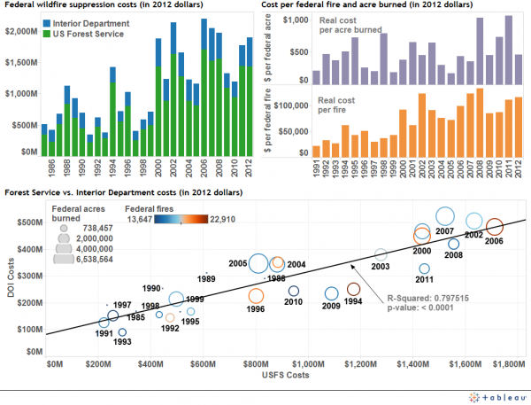
Before the federal shutdown turned government websites into virtual ghost towns, I was snooping around the National Interagency Fire Center’s site, and I came across some new data on suppression spending (specifically this table). Below is a screenshot of a dashboard that I built to visualize the data (click to enlarge).

Wildfire suppression costsSome thoughts about the three graphics in this dashboard:

1) Overall costs increasing, but not steadily

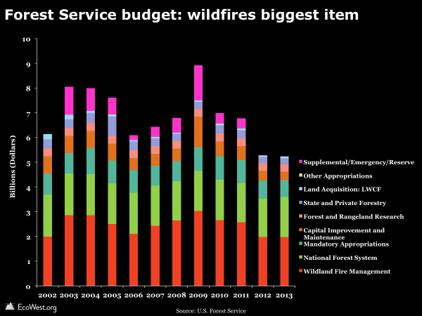
In recent years, the annual tab for U.S. taxpayers has sometimes exceeded $2 billion (in 2012 dollars). But as we’ve discussed in previous posts, wildfire activity can vary dramatically from year to year, largely due to weather conditions, so the costs also jump around. The U.S. Forest Service accounts for the bulk of spending. As shown in the graphic below from our politics deck, wildfires make up the biggest chunk of the agency’s budget. Bad fire years often require emergency or supplemental spending, shown at the top in pink.

Forest Service budget

2) Why are costs per fire and acre increasing?

The acreage burned by wildfires is trending higher, so it’s not surprising that the overall total for suppression is also rising. But I was intrigued to discover that the amount of money spent per fire and per acre burned is also increasing. To calculate these measures, I took the total spending and divided by the number of fires and acres classified as “federal.” Now, I’m sure that some federal suppression funds have helped fight wildfires on non-federal lands, and I’m certain that the budgets of state and local fire agencies have sometimes helped battle fires on federal property. So this simple calculation may have issues, but it seems like a metric worth watching.

It’s not clear why these figures are rising. Is it a sign of mounting government inefficiency? Are increasingly intense wildfires more difficult to control? Are fire managers using more expensive resources, such as air power? For more on the last question, see this Los Angeles Times story, part of a great 2008 series on wildfires by Bettina Boxall and Julie Cart, who won the Pulitzer Prize for their work. Aviation accounts for about one-fifth of the Forest Service’s suppression budget, according to the story, but as the headline says, “Air tanker drops in wildfires are often just for show.”

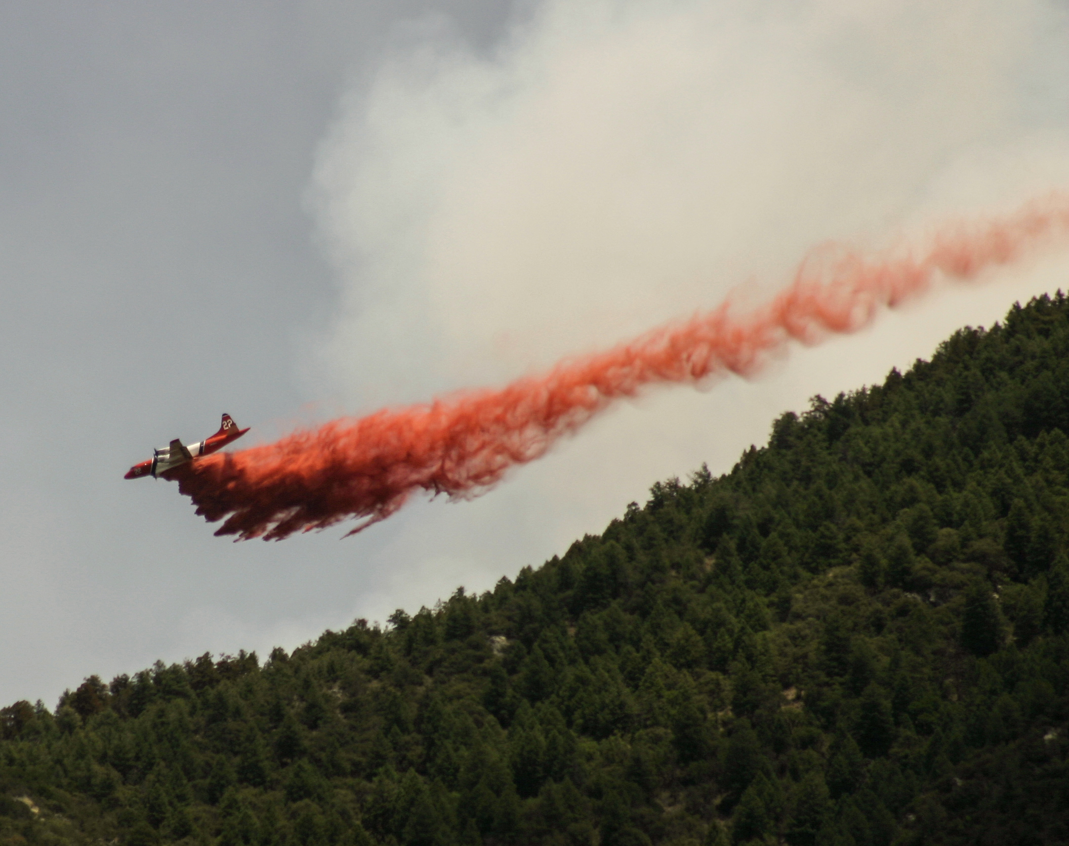
An air tanker drops retardant in Arizona's Coronado National Forest. Photo by Mitch Tobin.
An air tanker drops retardant in Arizona’s Coronado National Forest. Photo by Mitch Tobin.

3) Forest Service and Interior suppression costs move together

The scatterplot in the dashboard shows that wildfire spending by the Forest Service tends to track spending by agencies in the Interior Department, such as the National Park Service, Bureau of Land Management, and U.S. Fish and Wildlife Service. Not a big surprise, but these various agencies do manage different landscapes, with the Forest Service lands often found in higher elevation areas than rangeland overseen by the BLM, so you would expect some variability between them. The severity of the wildfire season isn’t the only determinant of suppression budgets. The overall fiscal climate presumably influences the budgets for these agencies in a similar way.

Data sources

The National Interagency Fire Center  is the data source for the suppression dashboard. The table also lists the total number of wildfires and acres burned, not just incidents on federal lands. Data on wildfires burned by landowner and agency are available for download our main wildfire page. We also track suppression metrics, such as days at various preparedness levels and deployment of firefighting assets, on this dashboard, which is described in this post.

Downloads

EcoWest’s mission is to analyze, visualize, and share data on environmental trends in the North American West. Please subscribe to our RSS feed, opt-in for email updates, follow us on Twitter, or like us on Facebook.
Viewing the Yosemite Rim Fire in context: images, maps, and graphics

The Rim Fire burning in and around Yosemite National Park is generating national headlines due to its vast size and its threats to San Francisco’s water supply, the park’s majestic sequoias, and thousands of homes.

To put this fire in context, I’ve created a few of graphics that summarize recent fire seasons in California and the national picture thus far in 2013. You can download the PowerPoint deck and data at the bottom of this post.

Views of the fire

Before getting to the data, let me first share some compelling views of the Rim Fire. The nearly 190,000-acre blaze is big enough to be visible from the orbiting International Space Station. Here’s a photo that astronaut Karen Nyberg tweeted on Monday.

Here’s a time-lapse video, posted by park staff, that shows the Rim Fire’s growth.

You should also check out this stunning video of the fire, filmed from the perspective of a C-130J air tanker making drops of retardant (I recommend fast-forwarding to 4:00). The tanker is guided to its target by a smaller lead plane, and it’s interesting to hear the chatter among the pilots. Unfortunately, they haven’t figured out how to turn off the “landing gear” audible warning.

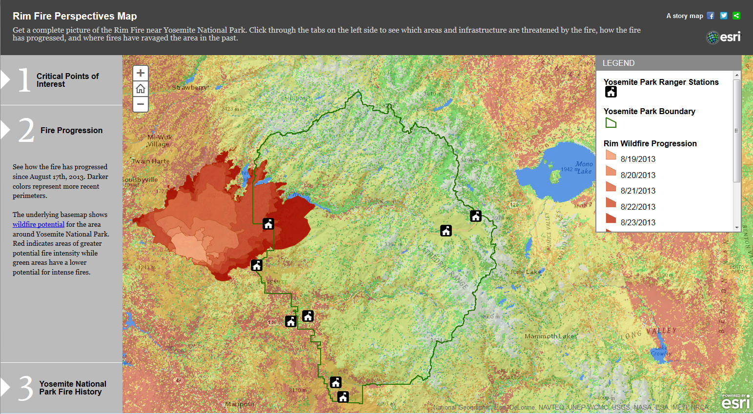
If you’re curious about the blaze’s footprint, ESRI has posted an interactive map of the Rim Fire, including its progression and perimeters of previous burns. Here’s a screen shot (click to enlarge).

esriimfire

EcoWest contributor David Kroodsma has put together an animated map of the fire’s progression.

Recent California fire history

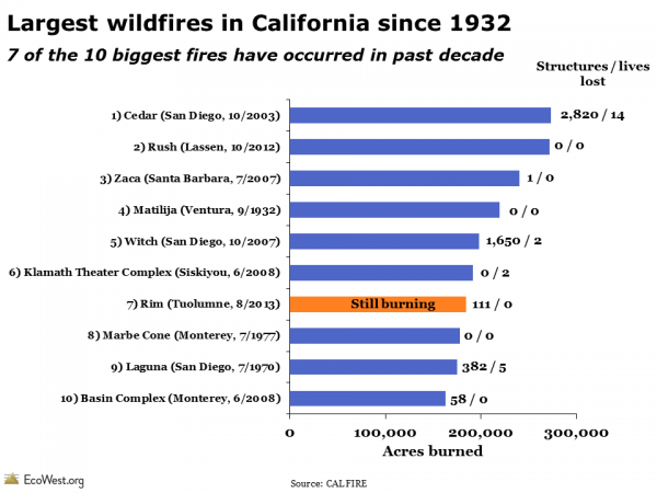
The Rim Fire is currently the seventh-largest wildfire in California’s recorded history. Cal Fire says its data goes back to 1932, and the graphic below shows that seven of the 10 largest fires have burned in the past decade.

Largest wildfires in California history

As Cal Fire notes, there were big wildfires prior to 1932, and we know from tree-ring records and other research that lightning and Native Americans would start fires that sometimes grew very large. The Rim Fire is less than a quarter contained, so it may well rise in the rankings.

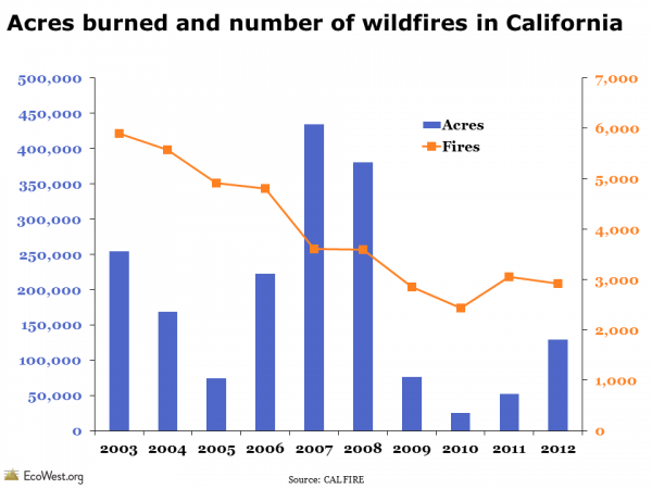
Looking back over the past decade, there has been a downward trend in the number of wildfires in California, something that isn’t seen in the national-level data. The number of acres charred by fires has varied considerably from year to year, but the previous four years were relatively tame.

California fire history

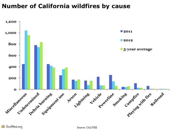
Cal Fire provides greater detail on the cause of wildfires than the National Interagency Fire Center (we present that data on this dashboard and this post). Below is a summary of wildfire ignitions in California. Lightning starts relatively few fires in the state and the cause of many blazes is never determined. The Rim Fire’s cause is under investigation.

Causes of wildfires in California

National picture: below-average fire season

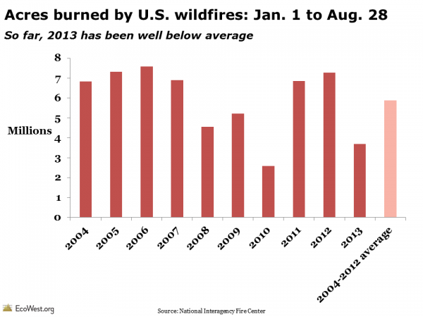
The Rim Fire and the deaths of 19 firefighters in Arizona in June will make 2013 a historic fire season, but in something of a paradox, 2013 is on track to be a below-average year for fire activity on the national level. The graphic below, based on data from the National Interagency Fire Center, shows the acreage burned each year from January 1 to August 28. So far, 2013 is the second lowest total since 2004. The 3,686,318 acres that have burned this year is just 63% of the 2004-2012 average.

2013 wildfire season to date

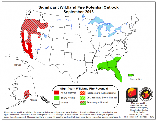
We’ve still got a way to go in the 2013 wildfire season, but many areas in the Southwest and Southern Rockies have received a good soaking over the past two months, so they are unlikely to add to the total in any big way. Going forward, the potential for large fires will be greatest in California, Nevada, Oregon, and Idaho.

Wildland fire potential outlookOverall trend: larger fires

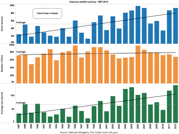
One of my main takeaways from analyzing wildfire data is that the numbers can jump around from year to year, and we shouldn’t put too much stock in any single data point. Relatively small fires can kill people and destroy hundreds of homes, while enormous blazes in wilderness settings can do wonders for ecosystems. Overall, the trend in recent years has been toward larger fires and more acres burned, as shown below.

Wildfires and acres burned: national overview since 1987

What’s not captured in these raw acreage totals is the real impact on the ground. What fraction of the landscape was nuked? How many acres are better off after a low-intensity burn? Reports from the fire lines and the imagery shared above suggest the Rim Fire is burning very intensely and could do considerable damage to the park’s resources and nearby residents’ homes.

Whatever the final acreage total, blazes like the Rim Fire are likely to become more common in the years and decades ahead, according to climate change projections. Andrew Freedman has a good discussion at Climate Central, which also provides this embeddable data visualization on Western wildfire trends.

Downloads

Data sources

Data on California fires comes from Cal Fire and its 2012 red book. The agency also has PDFs showing the largest fires in terms of acres burned and structures lost.

The National Interagency Fire Center provides year-to-date totals for fires and acres burned on this page.

EcoWest’s mission is to analyze, visualize, and share data on environmental trends in the North American West. Please subscribe to our RSS feed, opt-in for email updates, follow us on Twitter, or like us on Facebook.