The federal government’s new National Climate Assessment paints a grim portrait of climate change’s impacts on the United States.
The 841-page report is full of graphics explaining how the rise of greenhouse gas emissions is already transforming the American West and the rest of the country. I’ve extracted the 14 images that I found most striking and organized them into 10 topics below. You’ll find the original captions and sources below the images, minus the footnotes. Click on images to enlarge them.
1) It’s getting hotter
Virtually every part of the country has gotten warmer in recent decades, but compare Alaska to the Southeast region.
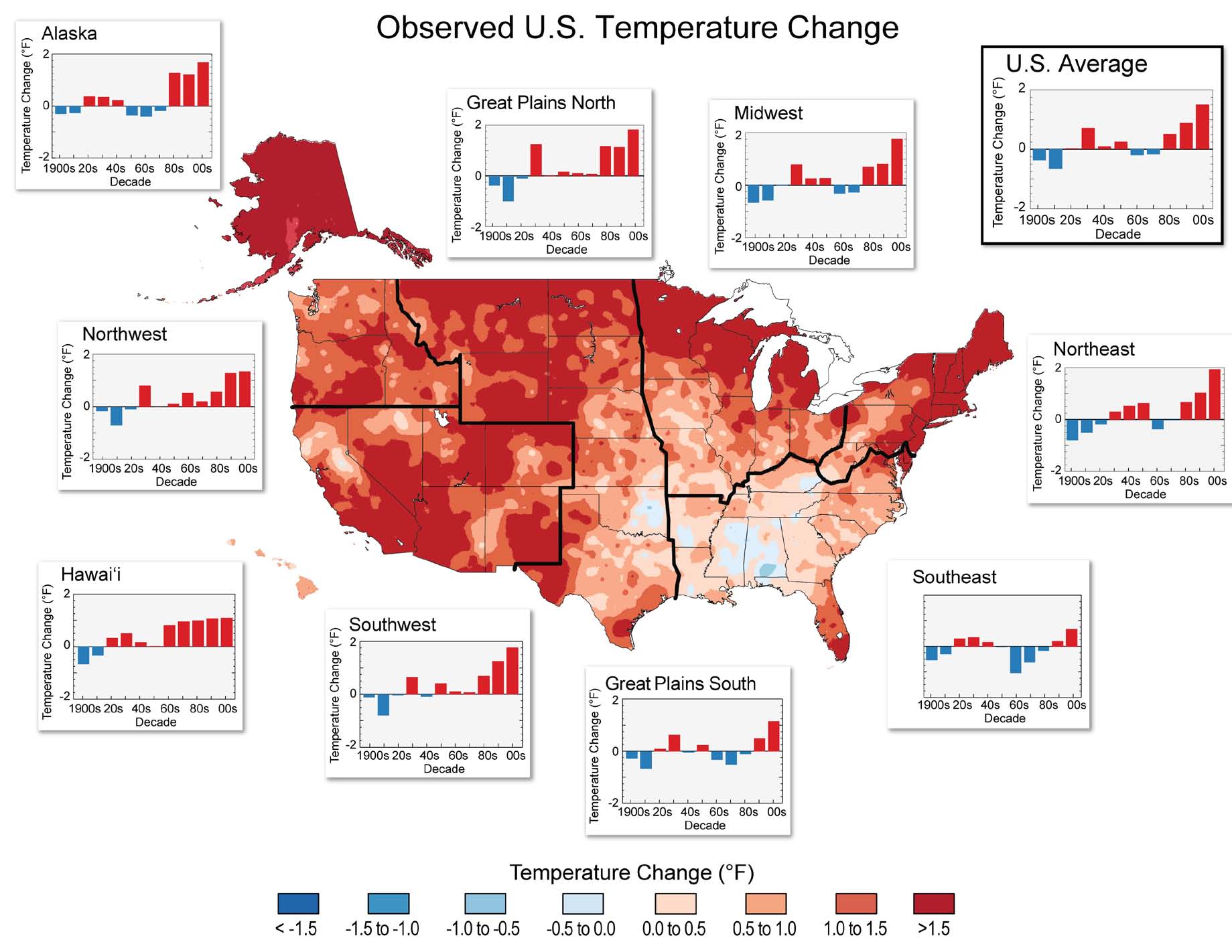
Caption: The colors on the map show temperature changes over the past 22 years (1991-2012) compared to the 1901-1960 average, and compared to the 1951-1980 average for Alaska and Hawai‘i. The bars on the graphs show the average temperature changes by decade for 1901-2012 (relative to the 1901-1960 average) for each region. The far right bar in each graph (2000s decade) includes 2011 and 2012. The period from 2001 to 2012 was warmer than any previous decade in every region. (Figure source: NOAA NCDC / CICS-NC).
2) Precipitation trends differ by region
Looking back at the 1991-2012 period, some parts of the country have been relatively wet, but Arizona has been especially dry. Very heavy precipitation events have been on the rise.
 Caption: The colors on the map show annual total precipitation changes for 1991-2012 compared to the 1901-1960 average, and show wetter conditions in most areas. The bars on the graphs show average precipitation differences by decade for 1901-2012 (relative to the 1901-1960 average) for each region. The far right bar in each graph is for 2001-2012. (Figure source: adapted from Peterson et al. 2013).
![]()
 Caption: One measure of heavy precipitation events is a two-day precipitation total that is exceeded on average only once in a 5-year period, also known as the once-in-five-year event. As this extreme precipitation index for 1901-2012 shows, the occurrence of such events has become much more common in recent decades. Changes are compared to the period 1901-1960, and do not include Alaska or Hawai‘i. (Figure source: adapted from Kunkel et al. 2013).
3) Season variations in precipitation projections
Looking ahead, models predict that some parts of the nation will be wetter overall, and others will be drier. There are also strong seasonal differences.
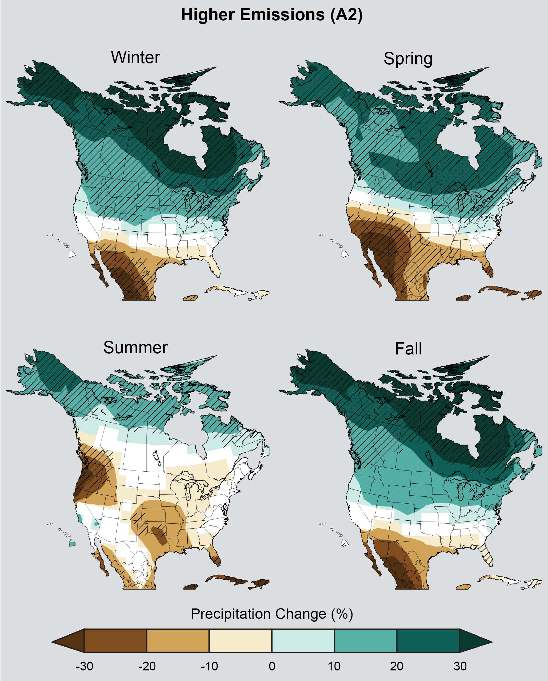
Caption: Projected change in seasonal precipitation for 2071-2099 (compared to 1970-1999) under an emissions scenario that assumes continued increases in emissions (A2). Hatched areas indicate that the projected changes are significant and consistent among models. White areas indicate that the changes are not projected to be larger than could be expected from natural variability. In general, the northern part of the U.S. is projected to see more winter and spring precipitation, while the southwestern U.S. is projected to experience less precipitation in the spring. (Figure source: NOAA NCDC / CICS-NC).
4) Drought becoming more common in West
The fraction of the West experiencing summer drought has been trending upward.
 Caption: The area of the western U.S. in moderately to extremely dry conditions during summer (June-July-August) varies greatly from year to year but shows a long-term increasing trend from 1900 to 2012. (Data from NOAA NCDC State of the Climate Drought analysis).
5) Bleak outlook for West’s snowpack
Even in places that are expected to get wetter overall, precipitation may be more likely to fall as rain than snow, causing major declines in the West’s vital snowpack.
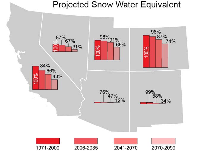
Caption: Snow water equivalent (SWE) refers to the amount of water held in a volume of snow, which depends on the density of the snow and other factors. Figure shows projected snow water equivalent for the Southwest, as a percentage of 1971-2000, assuming continued increases in global emissions (A2 scenario). The size of bars is in proportion to the amount of snow each state contributes to the regional total; thus, the bars for Arizona are much smaller than those for Colorado, which contributes the most to region-wide snowpack. Declines in peak SWE are strongly correlated with early timing of runoff and decreases in total runoff. For watersheds that depend on snowpack to provide the majority of the annual runoff, such as in the Sierra Nevada and in the Upper Colorado and Upper Rio Grande River Basins, lower SWE generally translates to reduced reservoir water storage. (Data from Scripps Institution of Oceanography).
6) Less runoff and greater water stress
Melting snowpack accounts for the bulk of water in many Western rivers. Higher evaporation rates and greater water use by plants will contribute to steep declines in runoff and greater risks to the water supply
 Caption: These projections, assuming continued increases in heat-trapping gas emissions (A2 scenario; Ch. 2: Our Changing Climate), illustrate: a) major losses in the water content of the snowpack that fills western rivers (snow water equivalent, or SWE); b) significant reductions in runoff in California, Arizona, and the central Rocky Mountains; and c) reductions in soil moisture across the Southwest. The changes shown are for mid-century (2041-2070) as percentage changes from 1971- 2000 conditions (Figure source: Cayan et al. 2013).
 Caption: Annual and seasonal streamflow projections based on the B1 (with substantial emissions reductions), A1B (with gradual reductions from current emission trends beginning around mid-century), and A2 (with continuation of current rising emissions trends) CMIP3 scenarios for eight river basins in the western United States. The panels show percentage changes in average runoff, with projected increases above the zero line and decreases below. Projections are for annual, cool, and warm seasons, for three future decades (2020s, 2050s, and 2070s) relative to the 1990s. (Source: U.S. Department of the Interior – Bureau of Reclamation 2011; Data provided by L. Brekke, S. Gangopadhyay, and T. Pruitt)
 Caption: Climate change is projected to reduce water supplies in some parts of the country. This is true in areas where precipitation is projected to decline, and even in some areas where precipitation is expected to increase. Compared to 10% of counties today, by 2050, 32% of counties will be at high or extreme risk of water shortages. Numbers of counties are in parentheses in key. Projections assume continued increases in greenhouse gas emissions through 2050 and a slow decline thereafter (A1B scenario). (Figure source: Reprinted with permission from Roy et al. 2012. Copyright American Chemical Society).
7) Altered timing of spring snowmelt
Climate change will cause the annual surge of snowmelt to occur earlier in the year, which will force changes in how dams and irrigation are managed. Altered timing of the snowmelt will also pose challenges for aquatic species and ecosystems.
 Caption (Left): Projected increased winter flows and decreased summer flows in many Northwest rivers will cause widespread impacts. Mixed rain-snow watersheds, such as the Yakima River basin, an important agricultural area in eastern Washington, will see increased winter flows, earlier spring peak flows, and decreased summer flows in a warming climate. Changes in average monthly streamflow by the 2020s, 2040s, and 2080s (as compared to the period 1916 to 2006) indicate that the Yakima River basin could change from a snow-dominant to a rain-dominant basin by the 2080s under the A1B emissions scenario (with eventual reductions from current rising emissions trends). (Figure source: adapted from Elsner et al. 2010).
Caption (Right): Natural surface water availability during the already dry late summer period is projected to decrease across most of the Northwest. The map shows projected changes in local runoff (shading) and streamflow (colored circles) for the 2040s (compared to the period 1915 to 2006) under the same scenario as the left figure (A1B). Streamflow reductions such as these would stress freshwater fish species (for instance, endangered salmon and bull trout) and necessitate increasing tradeoffs among conflicting uses of summer water. Watersheds with significant groundwater contributions to summer streamflow may be less responsive to climate change than indicated here.
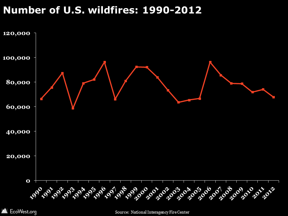
8) Greater wildfire activity expected
Higher temperatures and a thinner snowpack would be enough to increase wildfire risks, but climate change is also contributing to the spread of insects and diseases in Western forests and woodlands.

Caption: (Top) Insects and fire have cumulatively affected large areas of the Northwest and are projected to be the dominant drivers of forest change in the near future. Map shows areas recently burned (1984 to 2008) or affected by insects or disease (1997 to 2008). (Middle) Map indicates the increases in area burned that would result from the regional temperature and precipitation changes associated with a 2.2°F global warming across areas that share broad climatic and vegetation characteristics.101 Local impacts will vary greatly within these broad areas with sensitivity of fuels to climate. (Bottom) Projected changes in the probability of climatic suitability for mountain pine beetles for the period 2001 to 2030 (relative to 1961 to 1990), where brown indicates areas where pine beetles are projected to increase in the future and green indicates areas where pine beetles are expected to decrease in the future. Changes in probability of survival are based on climate-dependent factors important in beetle population success, including cold tolerance,102 spring precipitation, and seasonal heat accumulation.
9) Heat could hurt tourism
If it gets too hot, some parts of the country may become unappealing for tourists, which could have major economic implications.
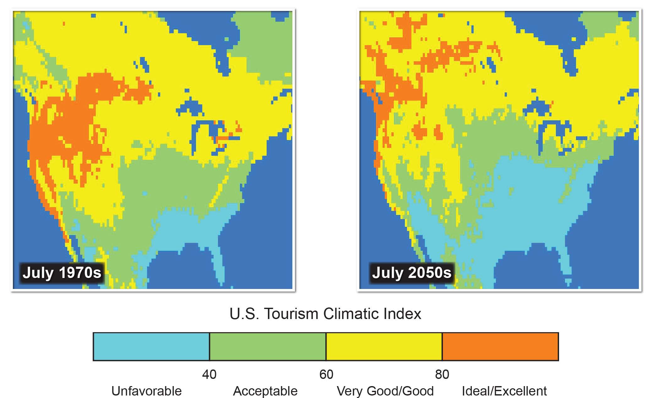
Caption: Tourism is often climate-dependent as well as seasonally dependent. Increasing heat and humidity – projected for summers in the Midwest, Southeast, and parts of the Southwest by mid-century (compared to the period 1961-1990) – is likely to create unfavorable conditions for summertime outdoor recreation and tourism activity. The figures illustrate projected changes in climatic attractiveness (based on maximum daily temperature and minimum daily relative humidity, average daily temperature and relative humidity, precipitation, sunshine, and wind speed) in July for much of North America. In the coming century, the distribution of these conditions is projected to shift from acceptable to unfavorable across most of the southern Midwest and a portion of the Southeast, and from very good or good to acceptable conditions in northern portions of the Midwest, under a high emissions scenario (A2a). (Figure source: Nicholls et al. 2005).
10) Carbon emissions are climbing
The report focuses on climate change impacts, but it includes a couple of good graphics showing the rise in carbon dioxide emissions. U.S. output of greenhouse gases have increased primarily due to our expanding population and growing affluence. Caption: Air bubbles trapped in an Antarctic ice core extending back 800,000 years document the atmosphere’s changing carbon dioxide concentration. Over long periods, natural factors have caused atmospheric CO2 concentrations to vary between about 170 to 300 parts per million (ppm). As a result of human activities since the Industrial Revolution, CO2 levels have increased to 400 ppm, higher than any time in at least the last one million years. By 2100, additional emissions from human activities are projected to increase CO2 levels to 420 ppm under a very low scenario, which would require immediate and sharp emissions reductions (RCP 2.6), and 935 ppm under a higher scenario, which assumes continued increases in emissions (RCP 8.5). This figure shows the historical composite CO2 record based on measurements from the EPICA (European Project for Ice Coring in Antarctica) Dome C and Dronning Maud Land sites and from the Vostok station. Data from Lüthi et al. 2008 (664-800 thousand years [kyr] ago, Dome C site); Siegenthaler et al. 2005 (393-664 kyr ago, Dronning Maud Land); Pépin 2001, Petit et al. 1999, and Raynaud 2005 (22-393 kyr ago, Vostok); Monnin et al. 2001 (0-22 kyr ago, Dome C); and Meinshausen et al. 2011 (future projections from RCP 2.6 and 8.5).
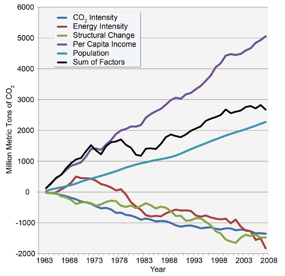 Caption: This graph depicts the changes in carbon dioxide (CO2) emissions over time as a function of five driving forces: 1) the amount of CO2 produced per unit of energy (CO2 intensity); 2) the amount of energy used per unit of gross domestic product (energy intensity); 3) structural changes in the economy; 4) per capita income; and 5) population. Although CO2 intensity and especially energy intensity have decreased significantly and the structure of the U.S. economy has changed, total CO2 emissions have continued to rise as a result of the growth in both population and per capita income. (Baldwin and Sue Wing, 2013).
EcoWest’s mission is to analyze, visualize, and share data on environmental trends in the North American West. Please subscribe to our RSS feed, opt-in for email updates, follow us on Twitter, or like us on Facebook.