
The 50 states pursue different paths to supply energy to their residents, with some heavily reliant on coal, others dependent on hydropower dams, and many tapping a broad portfolio of sources. I described this diversity of approaches in previous posts on energy flow diagrams and a map of the “United States of Energy.”
In this post, I take a closer look at how U.S. states compare in their energy consumption, spending, and prices. Using data from the U.S. Energy Information Administration’s Annual Energy Review, I created a dashboard to visualize the patterns, and I put together an accompanying slide deck that you can download at the bottom of this post.
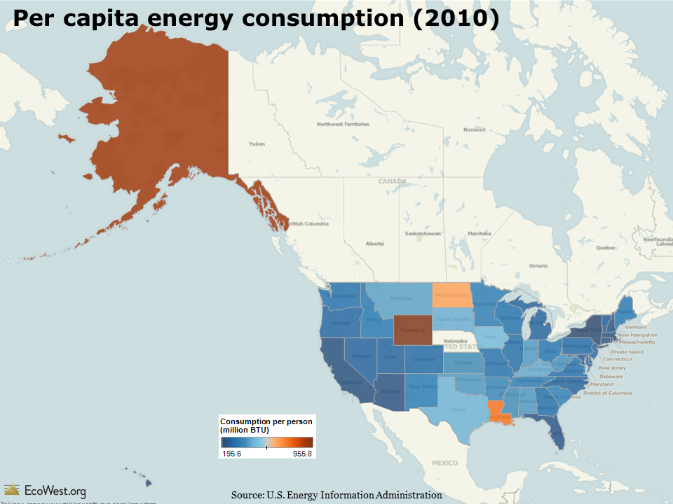
Per capita energy consumption
The map below (click to enlarge) illustrates per capita energy consumption in 2010. Four states—Alaska, Wyoming, North Dakota, and Louisiana—stick out. This group of states shares two things in common. First, all have relatively low populations, so the denominator in the per capita calculation is small. Second, all four states are major energy producers. Because it generally takes a lot of energy to extract, produce, and distribute fossil energy sources, these states also rank high on consumption.
Energy use, prices, and spending
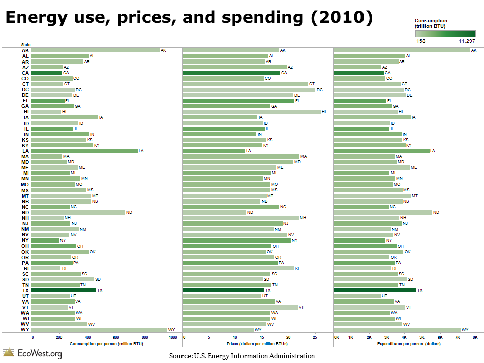
The chart below adds two more dimensions: prices and per capita spending. The bars are shaded green according to the total energy consumption in the state. I’ve sorted the states alphabetically, but on the dashboard you can order them by any of these variables.
Prices versus consumption
I was curious whether there was any relationship between energy consumption and prices. Economics 101 suggests higher prices could mean lower consumption. The scatter plot below shows that there is, in fact, an inverse relationship between energy prices and use. I’ve sized the circles according to the total energy consumed in the state and colored them according to per capita energy expenditures.
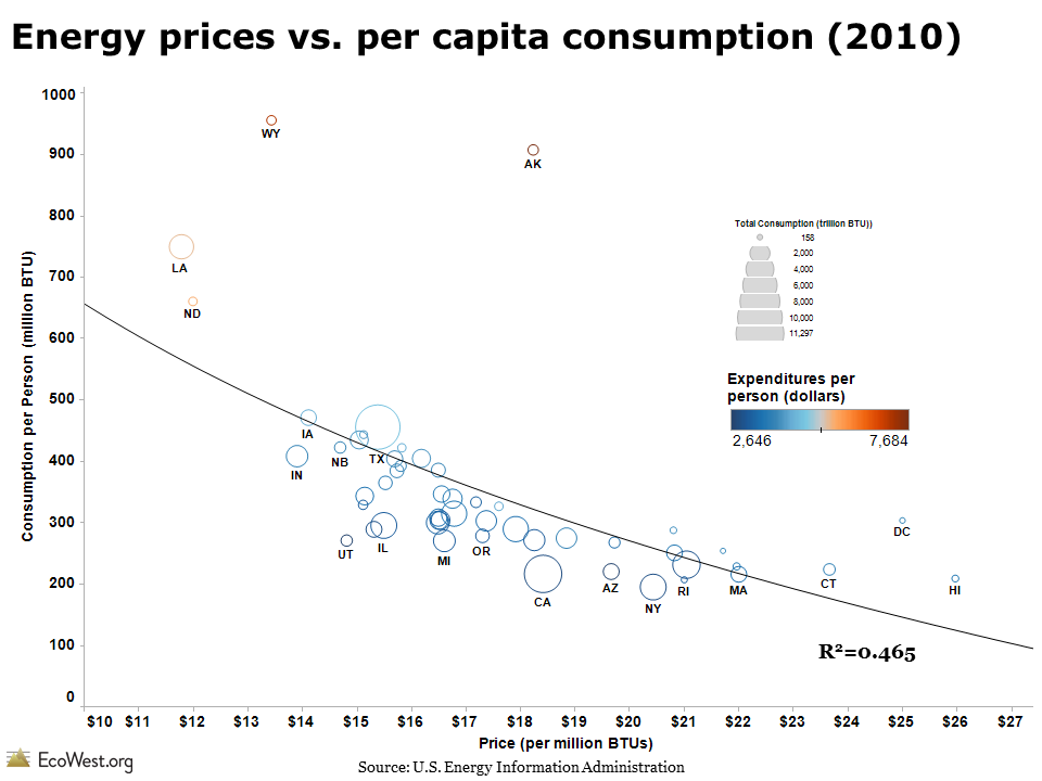
The spread in energy consumption and prices across the 50 states is very wide. Energy prices in Hawaii and some Northeast states are double, or nearly so, the costs in Louisiana and North Dakota. Per capita consumption in New York and California is less than one-fourth the use in Alaska and Wyoming.
Once again, the four energy-producing states are outliers. Leaving aside Alaska, where prices for many commodities are high, these states have the lowest energy prices. I repeated the analysis by excluding the four states and the R2 value increased from 0.465 to 0.566, indicating a stronger correlation between price and consumption.
But correlation is not causation! Other factors, such as the local climate and travel patterns in a state, may be more important variables. Several of the states with the most expensive energy prices and lowest energy consumption are in the Northeast (e.g., Connecticut, Rhode Island, Massachusetts, New York). Prices tend to be higher in this urbanized region, which has a large population, extensive mass transit, and fewer vehicle-miles traveled. In other words, the high cost of gasoline in Manhattan is probably not the main reason why its residents drive less.
In a future post, I’ll analyze state-level data on carbon dioxide emissions.
Data sources
The energy dashboard is based on data from the U.S. Energy Information Administration’s Annual Energy Review, specifically this table.
Downloads
EcoWest’s mission is to analyze, visualize, and share data on environmental trends in the North American West. Please subscribe to our RSS feed, opt-in for email updates, follow us on Twitter, or like us on Facebook.


