Tag Archives: energy

Greenhouse gases: how do Western states compare?

One of the great challenges in reducing greenhouse gas (GHG) emissions is that the pollution emanates from so many activities and economic sectors. In this set of slides, we examine the sources of heat-trapping GHGs, with a focus on Western states.

Greenhouse gas emissions overview from EcoWest on Vimeo.

Nationally, nearly one third of GHG emissions come from providing electricity and heat to buildings, and more than one quarter is from transportation, mostly driving. GHG emissions have risen steadily since 1990, with growth slowing in the mid-2000s, partly due to efficiency improvements in the transportation and electricity sectors, and also thanks to a slowing economy.

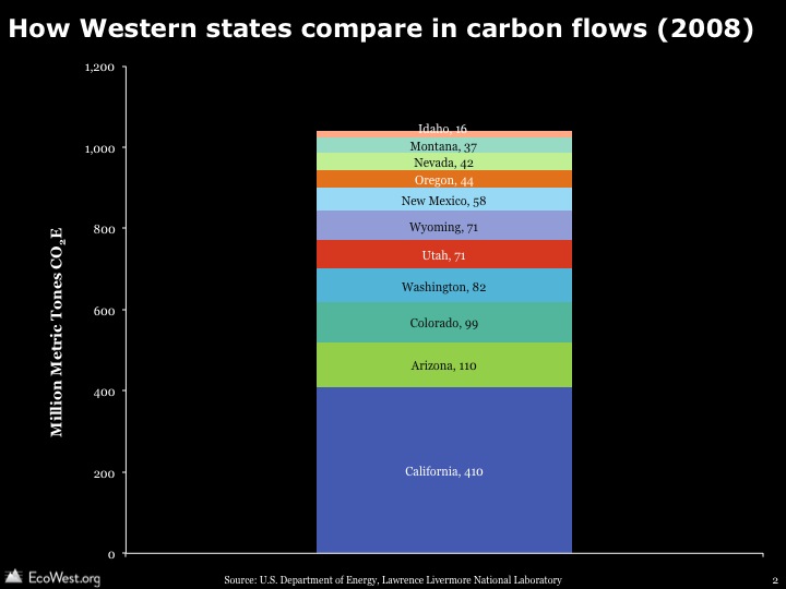
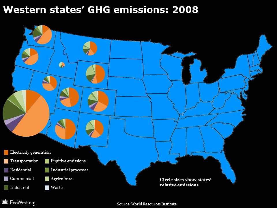
Using data from the World Resources Institute, we found that on average since 1990 the West has contributed 15-17% of national GHG emissions. Overall, the source profile for the West is very similar to that of the United States as a whole, but there are some important state-by-state differences. With an enormous economy and population, California leads the pack in GHG emissions, but power generation accounts for a much smaller share of those emissions than it does in states in the inland West. One major reason is that California imports a good deal of power from places like the Four Corners states. California also produces substantial electricity from hydropower dams and other renewable sources.

Western states GHG map

Transportation accounts for nearly half of California’s GHG emissions, in part due to the high level of auto-dependence in such a large, sprawling state, but also due to the presence of major transport hubs, such as the massive ports of Los Angeles and Long Beach.

On the bright side, California leads the country in per capita energy efficiency. The state’s 37 million residents use 6,700 kilowatts yearly on average, while the 25 million residents in Texas consume an average of 14,000 kilowatts a year. Wyoming residents use a whopping 27,000 kilowatts per capita annually.

Western states not only vary in their emissions profiles and energy efficiency; they also absorb widely varying amounts of carbon dioxide from the atmosphere. Heavily forested states, such as Washington and Oregon, have some of the largest carbon sinks, while states in the arid Southwest, such as Arizona and New Mexico, have much less vegetation to soak up all that carbon we’re emitting.

Downloads

EcoWest’s mission is to analyze, visualize, and share data on environmental trends in the North American West. Please subscribe to our RSS feed, opt-in for email updates, follow us on Twitter, or like us on Facebook.

Flow diagrams of U.S. and Western carbon emissions

The United States emits around 5.6 billion metric tons of carbon dioxide equivalent (CO2e) each year. That’s roughly the annual CO2 exhaust of 1.2 billion cars, according to the U.S. EPA’s Greenhouse Gas (GHG) equivalency calculator, and it’s nearly 20 percent of annual global GHG emissions.

U.S. and Western carbon flow diagrams from EcoWest on Vimeo.
Flow diagrams from the Lawrence Livermore National Laboratory provide informative visual summaries of the nation’s carbon emissions from generation to end use. These graphics, also known as Sankey diagrams, show how many GHGs originate from the burning of fuels and how many GHGs are attributable to different economic sectors. Think of the left side of the flow as the supply side, and the right as the demand side. In this deck, I’ve also compiled slides representing GHG emissions in the 11 Western states, which show some interesting patterns in GHG emissions from origin to end use.

Data on GHG emissions is only available at the national level. To understand state-by-state differences, Lawrence Livermore uses state-level energy use data to estimate the flow of GHGs. The U.S. Department of Energy’s Energy Information Administration compiles such energy use data in the State Energy Data System (SEDS).

Sankey carbon

U.S. carbon emissions are generated by burning coal, natural gas, and petroleum products (gasoline, diesel, etc.); roughly 35%, 23%, and 42% of 2010 emissions, respectively. The carbon flows in individual states vary widely depending on state energy portfolios. End uses differ according to what industries predominate and population levels. Some of the patterns that jump out:

  • California, Idaho, Oregon, and Washington are less coal-dependent and more petroleum dependent.
  • Natural gas accounts for a higher portion of carbon emissions in states like Nevada and Oregon.
  • Petroleum accounts for a lower portion of carbon emissions in Colorado and Wyoming.

Comparing Washington to Wyoming demonstrates how end use differs by state. Energy generation accounts for the bulk of carbon emissions in Wyoming, but the transportation and industrial sectors dominate in Washington. Wyoming is a major energy exporter to other states, while Washington relies heavily on hydropower, which does is essentially carbon-free.

When examining these slides, it’s important to remember that the size of the rectangles and the lines between them are not comparable from state to state. They show, within a state, where GHGs originate and terminate in various uses.

Lawrence Livermore also produces similar graphics for energy and water, and in another post, we provide a little background on Sankey diagrams, which are great tools for visualizing how commodities flow through systems.

Downloads

EcoWest’s mission is to analyze, visualize, and share data on environmental trends in the North American West. Please subscribe to our RSS feed, opt-in for email updates, follow us on Twitter, or like us on Facebook.

Human footprint maps of Western states and cities

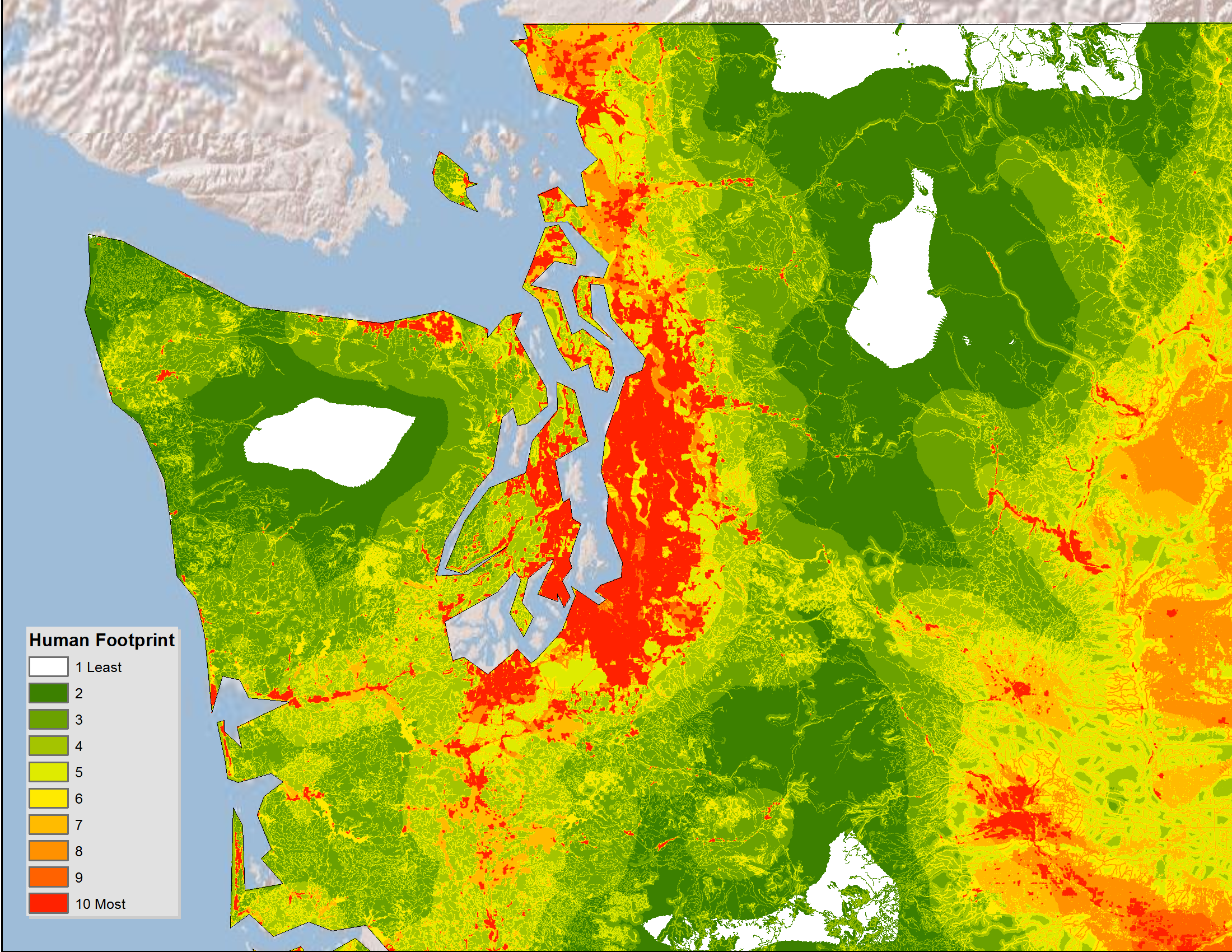
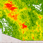
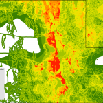
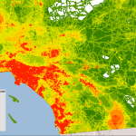
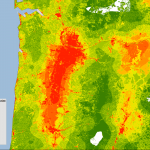
Just a quick post to let you know that I’ve created a gallery of high-resolution maps depicting the human footprint in each of the 11 Western states, plus some major cities in the region.

I wrote about this dataset a few weeks ago and wanted to share some more detailed, zoomed-in views. White indicates areas with the least human impact, followed by green for places where the footprint is minimal, while orange and red areas are where people have done the most to transform native ecosystems.

Below is the gallery, which also available on this page.

The human footprint map is based on the work of U.S. Geological Survey (USGS) scientists and was the basis of a 2008 paper in Ecological Applications by Matthias Leu, Steven E. Hanser, and Steven T. Knick. The scientists focused on 14 features, including the location of cities, farms, roads, canals, power lines, oil and gas wells, and human-caused wildfires.

Please let me know if you have any issues viewing the maps. This is the first time I’ve used the WordPress gallery feature and I’m wondering if it’s an effective tool for sharing images.

Same goes for anything on EcoWest: as we get off the ground, we’re looking for feedback, suggestions, and other comments from users so we can make this site as useful as possible. Thanks!

EcoWest’s mission is to analyze, visualize, and share data on environmental trends in the North American West. Please subscribe to our RSS feed, opt-in for email updates, follow us on Twitter, or like us on Facebook.