Tag Archives: flow diagram

Flow diagrams of U.S. and Western carbon emissions

The United States emits around 5.6 billion metric tons of carbon dioxide equivalent (CO2e) each year. That’s roughly the annual CO2 exhaust of 1.2 billion cars, according to the U.S. EPA’s Greenhouse Gas (GHG) equivalency calculator, and it’s nearly 20 percent of annual global GHG emissions.

U.S. and Western carbon flow diagrams from EcoWest on Vimeo.
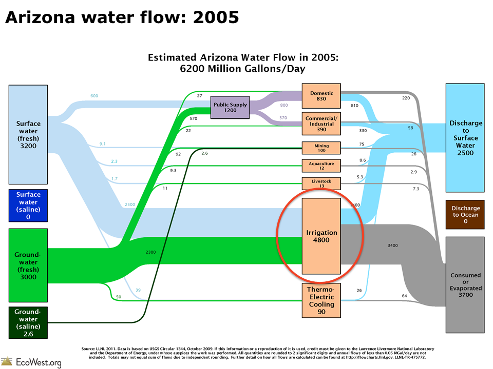
Flow diagrams from the Lawrence Livermore National Laboratory provide informative visual summaries of the nation’s carbon emissions from generation to end use. These graphics, also known as Sankey diagrams, show how many GHGs originate from the burning of fuels and how many GHGs are attributable to different economic sectors. Think of the left side of the flow as the supply side, and the right as the demand side. In this deck, I’ve also compiled slides representing GHG emissions in the 11 Western states, which show some interesting patterns in GHG emissions from origin to end use.

Data on GHG emissions is only available at the national level. To understand state-by-state differences, Lawrence Livermore uses state-level energy use data to estimate the flow of GHGs. The U.S. Department of Energy’s Energy Information Administration compiles such energy use data in the State Energy Data System (SEDS).

Sankey carbon

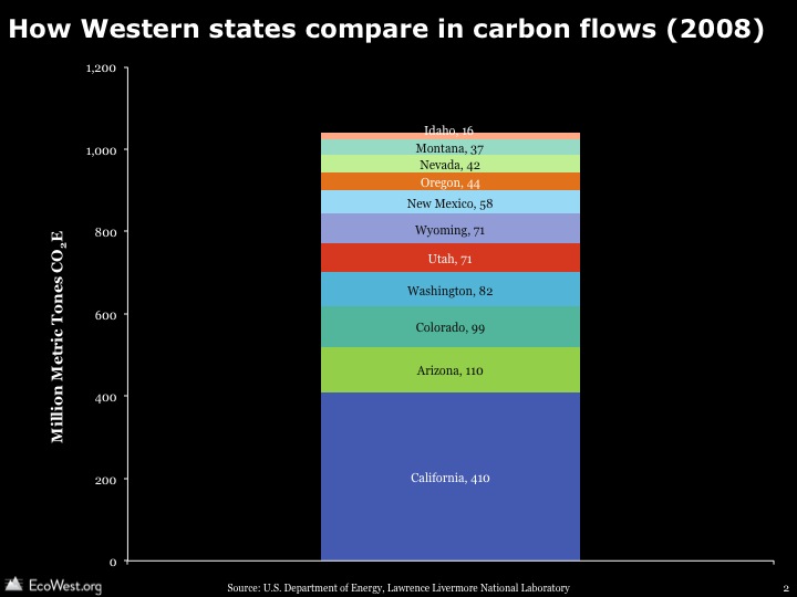
U.S. carbon emissions are generated by burning coal, natural gas, and petroleum products (gasoline, diesel, etc.); roughly 35%, 23%, and 42% of 2010 emissions, respectively. The carbon flows in individual states vary widely depending on state energy portfolios. End uses differ according to what industries predominate and population levels. Some of the patterns that jump out:

  • California, Idaho, Oregon, and Washington are less coal-dependent and more petroleum dependent.
  • Natural gas accounts for a higher portion of carbon emissions in states like Nevada and Oregon.
  • Petroleum accounts for a lower portion of carbon emissions in Colorado and Wyoming.

Comparing Washington to Wyoming demonstrates how end use differs by state. Energy generation accounts for the bulk of carbon emissions in Wyoming, but the transportation and industrial sectors dominate in Washington. Wyoming is a major energy exporter to other states, while Washington relies heavily on hydropower, which does is essentially carbon-free.

When examining these slides, it’s important to remember that the size of the rectangles and the lines between them are not comparable from state to state. They show, within a state, where GHGs originate and terminate in various uses.

Lawrence Livermore also produces similar graphics for energy and water, and in another post, we provide a little background on Sankey diagrams, which are great tools for visualizing how commodities flow through systems.

Downloads

EcoWest’s mission is to analyze, visualize, and share data on environmental trends in the North American West. Please subscribe to our RSS feed, opt-in for email updates, follow us on Twitter, or like us on Facebook.

Flow diagrams of U.S. and Western water use

Americans use an average of 410 billion gallons of water per day. Where does all that water come from and where does it go?

Flow diagrams from the Lawrence Livermore National Laboratory provide excellent summaries of the nation’s water use. These graphics, also known as Sankey diagrams, show how much we pump from groundwater aquifers, how many gallons of surface water we divert, and which economic sectors use the most water.

In this slide deck (download links at bottom of post), I’ve pulled together the flow diagrams for the 11 Western states, which show some interesting regional patterns in water use.

Flow diagrams of U.S. and Western water use from EcoWest on Vimeo.

Diagrams visualize commodity flows

Lawrence Livermore produces similar graphics for energy and carbon dioxide. In another post, I provide a little background on Sankey diagrams, which are a great tool for visualizing how a commodity flows through a system.

Data for the water diagrams come from the U.S. Geological Survey, which publishes a report every five years summarizing the nation’s water use (the latest year available is 2005).

The flow diagrams segment water sources into four main categories: fresh surface water, saline surface water, fresh groundwater, and saline (brackish) groundwater. Lawrence Livermore summarizes national-level water use this way:

Fresh surface-water, from lakes and rivers, is used at large scale in every sector of the economy. Saline surface water, primarily ocean water, is mostly used for once-through thermoelectric cooling, although some ocean water is used for industrial cooling and a small but growing amount of ocean water is being desalinated for public consumption. Significant quantities of fresh groundwater are used in irrigation and fresh groundwater plays an important role in both public supply as well as self-supplied domestic water consumption. Brackish groundwater is the most difficult water resource to use and is therefore primarily used in the mining sector and in power production (often in geothermal power plants).

Western states vary widely

The state-level slides reveal that water is managed very differently across the West, with some residents heavily dependent on surface water and others more reliant on groundwater. In Montana, Utah, and Wyoming, saline groundwater is an important source for mining and industry, while in Idaho and Oregon there’s a fair amount of fresh water devoted to aquaculture.

Across the region, the water delivered to homes and businesses is just a fraction of what’s devoted to growing crops. Consider the arid state of Arizona, where discussions about water tend to focus on the state’s growing cities. In reality, the graphic below (click to enlarge) shows that farming totally dominates water consumption in Arizona.

Arizona water flow

When examining these slides, it’s important to remember that the size of the rectangles and the connecting lines are not comparable from state to state. Instead, they show the proportions of surface water and groundwater that are directed to various uses within each state.

Lawrence Livermore also offers this caveat:

Water use data is notoriously hard to compile. Accounting policies vary between different water management districts and water use is not metered in the same way that higher-priced commodities are sold. Quantifying water use by location and sector requires substantial estimation.Water disposition is even more difficult to quantify. While the quality of wastewater discharge is measured regularly for environmental purposes, the total quantity of wastewater is not carefully monitored, especially when that wastewater already meets environmental regulations for discharge.

Despite these drawbacks, I’ve found these diagrams to be super-helpful in understanding Western and national water-use patterns. Once the U.S. Geological Survey releases data from the 2010 report, which isn’t expected until 2014, it’ll be interesting to see if there have been any significant shifts in water use.

Downloads

EcoWest’s mission is to analyze, visualize, and share data on environmental trends in the North American West. Please subscribe to our RSS feed, opt-in for email updates, follow us on Twitter, or like us on Facebook.