Tag Archives: greenhouse gases

Mapping major emitters with EPA’s greenhouse gas tool

If you’re curious about the industrial operations that are emitting greenhouse gases (GHG) in your state or neighborhood, the U.S. Environmental Protection Agency (EPA) has a great data tool that also provides some helpful context with its visualizations.

Data is only available for 2011, but EPA’s tool provides a wealth of information for interested citizens and environmental experts alike. The tool only reports on facilities that emit more than 25,000 metric tons of GHGs a year, but these major emitters, such as power plants and refineries, account for more than half of the nation’s total GHG output.

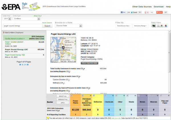
The maps, which can be analyzed by state and county, show the location of GHG emitters; suppliers of fossil fuels and industrial chemicals; onshore gas production facilities; local energy distribution companies; and the handful of facilities that inject CO2 underground. The maps will tell you how many facilities are in a given location and, if you keep zooming in, you get to facility-level data. For example, in Washington you can click on facilities in Bellevue and get to Puget Sound Energy, as shown below.

EPA GHG map 1

If you click on “View reported data,” you’ll be sent to another EPA database page that provides greater detail.

Aside from just clicking through points on the map, you can search for facilities by name or location. You can also filter data by type of GHG, or by the quantity of emissions.

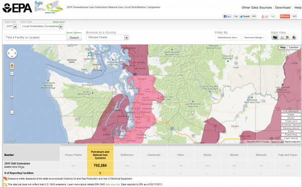
Where the data tool really comes to life is in the mapping of coverage areas for local energy companies. Still using Puget Sound Energy as our example, the mapped data shifts from the point source facility to the region served by the utility.

EPA GHG map 2

Below the map, EPA provides some context for the sector you are viewing, in this case petroleum and natural gas systems in the state. Washington has five such facilities that reported 702,285 metric tons of CO2-equivalent in 2011. At 665,994 metric tons, Puget Sound Energy is responsible for the vast majority of emissions associated with the state’s energy supply.

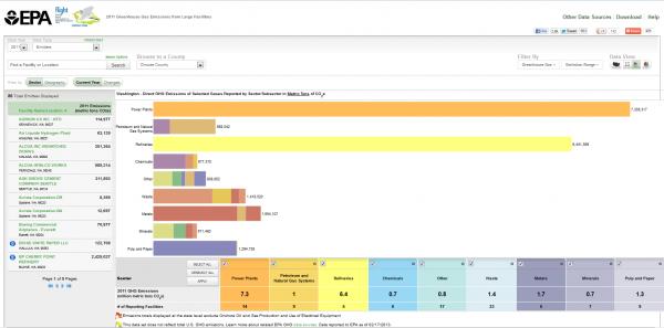
You can easily get a snapshot of statewide GHG emissions by playing with the “Data View” buttons on the top right of the GHG tool web page. In Washington, power plants and refineries account for the bulk of reported GHG emissions. Clicking on the pie chart instead of the bar chart displace the same data in more intuitive percentages.

EPA GHG map 3

To learn more about state-level GHG data, see our other posts: “Greenhouse gases: how do Western states compare?” and “Flow diagrams of U.S. and Western carbon emissions.”

EcoWest’s mission is to analyze, visualize, and share data on environmental trends in the North American West. Please subscribe to our RSS feed, opt-in for email updates, follow us on Twitter, or like us on Facebook.

Greenhouse gases: how do Western states compare?

One of the great challenges in reducing greenhouse gas (GHG) emissions is that the pollution emanates from so many activities and economic sectors. In this set of slides, we examine the sources of heat-trapping GHGs, with a focus on Western states.

Greenhouse gas emissions overview from EcoWest on Vimeo.

Nationally, nearly one third of GHG emissions come from providing electricity and heat to buildings, and more than one quarter is from transportation, mostly driving. GHG emissions have risen steadily since 1990, with growth slowing in the mid-2000s, partly due to efficiency improvements in the transportation and electricity sectors, and also thanks to a slowing economy.

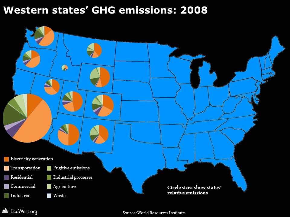
Using data from the World Resources Institute, we found that on average since 1990 the West has contributed 15-17% of national GHG emissions. Overall, the source profile for the West is very similar to that of the United States as a whole, but there are some important state-by-state differences. With an enormous economy and population, California leads the pack in GHG emissions, but power generation accounts for a much smaller share of those emissions than it does in states in the inland West. One major reason is that California imports a good deal of power from places like the Four Corners states. California also produces substantial electricity from hydropower dams and other renewable sources.

Western states GHG map

Transportation accounts for nearly half of California’s GHG emissions, in part due to the high level of auto-dependence in such a large, sprawling state, but also due to the presence of major transport hubs, such as the massive ports of Los Angeles and Long Beach.

On the bright side, California leads the country in per capita energy efficiency. The state’s 37 million residents use 6,700 kilowatts yearly on average, while the 25 million residents in Texas consume an average of 14,000 kilowatts a year. Wyoming residents use a whopping 27,000 kilowatts per capita annually.

Western states not only vary in their emissions profiles and energy efficiency; they also absorb widely varying amounts of carbon dioxide from the atmosphere. Heavily forested states, such as Washington and Oregon, have some of the largest carbon sinks, while states in the arid Southwest, such as Arizona and New Mexico, have much less vegetation to soak up all that carbon we’re emitting.

Downloads

EcoWest’s mission is to analyze, visualize, and share data on environmental trends in the North American West. Please subscribe to our RSS feed, opt-in for email updates, follow us on Twitter, or like us on Facebook.