The number of acres burned is the most common metric used for tracking wildfires, but there are other important measures for gauging the severity of the fire season.
The struggle to suppress wildfires is something that the federal government monitors very closely. For decades, it has been consistently reporting data on the army of firefighters deployed and the fleet of aircraft mobilized.
I’ve gathered the data on wildfire suppression in this dashboard and I’ve created a corresponding PowerPoint deck that’s available for download at the bottom of this post. In an earlier post, I discuss our fire trends dashboard, which tracks the number of fires and acres burned.
EcoWest wildfire suppresion metrics from EcoWest on Vimeo.
Preparedness levels
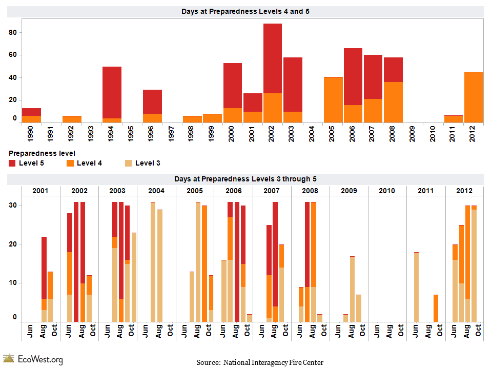
One way to examine historical wildfire activity is to look at how many days the federal government was operating under various preparedness levels. The National Interagency Fire Center uses five categories, similar to the now-abandoned Homeland Security threat levels. Preparedness level 5 is reserved for the most active times, while under level 4 the competition for firefighting resources is a bit less intense, and so on down to level 1, which is where we’re at now. It’s a little like the DEFCON levels that indicate the posture of American armed forces and show how close we are to a nuclear war.
The graphic below (click to enlarge) shows that preparedness levels vary greatly from year to year, but the 2000s were generally a busy time for wildland firefighters. In 2009 and 2010, however, the federal government never raised the preparedness level beyond 3.

Firefighting resources
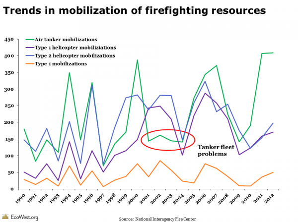
The federal government collects copious data on its deployment of firefighting resources and those figures are also barometers of wildfire activity. The graphic below (click to enlarge) shows some of the suppression trends. Type 1 helicopters are larger than type 2 helicopters, and type 1 mobilizations refer to the number of times that top-level incident command teams are deployed. Smaller, less complex fires are managed by type 2 teams. These categories tend to move together, but you’ll notice that the number of air tankers mobilized dropped around 2001—that’s because safety concerns over the aging fleet forced many planes to be grounded, even during some very active fire seasons.

It’s hard to detect any long-term trend in these suppression metrics. The level of effort expended to fight wildfires could also depend on government budgets. But when I’ve compared these suppression numbers to the data on acres burned, they’ve lined up pretty well. The number of days at preparedness levels 4 and 5, as well as the deployment of firefighting resources, is higher in years with a lot of big burns and lower in years when there are fewer fires that demand a quasi-military response.
I’d be curious to hear what others see in these graphics and whether folks think these metrics yield any valuable insights.
Data sources
The National Interagency Fire Center in Boise (which wildfire wonks pronounce “NIF-see”) is the go-to source for information on wildfires and suppression. I scraped data from NIFC’s annual reports to create these graphics and dashboards.
Downloads
- Download Slides: Wildfire Suppression Metrics (5988 downloads )
- Download Notes: Wildfire Suppression Metrics (6040 downloads )
- Download Data: Wildfire Suppression Metrics (5118 downloads )
EcoWest’s mission is to analyze, visualize, and share data on environmental trends in the North American West. Please subscribe to our RSS feed, opt-in for email updates, follow us on Twitter, or like us on Facebook.

