The United States emits around 5.6 billion metric tons of carbon dioxide equivalent (CO2e) each year. That’s roughly the annual CO2 exhaust of 1.2 billion cars, according to the U.S. EPA’s Greenhouse Gas (GHG) equivalency calculator, and it’s nearly 20 percent of annual global GHG emissions.
U.S. and Western carbon flow diagrams from EcoWest on Vimeo.
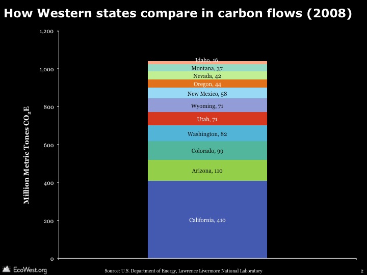
Flow diagrams from the Lawrence Livermore National Laboratory provide informative visual summaries of the nation’s carbon emissions from generation to end use. These graphics, also known as Sankey diagrams, show how many GHGs originate from the burning of fuels and how many GHGs are attributable to different economic sectors. Think of the left side of the flow as the supply side, and the right as the demand side. In this deck, I’ve also compiled slides representing GHG emissions in the 11 Western states, which show some interesting patterns in GHG emissions from origin to end use.
Data on GHG emissions is only available at the national level. To understand state-by-state differences, Lawrence Livermore uses state-level energy use data to estimate the flow of GHGs. The U.S. Department of Energy’s Energy Information Administration compiles such energy use data in the State Energy Data System (SEDS).
U.S. carbon emissions are generated by burning coal, natural gas, and petroleum products (gasoline, diesel, etc.); roughly 35%, 23%, and 42% of 2010 emissions, respectively. The carbon flows in individual states vary widely depending on state energy portfolios. End uses differ according to what industries predominate and population levels. Some of the patterns that jump out:
- California, Idaho, Oregon, and Washington are less coal-dependent and more petroleum dependent.
- Natural gas accounts for a higher portion of carbon emissions in states like Nevada and Oregon.
- Petroleum accounts for a lower portion of carbon emissions in Colorado and Wyoming.
Comparing Washington to Wyoming demonstrates how end use differs by state. Energy generation accounts for the bulk of carbon emissions in Wyoming, but the transportation and industrial sectors dominate in Washington. Wyoming is a major energy exporter to other states, while Washington relies heavily on hydropower, which does is essentially carbon-free.
When examining these slides, it’s important to remember that the size of the rectangles and the lines between them are not comparable from state to state. They show, within a state, where GHGs originate and terminate in various uses.
Lawrence Livermore also produces similar graphics for energy and water, and in another post, we provide a little background on Sankey diagrams, which are great tools for visualizing how commodities flow through systems.
Downloads
- Download slides: carbon flow diagrams (8988 downloads )
- Download notes: carbon flow diagrams (9727 downloads )
EcoWest’s mission is to analyze, visualize, and share data on environmental trends in the North American West. Please subscribe to our RSS feed, opt-in for email updates, follow us on Twitter, or like us on Facebook.


