The Nature Conservancy’s Atlas of Global Conservation is a fabulous resource for understanding biological diversity. Scientists have divided up the world into more than 1,000 ecoregions and analyzed how they compare across dozens of measures.
I’ve used data from TNC’s atlas to create a slide deck that illustrates patterns in species richness and threats to biodiversity, with a focus on the United States and American West. Below is a video of the PowerPoint, which you can download at the bottom of this post.
Visualizing biodiversity through the lens of ecoregions from EcoWest on Vimeo.
Biome basics
Before we get to ecoregions, let me first note a broader way that TNC and others classify the natural world: biomes. An area’s climate more or less determines what types of plants can grow, and at the highest level we can classify the planet’s land masses according to the predominant vegetation, or lack thereof. There are 16 terrestrial biomes, ranging from snow and tundra to tropical forests.
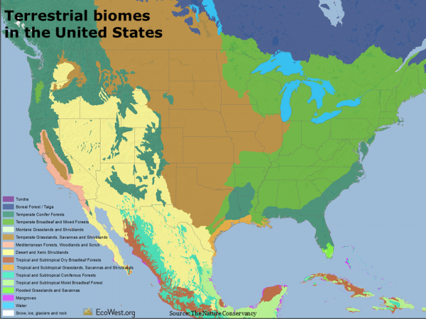
The map below (click to enlarge) shows the biomes found in the United States. Much of the interior West is dominated by desert and xeric (dry) shrublands, but the higher elevations support temperate conifer forests. California has Mediterranean forests along much of its coast and the Sierra Foothills. There’s a bit of subtropical forest in the mountains of Southeast Arizona and temperate broadleaf forest in Oregon’s Coastal Range.
As with temperature, rainfall, and elevation, there is more uniformity in the biomes found in the East than the West. Look, for example, at how many different types of communities are found in California, or how isolated mountains in the Great Basin create little biome islands.
The United States actually leads the world in the number of biomes and smaller ecoregions within its borders, even exceeding countries that are much larger in size, as shown in the graphic below.
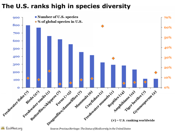
So it’s no surprise that the United States also ranks high in species diversity. In the graphic below, blue bars show the number of species by type. Orange diamonds show what percent of the world’s species are found in the United States and the number in parenthesis in the labels indicate the U.S. ranking worldwide. The highest levels of diversity for several groups are found in the United States, including freshwater mussels, freshwater snails, and crayfishes; several other groups, such as freshwater fishes and gymnosperms, are also well represented here.
Analyzing ecoregions
A more fine-grained view than biomes classifies the terrestrial world into 825 unique ecoregions. These areas are sort of like ecological neighborhoods with similar habitat. Below is a close-up of the American West. If you were to drive through several ecoregions on an interstate road trip, you’d notice the differences simply by looking out the window.
TNC’s atlas also analyzes the planet according to its 426 freshwater ecoregions. Each of the regions has a unique collection of aquatic species and freshwater habitats. The map below shows the West’s two-dozen or so freshwater ecoregions, which generally correspond to the boundaries of important river basins.
Dozens of biodiversity metrics
TNC’s atlas offers dozens and dozens of layers of geographic information by terrestrial, freshwater, and marine ecoregion. The deck that you can download at the bottom of this post has 71 slides, with views of both the world and United States.
To give you a taste of what’s available, here’s a summary of three slides.
1) Species diversity is greatest around the equator
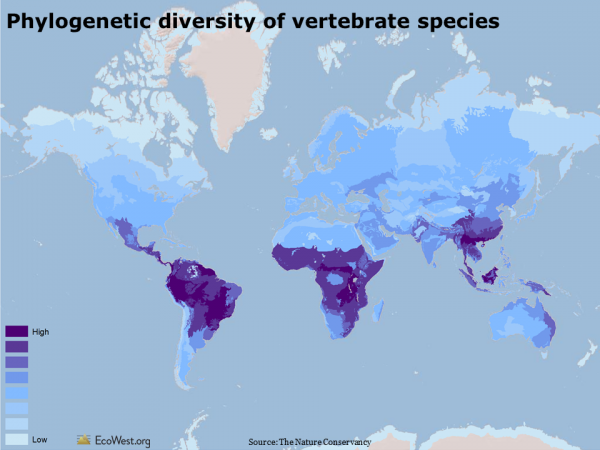
One way to describe biodiversity is to look at the evolutionary distinctiveness of species in a given location. The map below shows the phylogenetic diversity of terrestrial vertebrate species (animals with a backbone). Phylogenetics is a measure of how closely related a group of species is. An ecoregion with high phylogenetic diversity has species that are more distinct from one another (see this summary and this paper for more on the measure).
In general, measures of species diversity are greater at lower latitudes due to the past effects of Ice Age glaciation at higher latitudes and the configuration of islands and other landforms on the Earth, both past and present. In the West, phylogenetic diversity of vertebrate species tends to be highest in the desert Southwest.
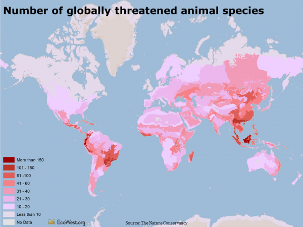
2) Hotspots for threatened animals
The analysis and conservation of biodiversity often focuses on those species most at risk of extinction. The map below shows the number of globally threatened animals by terrestrial ecoregion. Threatened species are those listed by the International Union for the Conservation of Nature’s Red List as vulnerable, endangered, or critically endangered. Globally, some of the greatest concentrations of threatened vertebrates are in South America and Southeast Asia. About half of the threatened animals are reptiles and amphibians, one quarter are mammals, and one quarter are birds. In the United States, the Southwest, the foothills around California’s Central Valley, the Southeast, and the Appalachians have the most threatened animals.
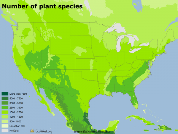
3) Plenty of plants in arid American West
The map below shows the number of plant species by terrestrial ecoregion. Worldwide, there are more than 420,000 of the so-called higher order plants: trees, vines, grasses, fruits, vegetables, and legumes. Deserts and arid lands typically have fewer plant species, while tropical rainforests have the most. But in North America, some drier parts of the inland West actually have more plant species than wetter climes along the coast. Compare, for example, the Great Basin in Nevada to Washington.
Those are just a few of the slides that I found most interesting. I’d be curious to hear from readers if they spot other patterns.
Data sources
To create the maps, I downloaded the GIS data from Data Basin (a search query for “Hoekstra,” as in atlas lead author and EcoWest advisor Jon Hoekstra, will return all the layers).
I highly recommend the book form of TNC’s atlas, which taught me a ton about biodiversity around the globe.
See this page for more background on ecoregions from WWF.
Downloads
- Download Slides: TNC Conservation Atlas (4457 downloads )
- Download Notes: TNC Conservation Atlas (5223 downloads )
EcoWest’s mission is to analyze, visualize, and share data on environmental trends in the North American West. Please subscribe to our RSS feed, opt-in for email updates, follow us on Twitter, or like us on Facebook.

