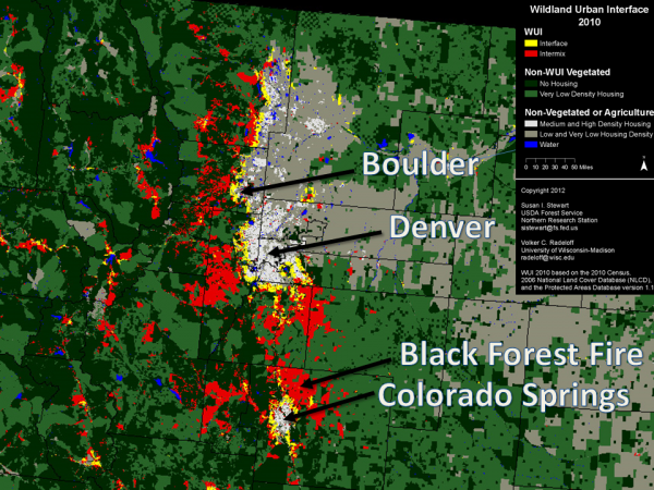
The fire-prone wildland-urban interface (WUI) is in the news after more than 500 homes burned in the 14,280-acre Black Forest Fire near Colorado Springs. The most destructive wildfire in state history (in terms of homes lost) has once again highlighted the dangers of living amid flammable forests and woodlands.
I’ve pulled together maps of the WUI (“WOO-ee” is how fire folks pronounce it) on this page and in PowerPoint slide decks that you can download at the bottom of this post.
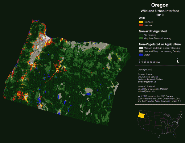
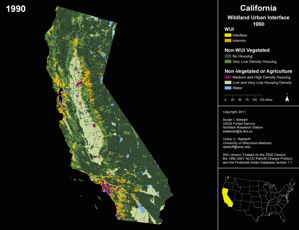
The maps come from the University of Wisconsin’s SILVIS laboratory. Below are some examples. If you click on the images, you’ll be able to see much more detail in a larger version and start the 1990-to-2000 animation for California.
Intermix versus interface
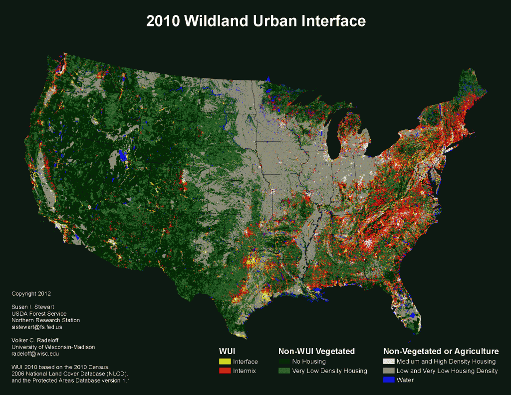
These maps distinguish between the wildland-urban interface (yellow in 2010 maps) and intermix (red) areas. “Intermix WUI are areas where housing and vegetation intermingle; interface WUI are areas with housing in the vicinity of contiguous wildland vegetation,” according to the lab.
I was surprised by the prevalence of the WUI back East. Eastern areas record a large number human-caused fires and some can get pretty large (see our fire trends dashboard and post for more on this), but it seems like wildfires burning down homes is always portrayed as a Western issue. These maps do not account for the varying fire potential around the country–they’re more about where homes and potential fuels mix.
In the West, the WUI is found pretty much where you’d expect. In many of the region’s cities and denser suburbs, there simply isn’t enough vegetation to burn. Conversely, you won’t find the WUI in the middle of a wilderness where homes aren’t allowed. It tends to be on the outskirts of metro areas, where homes mix with the vegetation, right up to the front porch in some cases, or in more rural places where homes are surrounded by public lands and continuous blocks of fuel.
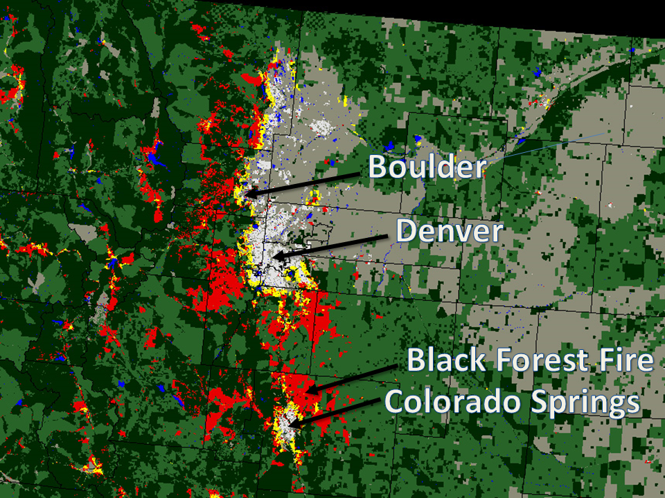
As an example, I’ve created this close-up of the Colorado Front Range and labelled it with some major cities, as well as the Black Forest Fire, in the WUI northeast of Colorado Springs.
These WUI maps seem like a pretty good proxy for the risk of wildfires destroying homes and property in the United States, at least in the West. The yellow/red color scheme may imply that the dangers are greater in the intermix than the interface, but in a 2005 paper, the researchers write that the categorization “does not explicitly account for differences in fire risk.”
With billions of dollars of real estate at stake, private firms like CoreLogic do even more detailed analysis of the hazards. In a future post, I’ll share some data on the number of homes at risk in each state.
Data sources
The SILVIS lab provides many more images and the underlying GIS data on this page.
This data was the basis for a 2005 paper in Ecological Applications (PDF here).
Downloads
- Download Slides: 2010 WUI (5764 downloads )
- Download Slides: 1990-2000 WUI Black Background (5562 downloads )
- Download Slides: 1990-2000 WUI White Background (5453 downloads )
EcoWest’s mission is to analyze, visualize, and share data on environmental trends in the North American West. Please subscribe to our RSS feed, opt-in for email updates, follow us on Twitter, or like us on Facebook.

