Tag Archives: map

Viewing biodiversity through the ecoregional lens

The Nature Conservancy’s Atlas of Global Conservation is a fabulous resource for understanding biological diversity. Scientists have divided up the world into more than 1,000 ecoregions and analyzed how they compare across dozens of measures.

I’ve used data from TNC’s atlas to create a slide deck that illustrates patterns in species richness and threats to biodiversity, with a focus on the United States and American West. Below is a video of the PowerPoint, which you can download at the bottom of this post.

Visualizing biodiversity through the lens of ecoregions from EcoWest on Vimeo.

Biome basics

Before we get to ecoregions, let me first note a broader way that TNC and others classify the natural world: biomes. An area’s climate more or less determines what types of plants can grow, and at the highest level we can classify the planet’s land masses according to the predominant vegetation, or lack thereof. There are 16 terrestrial biomes, ranging from snow and tundra to tropical forests.

The map below (click to enlarge) shows the biomes found in the United States. Much of the interior West is dominated by desert and xeric (dry) shrublands, but the higher elevations support temperate conifer forests. California has Mediterranean forests along much of its coast and the Sierra Foothills. There’s a bit of subtropical forest in the mountains of Southeast Arizona and temperate broadleaf forest in Oregon’s Coastal Range.

United States biomes

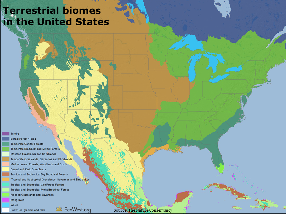
As with temperature, rainfall, and elevation, there is more uniformity in the biomes found in the East than the West. Look, for example, at how many different types of communities are found in California, or how isolated mountains in the Great Basin create little biome islands.

The United States actually leads the world in the number of biomes and smaller ecoregions within its borders, even exceeding countries that are much larger in size, as shown in the graphic below.

United States biomes and ecoregions

So it’s no surprise that the United States also ranks high in species diversity. In the graphic below, blue bars show the number of species by type. Orange diamonds show what percent of the world’s species are found in the United States and the number in parenthesis in the labels indicate the U.S. ranking worldwide. The highest levels of diversity for several groups are found in the United States, including freshwater mussels, freshwater snails, and crayfishes; several other groups, such as freshwater fishes and gymnosperms, are also well represented here.

United States ranks high in species diversity

Analyzing ecoregions

A more fine-grained view than biomes classifies the terrestrial world into 825 unique ecoregions. These areas are sort of like ecological neighborhoods with similar habitat. Below is a close-up of the American West. If you were to drive through several ecoregions on an interstate road trip, you’d notice the differences simply by looking out the window.

Ecoregions of the American West

TNC’s atlas also analyzes the planet according to its 426 freshwater ecoregions. Each of the regions has a unique collection of aquatic species and freshwater habitats. The map below shows the West’s two-dozen or so freshwater ecoregions, which generally correspond to the boundaries of important river basins.

Freshwater ecoregions of the American West

Dozens of biodiversity metrics

TNC’s atlas offers dozens and dozens of layers of geographic information by terrestrial, freshwater, and marine ecoregion. The deck that you can download at the bottom of this post has 71 slides, with views of both the world and United States.

To give you a taste of what’s available, here’s a summary of three slides.

1) Species diversity is greatest around the equator

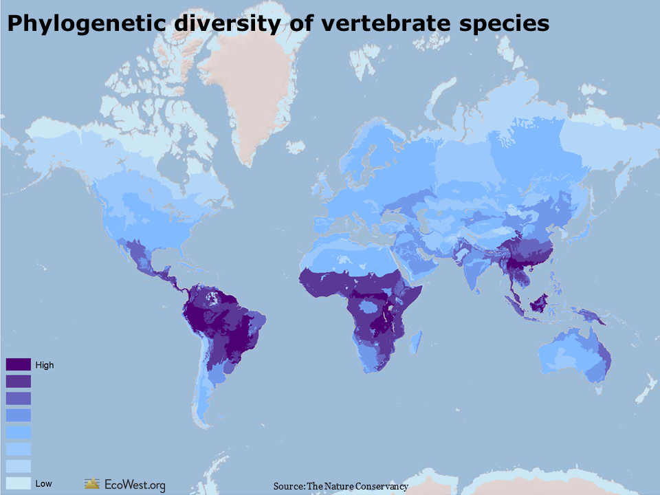
One way to describe biodiversity is to look at the evolutionary distinctiveness of species in a given location. The map below shows the phylogenetic diversity of terrestrial vertebrate species (animals with a backbone). Phylogenetics is a measure of how closely related a group of species is. An ecoregion with high phylogenetic diversity has species that are more distinct from one another (see this summary and this paper for more on the measure).

In general, measures of species diversity are greater at lower latitudes due to the past effects of Ice Age glaciation at higher latitudes and the configuration of islands and other landforms on the Earth, both past and present. In the West, phylogenetic diversity of vertebrate species tends to be highest in the desert Southwest.

Phylogenetic diversity of species

2) Hotspots for threatened animals 

The analysis and conservation of biodiversity often focuses on those species most at risk of extinction. The map below shows the number of globally threatened animals by terrestrial ecoregion. Threatened species are those listed by the International Union for the Conservation of Nature’s Red List as vulnerable, endangered, or critically endangered. Globally, some of the greatest concentrations of threatened vertebrates are in South America and Southeast Asia. About half of the threatened animals are reptiles and amphibians, one quarter are mammals, and one quarter are birds. In the United States, the Southwest, the foothills around California’s Central Valley, the Southeast, and the Appalachians have the most threatened animals.

Number of globally threatened animals

3) Plenty of plants in arid American West

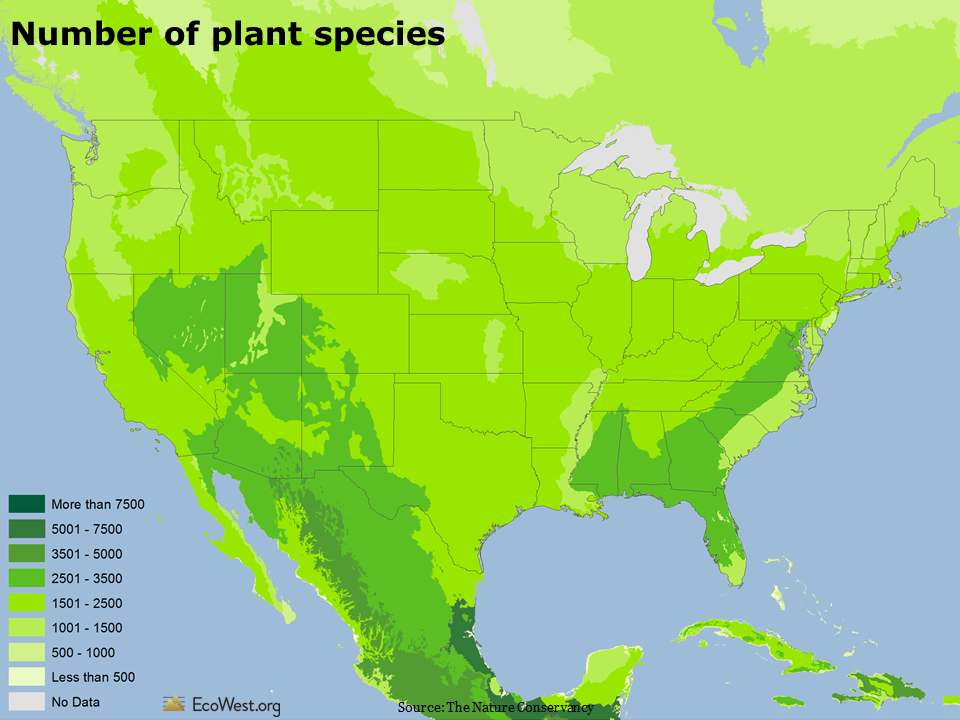
The map below shows the number of plant species by terrestrial ecoregion. Worldwide, there are more than 420,000 of the so-called higher order plants: trees, vines, grasses, fruits, vegetables, and legumes. Deserts and arid lands typically have fewer plant species, while tropical rainforests have the most. But in North America, some drier parts of the inland West actually have more plant species than wetter climes along the coast. Compare, for example, the Great Basin in Nevada to Washington.

Number of plant species

Those are just a few of the slides that I found most interesting. I’d be curious to hear from readers if they spot other patterns.

Data sources

To create the maps, I downloaded the GIS data from Data Basin (a search query for “Hoekstra,” as in atlas lead author and EcoWest advisor Jon Hoekstra, will return all the layers).

I highly recommend the book form of TNC’s atlas, which taught me a ton about biodiversity around the globe.

See this page for more background on ecoregions from WWF.

Downloads

EcoWest’s mission is to analyze, visualize, and share data on environmental trends in the North American West. Please subscribe to our RSS feed, opt-in for email updates, follow us on Twitter, or like us on Facebook.

Mapping major emitters with EPA’s greenhouse gas tool

If you’re curious about the industrial operations that are emitting greenhouse gases (GHG) in your state or neighborhood, the U.S. Environmental Protection Agency (EPA) has a great data tool that also provides some helpful context with its visualizations.

Data is only available for 2011, but EPA’s tool provides a wealth of information for interested citizens and environmental experts alike. The tool only reports on facilities that emit more than 25,000 metric tons of GHGs a year, but these major emitters, such as power plants and refineries, account for more than half of the nation’s total GHG output.

The maps, which can be analyzed by state and county, show the location of GHG emitters; suppliers of fossil fuels and industrial chemicals; onshore gas production facilities; local energy distribution companies; and the handful of facilities that inject CO2 underground. The maps will tell you how many facilities are in a given location and, if you keep zooming in, you get to facility-level data. For example, in Washington you can click on facilities in Bellevue and get to Puget Sound Energy, as shown below.

EPA GHG map 1

If you click on “View reported data,” you’ll be sent to another EPA database page that provides greater detail.

Aside from just clicking through points on the map, you can search for facilities by name or location. You can also filter data by type of GHG, or by the quantity of emissions.

Where the data tool really comes to life is in the mapping of coverage areas for local energy companies. Still using Puget Sound Energy as our example, the mapped data shifts from the point source facility to the region served by the utility.

EPA GHG map 2

Below the map, EPA provides some context for the sector you are viewing, in this case petroleum and natural gas systems in the state. Washington has five such facilities that reported 702,285 metric tons of CO2-equivalent in 2011. At 665,994 metric tons, Puget Sound Energy is responsible for the vast majority of emissions associated with the state’s energy supply.

You can easily get a snapshot of statewide GHG emissions by playing with the “Data View” buttons on the top right of the GHG tool web page. In Washington, power plants and refineries account for the bulk of reported GHG emissions. Clicking on the pie chart instead of the bar chart displace the same data in more intuitive percentages.

EPA GHG map 3

To learn more about state-level GHG data, see our other posts: “Greenhouse gases: how do Western states compare?” and “Flow diagrams of U.S. and Western carbon emissions.”

EcoWest’s mission is to analyze, visualize, and share data on environmental trends in the North American West. Please subscribe to our RSS feed, opt-in for email updates, follow us on Twitter, or like us on Facebook.

An interactive map of water risk and stress

The World Resources Institute has developed Aqueduct, an interactive mapping tool that offers a fascinating look at water-related risks and stresses, including projected impacts due to climate change.

Using global data donated by Coca-Cola, one of several heavyweight corporate partners (Goldman Sachs and General Electric founded the Aqueduct Alliance), WRI has analyzed and visualized a dozen water-related risk factors facing businesses, governments, and communities. Below is a view of overall water risk (click to enlarge).

WRI Aqueduct: overall water risk

Elements of water risk

Aqueduct’s water risk model includes a dozen components, as shown in the slide below. The physical quantity risks deal with questions of supply, such as a location’s climate and its susceptibility to drought. The physical quality risks revolve around pollution, such as the protective status of upstream watersheds and how many times river water is re-used. The final category, regulatory and reputational risk, uses proxies, such as the number of threatened amphibians to highlight more fragile ecosystems that may face restrictions on withdrawals. There’s even a measure for media coverage of water issues to indicate where businesses will face greater risks to their public image if they do not manage water sustainably.

WRI Aqueduct water risk framework

In the online atlas, you can examine each of these dozen factors separately and weight the three categories according to the needs of industry groups, including agriculture, semiconductors, and oil and gas. In the screenshot below, I’ve zoomed in on the United States and selected interannual variability (how much the water supply varies year to year). This risk factor is generally much greater in the West than in the East, and especially high in the Southwest. The numbers in circles indicate how many water-related media stories are currently showing up in the map’s built-in news feed.

WRI Aqueduct: example

Background on project

Here’s more about the project from WRI:

Water scarcity is one of the defining issues of the 21st century. In its Global Risks 2013 report, the World Economic Forum identified water supply crises as one of the highest impact and most likely risks facing the planet. With the support of a diverse group of partners, the World Resources Institute built Aqueduct to help companies, investors, governments, and communities better understand where and how water risks are emerging around the world.In January 2013, the World Resources Institute launched the centerpiece of Aqueduct after a three-year development effort: the Water Risk Atlas. The Atlas uses a robust, peer reviewed methodology and the best-available data to create high-resolution, customizable global maps of water risk.

The Aqueduct Water Risk Framework brings together 12  indicators into three categories of water risk and an overall aggregated score. The framework is based on a thorough review of the literature and available global data, and includes several indicators developed exclusively for Aqueduct. It is structured, in particular, to help companies and investors understand indicators of water-related risk to their business, but is intended for all users, including government and civil society to better understand geographic water issues. The Aqueduct Alliance, founded by General Electric and Goldman Sachs, is the network of companies and organizations that support the Aqueduct project. These partners provide resources as well as expertise and perspective to the project.

Mapping water stress

One illuminating feature of the atlas is that it allows you to examine water stress–essentially the imbalance between water supply and demand–under current conditions and three IPCC climate change scenarios.

The map below shows the baseline water stress, which is defined as “the ratio of total annual freshwater withdrawals for the year 2000, relative to expected annual renewable freshwater supply based on 1950-1990 climatic norms.”

WRI aqueduct: baseline water stress

As you would expect, there’s a lot more stress, water-wise, in Phoenix than Portland. The roots of some age-old intrastate water conflicts show up pretty clearly, such as lower water stress in California’s wetter north, but extremely high stress in the drier south. There are similar dividing lines in Colorado: most of the water is on the Western slope, but the bulk of the population is east of Continental Divide along the Front Range.

Projecting climate change impacts

The maps below look ahead to 2095 and depicts projected changes in water stress. I’ve used the IPCC’s optimistic B2 and pessimistic A2 emissions scenarios, which show that higher levels of greenhouse gases will create much more water stress across the country. In the pessimistic scenario, I didn’t find any places in the continental United States where water stress decreased by 2095.

WRI Aqueduct projected change in water stress optimistic scenario

Water stress map

The Aqueduct atlas also has climate change projections for 2025 and 2050. It’s one of many ways you can customize your views of the data and I’d encourage anyone with an interest in water issues to take a few minutes to explore WRI’s useful visualization.

Data sources

WRI provides the data for download on this page. You can also download their framework document and indicator metadata. Below is an embed of their YouTube video explaining how to use the Aqueduct tool.

Downloads

EcoWest’s mission is to analyze, visualize, and share data on environmental trends in the North American West. Please subscribe to our RSS feed, opt-in for email updates, follow us on Twitter, or like us on Facebook.