All posts by Mitch Tobin

Mitch Tobin, the editor of ecowest.org, is owner of Sea to Snow Consulting and was previously communications director at California Environmental Associates. Prior to joining CEA, Mitch was a newspaper reporter at the Napa Valley Register, Tucson Citizen, and Arizona Daily Star, where he covered water, environmental, and border issues for five years. He was also a contributor to High Country News. Mitch's first book, Endangered (Fulcrum 2010), evaluates the effectiveness of the Endangered Species Act and received a gold medal in the 2011 Independent Publisher Book Awards.

Timber harvest falls in national forests

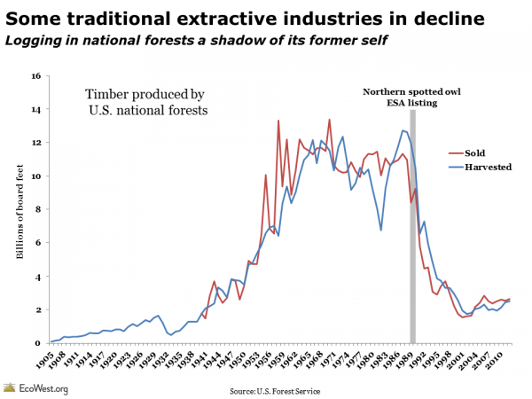
Logging on national forests, many of them located in the West, is a shadow of its former self. One of the clearest trends we found in our research was the decline in the timber harvest reported by the U.S. Forest Service, as shown in the graphic below (click to enlarge) and on our forestry dashboard.

Forest service harvest

Prior to creation of the Forest Service in 1905, the activity was largely unregulated in the West. After World War II, harvest rates increased significantly, but starting in the late 1970s, environmental regulations and international competition led to dramatic decreases in the amount of timber coming off public lands. Passage of the National Forest Management Act of 1976 and restrictions related to the spotted owl in the 1990s led to major reductions in clear-cutting and other harmful practices.

Interactive dashboard from Headwaters

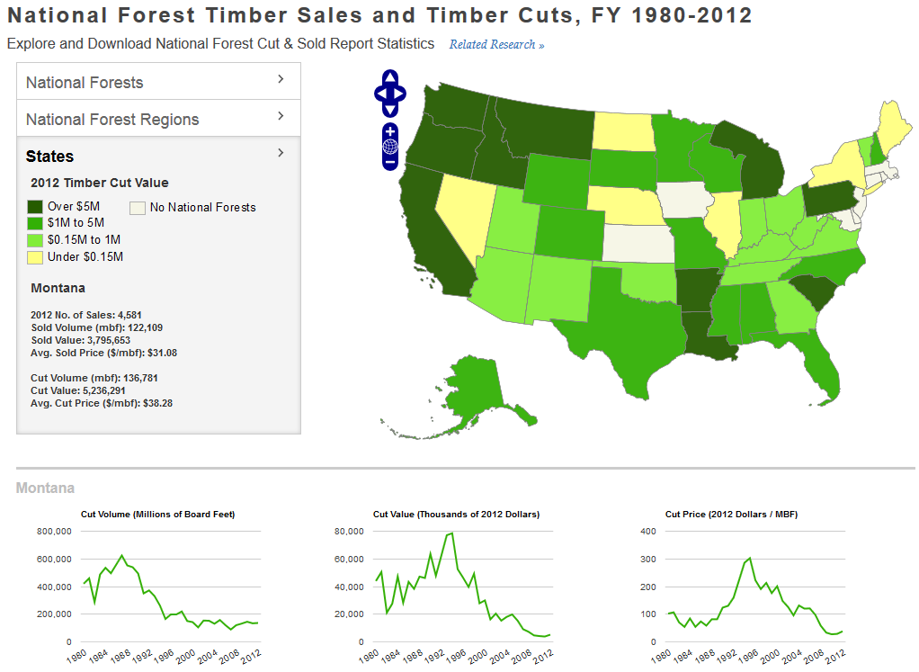
To learn more about public lands logging, check out the great dashboard that Headwaters Economics has developed. Although the data only goes back to 1980, the dashboard illustrates the timber harvest in each state, national forest, and U.S. Forest Service region.

In the screenshot below, I’ve highlighted Oregon’s Willamette National Forest. You can see a pretty stunning drop in logging starting around 1990, which is mirrored in other national forests in the region.
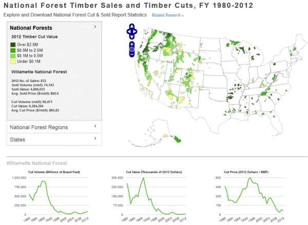
Source: Headwaters Economics

I was curious whether the timber harvest had also fallen as precipitously in places where there aren’t any spotted owls. The screenshot below highlights logging on national forests in Montana, which also declined, but not as sharply as in the West Coast states.

Source: Headwaters Economics

National forests aren’t the only places where logging takes place in the West. Especially along the Pacific Coast, there’s a ton of private and state land that’s actively logged. Some timber harvests also take place on tribal and BLM land. While national forests account for a big piece of the pie, it would be interesting to see whether the same trends are playing out on other lands in the West.

Data sources

The U.S. Forest Service provides historical data on harvests in this document and on this page. Headwaters Economics offers free downloads of the data in its interactive dashboard and provides more details on the data here.

Downloads

EcoWest’s mission is to analyze, visualize, and share data on environmental trends in the North American West. Please subscribe to our RSS feed, opt-in for email updates, follow us on Twitter, or like us on Facebook.

Flow diagrams of U.S. and Western water use

Americans use an average of 410 billion gallons of water per day. Where does all that water come from and where does it go?

Flow diagrams from the Lawrence Livermore National Laboratory provide excellent summaries of the nation’s water use. These graphics, also known as Sankey diagrams, show how much we pump from groundwater aquifers, how many gallons of surface water we divert, and which economic sectors use the most water.

In this slide deck (download links at bottom of post), I’ve pulled together the flow diagrams for the 11 Western states, which show some interesting regional patterns in water use.

Flow diagrams of U.S. and Western water use from EcoWest on Vimeo.

Diagrams visualize commodity flows

Lawrence Livermore produces similar graphics for energy and carbon dioxide. In another post, I provide a little background on Sankey diagrams, which are a great tool for visualizing how a commodity flows through a system.

Data for the water diagrams come from the U.S. Geological Survey, which publishes a report every five years summarizing the nation’s water use (the latest year available is 2005).

The flow diagrams segment water sources into four main categories: fresh surface water, saline surface water, fresh groundwater, and saline (brackish) groundwater. Lawrence Livermore summarizes national-level water use this way:

Fresh surface-water, from lakes and rivers, is used at large scale in every sector of the economy. Saline surface water, primarily ocean water, is mostly used for once-through thermoelectric cooling, although some ocean water is used for industrial cooling and a small but growing amount of ocean water is being desalinated for public consumption. Significant quantities of fresh groundwater are used in irrigation and fresh groundwater plays an important role in both public supply as well as self-supplied domestic water consumption. Brackish groundwater is the most difficult water resource to use and is therefore primarily used in the mining sector and in power production (often in geothermal power plants).

Western states vary widely

The state-level slides reveal that water is managed very differently across the West, with some residents heavily dependent on surface water and others more reliant on groundwater. In Montana, Utah, and Wyoming, saline groundwater is an important source for mining and industry, while in Idaho and Oregon there’s a fair amount of fresh water devoted to aquaculture.

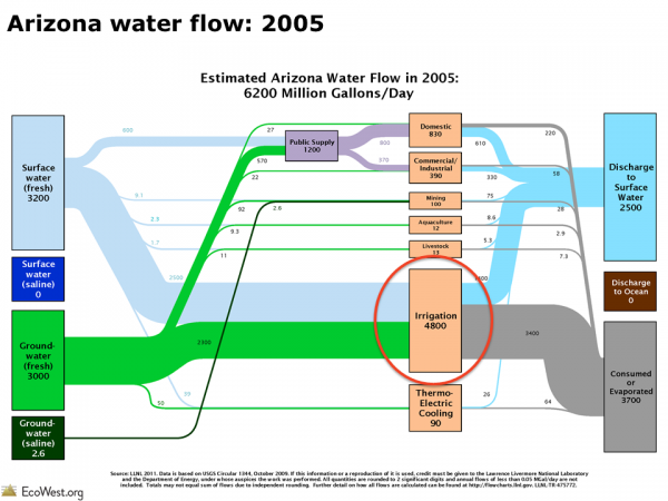
Across the region, the water delivered to homes and businesses is just a fraction of what’s devoted to growing crops. Consider the arid state of Arizona, where discussions about water tend to focus on the state’s growing cities. In reality, the graphic below (click to enlarge) shows that farming totally dominates water consumption in Arizona.

Arizona water flow

When examining these slides, it’s important to remember that the size of the rectangles and the connecting lines are not comparable from state to state. Instead, they show the proportions of surface water and groundwater that are directed to various uses within each state.

Lawrence Livermore also offers this caveat:

Water use data is notoriously hard to compile. Accounting policies vary between different water management districts and water use is not metered in the same way that higher-priced commodities are sold. Quantifying water use by location and sector requires substantial estimation.Water disposition is even more difficult to quantify. While the quality of wastewater discharge is measured regularly for environmental purposes, the total quantity of wastewater is not carefully monitored, especially when that wastewater already meets environmental regulations for discharge.

Despite these drawbacks, I’ve found these diagrams to be super-helpful in understanding Western and national water-use patterns. Once the U.S. Geological Survey releases data from the 2010 report, which isn’t expected until 2014, it’ll be interesting to see if there have been any significant shifts in water use.

Downloads

EcoWest’s mission is to analyze, visualize, and share data on environmental trends in the North American West. Please subscribe to our RSS feed, opt-in for email updates, follow us on Twitter, or like us on Facebook.
Gauging wildfire severity with suppression metrics

The number of acres burned is the most common metric used for tracking wildfires, but there are other important measures for gauging the severity of the fire season.

The struggle to suppress wildfires is something that the federal government monitors very closely. For decades, it has been consistently reporting data on the army of firefighters deployed and the fleet of aircraft mobilized.

I’ve gathered the data on wildfire suppression in this dashboard and I’ve created a corresponding PowerPoint deck that’s available for download at the bottom of this post. In an earlier post, I discuss our fire trends dashboard, which tracks the number of fires and acres burned.

EcoWest wildfire suppresion metrics from EcoWest on Vimeo.

Preparedness levels

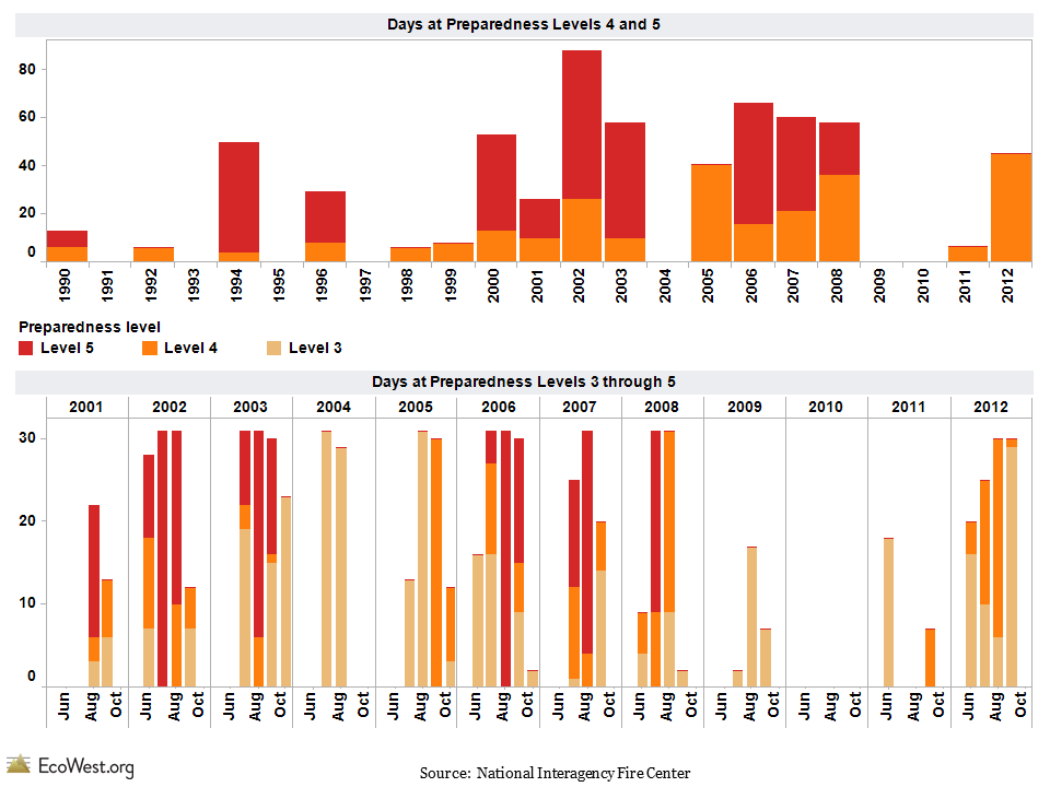
One way to examine historical wildfire activity is to look at how many days the federal government was operating under various preparedness levels. The National Interagency Fire Center uses five categories, similar to the now-abandoned Homeland Security threat levels. Preparedness level 5 is reserved for the most active times, while under level 4 the competition for firefighting resources is a bit less intense, and so on down to level 1, which is where we’re at now. It’s a little like the DEFCON levels that indicate the posture of American armed forces and show how close we are to a nuclear war.

The graphic below (click to enlarge) shows that preparedness levels vary greatly from year to year, but the 2000s were generally a busy time for wildland firefighters. In 2009 and 2010, however, the federal government never raised the preparedness level beyond 3.
wildfire preparedness

Firefighting resources

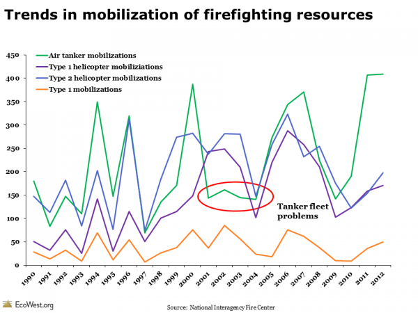
The federal government collects copious data on its deployment of firefighting resources and those figures are also barometers of wildfire activity. The graphic below (click to enlarge) shows some of the suppression trends. Type 1 helicopters are larger than type 2 helicopters, and type 1 mobilizations refer to the number of times that top-level incident command teams are deployed. Smaller, less complex fires are managed by type 2 teams. These categories tend to move together, but you’ll notice that the number of air tankers mobilized dropped around 2001—that’s because safety concerns over the aging fleet forced many planes to be grounded, even during some very active fire seasons.
wildfire suppression metrics
It’s hard to detect any long-term trend in these suppression metrics. The level of effort expended to fight wildfires could also depend on government budgets. But when I’ve compared these suppression numbers to the data on acres burned, they’ve lined up pretty well. The number of days at preparedness levels 4 and 5, as well as the deployment of firefighting resources, is higher in years with a lot of big burns and lower in years when there are fewer fires that demand a quasi-military response.

I’d be curious to hear what others see in these graphics and whether folks think these metrics yield any valuable insights.

Data sources

The National Interagency Fire Center in Boise (which wildfire wonks pronounce “NIF-see”) is the go-to source for information on wildfires and suppression. I scraped data from NIFC’s annual reports to create these graphics and dashboards.

Downloads

EcoWest’s mission is to analyze, visualize, and share data on environmental trends in the North American West. Please subscribe to our RSS feed, opt-in for email updates, follow us on Twitter, or like us on Facebook.