All posts by Mitch Tobin

Mitch Tobin, the editor of ecowest.org, is owner of Sea to Snow Consulting and was previously communications director at California Environmental Associates. Prior to joining CEA, Mitch was a newspaper reporter at the Napa Valley Register, Tucson Citizen, and Arizona Daily Star, where he covered water, environmental, and border issues for five years. He was also a contributor to High Country News. Mitch's first book, Endangered (Fulcrum 2010), evaluates the effectiveness of the Endangered Species Act and received a gold medal in the 2011 Independent Publisher Book Awards.

Snow jobs: America’s $12 billion winter sports economy and climate change

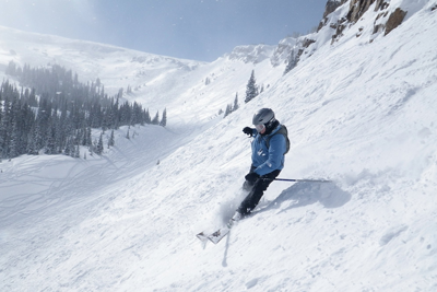
The author at work. Photo by Andy Tarica.

Full disclosure: I love to ski and snowboard, so before reading further, you should know that I’m more of a passionate participant than neutral analyst of America’s snow sports industry.

But whether you’re a ski bum, X Games aspirant, or disinterested flatlander, it’s undeniable that a ton of money is changing hands when it comes to skiing, snowboarding, snowmobiling, and other sports dependent on snow.

In the 2012/2013 season, 8.2 million Americans alpine skied at least once, 7.4 million people snowboarded, and 3.3 million people cross-country skied, for a combined total of nearly 57 million skier-visits. Snowmobiling, which is especially popular in the Upper Midwest, generated more than 7 million visits in just three states combined: Minnesota, Michigan, and Wisconsin.

To cut to the chase: if greenhouse gas emissions continue to climb, climate change is going to endanger America’s winter sports industry. Although a warming atmosphere can hold more water vapor, the precipitation will be more likely to fall as rain than snow, so even parts of the West that get wetter overall could see dramatic reductions in snowfall.

A diminished snowpack will jeopardize water supplies, increase wildfire risks, and transform entire ecosystems. Compared to these impacts, harm to ski bums and resorts may seem trivial, but in economic terms, low-snow years can devastate the tourism that some communities depend on. In the 2009/2010 season, U.S. winter sports trips generated nearly 212,000 jobs, labor income of $7 billion, and total economic value of $12.2 billion.

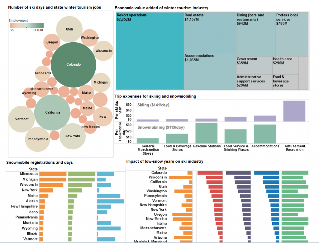
To illustrate what winter sports mean to the U.S. economy, I’ve created a dashboard on this page that visualizes data in a report from two researchers at the University of New Hampshire. Below is a screenshot (click to enlarge).

EcoWest winter sports dashboard

The Natural Resources Defense Council and Protect Our Winters, two advocacy groups, contracted with Elizabeth Burakowski and Matthew Magnusson to examine winter sports tourism in 38 states. The December 2012 report also estimates how much money each state lost, in jobs and economic value, in a low-snow year compared to a high-snow year.

In a future post, we’ll take a closer look at what the science is telling us about trends in the Western snowpack, but the authors of this report paint a bleak portrait of what’s to come under business-as-usual emissions scenarios:

Without intervention, winter temperatures are projected to warm an additional 4 to 10 degrees Fahrenheit by the end of the century, with subsequent decreases in snow cover area, snowfall, and shorter snow season. Snow depths could decline in the west by 25 to 100 percent. The length of the snow season in the northeast will be cut in half.

Yikes. Better seize those powder days while you can. I know I am.

Below is a summary of some visualizations from the dashboard, the original study, and other data sources.

Snow sports widespread

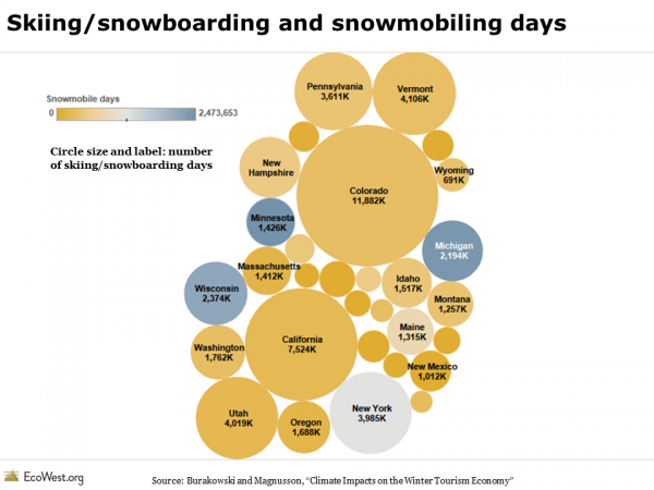
Here in Colorado, winter tourism is a major economic driver, and it’s no shock that we’re tops in the nation for skiing/snowboarding visits. Colorado accounted for one-fifth of ski and snowboarding visits, while one-eighth took place in California. What surprised me was that all but 12 of the 50 states have a winter sports economy (in reporting their findings, the authors did lump together some alpine powerhouses, such as Illinois and Indiana). If you factor in snowmobiling, the winter sports industry has an impressive geographic reach. In the graphic below, the circles are sized by the number of skiing/snowboarding visits and colored according to the number of snowmobiling visits.

Skiing, snowboarding, and snowmobiling days

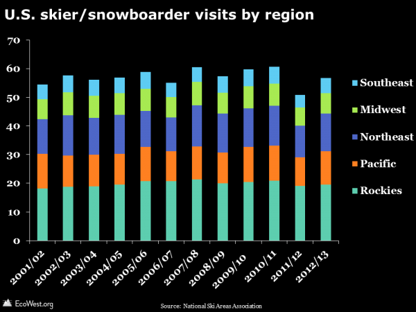
Data from another source, the National Ski Areas Association, confirms there’s plenty of skiing and snowboarding taking place outside of the West. I grew up skiing/skidding on the icy hills of Northern New Jersey, Vermont, and New Hampshire, and I can definitively state that the skiing out West is way better, but if you look at the number of visits to U.S. resorts, the Rockies and Pacific regions only make up about 55% of the total.

U.S. skier/snowboarder visits by region

Billions at stake in winter tourism

It’s hard not to spend money while skiing and snowboarding, even if you live in Colorado. Before hitting the slopes, I’ll often fuel up my car at the gas station and fill my belly at my local greasy spoon. At the mountain, my annual ski pass helps pay for the parking attendants, lift operators, and ski patrol. Single-day lift ticket prices are north of $100 at some ski areas, which explains why “resort operations” is the biggest box in the graphic below.
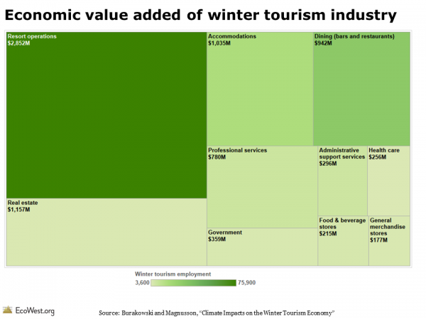
Economic value added of winter tourism industryMany ski areas have villages or minor cities at their bases with restaurants, shops, hotels, and spas. Whether it’s the glitterati buying up garish outfits or local yokels like me purchasing coffee for the drive home, money is circulating in the snow-based economy. In mid-February, at Denver International Airport, the wind-chill outside may be 10-below zero, but the baggage claim is a madhouse of travelers arriving from around the globe, ready to shell out big bucks.

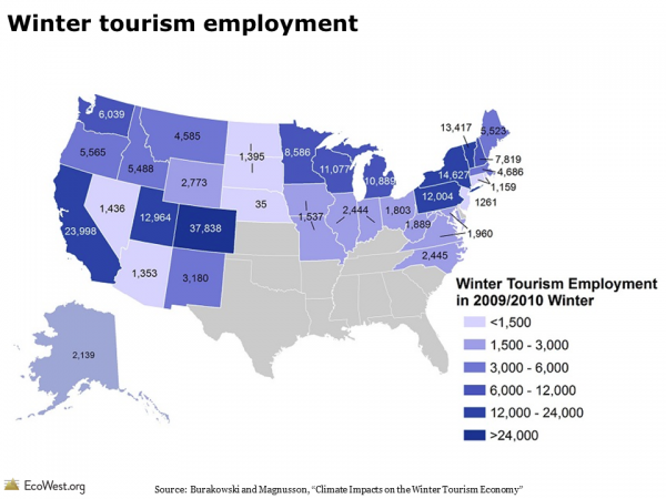
In some cases, entire cities owe their existence to ski areas. Here in Colorado, communities such as Vail, Aspen, Breckenridge, and Telluride are synonymous with their ski mountains. These places see plenty of visitors in spring, summer, and fall. There’s actually some controversy about resorts getting too busy during the “off season.” Even so, winter sports are the magnet for many of these communities, snow is like manna from heaven, and the financial impact of winter sports extends far beyond chic destinations to the more humble places where planes land and tourists drive through. The map below shows that every Western state has more than 1,000 jobs connected to winter sports.

Winter tourism employment

It’s important to remember that the data in our dashboard only tells part of the story. The data focuses on the local economic impact of skiing, snowboarding, and snowmobiling trips. Airline tickets are not included. Nor are the thousands of dollars that people spend on equipment and clothing. Last season, nearly $1.8 billion was spent at snow sports specialty stores on apparel, equipment, and accessories (in roughly equal proportions), according to SnowSports Industries America. Consumers spent about $750 million online on winter sports products.

Low-snow years harm industry

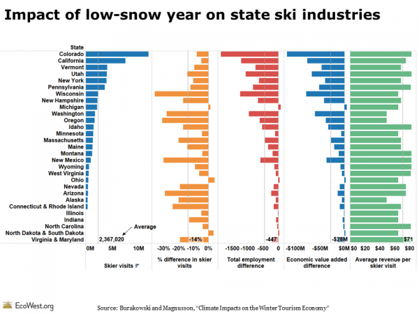
To gauge the impact of climate change, the University of New Hampshire researchers examined what happened to snow sports visits during low-snow years and then estimated the economic hit in the 38 states they studied. As shown below, some states appear to be more resilient than others. Colorado, California, and Utah suffered declines that were less than the national average, but other states, such as Washington, Oregon, and New Hampshire, saw skier visits fall even more than the national average.

Impact of low-snow year on state ski industries

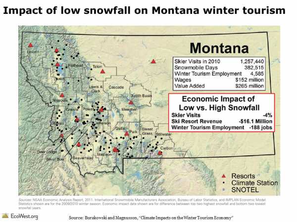
As an example, the graphic below shows that ski resorts in Montana lost $16 million in a low-snow year and winter tourism employment declined by 188 jobs due to the 4% decline in skier visits.

Impact of low snowfall on Montana winter tourism

Industry faces questionable future

Skiing, snowboarding, and snowmobiling are certainly not without their environmental impacts. Fly west out of Denver on a clear day and you’ll see a lot of clear-cut strips marking the runs at the ski resorts. Below is a photo I snapped of Loveland Ski Area, where I wrote some of this post in between runs.
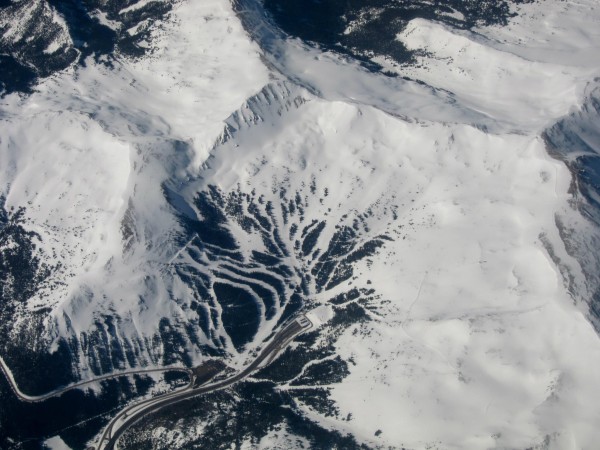
Loveland Ski Area, Colorado
Loveland Ski Area and Eisenhower Tunnel, Colorado. Photo by Mitch Tobin.

I’ve certainly done my share to cook the planet by driving into the mountains to ski and ride. A 114-mile round trip to Loveland from Denver causes my Subaru Forester to emit around 80 pounds of carbon-dioxide equivalent, according to the EPA’s Greenhouse Gas Emissions Calculator.

But for me and millions of other Americans, playing in the snow is essential to our well-being. We’ll neglect family, friends, work, the health of the planet, and other concerns in order to get our white powder fix. Call it an addiction or healthy habit, snow sports are more than fun and games: they’re also an economic engine that climate change threatens to freeze.

Data sources

Climate Impacts on the Winter Tourism Economy, a report by the Natural Resources Defense Council and Protect Our Winters, is the source for data on jobs, economic value, and snow sports visits in the 38 states.

Data on skiing and snowboarding is also available from Snowsports Industries America and the National Ski Areas Association.

Downloads

EcoWest’s mission is to analyze, visualize, and share data on environmental trends in the North American West. Please subscribe to our RSS feed, opt-in for email updates, follow us on Twitter, or like us on Facebook.

2013 wildfire season way below average

Wildfires were thrust into the national spotlight twice this year, first when 19 firefighters died in Arizona on June 30, and again in August, when the 257,314-acre Rim Fire burned in and around Yosemite National Park.

But if you look at the federal government’s statistics, 2013 is on track to be one of the quietest wildfire seasons in years. In the West and on Forest Service land, the season was closer to normal, but in the South and East, 2013 was a very quiet year for wildfires.

Year-to-date numbers

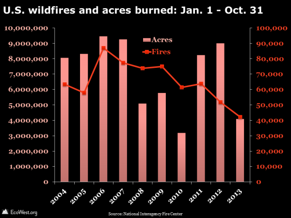
By the end of October, 40,775 fires had burned 4.1 million acres nationwide, which was only 63% of the 10-year average for the number fires, and just 59% of the 10-year average for acres burned (click on graphics to enlarge).

U.S. wildfires and acres burned: Jan. 1 - Oct. 31

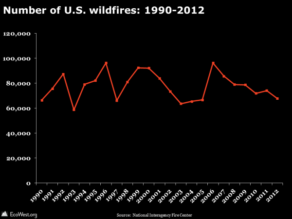
Some wildfires will break out between now and December 31, but the numbers aren’t going to jump as we head into winter. The time series below, for the full 12 months, shows that the lowest number of fires since 1990 was 58,810 in 1993, so unless there are more than 18,000 fires in November and December, 2013 is going to beat that record.

Number of U.S. wildfires: 1990-2012

Regional breakdown

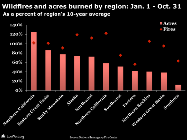
The graphics above illustrate national data. If you break it down by region, the number of acres burned has been below the 10-year average in every region except Southern California (which encompasses the Rim Fire).

The chart below shows the Southern region is at just 63% of average for fires and 12% for acres, while the number of fires in the Eastern region is 56% of average and the number acres burned is 41% of average. Very wet conditions in the South and East in 2013 were responsible for the diminished fire activity and this played a big part in suppressing the national totals (a map of the regions is here).

Wildfires and acres burned by region: Jan. 1 - Oct. 31

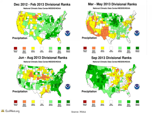
Going into the 2013 wildfire season, it looked like the West might be in store for a bad year. The preceding winter and spring were relatively dry, but some late spring storms and a strong summer monsoon in the Southwest reduced the danger. September was the wettest on record for many places in Colorado, Oregon, and Washington, as shown below.

NOAA monthly precip

Fire activity by landowner

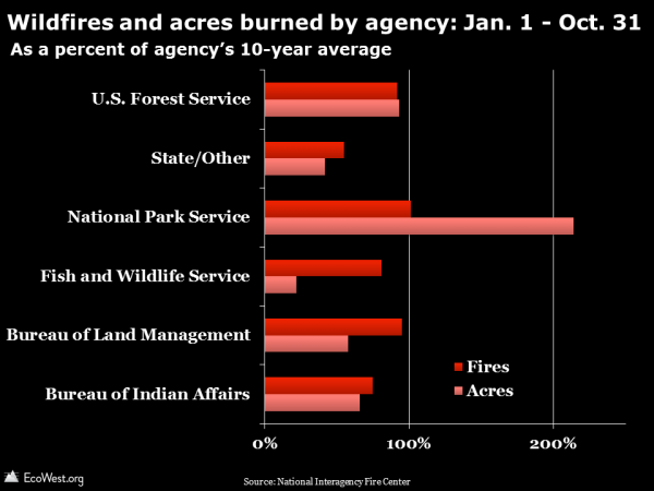
Another way to look at fire activity is by landowner. The National Park Service, which saw a chunk of Yosemite National Park burned by the massive Rim Fire, stands out in 2013. But other agencies had fewer fires and acres burned than average. On November 1, the Forest Service was at 92% of average for fires and 93% of average for acres burned. Much of the land in Southern and Eastern regions is private and you can see that reflected in the sub-average total for the “state/other” category, which includes private property.

Wildfires and acres burned by agency: Jan. 1 - Oct. 31

Historic, below-average season

The 2013 season raised the profile of the wildfire issue like few other in recent memory, but if it weren’t for the Yarnell Hill disaster and the Rim Fire, I think we would have seen a fraction of the media coverage.

As I noted in a previous post, national-level wildfire statistics, while interesting and easy to grasp, can obscure more interesting stories happening at the local and regional level. Wildfire manifests in manifold ways in the United States. A lightning-sparked blaze in the Alaskan tundra can scorch a half-million acres of wilderness and claim not a single structure. An arson fire in the suburbs can burn a couple thousand acres and cause $1 billion in property damage.

What seems odd is that even in a slightly below-average year, the Forest Service has once again run out of money for wildfire suppression. Consider these excerpts from an October 30 E&E story with the headline “‘It’s just nuts’ as wildfires drain budget yet again.”

Lightning bolts rained across the West in August, sparking hundreds of wildfires in California, Oregon, Idaho and Montana and pushing the cash-strapped Forest Service to the brink. The service had at that point spent $967 million battling wildfires that had torched more than 3.4 million acres in 2013. Its emergency fund exhausted, it had about $50 million left — enough for about half a week … The Forest Service this year siphoned $505 million from budgets for research, capital improvement and reforestation accounts, among other programs, according to a memo obtained by Greenwire.

In a previous post, we showed that federal wildfire suppression costs are soaring, not only in the aggregate but also per acre and per fire. It’ll be interesting to see if the costs continue the upward march in 2013, even though this season has been relatively tame.

Data sources

The National Interagency Fire Center just published this summary of the 2013 wildfire season to date. NIFC provides data for the January 1 – October 31 time frame going back 10 years. It’s worth noting that if “average” were defined as the past 20 years or some other period, 2013 would rank differently.

Downloads

EcoWest’s mission is to analyze, visualize, and share data on environmental trends in the North American West. Please subscribe to our RSS feed, opt-in for email updates, follow us on Twitter, or like us on Facebook.
Trulia’s mapping tool goes far beyond real estate

You may quibble with how Trulia values your home, but the real estate website provides an impressive interactive map with detailed views of social and environmental variables.

In addition to offering a treasure trove of information on real estate down to the parcel level, Trulia’s mapping engine also visualizes high-resolution data on things like commute times and the risk of wildfires, flooding, and earthquakes.

Below I describe some of my favorite features and share some screenshots. This mapping tool is not without its issues, but it’s generally well-designed and easy to use.

Commute times: driving and transit

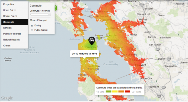
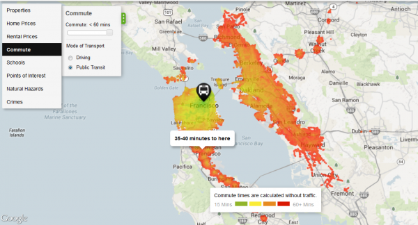
One of Trulia’s most interesting features is a layer that maps commuting times. Below are the heat maps for San Francisco, first for driving and then for transit. The two maps are pretty close. Putting aside transit strikes, the Bay Area has a solid system of trains, buses, ferries, and other alternatives to driving, so commuting long distances by transit is feasible, even mandatory, for many residents in the region. These maps don’t account for traffic delays, which is a big caveat. Click on images to enlarge.

San Francisco commute time driving
Source: Trulia
San Francisco commute time transit
Source: Trulia

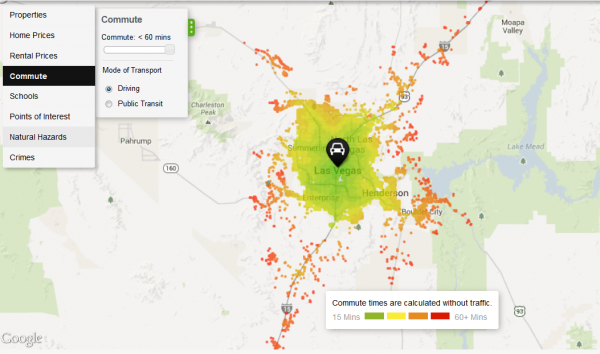
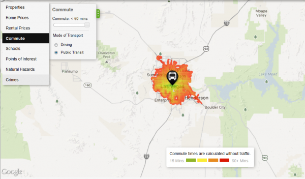
Compare the pair of images above to the ones below for Las Vegas, where there’s a huge disparity between driving and public transit commuting times. If you give yourself an hour to commute to the city center, being able to drive opens up many more places to live around Las Vegas.

Las Vegas commute driving
Source: Trulia
Las Vegas commute transit
Source: Trulia

Natural hazards mapped

Another useful aspect of Trulia’s map is a collection of natural hazard maps, including depictions of the risks of flooding, wildfires, tornadoes, earthquakes, and hurricanes. One criticism is that the mapping engine doesn’t let you export your views, so you’ll have to rely on screenshots. It’s also difficult to zoom out and see the entire country. You can get around this by zooming out on your browser (press control and the minus sign), which is what I’ve done for the national maps below, but then the text is microscopic. Trulia works best when zoomed in to a region or metro area.

Wildfires

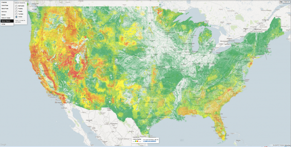
The map below shows wildfire potential across the country and illustrates the inherent risk of an area experiencing a severe blaze under the right conditions.

Trulia wildfire
Source: Trulia

Trulia does a good job explaining its data sources. For the wildland fire potential (WFP) layer, here’s the definition they’re using:

Areas with high WFP values represent fuels with a higher probability of experiencing a high-intensity fire under conducive weather conditions. Areas with low WFP values, therefore, represent a low probability of experiencing a wildfire. The WFP map is maintained by the USDA Forest Service, Fire Modeling Institute, and is intended to be used in analyses of wildfire risk at regional or national scales. The WFP is not intended to be a forecast or wildfire outlook, as it does not include information on current or forecasted weather or fuel moisture conditions.

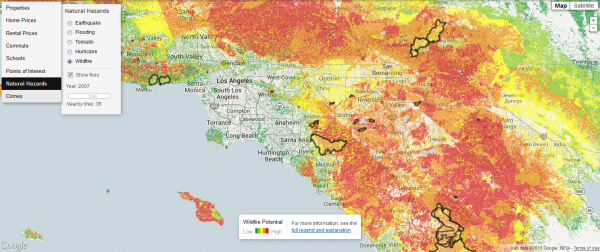
If you zoom in close enough, the wildfire data also includes perimeters of previous fires. Below is the fire potential around Los Angeles, including the outlines of fires during 2007, a particularly active year. At least in this part of the country, extremely high fire danger areas lie in close proximity to places where the risk is virtually nil.

Trulia wildfire LA
Source: Trulia

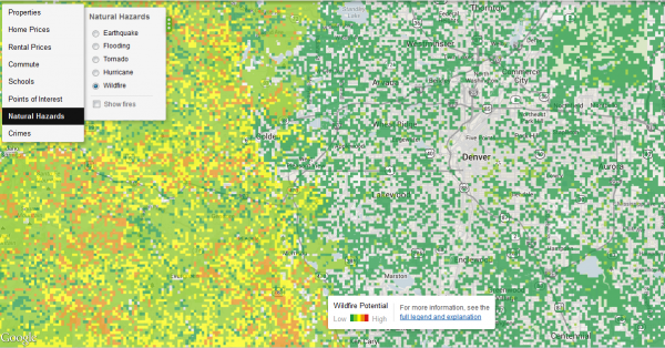
If you zoom in to some other regions, the data may get a little funky. Below is a close-up of the Denver area. In the city, the pixelated data suggests that some city blocks have a greater wildfire risk than others, but in reality you’re not going to see a wildfire within the Denver city limits. The map is basically right: as you move west, into the foothills of the Front Range, wildfire potential definitely increases, but at this resolution the map is somewhat misleading.

Trulia wildfire Denver
Source: Trulia

Flooding

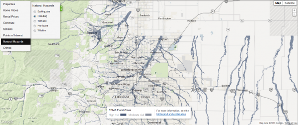
Another limitation is that Trulia is missing data for some parts of the country. In the screenshot below, flood risks suddenly disappear north of Denver. That’s because there’s no data for Weld County. Trulia cautions that even counties with flood data from FEMA don’t necessarily have full coverage.

Trulia flood Boulder
Source: Trulia

Here’s how Trulia describes the high (100-year flood zone ) and moderate (500-year flood zone) risk categories:

In high risk areas, there is at least a 1 in 4 chance of flooding during a 30-year mortgage. All home and business owners in these areas with mortgages from federally regulated or insured lenders are required to buy flood insurance. In moderate risk areas, the risk of being flooded is reduced but not completely removed. These areas submit over 20% of NFIP claims and receive one-third of disaster assistance for flooding. Flood insurance isn’t federally required in moderate-to-low areas, but it is recommended for all property owners and renters.

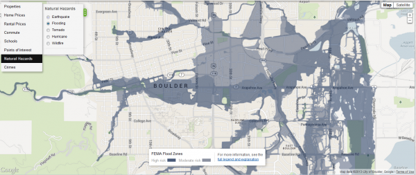
Although Trulia’s flood risk data may be spotty, covered areas are mapped in great detail, as shown in the map below of Boulder, Colorado, which recently experienced epic flooding.

Trulia flood Boulder zoom
Source: Trulia

Tornadoes

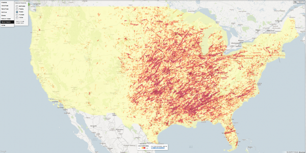
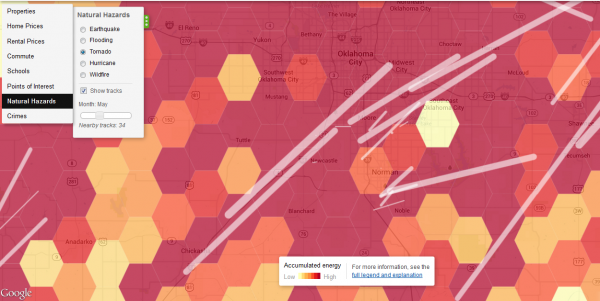
Trulia’s tornado hazard map, based on data from the National Weather Service’s Storm Prediction Center, shows that this weather phenomenon is largely absent from the American West. Drill down to the local level and the map shows the tracks of previous tornadoes. Below the national map is the area around Oklahoma City. I chose the month of May, when disasters such as the Moore Tornado of 2013 have occurred. This map uses a technique known as hexagonal binning, which employs a honeycomb grid to aggregate and visualize the data.

Trulia tornado
Source: Trulia
Trulia tornado OKC
Source: Trulia

Earthquakes

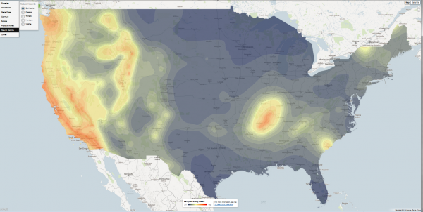
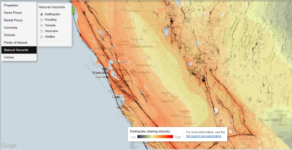
Trulia’s earthquake hazard map shows potential shaking intensity and the system of faults. Here’s how Trulia summarizes the USGS data:

The data represent a model showing a 10% probability that ground motion will reach a specified level within 50 years. Shaking potential is calculated considering historic earthquakes, slip rates on major faults and deformation throughout the region, and the potential for amplification of seismic waves by near-surface geologic materials … Faults are represented as black lines on the map. Darker lines signify a larger slip rate, which is a measurement of how fast one side of the fault slides past the other side.

Everyone knows California and the West Coast is earthquake country, but I hadn’t realized how many other, inland areas are also susceptible to shaking. Below the national map is a close-up of central California.

Trulia earthquake
Source: Trulia
Trulia earthquake SF
Source: Trulia

Telling stories with Trulia

I was pleasantly surprised by the richness of data in Trulia’s maps. Its main competitor, Zillow, doesn’t have anything that comes close. Even if you’re not in the market for a house or thinking of selling, the website is a useful resource for learning more about your community.

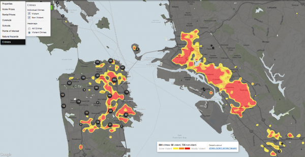
The geography of crime, shown below for the Bay Area, is a bit beyond our bailiwick here at EcoWest, but it’s certainly a key driver of growth and land-use patterns that have major environmental consequences (see this Trulia post for more on these crime maps).

Using Trulia, journalists, NGOs, researchers, and local policymakers can piece together a compelling portrait of a city or region by visualizing geographic patterns in crime, housing, transportation, education, and environmental hazards.

Trulia crime San Francisco Oakland
Source: Trulia

EcoWest’s mission is to analyze, visualize, and share data on environmental trends in the North American West. Please subscribe to our RSS feed, opt-in for email updates, follow us on Twitter, or like us on Facebook.