Category Archives: Resources

Americans are driving less: the state-by-state story

At the peak of the recession, did you swap your family’s annual summer road trip for a “staycation” or plan errands to reduce your number of car trips? Have you engaged in the semi-competitive practice of hypermiling? If so, you’re far from alone in your quest to reduce your annual mileage behind the wheel, according to a recent report from the U.S. Public Interest Research Group (PIRG).

In the report, “Moving Off the Road: A State-by-State Analysis of the National Decline in Driving,” U.S. PIRG shows that 46 states plus the District of Columbia have experienced a reduction in the average number of driving miles since 2004.

The report counters U.S. government forecasts, which have traditionally held that economic conditions and driving activity are directly related: as the economy improves, driving would be expected to increase. But U.S. PIRG found no correlation between the per capita decline in driving and how states fared economically in recent years. Here’s their summary infographic:

US PIRG new direction infographic
Source: U.S. PIRG

The study puts transportation policy—and the tens of billions of dollars associated with it—in a new light. Joanna Guy, program associate with the Maryland PIRG Foundation, framed the situation this way:

Given these trends, we need to press the reset button on our transportation policy. Just because past transportation investments overwhelmingly went to highway construction doesn’t mean that continues to be the right choice for [the] future.

End of the “driving boom”

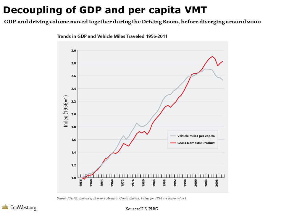
During the nearly six-decade “driving boom” that began in 1946, Americans increased their driving nearly every year. Nationally, per capita vehicle-miles traveled (VMT) peaked in the year 2004 and began to decline prior to the recession, which suggests that something other than the economy is behind the drop-off in driving.

In an earlier report released this spring, U.S. PIRG identified a few factors that contributed to the end of the driving boom:

  • The baby boom generation is retiring, leading to far fewer commuting miles.
  • Millennials are driving significantly less than previous generations and prefer a more walkable, public transit-oriented lifestyle.
  • Rising gas prices have increased the cost of driving.
  • The depressed economy has reduced transportation demands for some sectors, even though the driving decline started prior to the recession.
  • New technologies, such as online shopping, have curbed the number of trips to stores, while smartphone apps for public transit schedules have made it easier to incorporate bus and rail trips into one’s lifestyle, particularly in dense urban areas.

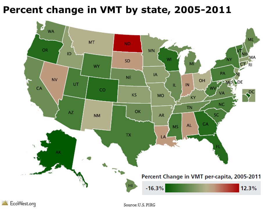
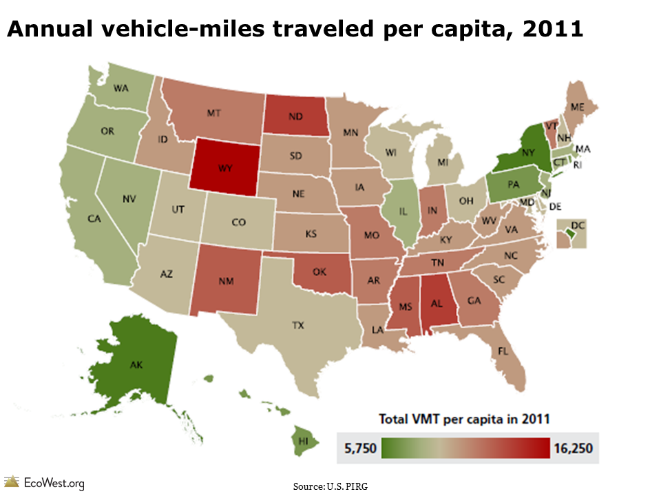
There are only four states (North Dakota, Nevada, Louisiana, and Alabama) where driving miles per capita in 2011 were above their 2004 or 2005 levels. Since 2005, several states—including Alaska, Delaware, Oregon, Georgia, Wyoming, and South Carolina—have actually seen double-digit percent reductions in per capita VMT.

Percent change in vehicle miles traveled (VMT) by state, 2005-2011

State-by-state driving differences

The average American drove roughly 9,500 miles in 2011, but there are big differences in driving patterns at the state level. For instance, the average Wyoming resident drives more than 16,000 miles annually, while District of Columbia residents drive less than 5,775 miles each year. Within the West, the average resident drives around 10,200 miles annually, with Washington State residents reporting the lowest annual figure at 8,300 miles.

Annual vehicle miles traveled per capita, 2011

According to the report, no single factor alone can explain the difference in per capita driving across states. The study examined multiple variables—population density, median household income, frequency of working from home—and found only a rough correlation between more urban populations and lower VMT.

Nationwide, urban residents drive about 9,930 miles per year, while rural residents drive an average of 14,850 miles. Wyoming has the second-lowest population density in the country, so you would expect it to fall on the upper end of the VMT range.

Driving decline: more than an economic aftershock

Although the recent recession has undoubtedly influenced the national per capita decline in driving, U.S. PIRG argues that the trend should not be perceived as a short-lived byproduct of the recession. It cites four reasons:

  • Per capita driving began declining before the recession, with VMT peaking in 2004.
  • Other metrics, such as the percentage of young people with a driver’s license and the number of vehicles per household, also started declining prior to the recession.
  • Per capita driving declined among both the employed and unemployed.
  • Per capita VMT and national GDP moved in tandem throughout the driving boom (1960s to early 2000s). At the beginning of the 21st century, the two indicators decoupled: GDP continued to increase, while driving fell or remained steady.

Decoupling of VMT and GDP

Reimagining future transportation policy

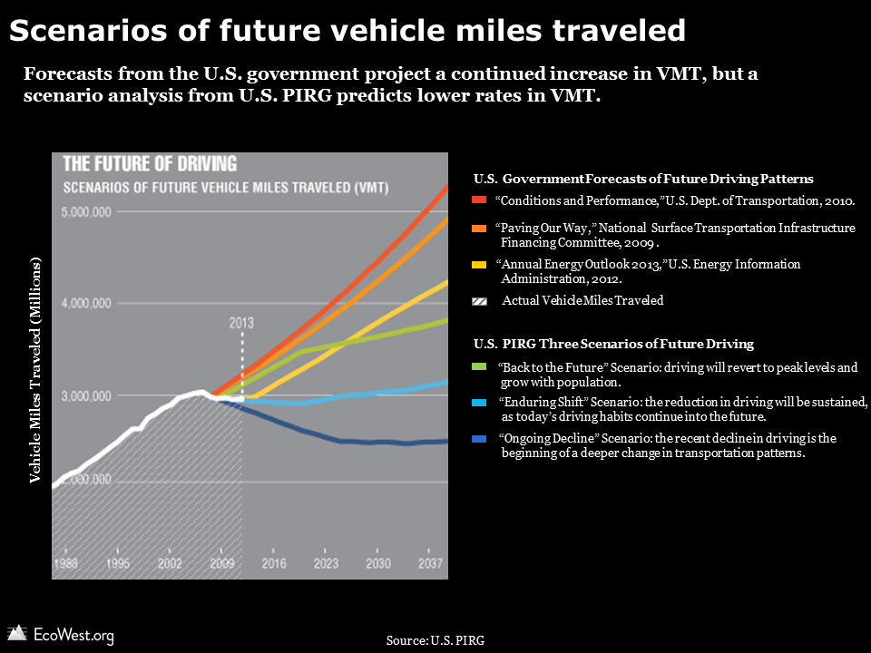
By default, U.S. transportation engineers typically estimate there will be a continually rising number of drivers on the road in the future. A range of government forecasts have all projected a steady increase in annual driving, with the expected increase by 2040 ranging from 44% to 67%.

U.S. PIRG, however, created its own scenarios for the future of driving, all of which predict lower VMT trendlines than government forecasts, as shown in the chart below.

Scenarios of future vehicle miles traveled

The U.S. PIRG report opens the conversation on why and how we might re-envision the country’s transportation policy. In light of tight budgets for transportation projects, there is fierce competition for every dollar. Funds diverted from a potentially superfluous highway expansion could be used to improve alternative transit options, such as bus routes and bike lanes.

Research suggests that investing in alternative forms of transportation is more than a feel-good policy: it can also boost economic development. A study by the University of Vermont Transportation Research Center found that housing prices in Baltimore tended to increase based on the proximity to bicycle lanes.

Data sources

You can download the full report and accompanying data for “Moving Off the Road: A State-by-State Analysis of the National Decline in Driving” from U.S. PIRG here.

The data is also accessible on this dashboard.

Downloads

EcoWest’s mission is to analyze, visualize, and share data on environmental trends in the North American West. Please subscribe to our RSS feed, opt-in for email updates, follow us on Twitter, or like us on Facebook.

State energy dashboard compares use, prices, and spending

The 50 states pursue different paths to supply energy to their residents, with some heavily reliant on coal, others dependent on hydropower dams, and many tapping a broad portfolio of sources. I described this diversity of approaches in previous posts on energy flow diagrams and a map of the “United States of Energy.”

In this post, I take a closer look at how U.S. states compare in their energy consumption, spending, and prices. Using data from the U.S. Energy Information Administration’s Annual Energy Review, I created a dashboard to visualize the patterns, and I put together an accompanying slide deck that you can download at the bottom of this post.

Per capita energy consumption

The map below (click to enlarge) illustrates per capita energy consumption in 2010. Four states—Alaska, Wyoming, North Dakota, and Louisiana—stick out. This group of states shares two things in common. First, all have relatively low populations, so the denominator in the per capita calculation is small. Second, all four states are major energy producers. Because it generally takes a lot of energy to extract, produce, and distribute fossil energy sources, these states also rank high on consumption.

Per capita energy consumption by state (2010)

Energy use, prices, and spending

The chart below adds two more dimensions: prices and per capita spending. The bars are shaded green according to the total energy consumption in the state. I’ve sorted the states alphabetically, but on the dashboard you can order them by any of these variables.
Energy use, prices and spending by state (2010)

Prices versus consumption

I was curious whether there was any relationship between energy consumption and prices. Economics 101 suggests higher prices could mean lower consumption. The scatter plot below shows that there is, in fact, an inverse relationship between energy prices and use. I’ve sized the circles according to the total energy consumed in the state and colored them according to per capita energy expenditures.

EcoWest State Energy Dashboard

The spread in energy consumption and prices across the 50 states is very wide. Energy prices in Hawaii and some Northeast states are double, or nearly so, the costs in Louisiana and North Dakota. Per capita consumption in New York and California is less than one-fourth the use in Alaska and Wyoming.

Once again, the four energy-producing states are outliers. Leaving aside Alaska, where prices for many commodities are high, these states have the lowest energy prices. I repeated the analysis by excluding the four states and the R2 value increased from 0.465 to 0.566, indicating a stronger correlation between price and consumption.

But correlation is not causation! Other factors, such as the local climate and travel patterns in a state, may be more important variables. Several of the states with the most expensive energy prices and lowest energy consumption are in the Northeast (e.g., Connecticut, Rhode Island, Massachusetts, New York). Prices tend to be higher in this urbanized region, which has a large population, extensive mass transit, and fewer vehicle-miles traveled. In other words, the high cost of gasoline in Manhattan is probably not the main reason why its residents drive less.

In a future post, I’ll analyze state-level data on carbon dioxide emissions.

Data sources

The energy dashboard is based on data from the U.S. Energy Information Administration’s Annual Energy Review, specifically this table.

Downloads

EcoWest’s mission is to analyze, visualize, and share data on environmental trends in the North American West. Please subscribe to our RSS feed, opt-in for email updates, follow us on Twitter, or like us on Facebook.

The United States of Energy

Maps of our nation’s energy potential usually display just one source, such as the location of wind farms or the extent of natural gas fields. In an interesting new data visualization, advertising and PR firm Saxum has combined both fossil and renewable energy resources into a map of The United States of Energy.

Below are the front and back of the viz, which has so much info that it probably reads best in hard copy (click on images to enlarge).

The firm describes the project as “the first data visualization piece of its kind to comprehensively detail our nation’s vast and diverse energy portfolio. ” Here’s more from them:

What began as a simple graphic showcasing America’s energy riches quickly grew into a two-sided, folded map concept displaying thousands of individual data points. The #USofEnergy map visualizes our country’s energy potential by charting current sources of energy production and identifying future resources and known deposits. Energy resources surveyed include: natural gas, oil, coal, nuclear, hydroelectric, wind, geothermal, solar and biomass. We compiled the data from a broad range of industry and government sources, including the National Renewable Energy Laboratory, U.S. Geological Survey, U.S. Energy Information Administration, U.S. Army Corps of Engineers, Nuclear Research Council and American Wind Energy Association.

In some parts of the country, such as the nation’s midsection, there are so many different energy sources being exploited that the map is tough to make out. Overlapping layers present a difficulty here, but in other regions, such as the East Coast, there’s a lot of white space.

Saxum, which describes itself as “one of the leading integrated marketing communications agencies in the Great Plains,” highlights that 46 percent of U.S. energy is produced by nine states in the center of the country, as shown below.

United States of Energy Midwest
Source: Saxum

It’s worth zooming in to their legend to see what all these layers really mean. With biomass, for example, an entire county is shaded orange if it’s in the top-20 percent for producing energy in this way per square kilometer. With solar, only the best places in the country are shown. Here in Denver, for example, we’re not covered by the solar layer, but photovoltaic panels on the roof of my home/office generate the majority of electricity we consume (see this more detailed solar potential map from the U.S. Department of Energy).

Don’t ask me how, but it would be great to see an online, interactive version of Saxum’s map. That format could let you provide even greater detail on the energy sources, such as varying the size of the points used to display nuclear plants and hydroelectric dams by how much energy they produce, or by allowing users to turn layers on and off. (UPDATE: Saxum has an interactive data visualization here.)

Emily Guerin at High Country News has a good overview of the other trends that Saxum highlights in its map.

If you’re looking for maps of individual energy sources, check out our PowerPoint presentation on land use.

EcoWest’s mission is to analyze, visualize, and share data on environmental trends in the North American West. Please subscribe to our RSS feed, opt-in for email updates, follow us on Twitter, or like us on Facebook.