Tag Archives: conservation

Visualizing Colorado River challenges and options

The Colorado River, lifeblood of the Southwest, is in trouble. Demand for river water is rising as the region’s population continues to grow, but the Colorado’s inherently capricious supply is increasingly in doubt due to climate change.

A federal report released in December took an exhaustive look at the challenges facing the Colorado River Basin and it examined the options for dealing with expected shortages.  I’ve gone through the Colorado River Basin Water Supply and Demand Study and pulled out the key figures, which you can download at the bottom of this post.

Colorado River Bain Study from EcoWest on Vimeo.

Shortage projected

If I had to pick one graphic that summed up the dilemma facing the Colorado River, it would be this one:

Colorado River historical and projected water use and supply

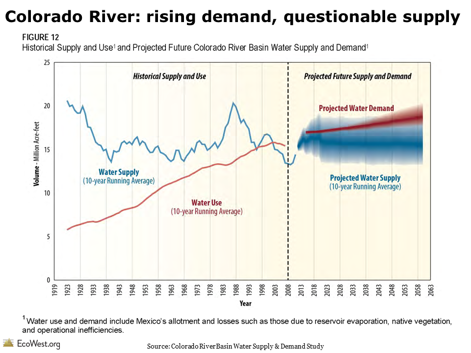
Looking back in time, the graphic shows that water use in the basin steadily increased during the 20th century, but the river’s flow was predictably erratic (that blue line is a 10-year moving average but it’s still as uneven as the basin’s topography).

Looking ahead, water demand is expected to keep growing (the fuzzy areas indicate the uncertainty in the projections). Predicting the flow of the Colorado decades into the future is a tough task, but the study concluded that the supply would probably decrease, as indicated by the gentle downward slope of the blue line. By 2060, the imbalance between supply and demand is expected to be about 3.2 million acre-feet.

Comparing costs of solutions

Besides identifying the problem, the Basin Study evaluated a wide variety of proposals for addressing the shortfall—everything from increasing water conservation in cities and on farms, to building massive new pipelines and desalination plants, even far-fetched ideas like towing icebergs to Southern California.

I extracted data from a summary table in the study in order to visualize how these options compare, both in price and in how much water they’ll yield.

In the graphic below, I’ve ranked all of the options from highest to lowest cost (the unit here is dollars per acre-foot per year). I’ve also color-coded them by category.

Cost of options for Colorado River

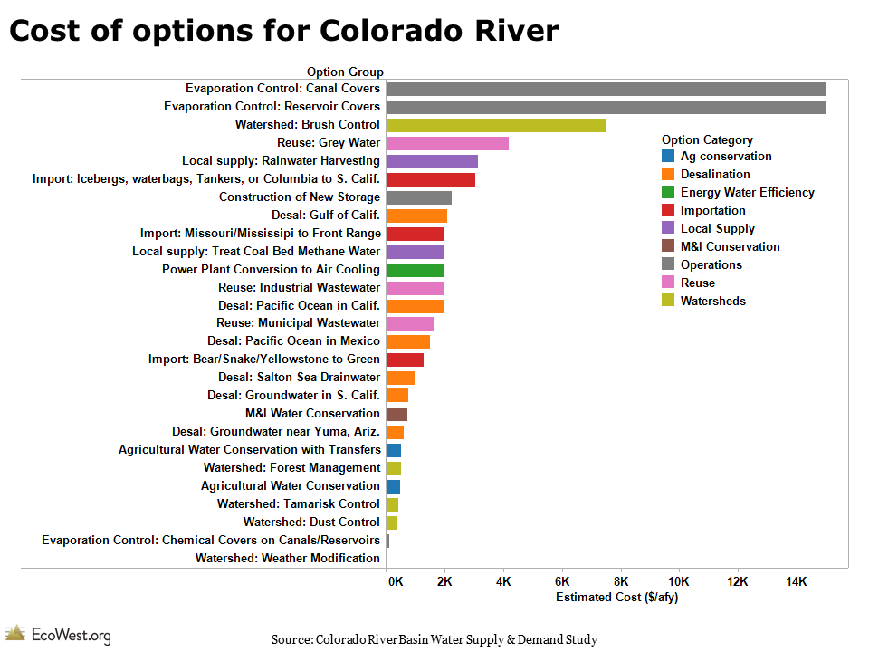
As you can see, the range of costs is enormous, but there are some general patterns. Conservation measures are among the cheapest, while desalinating ocean water or covering reservoirs to reduce evaporation are pricey. (For a few of these options, the study provided a range of costs, but for simplicity’s sake I’ve used the average in this graphic.)

The chart below ranks the options by how much water they’re expected to yield in 2035.

Potential yield of options for Colorado River

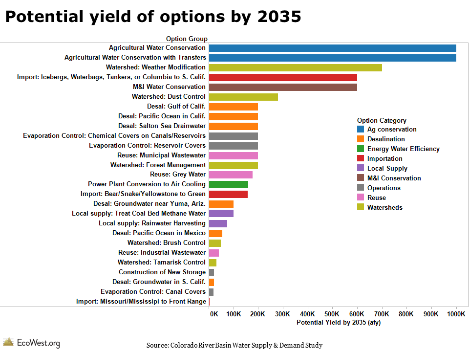
Water conservation in agriculture and among municipal and industrial (M&I) users is projected to yield the most, but weather modification (aka cloud-seeding) also performs well on this measure.

I combined the cost and yield data into one graphic by varying the width of the bars by the volume of water that each strategy is expected to produce. The thicker the bar, the greater the yield. In this case, I used the projections for 2060, rather than 2035.

Cost and yield of options for Colorado River

In releasing the Basin Study in December, federal officials stressed the conservation options over massive new infrastructure projects, such as pumping the Missouri or Mississippi rivers to the Colorado Front Range. These graphics show why that’s pretty much a no-brainer: conservation delivers more bang for the buck and avoids the enormous environmental impacts of augmentation projects.

Downloads

Data sources

You can download the Basin Study and associated reports here.

The Denver Post had a good overview of the Basin Study’s release. See recent stories by the Los Angeles Times and Associated Press  for more on what the federal government is doing to follow up on the report.

EcoWest’s mission is to analyze, visualize, and share data on environmental trends in the North American West. Please subscribe to our RSS feed, opt-in for email updates, follow us on Twitter, or like us on Facebook.

Tracking conservation ballot measures

Open space bonds and other ballot measures are a critical source of environmental funding in the United States. Since 1988, American voters have approved 1,810 ballot measures that have generated more than $58 billion for conservation.

These measures usually pass, even though they typically involve increasing taxes and government spending.

To track the success of conservation ballot measures, I’ve created a dashboard on this page based on the Trust for Public Land’s LandVote database. Click on the screenshot below to enlarge.

Ballot measure dashboard

I used the same data to create a couple of slides, which are available for download at the bottom of this post and in this video below.

Conservation measures generally do well at the polls, in part because backers tend to avoid placing them on ballots when the chances of passage are low, such as during a recession. On average, three-quarters are approved, but the number of measures tends to be lower in off-year elections.

In recent years, with the economy in the doldrums, fewer measures have been placed on ballots. Funding peaked in 2008, when some $8 billion was approved.

It’ll be interesting to see whether the number of measures put to voters increases in the years ahead if the economy continues to recover.

Downloads

Data sources

The Trust for Public Land makes this data available through its LandVote database. Data from 1996 onward is most comprehensive. “Measures for the years prior to 1996 have been researched to the extent possible,” the website says, “based on historical research collected from newspaper archives and state and local elections officials.”

EcoWest’s mission is to analyze, visualize, and share data on environmental trends in the North American West. Please subscribe to our RSS feed, opt-in for email updates, follow us on Twitter, or like us on Facebook.

Hawaii, West and South have most at-risk species

The United States boasts the greatest diversity of ecosystems of any country and it’s home to more than 200,000 species. But about one-third of U.S. plants and animals are considered at risk by biologists, and at least 500 U.S. species are already extinct or missing.

How do the 50 states compare in terms of number of species—and their imperilment? I’ve created some simple dashboards that illustrate the state-by-state tallies. These graphics, which you can sort, print, and customize, show the number of various types of species found in each state and the fraction of those species that are imperiled.

Percent of species at risk

The data comes from Precious Heritage: The Status of Biodiversity in the United States, a great book produced by The Nature Conservancy and NatureServe in 2000. At-risk species have elevated risks of extinction, according to the system developed by the project, and therefore have the greatest conservation concern.

Here are some of the patterns I noticed in the dashboards:

  • Despite their aridity, many Western states have tons of species. Arizona and New Mexico, neither of which have any coastal habitat, rank third and fourth in total number of species.
  • Hawaii has by far the greatest percent of species at risk. The native biodiversity of this isolated archipelago has been devastated by the introduction of non-native species.
  • States in the West, especially the Southwest, also have many imperiled species. California, Arizona, Utah, and Nevada round out the top 5 states.
  • Freshwater fish are doing very poorly, especially in the West, where Arizona, Utah, Nevada, New Mexico, California, and Oregon all have at least 25 percent at risk.
  • Outside of Hawaii, birds tend to be doing better than many other types of species.

Using the dashboard

A couple of notes about the dashboards:

  • You can sort by state name or by any of the variables at the bottom.
  • Because Hawaii is such an outlier, I can be helpful to examine the dashboard by excluding that state (just click on the name and the option will pop up).
  • The toolbar at the bottom allows you to create an image or PDF, plus download the underlying data.
  • This dashboard reports the percent of a state’s species at risk, not the actual number, but that data is also provided in Precious Heritage.

Learn more in our biodiversity deck

These dashboards focus on the state level, but in our biodiversity slide deck we offer a slew of maps and graphics summarizing the national picture. The one below shows that many freshwater species are in jeopardy, whereas some of the best known types of species, such as birds and mammals, are doing comparatively better.

National species at risk

Data sources

Anyone doing research on U.S biodiversity should definitely check out the Precious Heritage book. It contains a wealth of information on the status of U.S. species and many of the graphics in the book are available for free download on this page.

EcoWest’s mission is to analyze, visualize, and share data on environmental trends in the North American West. Please subscribe to our RSS feed, opt-in for email updates, follow us on Twitter, or like us on Facebook.