If you’ve ever been curious about energy facts in your state—such as which sector consumes the most energy, or how your state’s electricity prices compare to the rest of the country—the State Portal hosted by the U.S. Energy Information Administration (EIA) is a convenient, user-friendly resource.
EIA’s portal compares energy in the 50 states from EcoWest on Vimeo.
In a previous EcoWest post, we highlighted another useful data visualization tool, Saxum’s United States of Energy map, which illustrates energy production and known fuel deposits around the country. The EIA web portal offers an interactive tool with state-level energy data and detailed profiles for each state. It also aggregates data on state rankings of energy consumption, production, and prices across sectors and fuel types. Users can create customized energy infrastructure maps, visualize state-level data by generating graphics and charts, and analyze key energy statistics for each state.
In this post, we’ll use the state of Montana as an example to highlight the range of information that the EIA portal provides. From the main landing page, you can select Montana to display the state’s profile overview. Under the “Layers/Legend” menu item, you can choose from over 30 infrastructure layers, including coal plants, hydroelectric plants, natural gas pipelines, transmission lines, and LNG export terminals.
Below are five outputs from the portal that we found especially useful.
1) State energy rankings
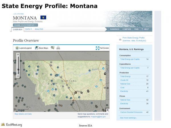
For easy reference, the portal provides a chart on the state profile page to indicate how that state ranks against all other U.S. states in terms of energy consumption, production, pricing, expenditures, and emissions. As you can see from the screenshot below, Montana is the country’s eighth largest producer of coal. The state emits a relatively low level of carbon dioxide, mostly owing to its sparse population.
2) Energy production by source
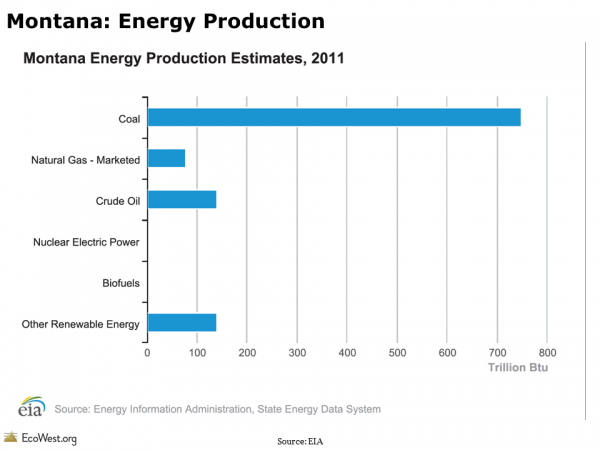
As shown in chart below, coal dominates energy production in Montana. The state is home to the country’s largest estimated recoverable coal reserves. Roughly one-quarter of the coal mined in Montana is consumed in-state for electric power; two-fifths is distributed domestically to more than 15 states; and one-third is exported, mainly to Asia.
3) Energy consumption by sector
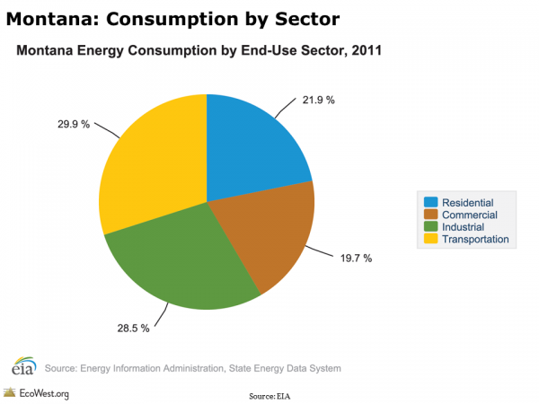
You can also view the breakdown of energy consumption by sector for each state. In Montana, the transportation and industrial sectors account for roughly three-fifths of energy use. At the national level, the industrial and transportation sectors are also the leading energy users.
4) State energy prices compared to U.S. average
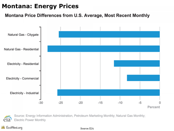
It’s also interesting to compare how energy prices in your state stack up against other states. In Montana, energy prices are about 25 percent lower than the national average. These low prices are primarily a result of a stable supply of energy produced in-state and a relatively low demand from the state’s comparatively small population.
5) Renewable energy potential
Montana is well-situated, geographically speaking, for renewable energy production. The state has significant hydroelectric potential from rivers flowing out of the Rocky Mountains. And across its wide plains, the state has the third highest commercial wind potential in the country.
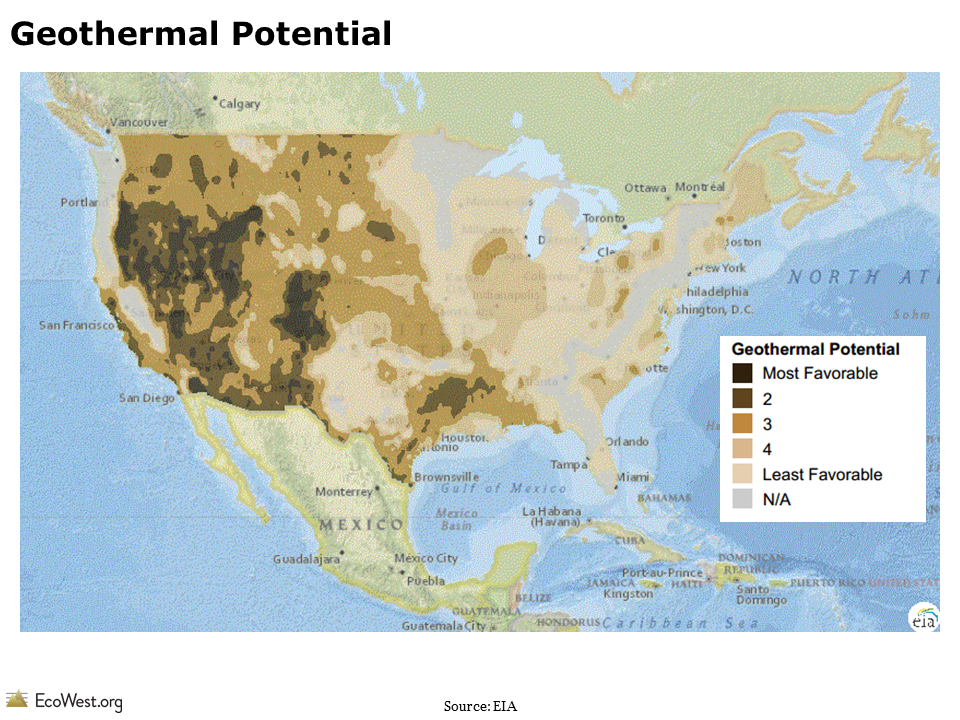
On the EIA state portal, you can map renewable energy potential by source across the country. As this map shows, Montana has significant geothermal potential, particularly in the state’s mountainous southwest corner. Currently, geothermal resources are largely untapped as an electricity source in Montana, a fact which many attribute to the state’s low fossil fuel energy prices, small population, and lack of transmission infrastructure in remote locations.
Given its frequency of updates and user-friendly format, the EIA portal is a handy resource for academics, decision-makers, and residents who are keen to learn more about their state’s energy portfolio. Take a tour of the portal and let us know what you learn about your state.
Data sources
EIA’s state energy portal provides state-level energy data and infrastructure overlays for all 50 U.S. states.
Downloads
- Download Slides: State Energy Portal (6618 downloads )
- Download Notes: State Energy Portal (7345 downloads )
EcoWest’s mission is to analyze, visualize, and share data on environmental trends in the North American West. Please subscribe to our RSS feed, opt-in for email updates, follow us on Twitter, or like us on Facebook.

