Tag Archives: conservation

LandScope America: a tool to visualize land conservation

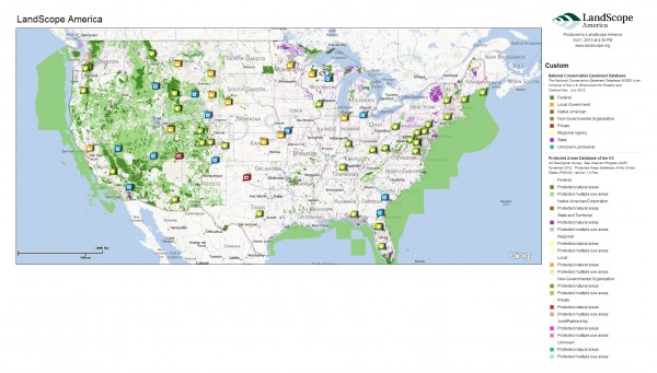
If you want to visualize your favorite wilderness area or map the protected areas in your city, LandScope America provides a free and convenient resource. This user-friendly GIS tool, a collaborative project of NatureServe and the National Geographic Society, lets you explore protected lands across the country, create maps of conservation projects, and share your work with others.

LandScope Screenshot

Key features of LandScope America

The focal point of LandScope America is an interactive map that overlays data layers, photos, and user-contributed stories. The map includes three key elements:

  • Base maps: three options (street, satellite, or hybrid) are found at the upper-right corner.
  • Themes: these comprise the spatial data that overlay the base map. Options include conservation priorities, protected areas, threats, plants and animals, and ecosystems. Users can change the theme by selecting the drop-down menu in the upper-left corner.

Diverse range of target audiences

One of the key advantages of LandScope America is its versatility for different user groups. Audiences that can benefit from the resource include:

  • Public agencies: In a recent post, we noted that $39 billion is spent annually on conservation in the United States. Public agencies could increase their effectiveness by combining the conservation priorities of public and private organizations in a single map layer. For example, agencies might overlay The Nature Conservancy’s ecoregional priorities with State Wildlife Action Plans and regional greenprints to better understand the level of coordination between various groups.
  • Land trusts: Using the mapping platform, land trusts can create, share, and print maps of conservation projects. For organizations on a tight budget, LandScope America can provide a powerful alternative to expensive GIS packages.
  • Private landowners: For farmers, ranchers, and private timberland owners, LandScope America features useful resources on options and financial incentives for conserving land. Using the map, landowners can see how their property fits into the wider ecological context and learn how providing wildlife habitat can make them eligible for incentive programs such as the Forest Land Enhancement Program.

Mapping in practice

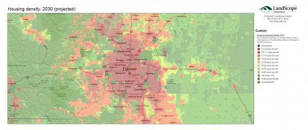
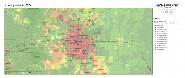
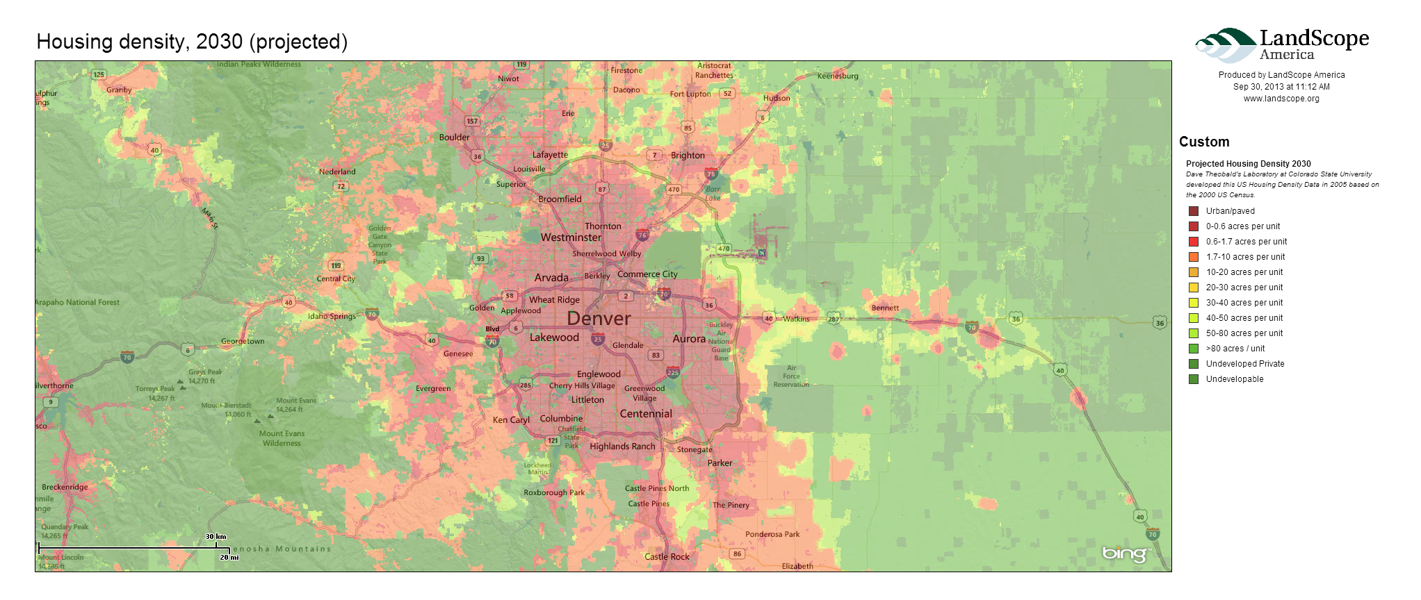
As an example, I mapped how changes in housing density around Denver relate to key wildlife habitat. The following three maps show the rapid rate of projected growth emanating from the city’s center.
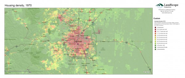
Denver_HousingDensity_1970
Denver_HousingDensity_2000
Denver_HousingDensity_2030
The next map shows important nesting areas and wildlife habitat in Colorado. Land trusts and public agencies could use similar maps to understand how projected human development may encroach upon habitat.
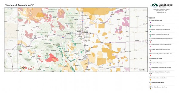
CO_State_Plants_Animals

Public expenditures in conservation

I also experimented with the map’s “Conservation by the Numbers” scorecards to examine trends in conservation spending across the West. This data is drawn from the Trust for Public Land’s Conservation Almanac, which tracks acres protected and dollars spent using public funding to buy land for parks and open space, during the time period 1998-2005.

Examining total spending on conservation, we see that California is the largest aggregate spender, with an annual average of $363 million spent on parks and open space protection. Wyoming has the lowest public expenditures, with $2.2 million spent annually on conservation funding. Montana has highest per capita public investments in conservation—roughly $179 per person. On the other end, Nevada spends only $13 per person on conservation. Below is an image from a dashboard we created to visualize the data.
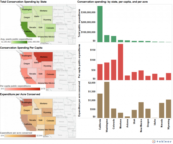
Conservation spending dashboardA wide variety of factors, however, influence the cost of protecting land in a given state. In Washington, it costs an average of $2,044 to conserve an acre of land, but only $14 per acre conserved in Idaho. Several variables could explain this wide gap, including differences in land prices and development pressures. Washington’s high costs may also reflect some high-value acquisitions during the period in question.

Explore beyond your backyard, both near and far

LandScope America also lets you discover and explore open spaces near your own home. Just enter a zip code to find parks and nature preserves, as well as the names of conservation organizations working in the area.

In addition, LandScope America exposes users to more remote wilderness areas through photographs, audio, video, and articles embedded directly in the maps.

Explore your favorite places in the West using LandScope America, and let us know what you learn.

Downloads

EcoWest’s mission is to analyze, visualize, and share data on environmental trends in the North American West. Please subscribe to our RSS feed, opt-in for email updates, follow us on Twitter, or like us on Facebook.

Tracking the ripple effects of conservation spending

If the Oregon Department of Fish and Wildlife pays to restore Chinook salmon habitat in Upper Klamath Lake, does it have an economic connection to an urbanite some 300 miles north in a Portland coffee shop?

The answer is yes, according to “The Conservation Economy in America,” a report commissioned by the National Fish and Wildlife Foundation.

The report, which examines the economic implications of spending by governments and the private sector to support conservation in the United States, shows that conservation investments ripple far beyond their initial investments. Based on the analysis, an estimated $38.8 billion is spent annually on conservation in the United States. Thanks to the multiplier effect, that direct spending leads to more than $93 billion of total economic activity in the country, including the generation of 660,000 jobs, $41.6 billion in salaries and wages, and $12.8 billion in tax revenues.

Southwick Associates, which produced the report, sums up their conclusions this way:

The money invested in supporting natural resource conservation […] provide much more than mere recreational benefits for those who hunt, fish or watch wildlife. These investments actually serve as a powerful driver of economic benefits that generate a positive ripple effect throughout the American economy.

Defining conservation investments

What qualifies as a conservation investment? In the context of this study, “natural resource conservation” refers to actions to protect or manage native fish and wildlife species, as well as land and water acquisitions to protect their habitats. The analysis does not include spending related to outdoor recreation, municipal parks, environmental education, historic preservation, or conservation spending outside the United States.

So what are actual examples of conservation spending? A public-sector expenditure could include payments from the U.S. Department of Agriculture to compensate landowners who improve wildlife habitat on agricultural land, through the Wildlife Habitat Incentive Program.

The report defines private-sector investments as conservation spending by nonprofit organizations, calculated based on the organizations’ annual Form 990 tax returns. Private sector spending could include, for instance, tree planting events carried out by the organization American Forests. (Additional details on the study’s methodology and data sources are available in the full report.)

Disparate contributions across states

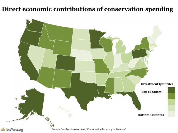
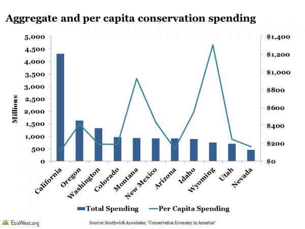
In terms of conservation spending, not all states are created equally. Conservation spending is highest in California, with $4.3 billion in direct investments, as compared to the lowest level of $108 million in Rhode Island.  These figures include the direct effects of conservation spending across all sectors, through the immediate jobs, income, and tax revenues associated with the expenditures.

Total direct economic contributions of conservation spending, by state Total direct economic contributions of conservation spending, by state

If we consider per capita spending, we see that California actually drops to the lowest rank in the West, with $113 in spending, while a sparsely populated state like Wyoming climbs to the top at $1,306.

Aggregate and per capita conservation spending

Aside from population, it’s not clear which variables explain the state-by-state differences in spending levels. One could hypothesize that the amount of federal lands in a state or the effectiveness of its lobbying efforts might influence the scale of federal dollars allocated to states, but the report didn’t draw any statistical inferences or speculate on this question.

Economic impacts beyond the check

Since spending is not limited to direct contributions alone, the study also measured indirect contributions of conservation spending, referring to the wider economic activities that result from the direct expenditures. For example, trail restoration activities by the Yosemite Conservancy may lead the organization to purchase equipment and hire an environmental engineer to conduct a watershed analysis for the ecologically sensitive site. Analysts at Southwick Associates used the IMPLAN model  to estimate the jobs, income, and taxes that are generated as a result of these direct investments.

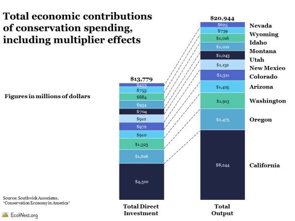
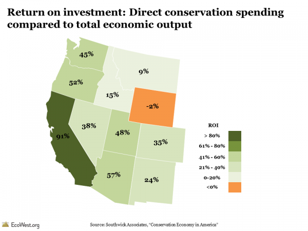
Nationwide, spending of $38.8 billion yielded a total economic output of $93.2 billion in 2011 (a ratio of 42 percent). In the West, $13.7 billion in direct conservation investments generated $20.9 billion of total economic activity in 2011 (a ratio of 66 percent).

Total economic contributions of conservation spending, including multiplier effects

In all but three states nationwide (Wyoming, South Dakota, and Texas), conservation investments yield higher economic returns than the costs of the original investment. In the big picture, these findings help rebut the classic “environment versus the economy” paradigm.

Return on investment: Direct conservation spending compared to total economic output

Incomplete price tag on nature

This report highlights that the impact of U.S. conservation spending is significant, and probably on a scale that is under-appreciated by most Americans.

At the same time, it’s worth noting that report evaluated only a narrow slice of the conservation economy. The value of ecosystem services, such as clean air and water, were excluded from the study, yet they carry a staggering economic value. One 1997 study of the world’s ecosystem services and natural capital estimated the value at $16-54 trillion dollars per year.

Valuation of natural resources is a burgeoning field and experts are developing new tools for evaluating how conservation investments can deliver wider societal benefits and lead to improved economic outcomes.

Data sources

You can download the full report, “The Conservation Economy in America: Direct investments and economic contributions” from Southwick Associates.

Downloads

EcoWest’s mission is to analyze, visualize, and share data on environmental trends in the North American West. Please subscribe to our RSS feed, opt-in for email updates, follow us on Twitter, or like us on Facebook.
Viewing biodiversity through the ecoregional lens

The Nature Conservancy’s Atlas of Global Conservation is a fabulous resource for understanding biological diversity. Scientists have divided up the world into more than 1,000 ecoregions and analyzed how they compare across dozens of measures.

I’ve used data from TNC’s atlas to create a slide deck that illustrates patterns in species richness and threats to biodiversity, with a focus on the United States and American West. Below is a video of the PowerPoint, which you can download at the bottom of this post.

Visualizing biodiversity through the lens of ecoregions from EcoWest on Vimeo.

Biome basics

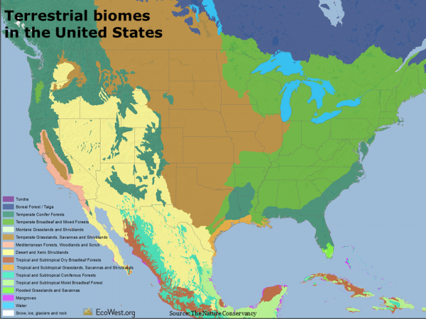
Before we get to ecoregions, let me first note a broader way that TNC and others classify the natural world: biomes. An area’s climate more or less determines what types of plants can grow, and at the highest level we can classify the planet’s land masses according to the predominant vegetation, or lack thereof. There are 16 terrestrial biomes, ranging from snow and tundra to tropical forests.

The map below (click to enlarge) shows the biomes found in the United States. Much of the interior West is dominated by desert and xeric (dry) shrublands, but the higher elevations support temperate conifer forests. California has Mediterranean forests along much of its coast and the Sierra Foothills. There’s a bit of subtropical forest in the mountains of Southeast Arizona and temperate broadleaf forest in Oregon’s Coastal Range.

United States biomes

As with temperature, rainfall, and elevation, there is more uniformity in the biomes found in the East than the West. Look, for example, at how many different types of communities are found in California, or how isolated mountains in the Great Basin create little biome islands.

The United States actually leads the world in the number of biomes and smaller ecoregions within its borders, even exceeding countries that are much larger in size, as shown in the graphic below.

United States biomes and ecoregions

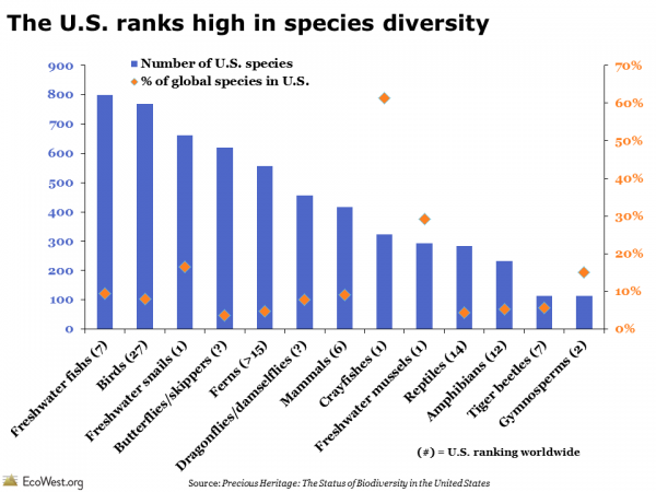
So it’s no surprise that the United States also ranks high in species diversity. In the graphic below, blue bars show the number of species by type. Orange diamonds show what percent of the world’s species are found in the United States and the number in parenthesis in the labels indicate the U.S. ranking worldwide. The highest levels of diversity for several groups are found in the United States, including freshwater mussels, freshwater snails, and crayfishes; several other groups, such as freshwater fishes and gymnosperms, are also well represented here.

United States ranks high in species diversity

Analyzing ecoregions

A more fine-grained view than biomes classifies the terrestrial world into 825 unique ecoregions. These areas are sort of like ecological neighborhoods with similar habitat. Below is a close-up of the American West. If you were to drive through several ecoregions on an interstate road trip, you’d notice the differences simply by looking out the window.

Ecoregions of the American West

TNC’s atlas also analyzes the planet according to its 426 freshwater ecoregions. Each of the regions has a unique collection of aquatic species and freshwater habitats. The map below shows the West’s two-dozen or so freshwater ecoregions, which generally correspond to the boundaries of important river basins.

Freshwater ecoregions of the American West

Dozens of biodiversity metrics

TNC’s atlas offers dozens and dozens of layers of geographic information by terrestrial, freshwater, and marine ecoregion. The deck that you can download at the bottom of this post has 71 slides, with views of both the world and United States.

To give you a taste of what’s available, here’s a summary of three slides.

1) Species diversity is greatest around the equator

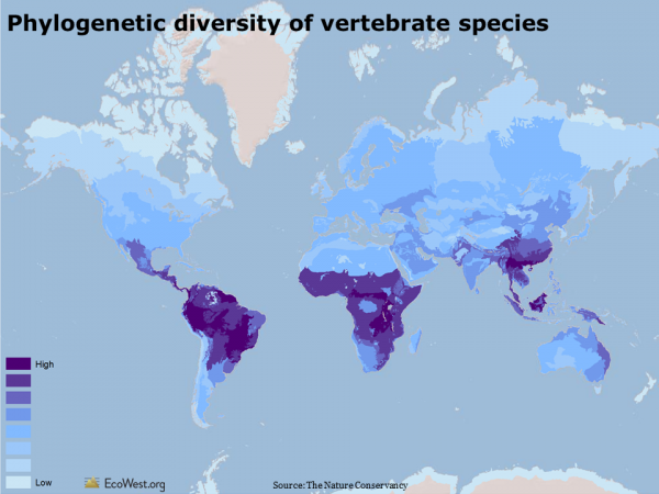
One way to describe biodiversity is to look at the evolutionary distinctiveness of species in a given location. The map below shows the phylogenetic diversity of terrestrial vertebrate species (animals with a backbone). Phylogenetics is a measure of how closely related a group of species is. An ecoregion with high phylogenetic diversity has species that are more distinct from one another (see this summary and this paper for more on the measure).

In general, measures of species diversity are greater at lower latitudes due to the past effects of Ice Age glaciation at higher latitudes and the configuration of islands and other landforms on the Earth, both past and present. In the West, phylogenetic diversity of vertebrate species tends to be highest in the desert Southwest.

Phylogenetic diversity of species

2) Hotspots for threatened animals 

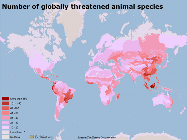
The analysis and conservation of biodiversity often focuses on those species most at risk of extinction. The map below shows the number of globally threatened animals by terrestrial ecoregion. Threatened species are those listed by the International Union for the Conservation of Nature’s Red List as vulnerable, endangered, or critically endangered. Globally, some of the greatest concentrations of threatened vertebrates are in South America and Southeast Asia. About half of the threatened animals are reptiles and amphibians, one quarter are mammals, and one quarter are birds. In the United States, the Southwest, the foothills around California’s Central Valley, the Southeast, and the Appalachians have the most threatened animals.

Number of globally threatened animals

3) Plenty of plants in arid American West

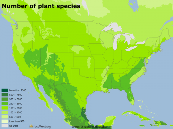
The map below shows the number of plant species by terrestrial ecoregion. Worldwide, there are more than 420,000 of the so-called higher order plants: trees, vines, grasses, fruits, vegetables, and legumes. Deserts and arid lands typically have fewer plant species, while tropical rainforests have the most. But in North America, some drier parts of the inland West actually have more plant species than wetter climes along the coast. Compare, for example, the Great Basin in Nevada to Washington.

Number of plant species

Those are just a few of the slides that I found most interesting. I’d be curious to hear from readers if they spot other patterns.

Data sources

To create the maps, I downloaded the GIS data from Data Basin (a search query for “Hoekstra,” as in atlas lead author and EcoWest advisor Jon Hoekstra, will return all the layers).

I highly recommend the book form of TNC’s atlas, which taught me a ton about biodiversity around the globe.

See this page for more background on ecoregions from WWF.

Downloads

EcoWest’s mission is to analyze, visualize, and share data on environmental trends in the North American West. Please subscribe to our RSS feed, opt-in for email updates, follow us on Twitter, or like us on Facebook.